Archive title heading too large on mobile – Product archive layout
-
Hi,
Following on from this resolved thread: https://xtemos.com/forums/topic/shop-page-header-background-colour-and-category-tabs-alignment%ee%81%96%ee%80%bb%ee%83%bb%ee%83%b9%ee%83%8e/
I now have the Product archive layout working correctly with the Archive title and Product categories elements centred inside a full-width section.
My new question: on mobile the Archive title heading is very large and dominates the screen. How do I reduce its font size and padding on mobile only, within the Product archive layout?
Staging URL: harvinderb1.sg-host.com/product-category/dogs/single-protein/
Thanks,
Harvinder
Attachments:
You must be
logged in to view attached files.
Hello,
You can edit the Archive title element and change its font size for table and mobile devices as shown on the video https://gyazo.com/4248261d09fe78162922756f8ffe2b91
Kind Regards
Thanks! This is great – how to I reduce the padding? I’ve made the font smaller but I can’t seem to reduce the padding at the bottom? There’s too much empty space here..
Attachments:
You must be
logged in to view attached files.
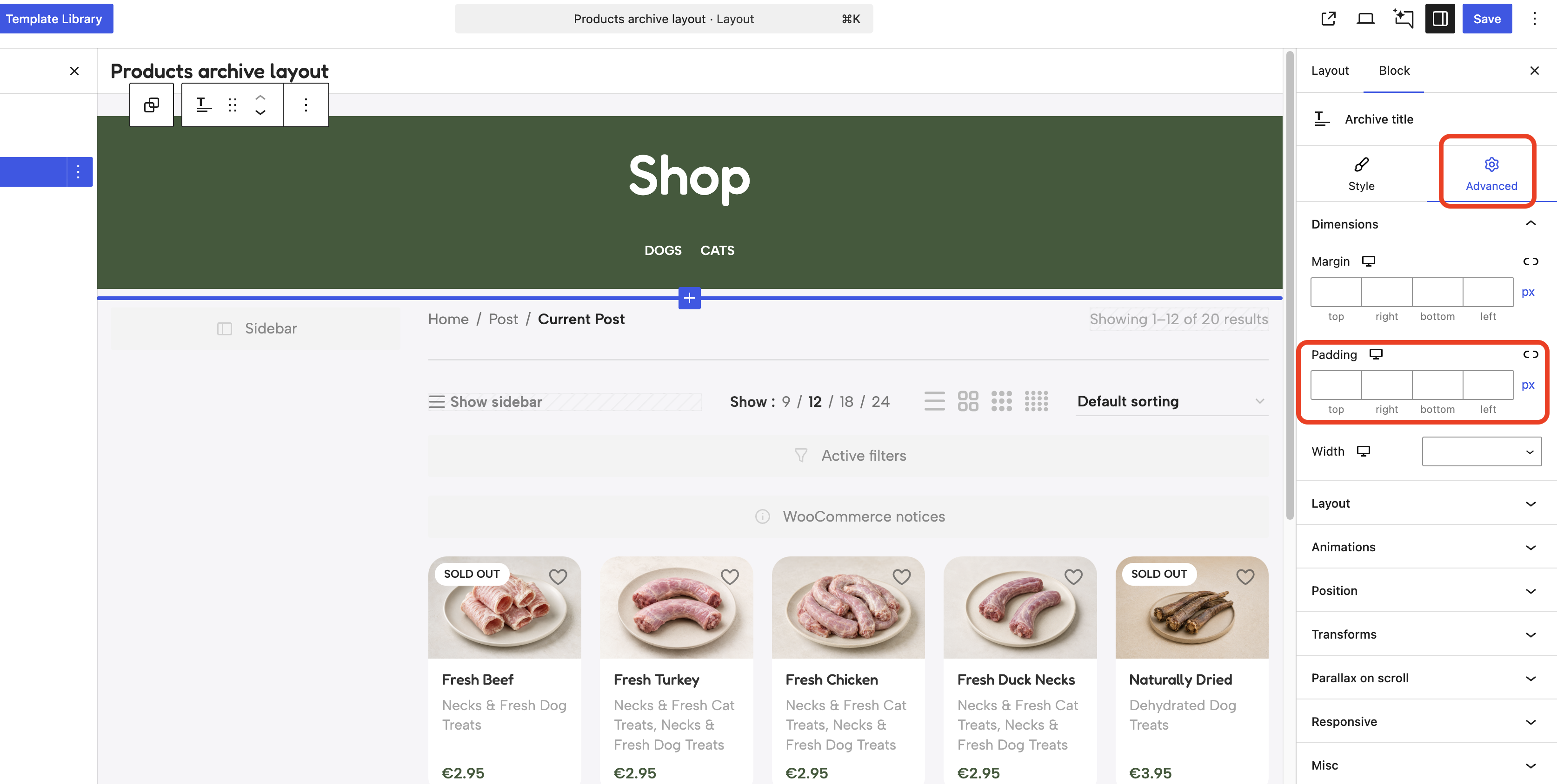
You can find the padding settings in the “Advanced” tab as shown on the screenshot
 .
.