Home › Forums › Basel support forum › Fresh Install, Many Errors › Reply To: Fresh Install, Many Errors
Artem Temos
1. There is no such function at the moment. You can easily achieve this by adding this code snippet to your Custom CSS area in Theme Settings
.home.enable-sticky-header.basel-header-overlap .main-header {
	position:absolute;
  	top:0;
}

.home.enable-sticky-header.basel-header-overlap .main-header {
	position:absolute;
  	top:0;
}

.home .act-scroll .main-nav .menu > li > a {
    height: 100px;
    line-height: 100px;
}

.home .act-scroll .site-logo img {
	max-height:100px;
}
2. Actually, our theme is 100% responsive as well as your coming soon page (see the gif https://gyazo.com/7de9eac842029a8858a89f9ebd53c2bd ). The problem is that responsive layout doesn’t mean that all font sizes you set will be decreased on mobile devices. As we can see you are using Visual Composer Custom Heading element for text

And unfortunately, it doesn’t have any option to decrease font for mobile devices. But we can suggest you the following trick:
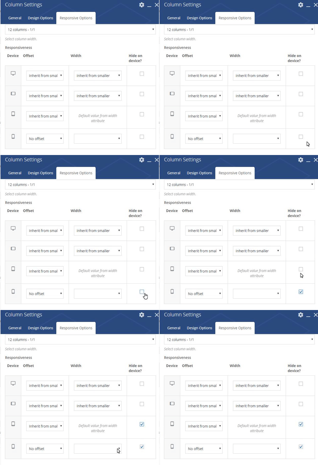
1. You have already created a row with column and all texts inside. Make it visible only for large screens
2. Clone this row. And make column inside be visible only for mobile devices. Decrease all font sizes for headings and text used in this section.
In this way you will hide one block on mobile and show another, with smaller font. Here is an example how you can manage column responsiveness

Hope this instruction will help you.
Regards