Home › Forums › WoodMart support forum › Properly size images in Woocommerce
Properly size images in Woocommerce
- This topic has 18 replies, 3 voices, and was last updated 2 years, 4 months ago by
 Artem Temos.
-
AuthorPosts
-
December 7, 2021 at 6:27 pm #337536
pierredemeudonParticipantHi,
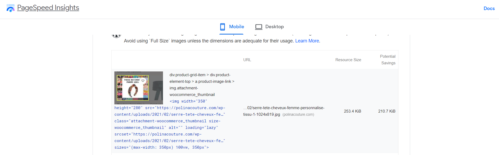
Google changed its pâgespeed test, and this is my store result in new one:
https://snipboard.io/QlIPDy.jpg
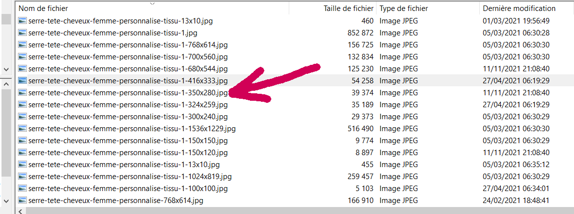
I am not a Tech but it seems that the uploaded image should the 350×280.This format is in the library:
https://snipboard.io/lXWFBZ.jpgAnd though, that’s according to first image, it’s the 1024×819 which has been loaded and considered by the test.
And if I take the other images, most were loaded in 1024×819, and few ones in 680×544.
Question: Could you tell why all are not loaded in 350×280?
Best regards
December 8, 2021 at 7:28 am #337648
Aizaz Imtiaz AwanKeymasterHello,
Basically the product images are controlled by woocommerce and our theme doesn’t influence this. WooCommerce Allows some settings that you can find under Appearance >> Customise >> WooCommerce >> Product Images.
You can read our detailed documentation about image alignment and content in the following link:
https://xtemos.com/docs/woodmart/faq-guides/image-size-content-alignment-product-grid/Best Regards
December 8, 2021 at 8:20 am #337668
pierredemeudonParticipantHi,
1. you don’t answer to the question. So, again: Could you tell why all are not loaded in 350×280. and I may add though defined so in Customise >> WooCommerce >> Product Images.
2. Your theme influence the layout of the shop / product archives. Then, directly or indirectly, on the size of the images, depending on device, screen resolution etc.
So?
Kind regards
December 8, 2021 at 12:43 pm #337763
Artem TemosKeymasterHello,
Could you please check how it works with some default WordPress themes like TwentyTwenty or WooCommerce Storefront to understand is it our theme issue or not?
As we wrote, our theme doesn’t control image sizes on the shop page.Regards
December 8, 2021 at 3:48 pm #337828
pierredemeudonParticipantHi,
With storefront, the behavior is different
Performance is better -what is logical and normal, even though there is no cache on my staging- but no issue with image size, it is served in 350
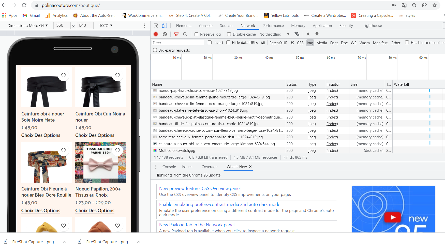
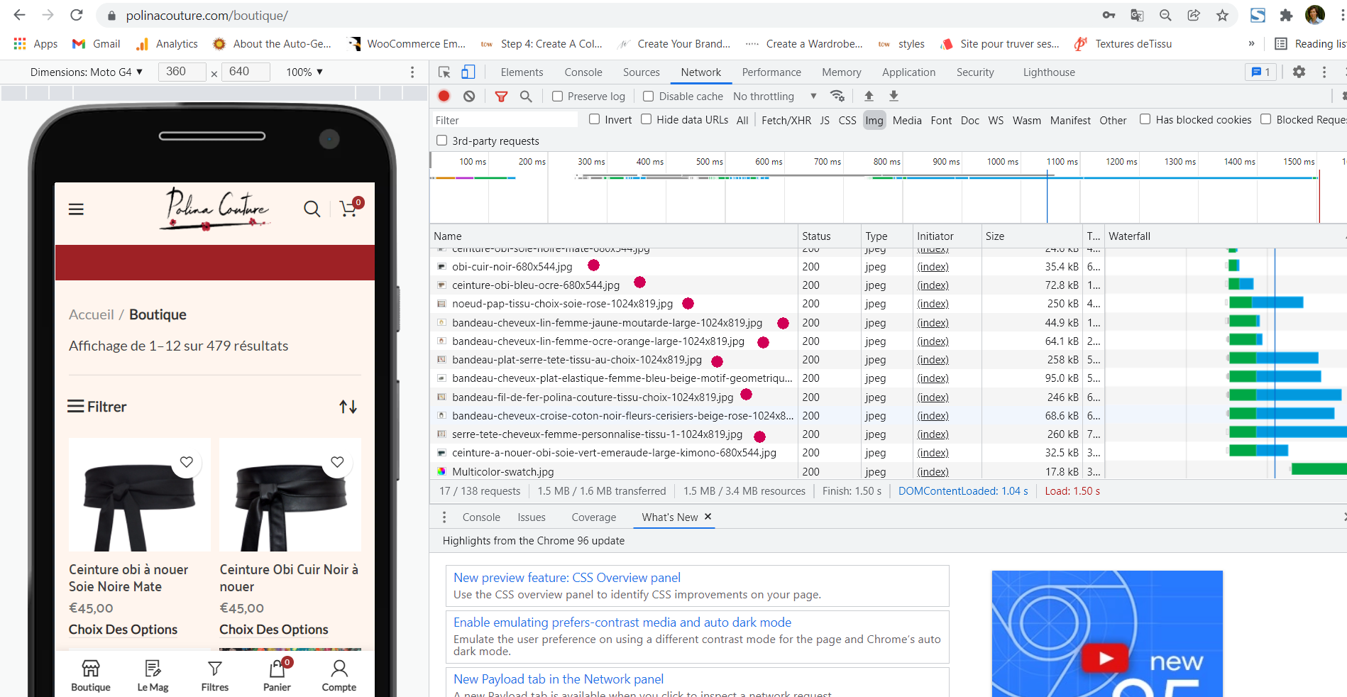
https://snipboard.io/IWKcf0.jpgIf I switch back to Woodmart -without adding the widgets for the reasons we talked about- the issue comes back:
https://snipboard.io/sC6bjU.jpg
And Chrome / Developer tools says the same:
https://snipboard.io/LjD91V.jpgAnd there is the same behavior on your own demo – for purpose of checking if there could be a browser influence, it’s here with Firefox / Developer Tools:
https://snipboard.io/953GWt.jpgKind regards
December 8, 2021 at 3:50 pm #337832
Artem TemosKeymasterIn this case, please, send us your admin access so we can check how it works and see your configuration.
December 8, 2021 at 4:03 pm #337835
pierredemeudonParticipantHi,
It’ a staging site
Kind regardsDecember 9, 2021 at 7:33 am #337984
Artem TemosKeymasterHello,
We just tested with the default WordPress theme and the image file size is the same
https://monosnap.com/file/OCvx3z1SMgGklSSaOtexy6Iq2BgUFL
https://monosnap.com/file/d6nSmiuxSRtbzrvitxcRPFloHP47IzKind Regards
December 9, 2021 at 1:09 pm #338109
pierredemeudonParticipantHi,
Hey, you are not on mobile! Wake up please, who cares about speed on desktops?
Kind regardsDecember 9, 2021 at 1:13 pm #338111
Artem TemosKeymasterBut the HTML code is the same both for mobile and desktop devices. Here is a screenshot from mobile device too https://gyazo.com/32760a48c829f74a4b20cdcc9b8c1b88
December 9, 2021 at 2:39 pm #338159
pierredemeudonParticipant1. Googles declares differently:
https://snipboard.io/jIW5Kf.jpg
How do you explain?2. how do you explain this on your demo?
https://snipboard.io/953GWt.jpg3. How do you explain this?
https://snipboard.io/0XDdRC.jpg4. How do you explain that results are different between woodmart and storefront?
I know nothing about code, and don’t know how to consider what you send. Supposing that this is showing kind of instruction, it would mean that browsers don’t care, or more probably receive different / conflicting instructions on the page, what constraints them to interprete / decide. What could explain that images are different on firefox, chrome, and edge. But at the end of the game, the image size that is delivered is not the right one… if, as you wrote, this is the settings in appearance / woocommerce that should prevail
When I started with you, 4 years ago, the efficiency was far superior
December 9, 2021 at 3:10 pm #338179
Artem TemosKeymasterFirst of all, please, check again with the default WordPress theme to see how the WooCommerce theme by default. Maybe Storefront overrides standard functionality, we don’t know exactly.
1. & 3. It is because of standard
srcsetsfor the image tag. But anyway, our theme doesn’t influence the image size itself.2. It is how we configured images sizes in Appearance -> Customize -> WooCommerce.
4. As we said, Storefront might have its own custom function to display WooCommerce images.
Kind Regards
December 9, 2021 at 3:25 pm #338184
pierredemeudonParticipantHi,
Thank the point: storefront delivers exactly what is set in Appearance -> Customize -> WooCommerce.
But Woordmart does not.
So, how can you say that your theme has no influence?December 9, 2021 at 3:26 pm #338186
Artem TemosKeymasterHave you tested with the default theme (not Storefront)?
December 9, 2021 at 3:28 pm #338187
pierredemeudonParticipantYou saw, or could have seen it on staging … that’s woodmart who is over-riding while storefront respects
December 9, 2021 at 3:54 pm #338198
pierredemeudonParticipantThere is no other default theme for woocommerce than storefront.
I see that you uploaded 20 / 21, but this is not appropriate, 20/21 is for blog, portfolio, …Again, point is sharp: PRODUCTS ARCHIVES ON MOBILE.
And sorry, your theme is impacting on this very specific point. All say the same.December 10, 2021 at 9:44 am #338426
Artem TemosKeymasterHello,
We just checked one more time with the Storefront theme it also loads large image on mobile https://monosnap.com/file/eYCDNgzODtNA3F6ua6X1buYQOxHCWp
And here is a screenshot with WoodMart https://monosnap.com/file/C5Tl9uzMBFKoyIs77aS8T2qCf1kjl4
We tested on this page https://woocommerce-477426-1641986.cloudwaysapps.com/categorie/noeud-papillon/
Please, let me know if you test it differently and specify the exact product where we can check it also.Kind Regards
December 10, 2021 at 3:56 pm #338565
pierredemeudonParticipantHi,
This is a fair point.
I checked more and indeed, it depends on the browser. For the same page (store), on “mobile” (if true), and using developer tools (I don’t know how it’s set):
– If you take Edge, they load 350x250g.
– Firefox load 680×544
– Chrome load 3 different sizes, above the others before.I looked at the sizes on desktop (via save image as), exactly same result.
This means that browser decides in all cases, edge takes small, firefox takes medium, and Chrome takes big, whatever the device, whatever how many products are set per row. I did not expect Chrome to choose the biggest while complaining it’s too big. And fact is it’s independent from your theme.
Sorry…
Looks like we all learnt something there though
Kind regards
Attachments:
You must be logged in to view attached files.December 13, 2021 at 6:58 am #339008
Artem TemosKeymasterHello,
It depends on
srcsetattribute of the image tag. Here is an article that might help you http://alistapart.com/article/responsive-images-in-practice/Kind Regards
-
AuthorPosts
- You must be logged in to create new topics. Login / Register