Home / Forums / WoodMart support forum / product style help me
Home › Forums › WoodMart support forum › product style help me
product style help me
- This topic has 23 replies, 2 voices, and was last updated 5 years, 2 months ago by
 Elise Noromit.
-
AuthorPosts
-
October 22, 2020 at 7:28 pm #235442
arsiviznetParticipant
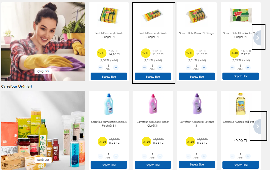
example website : https://www.carrefoursa.com/tr/
Hello;
I apologize for the inconvenience to you. But since I am desperate, I am waiting for your help.
I have to present my products as on the site I gave as an example.
unfortunately my client wants the site to look like that.
Since I don’t have enough knowledge about how to edit css files, I cannot do this editing myself. For this reason, I am ready to pay for it if you want, I expect urgent support from you in this regard.
please guide me to solve this

example website : https://www.carrefoursa.com/tr/
Attachments:
You must be logged in to view attached files.October 23, 2020 at 7:03 am #235521
Elise NoromitMemberHello,
I am checking the site and now it is exactly the same as the picture provided. Please specify what you would like to change?
Best Regards
October 23, 2020 at 12:47 pm #235630
arsiviznetParticipantI know the website is the same with the picture. I gave you the sample picture and the sample website address at the same time. As on the sample site, I want to show the same products on the woodmart. I choose the standard button closest to this display style on woodmart, but my client does not like it. wants it to look like the sample site you sent to you. It wants to have a border on the outside of the products. they want the products to be separated from each other, that is, they want them not to appear adjacent to each other. there is also a shift in word lengths. Although the word line lengths are different in the sample site I sent you, the product does not shift in appearance. Please help me do it like on the sample site. I am ready to pay the fee if necessary
October 23, 2020 at 4:05 pm #235670
Elise NoromitMemberHello,
Please find all the options in the Theme Settings > shop page > Product grid and Product Styles, choose the option and we shall provide custom CSS to make it more qual. We do not guarantee we would reproduce the exact design, but we’ll do our best.
Best Regards
October 23, 2020 at 4:44 pm #235675
arsiviznetParticipantvery very thank you. good work
Much obliged
October 23, 2020 at 9:20 pm #235708
Elise NoromitMemberYou are welcome! If you have any questions or need help, please feel free to contact us.
Best Regards
October 24, 2020 at 7:21 pm #235859
arsiviznetParticipantHow soon can I add the css code to my site? When can I get from you?
my customer is waiting for time from methank you
October 25, 2020 at 8:59 am #235914
Elise NoromitMemberHello,
Please provide your site admin access to the private area.
Best Regards
October 25, 2020 at 3:55 pm #235975
arsiviznetParticipantI entered the login information in the private field.
please help to make it like the sample site.
products should be like the example site I gave in mobile view and desktop view.
my customer is a little grumpy and i just need your help
thank you for everything
respects.October 26, 2020 at 9:41 am #236138
Elise NoromitMemberHello,
I have made the general layout as on the sample. You need to upload images on the left column.
Best Regards
October 26, 2020 at 1:41 pm #236223
arsiviznetParticipantexample website image : https://i.hizliresim.com/rarQ2G.png
a sample of your design: https://i.hizliresim.com/Uz3ldn.png
Thank you for your interest.
I showed it to my client but he said it wasn’t the same.Appearance deteriorates when product name lengths are different. see. I uploaded a sample picture.
customer does not want restrictions on product nameI uploaded the screenshot and visuals of the design you set to the sample website.
The sample website has arrow keys to the right and left to scroll products.
on sample site: there is distance between products
The product table on our site looks adjacentmobile views are not the same.
help me get a similar look.
Please help me.
Attachments:
You must be logged in to view attached files.October 27, 2020 at 9:44 am #236447
Elise NoromitMemberHello,
I cannot enter your site https://prnt.sc/v7r39d
You can set the arrows and gaps in the element settings. You will find the options of the border, padding margins
When you hover the element the arrows would appear. Here is the code CSS to make arrows always visible:
body .owl-carousel .owl-nav>div {
    visibility: visible;
    opacity: 1;
}
The errors need space to be visible.
As for the title, I can give you CSS for the title to make equal height, however, items with the short title would have a gap:
.product-grid-item .product-title{
min-height:60px;
}
Best Regards
October 27, 2020 at 5:01 pm #236610
arsiviznetParticipantThank you for your interest, now you can enter the site fixed the problem.
There are 2 most important problems I want from you
1 – problem with header lengths
2 – products should not appear adjacent, they should stand separatelyLet our products be viewed as in the sample site
October 27, 2020 at 7:27 pm #236633
arsiviznetParticipanthttps://i.hizliresim.com/TTTbCY.png
actually this is exactly what I wanted.
If I choose a 6-section structure in the elementor and enter one product in each section, the products appear separately.
but I don’t want to manage like that. because products appear one by one on mobile. also the navigation does not work. I can’t slide it left or right.
I have more disadvantages, I have to enter each product one by one. and it is necessary to manage all categories one by one.
please help me fix it with necessary css files.
I want to bring the products to the design I want with (carousel) item.Look, I added the sample photo I made myself.
October 27, 2020 at 8:19 pm #236643
arsiviznetParticipantHello I don’t want to write messages back to back, but I solved the problem. I chose “Tiled” from the product styles section for the product looks. and my products appear separately I removed the grid view.
I only have two problems right now.
It does not appear in “Tiled” product style. Add to cart button and product quantity entry.
How can I add product quantity entry and add to cart button in “Tiled” product style.
I attached a screenshot. on the attachment
Now all I need is product quantity entry and add to cart button
I apologize for tiring you, I am very grateful to you. very thank you
Attachments:
You must be logged in to view attached files.October 28, 2020 at 9:47 am #236742
Elise NoromitMemberHello,
Now I am checking the home page and I cannot find anything. Please clarify.
Best Regards
October 28, 2020 at 3:41 pm #236842
arsiviznetParticipantvery sorry wordpress editor was left open.
now editable with elementorOctober 29, 2020 at 3:07 pm #237099
Elise NoromitMemberHello,
Titled design supposes the Add to cart button appears on hover, and quantity is not supped for this type of design. You will have to leave the Standard buttons.
The arrows are provided at the top: https://prnt.sc/v9h2h5
If you need arrows on each side, you need to use Product Grid, not Product AJAX tabs.
We do not guarantee the exact clone of the image you have provided, we can change the color of the button, add the background to the rows, and make them always visible.
Best Regards
October 29, 2020 at 6:49 pm #237148
arsiviznetParticipantdear editor, my customer did not like your design.
I uploaded the sample picture. We want it to be as in the second row. single product view background will be white
we want it to be like the second row picture : https://prnt.sc/v9lr9sThe background of the product quantity entry must be white
add to cart button background should be white
As for the header, I still haven’t found the solution for the header to be of equal height.
October 30, 2020 at 10:20 am #237276
Elise NoromitMemberHello,
Please add this code to the Theme Settings > Custom CSS > Global:
body .product-grid-item {
    background-color: white;
}
Best Regards
October 30, 2020 at 8:58 pm #237397
arsiviznetParticipanthello appearance was as the customer wanted. thank you. There are only two problems
– The product views are adjacent to the shop page.
example image: https://prnt.sc/vadkq2
The appearance is beautiful everywhere except the shop page– Will you give a css code for the length setting in the product headers?
Thank you for your patience and interest so far.
October 31, 2020 at 3:16 pm #237550
Elise NoromitMemberHello,
Please add this code to the Theme Settings > Custom CSS > Global:
.woodmart-spacing-30>[class*=col] {
    margin-bottom: 30px;
    padding-right: 10px;
    padding-left: 10px;
    margin: 30px 15px;
    padding-bottom: 30px;
}
I have already provided the CSS code for the title and you have added it: https://prnt.sc/var4mj
If you want arrows to be always visible in the carousel on the home page, add this code:
body .owl-carousel .owl-nav>div {
    visibility: visible;
    opacity: 1;
}
Best Regards
November 1, 2020 at 2:31 pm #237690
arsiviznetParticipantthank you so much
I am grateful to you
for helping me with patienceNovember 1, 2020 at 4:39 pm #237722
Elise NoromitMemberWe are always happy to help you, write to us when you have any difficulties or issues with our theme.
We would be grateful for 5 stars rate on http://themeforest.net/downloads in case you are satisfied with our theme and customer service
Thank you in advance
-
AuthorPosts
Tagged: product style
The topic ‘product style help me’ is closed to new replies.
- You must be logged in to create new topics. Login / Register