Home / Forums / WoodMart support forum / Default Image sizes
Home › Forums › WoodMart support forum › Default Image sizes
Default Image sizes
- This topic has 30 replies, 2 voices, and was last updated 8 years, 5 months ago by
 Artem Temos.
-
AuthorPosts
-
December 29, 2017 at 9:04 am #30854
MoeMauphieParticipantHi there,
I know that you theme is versatile and supports all images sizes, but I want to make sure it looks as pretty as your demo, so I need to know the exact images sizes you’ve used on your demo website. I’d really appreciate it if you could help me with that.
Could you please advise what sizes you use for the following items:
thumbnail:
medium:
medium_large:
large:
yith-woocompare-image:
shop_thumbnail:
shop_catalog:
shop_single:
woodmart_shop_catalog_x2:Thanks a lot,
December 29, 2017 at 9:25 am #30858Hi,
Sure, here is a list of image sizes
thumbnail: 150×150
medium: 400×300
large: 1300×800
yith-woocompare-image: 430×490
shop_thumbnail: 200×230
shop_catalog: 430×490
shop_single: 700×800
woodmart_shop_catalog_x2: generatedRegards
December 29, 2017 at 10:12 am #30859
MoeMauphieParticipantThanks a lot,
Have you also registered new sizes for post images via function.php? I see in one of your blog pages that these sizes are also created to use for srcset.
150×67
400×180
100×45
200×90.jpg
430×193
700×314.jpg
860×386.jpgDecember 29, 2017 at 10:53 am #30863
MoeMauphieParticipantAs far as I know when you upload a new photo, WordPress automatically creates all available sizes for that photo, no matter it’s a product image or a post image. But it seems this is not the case on your demo, namely, if you upload an image for a post featured image, it doesn’t create other sizes including those you’ve registered for shop. Actually that’s a good thing, because you don’t create unnecessary photos. How can I have that on my website?
Thanks
December 29, 2017 at 12:26 pm #30868Actually, our theme doesn’t override default WordPress thumbnails behavior. It doesn’t depend on our theme at all, you just upload the image to the library and then WordPress generates all the necessary thumbnails sizes.
Regards
December 29, 2017 at 12:37 pm #30872
MoeMauphieParticipantSee this page as an example:
https://woodmart.xtemos.com/blog/2016/07/23/a-companion-for-extra-sleeping/
There are a bunch of sizes for the featured image like this one: https://wood.r.worldssl.net/wp-content/uploads/2016/07/blog-12-860×386.jpg which is 860px wide and this size is not among those you listed above.
December 29, 2017 at 12:39 pm #30873If you are talking about srcset attribute so it display other images size that don’t depend on your images sizes configuration. You can read the information about this in WordPress documentation https://make.wordpress.org/core/2015/11/10/responsive-images-in-wordpress-4-4/
December 29, 2017 at 12:59 pm #30876
MoeMauphieParticipantI’m quite familiar with srcset attribute; As far as I know it doesn’t generate additional sizes, it just includes the available sizes of an image (those with the same aspect ratio) and then browsers will choose the more appropriate ones. On your demo, we see some sizes that have been created specifically for the featured image, just check this image and you’ll see it’s not available in most of the sizes you listed above.
https://wood.r.worldssl.net/wp-content/uploads/2016/07/blog-12-860×386.jpg
Regards
December 29, 2017 at 1:02 pm #30878According to the information from WordPress website it generates additional images that are not related to any of images size defined
 December 29, 2017 at 1:10 pm #30884
MoeMauphieParticipantBut it doesn’t say that 🙂
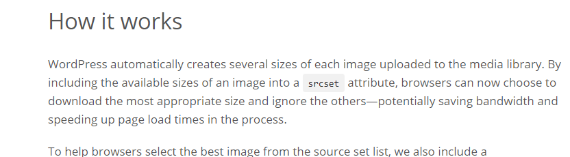
By including the available sizes of an image into a srcset attribute,
Regards
December 29, 2017 at 1:11 pm #30885Yes, but it firstly says
WordPress automatically creates several sizes of each image uploaded to the media library.
🙂
December 29, 2017 at 1:16 pm #30886
MoeMauphieParticipantThat’s exactly what I’m saying. So you have to define those new sizes first in function.php file or in the admin panel, right? Therefore you have a different set of sizes for woodmart in addition to the ones you listed above?
December 29, 2017 at 1:16 pm #30887No, we didn’t define any extra sizes in our theme except the sizes from the list above.
December 29, 2017 at 1:18 pm #30889
MoeMauphieParticipantHow has this image been generated then?
https://wood.r.worldssl.net/wp-content/uploads/2016/07/blog-12-860×386.jpg
Regards
December 29, 2017 at 1:20 pm #30891WordPress itself generates this image and we don’t have a control over them. You can check that it will work in the same way with other themes as well.
December 29, 2017 at 1:30 pm #30899
MoeMauphieParticipantIn order to see the difference, I changed all the image sizes to the ones you listed above and then uploaded the very same photo of your blog on my website and as you can see it has NOT generated those images for me.
http://tennisfa.com/shop/2017/06/16/the-big-design-wall-likes-pictures/
https://woodmart.xtemos.com/blog/2016/07/23/a-companion-for-extra-sleeping/
December 29, 2017 at 1:35 pm #30901It may happen for our demo only because we have a lot of demo versions on the same website and they all have different images sizes. Or it happens because we are using multisite on our demo website. But we didn’t add any extra sizes to control this srcset for our demo only.
December 29, 2017 at 2:09 pm #30911
MoeMauphieParticipantThat’s reasonable. Thanks for your help.
December 29, 2017 at 2:45 pm #30919You are welcome!
December 29, 2017 at 3:28 pm #30933
MoeMauphieParticipantHi again 🙂
It looks, on a category page like this: https://woodmart.xtemos.com/blog/category/design-trends/page/2/ the most appropriate image is not chosen by the browser. Actually the browser always chooses the biggest image, which is not necessary and makes loading slower. And that happens even on desktop and when there are three columns and the display is not retina.
It seems “sizes” attribute should be better configured.
Could you please look into it?
Thanks
December 30, 2017 at 9:38 am #31001Hi,
Again, it happens in our demo because we specified large images size to make it look better on both full-width blog layout and on the masonry grid. We have demos with one blog layout and with another. That is why we can’t set blog images to 400×300, for example, to make the performance better in overall. But it shouldn’t happen on your website since if you are going to use blog masonry grid you can simply specify smaller images.
Regards
December 31, 2017 at 8:58 am #31051
MoeMauphieParticipantHi there,
I think the “sizes” attribute is not correctly configured for blog masonry grids, whereas for shop grid view you’re using the right one.
You use the following for blog grids: sizes=”(max-width: 1024px) 100vw, 1024px”
While for shop grids you use this one: sizes=”(max-width: 430px) 100vw, 430px”And that’s why on blog grids the biggest image is always called. It needs to be configured to match the theme breakpoints, otherwise it always uses the biggest image which is not efficient.
And one more thing: why don’t you enable hard cropping for theme photos to make grid view look tidy and uniform? On your demos, you have used photos with the same size so the grid is always uniform and pretty, but what if we upload images with different sizes? Soft cropping creates images with different heights and the result is not very good. I think that would be a good idea to enable hard cropping for images that are going to be used somewhere in the theme.
Regards
December 31, 2017 at 12:20 pm #31063Hi,
Yes, you are right, on the blog page it shows 1024 because this size is set in our WordPress media settings. And we set it to this because except masonry grid style we use default one too. On real website, you will choose between these two for all website and will set smaller size if you will choose the masonry grid.
As for the hard crop option, so you can enable it in WooCommerce -> Settings -> Products -> Display.
Regards
December 31, 2017 at 2:53 pm #31081
MoeMauphieParticipantHi,
I’m afraid the “sizes” attribute for blog grids should be modified to something like this:
sizes=”(max-width: 480px (or whatever media breakpoint is used for phones) 100vw, 1024px”As for hard cropping, I was referring to blog images, and that can be achieved by registering new sizes in function.php. Please find the attached file to see what it looks like when hard cropping is not used.
Regards
Attachments:
You must be logged in to view attached files.December 31, 2017 at 3:27 pm #31089
MoeMauphieParticipantHi there,
Please also have a look at this website to see what I mean: http://theme-sphere.com/smart-mag/demos/tech/category/gadgets/
By setting the size attribute properly, on grid page the correct size will be used and the bigger size is used on retina displays and on single page view. And we need hard cropping to make them all look the same size.
Regards
December 31, 2017 at 8:34 pm #31106
MoeMauphieParticipantHi there,
Another thing that, I think, is worth having a look at:
In content.php:
					<?php elseif ( ! is_single() ): ?>

						<div class="post-img-wrapp">
							<a href="<?php echo esc_url( get_permalink() ); ?>">
								<?php echo woodmart_get_post_thumbnail( 'large' ); ?>
							</a>
						</div>
						<div class="post-image-mask">
							<span></span>
						</div>

					<?php else: ?>
						<?php the_post_thumbnail(); ?>
					<?php endif ?>
You have not defined any size for <?php the_post_thumbnail(); ?> which means it uses the full size (uploaded image). That means if you upload a 20000 px wide photo, that photo is loaded when you visit a single post. Why not using ‘large’ size?
Regards
January 1, 2018 at 1:52 pm #31135Hello,
We will investigate this question and back to you tomorrow.
Regards
January 2, 2018 at 7:35 am #31203
MoeMauphieParticipantI think I sort of solved the problem. I modified a few lines in content.php and used the 768 breakpoint as a base, of course we need more media conditions to have a more elegant approach, but I think this one also works and stops big images from loading in grid view (on desktop). I also register a custom size (largesoft) to stop ultra big images from being called directly in single page view and since it uses soft crop, the full image size is always present to to be used in ultra large screen if needed.
I also changed ‘medium’ and ‘large’ sizes crop type to hard crop to have a uniform grid.And this is what I used in content.php
					<?php elseif ( ! is_single() ): ?>

						<div class="post-img-wrapp moegrid">
							<a href="<?php echo esc_url( get_permalink() ); ?>">
								<?php the_post_thumbnail('medium', ['sizes' => '(max-width: 768px) 100vw, 640px']); ?>
							</a>
						</div>
						<div class="post-image-mask">
							<span></span>
						</div>

					<?php else: ?>
							<?php the_post_thumbnail('largesoft', ['sizes' => '(min-width: 768px) 100vw, 768px']); ?>
					<?php endif ?>
January 2, 2018 at 9:44 am #31216Hello,
We will take into account all your recommendations here and will try to improve this functionality in our updates.
Kind Regards
January 2, 2018 at 3:15 pm #31262
MoeMauphieParticipantThanks a lot, guys. Keep up the good job.
-
AuthorPosts
- You must be logged in to create new topics. Login / Register