The labels (th) of the table in the checkout view are on display:none on mobile view. That way there are no labels at all when viewing the shop in smaller screens.
This is the code which removes the labels in mobile view:
.shop_table_responsive th, .shop_table_responsive thead {
    display: none;
}
The code comes from /wp-content/themes/woodmart/style.min.css?ver=2.5.0
I added this to my custom CSS to fix this problem.
/* Checkout Mobile Fix */
.shop_table_responsive tr.cart-subtotal th,
.shop_table_responsive tr.shipping th,
.shop_table_responsive tr.order-total th,
.shop_table_responsive tr.order-tax th,
.shop_table_responsive thead {
    display: block;
    border: none;
    padding: 0;
    float: left;
}
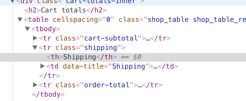
I added screenshot for clarification.
Attachments:
You must be
logged in to view attached files.
 .
.