Home / Forums / WoodMart support forum / iPad/Mobile Menu Alignment Issue – Support Needed
Home › Forums › WoodMart support forum › iPad/Mobile Menu Alignment Issue – Support Needed
iPad/Mobile Menu Alignment Issue – Support Needed
- This topic has 7 replies, 4 voices, and was last updated 5 months, 4 weeks ago by
 Artem Temos.
-
AuthorPosts
-
June 7, 2025 at 12:23 am #665941
emrecanParticipantHi Xtemos team,
I tried posting on the forum but received a database error.
We’re using the latest Woodmart version on https://omoco.com.
There’s a layout issue in the Category menu on iPad and mobile devices.Inside
.cat-item a.category-nav-link, the icon and text are not aligned horizontally.
We tried everything (Custom CSS, Custom JS, querySelector, setInterval) but nothing works — probably due to JS-rendered structure.Can you please review this layout issue and help us fix it?
We would appreciate a direct solution (CSS snippet, JS fix, or file override instructions).Thanks in advance!
Attachments:
You must be logged in to view attached files.June 7, 2025 at 1:28 am #665947
emrecanParticipantplease solve my problem
June 9, 2025 at 10:01 am #666105
Luke NielsenMemberHello,
The issue is with the SVGs that don’t have width and height attributes.
You need to open your SVG icons file with some editor like Sublime Text or default system text editor and add width=”31″ height=”40″ attributes to your svg tag like it is shown https://prnt.sc/N-wyqYgD3npT. Then you will need to re-upload your image in WordPress Dashboard.
Kind Regards
January 7, 2026 at 12:34 pm #703452
TradeSurveyParticipantI’ve got the exact same problem. I tried to add the width and height in the html of the svg using notepad on a MacBook and re uploaded the image but doesnt seem to work.
Please can you reshare the screenshot of the attributes above as the link no longer works.
Thanks
Attachments:
You must be logged in to view attached files.January 7, 2026 at 12:37 pm #703454Hi there,
To resolve this issue, you’ll need to open your SVG icons file in an editor and add height and width attributes to your
<svg>tag, as demonstrated in the screenshot provided: https://gyazo.com/83fd36b0bb9628bb1aed2bd3d5d063c5Once you’ve made these changes, you’ll need to reupload your icons in the WordPress Dashboard.
Best regards
January 7, 2026 at 1:25 pm #703463
TradeSurveyParticipantDo I need to paste this xml:
<rect x=”10″ y=”10″ width=”100″ height=”100″/>after all the other code eg. <defs> &<polygon> ?
January 7, 2026 at 1:45 pm #703472
TradeSurveyParticipantAh! I guess not – i got an error with that file.
Attachments:
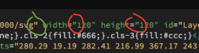
You must be logged in to view attached files.January 8, 2026 at 11:46 am #703588As I can see from your screenshot, you used incorrect double quotes. In the following screenshot, I’ve highlighted the correct format with a green circle and the incorrect format with a red circle.
-
This reply was modified 5 months, 4 weeks ago by Artem Temos.
-
This reply was modified 5 months, 4 weeks ago by
-
AuthorPosts
Tagged: mobile
- You must be logged in to create new topics. Login / Register