Home / Forums / WoodMart support forum / Product Categories | Arrow
Home › Forums › WoodMart support forum › Product Categories | Arrow
Product Categories | Arrow
- This topic has 11 replies, 2 voices, and was last updated 4 years, 2 months ago by
 Aizaz Imtiaz Awan.
-
AuthorPosts
-
October 9, 2021 at 3:51 am #324044
shwetaParticipantHello Team,
I’m using the product categories element on my website arrow is not showing on the mobile view and desktop view.
Best
Attachments:
You must be logged in to view attached files.October 9, 2021 at 6:15 am #324053
Aizaz Imtiaz AwanKeymasterHello,
Your issue has been Resolved. Please clear cache and check back. The issue was the caused by the number of categories option is set to 6. And there were a total of 6 categories that’s why the Arrows weren’t displayed.
Regards.
Xtemos Studios.October 9, 2021 at 6:44 am #324057
shwetaParticipantHello,
Thank you for the quick reply.
The arrow has been showing on the desktop view still not show on the mobile view can you please check and resolve this issue.
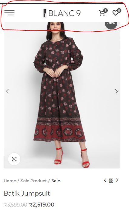
also if you go to the single product page the top header banner overlaps the image. for better understanding please find the screenshot attached.
Best
Attachments:
You must be logged in to view attached files.October 9, 2021 at 7:07 am #324061
Aizaz Imtiaz AwanKeymasterHello,
The arrows are displayed on your website on mobile please clear cache and check back.
The issue is caused by the CSS that you added. Please remove the CSS then check back.
Screenshot for Clarification: https://gyazo.com/e53b5f8cd6298b4eb4a6e308af3796e7
Regards.
Xtemos Studios.October 9, 2021 at 7:57 am #324065
shwetaParticipantI have already clear the cache still not showing. I have checked on multiple phones.
October 9, 2021 at 9:19 am #324071
Aizaz Imtiaz AwanKeymasterHello,
I have rechecked my phone and the arrows are displayed on my mobile.
Screenshot for Clarification: https://ibb.co/zndMZYY
Please clear the cache and check in the private window.
Best Regards.
October 12, 2021 at 4:56 pm #324689
shwetaParticipantThe arrows are displayed on your website on mobile please clear cache and check back.
The issue is caused by the CSS that you added. Please remove the CSS then check back.
Screenshot for Clarification: https://gyazo.com/e53b5f8cd6298b4eb4a6e308af3796e7This was your reply was on October 9, 2021, at 7:07 am. This CSS is removed however there is now a gap in the header and first row. The same can be seen on any page. This css was suggested by you only. Kindly suggest a way to have arrows as well as get rid of that gap…
From the file, https://blanc9.com/wp-content/themes/woodmart-2/css/parts/base.min.css?ver=6.1.4
CSS loaded is
.main-page-wrapper {
    margin-top: -40px;
    padding-top: 40px;}
Kindly look into it.
October 13, 2021 at 6:31 am #324794
Aizaz Imtiaz AwanKeymasterHello,
For the GAP try adding the following Custom CSS.
.home .main-page-wrapper {
    padding-top: 0;
}
And the Arrows are displayed on mobile. It is your cache issue.
Screenshot for Clarification: https://ibb.co/dJFvyD3
Regards.
Xtemos Studios.October 13, 2021 at 7:06 am #324805
shwetaParticipant.home .main-page-wrapper { padding-top: 0; }This only works for the home page, the problem is global. The gap between the header and 1st row exists on every page. Including shop and all other pages.
If I remove, .home from the CSS, the arrows on the carousel in the first row of page https://blanc9.com/women-collection-by-shweta disappears (as discussed in this thread, all along).
Please help on priority.
October 13, 2021 at 7:15 am #324811
Aizaz Imtiaz AwanKeymasterHello,
Please replace the previous Custom CSS with the following.
.main-page-wrapper {
    padding-top: 0;
}
And to avoid this CSS affecting single product pages try adding the following Custom CSS.
.single-product .main-page-wrapper {
    padding-top: 40px;
}
Regards.
Xtemos Studios.October 13, 2021 at 8:06 am #324823
shwetaParticipanthttps://blanc9.com/women-collection-by-shweta is not a single product page. I have added both the CSS however, original Problem in this thread remains unresolved.
Please suggest a solution.
In addition, I don’t see a reason to add padding-top on a single product page. Also, what has padding got to do with the do navigation arrow not displaying in the category carousel. Please take this feedback for the next update. It is crucial. I have three license of your theme. Planning to buy more but this padding top is becoming a grave concern.
October 13, 2021 at 8:39 am #324836
Aizaz Imtiaz AwanKeymasterHello,
You again have changed the number of items on the slide that’s why the arrows not displaying on the page on desktop and on mobile arrows are displayed.
Screenshot for Clarification: https://ibb.co/SfyKCJt
I have set the number of slides to 3 and the arrows are displayed on the desktop as well.
And this is the reason to add padding to the Single product page as you asked for this:
https://xtemos.nyc3.digitaloceanspaces.com/wp-content/uploads/2021/10/single-product.jpgThat’s why we recommend creating new topics for each of your issues to avoid such confusion.
If you keep asking other questions on the same topic as a result we move away from the original issue for which the topic was created. Hope you can understand this.
Best Regards.
-
AuthorPosts
- You must be logged in to create new topics. Login / Register