WordPress blog
Creating an accessible website is not just about compliance — it’s about ensuring that every user, regardless of their ability, can navigate and interact with your content effectively. With growing awareness and legal requirements around digital accessibility, it’s more important than ever to build inclusive online experiences.
When working with the WoodMart theme for WordPress, it’s important to understand that accessibility is not solely the responsibility of the theme itself. In fact, many accessibility issues are related to the overall structure, content, and third-party plugins used on the site. While WoodMart provides a solid foundation, not all problems can be resolved through the theme’s built-in code alone — some issues may require adjusting theme settings or editing the content directly.
To effectively address common accessibility challenges, a comprehensive approach is required — one that involves analyzing the root causes of the issues and implementing solutions at various levels, including design, content, and functionality. In this article, we’ll explore how to enhance accessibility in a WoodMart-powered site and provide practical guidance for making your website more inclusive for everyone.
How to oneself check accessibility on a given page
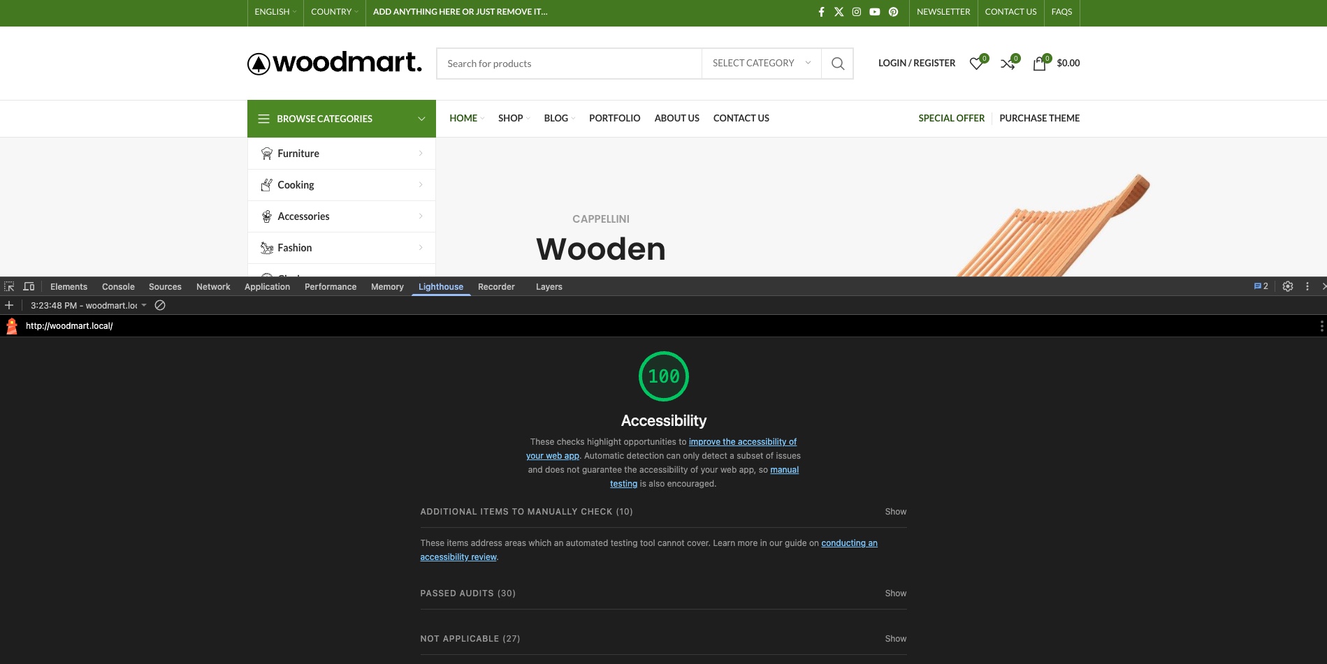
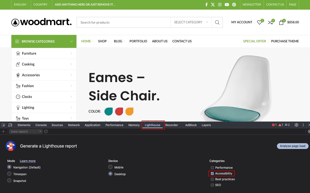
The most common tool for generating a website page’s performance and accessibility report is Google PageSpeed Insights (https://pagespeed.web.dev/) or the Lighthouse tool that is a part of Chrome DevTools that allows conveniently checking website pages even in a local environment during web page development.
To check accessibility using Lighthouse in Chrome DevTools, follow these steps: Open your website in Chrome, then press F12 or right-click and select Inspect to open DevTools. Navigate to the Lighthouse tab. Choose the desired categories (make sure Accessibility is selected) and the device type (Mobile or Desktop). Click Generate report. Lighthouse will analyze the page and provide a detailed report highlighting accessibility issues, suggestions, and scores. You can expand each issue to see explanations and recommended fixes.
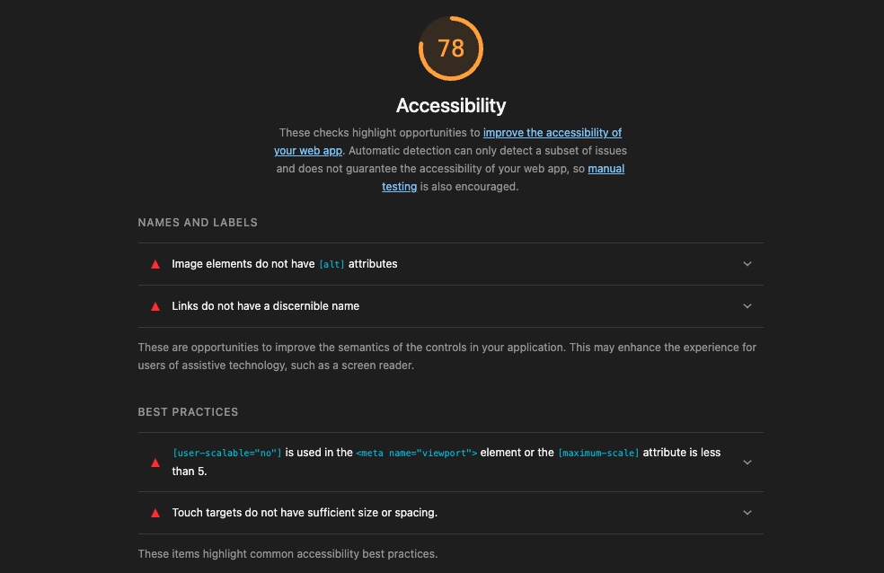
Typical errors in accessibility report
Below is a list of the most common accessibility issues found in reports, along with recommendations on how to resolve them by editing your content or adjusting the theme options. It is important to note that modifying certain elements of your site to improve accessibility may affect the original design and visual style. When working on enhancing accessibility, you will often need to find a balance between maintaining the site’s appearance and ensuring it is easy to use for people with various disabilities.
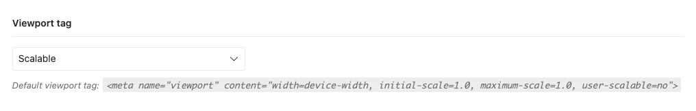
[user-scalable=”no”] is used in the <meta name=”viewport”> element or the [maximum-scale] attribute is less than 5.
This indicates that the page restricts users’ ability to zoom or scale the content on mobile devices. This limitation negatively impacts accessibility because users with visual impairments may need to zoom in to read content comfortably. To remove the maximum-scale restriction and allow zooming on mobile devices, go to Theme Settings → Other, locate the Viewport tag option, and set its value to Scalable.
It’s important to note that by default, when maximum-scale is set to a value greater than 1 and zooming is enabled, mobile Safari will automatically zoom in on text input fields when they receive focus. This is standard behavior in Safari on mobile, and there is no way to disable it other than by changing the attributes in the viewport tag. Therefore, when optimizing for accessibility, you will need to choose between allowing full-page zoom or preventing Safari’s automatic zoom on form inputs.
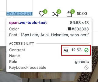
Background and foreground colours do not have a sufficient contrast ratio
This warning indicates that the color combination between text (foreground) and its background does not meet accessibility standards for contrast. Insufficient contrast makes content difficult to read, especially for users with visual impairments or color blindness. According to WCAG guidelines, normal text should have a contrast ratio of at least 4.5:1 against its background, while large text should have a minimum of 3:1.
To check the contrast ratio of specific elements, open Chrome DevTools, go to the Elements panel, select the element in question, then in the Styles pane hover over the color values for text or background. DevTools will display the contrast ratio and indicate whether it passes WCAG requirements.
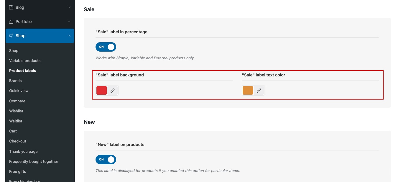
To achieve the required contrast, you need to adjust either the text color or the background color to meet the necessary values. This can be done in various ways depending on the element being modified. If the element is part of the builder, start by checking the element’s settings for available color options. In other cases — such as the primary color, notices, or product labels — you can adjust the colors directly in the Theme Settings.
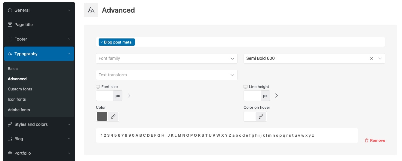
The most unique and specific elements — such as product categories in the grid, the old price in a discounted price display, blog post meta information, and others — can be found under Advanced Typography located in Theme Settings → Typography. For example, to change the color of the blog post meta information, go to the Advanced Typography interface, select Blog post meta, set the desired color, and save the changes.
It’s important to note that WCAG standards require a relatively high contrast between background and text, which may force the use of darker colors for text on white backgrounds, and darker background colors for white text. As a result, this can significantly alter the visual design of your website’s pages. In such cases, you’ll often need to make a decision between preserving the original design vision and achieving full compliance with WCAG contrast requirements across all possible elements.
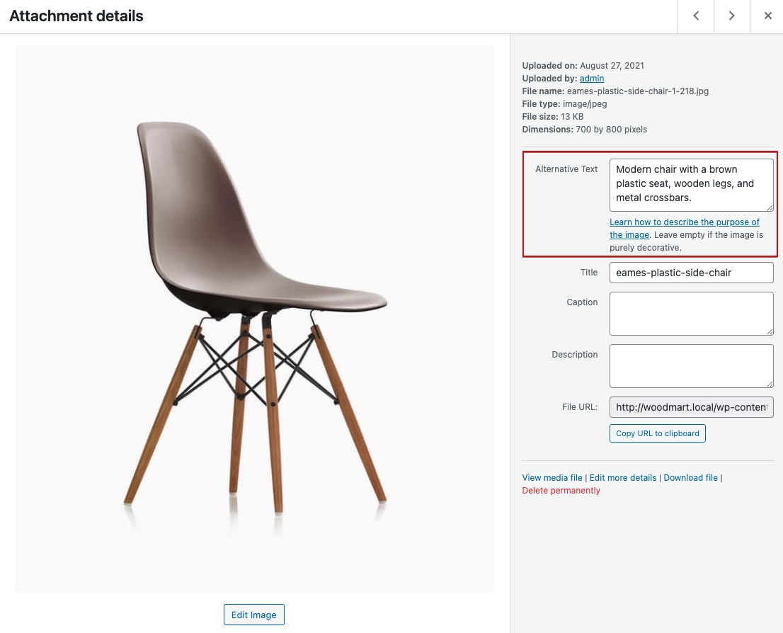
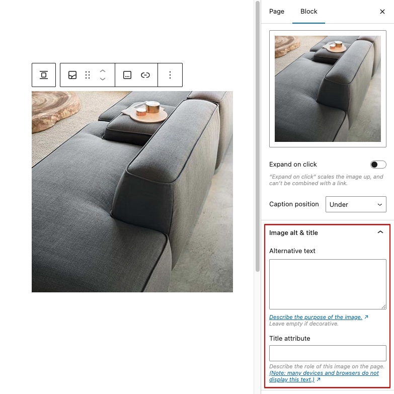
Image elements do not have [alt] attributes
This warning means that one or more images on the page are missing an alt attribute, which is used to describe the content of an image. This violates accessibility requirements (WCAG), as screen readers will not be able to tell what is depicted, and visually impaired users will lose some information.
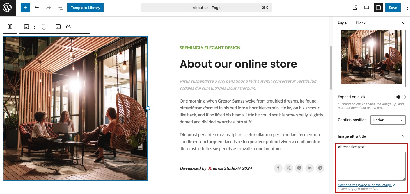
In WordPress, you can add alternative text to an image by opening the Media Library from the dashboard, clicking on the image you want to edit, and entering your description in the “Alternative Text” field in the Attachment Details panel. This text describes the content or function of the image and is used to improve accessibility and SEO. The value you enter is saved automatically and will be used whenever the image is inserted into content, unless manually overridden.
Some Gutenberg page builder blocks related to images (such as Image, Gallery, etc.) also have additional fields for setting the alt attribute directly within the block’s own settings panel.
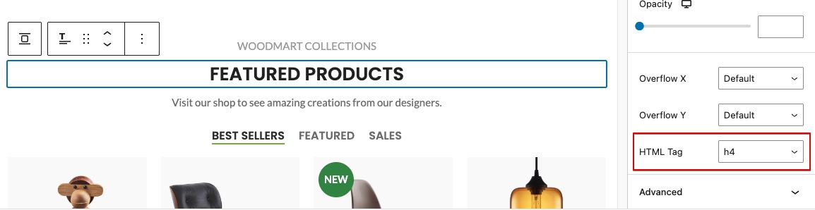
Heading elements are not in a sequentially-descending order
The following warning indicates that the headings on your page (e.g., <h1>, <h2>, <h3>, etc.) do not follow a logical, hierarchical structure. Headings should increase or decrease by one level at a time to maintain proper semantic flow. For example, the heading level following an h1 element should be an h2 element, not an h3 element.
You can manually check which heading levels are used by inspecting the page with Chrome DevTools, or view the complete heading structure of the page using the Chrome browser extension HeadingsMap. Once you’ve reviewed the heading map, you can make changes by editing the text directly through the product builder’s text areas (if it’s HTML content), or, if direct editing is not available in certain areas, by using various built-in theme options.
List of options for heading level configuration:
- (Theme settings) Title tag
- (Theme settings) Widget title tag
- (Elementor Section title element) Tag
- (WPBakery Section title element) Tag
- (Gutenberg Title block) Tag
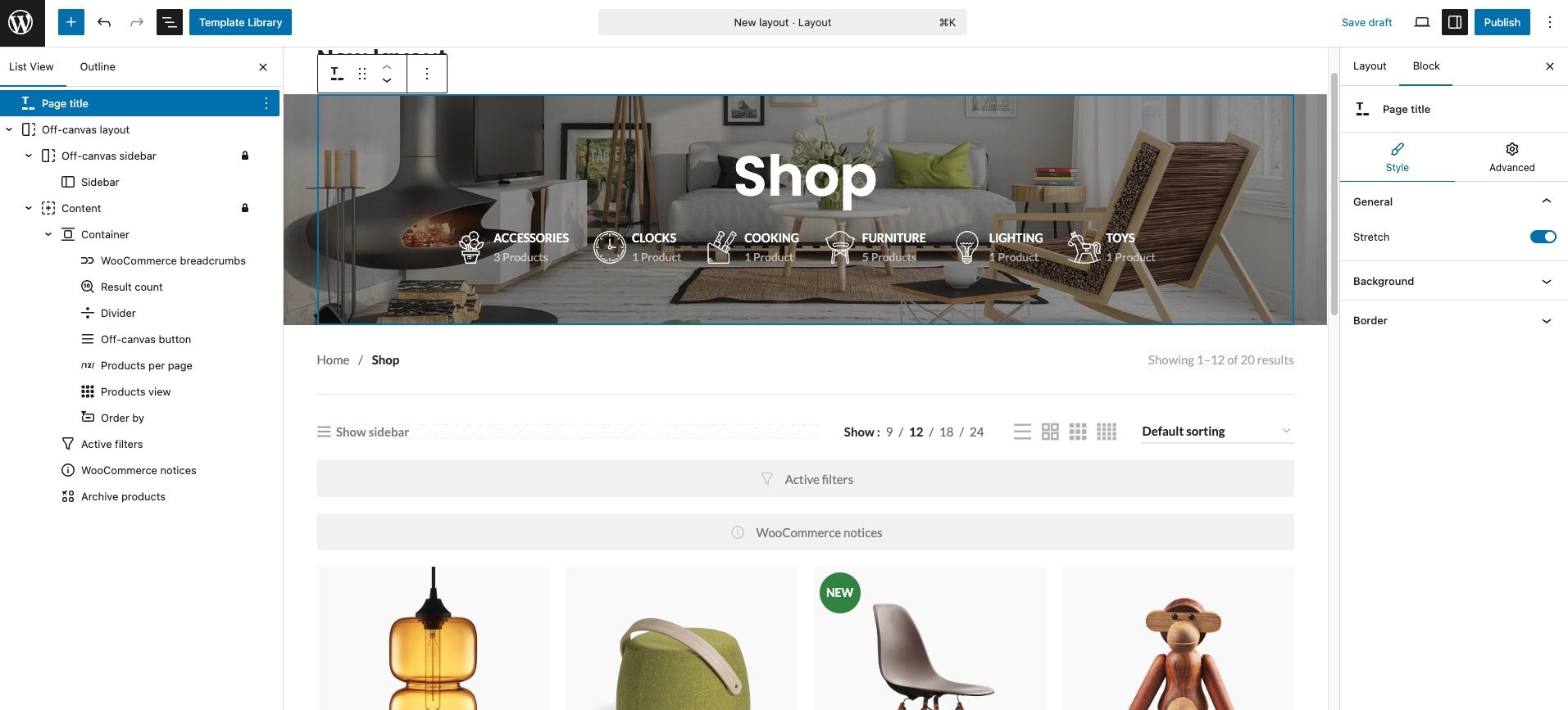
Ensure that the page, or at least one of its frames contains a level-one heading
The following warning indicates that your page is missing an <h1> element, which serves as the primary heading of the document. The <h1> is crucial for accessibility and semantic structure, helping screen readers, search engines, and users understand the main topic of the page.
This issue most commonly occurs on pages built with a page builder. For example, the homepage might contain multiple heading elements, but none of them is set as an <h1> tag. Or the main shop page may be created using the layout builder, but the Page Title element is missing. To improve accessibility on these pages, assign the <h1> tag to the heading element you consider the main one by using the Tag option, which can be found in the Title element’s settings (its location is described in the previous section). Alternatively, when using the layout builder, make sure the page includes a Page title, Archive title or any other heading element that uses an <h1> level.
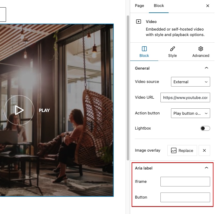
Links do not have a discernible name
This means that one or more <a> (anchor) elements on your page are missing accessible text or labels, making them unreadable to screen readers and other assistive technologies. This results in poor accessibility because users relying on those tools won’t understand where the link leads or what it does.
This usually occurs when:
- The
<a>tag has no inner text or content. - The link only contains an icon or image without alt text or aria-label.
- The link is styled or scripted to behave like a button without proper labeling.
❌ Example of a link with an accessibility issue:
<a href="/settings"><img src="gear.png"></a> <!--No alt, no label-->
✅ Fixed by adding text inside the link:
<a href="/settings">Settings</a>
✅ Fixed by adding an alt attribute with an image description:
<a href="/settings"><img src="gear.png" alt="Settings"></a>
The changes described above can be made either by editing the HTML content directly or (depending on how the image is inserted into the page) by adding alt text to images through the dedicated field in the Media Library, as described in one of the previous sections. Additionally, since Gutenberg does not always inherit values from the Media Gallery, when using this builder, it is recommended to check the options of each individual element for specific settings that may contain fields for entering title, alt, or aria-label attributes.
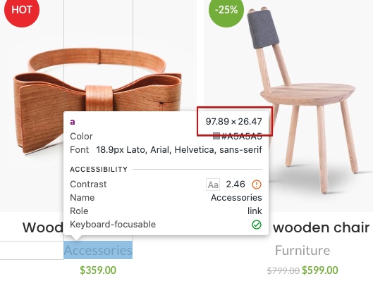
Touch targets do not have sufficient size or spacing
This means that interactive elements such as buttons, links, or icons are either too small or placed too close to one another, making it difficult for users — especially on touchscreens — to tap them accurately. This issue most commonly occurs on mobile devices, as tapping with a finger is less precise than hovering and clicking with a mouse. According to WCAG standards, touch targets should be at least 24px by 24px in size. If the audit shows that certain interactive elements are too small to be easily tapped, they should be repositioned or resized.
Our theme provides a wide range of options that can affect element sizes — from predefined button size settings to typography controls for individual elements, where you can adjust the font-size of links, thereby increasing their tappable area.
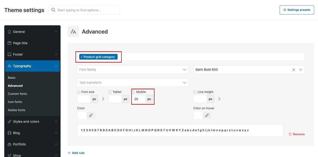
For example, if the audit shows that category links in the product grid are too small on mobile devices, you can adjust them using the Advanced Typography feature located in Theme Settings → Typography. In the typography interface, locate the “Product grid category” option and set an appropriate font-size specifically for mobile. It’s worth noting that inline text typically has a line-height greater than 1, which naturally increases the overall tappable area. Therefore, it’s not always necessary to set the font size to 24px — smaller sizes may still meet the recommended touch target area depending on spacing and layout.
You can check the exact boundaries of each interactive element on the page by opening Chrome DevTools and hovering your cursor over the desired element. Its boundaries will be highlighted, and the size will be displayed in the corner of the tooltip overlay.
Since accessibility issues like this can appear in unexpected places and result from a complex combination of line height, font size, design constraints, and sizing options, it’s not possible to provide a one-size-fits-all solution for every case. However, if you encounter this problem, try adjusting the size, font-size, line-height, and spacing settings if the element is part of a page builder or the header builder. Otherwise, check whether the Advanced Typography section in Theme Settings includes a selector for the specific element you need — this allows you to adjust the size of the interactive element directly.
Keyboard-only navigation
Keyboard accessibility ensures everyone can navigate websites and apps using just a keyboard. This is vital for users with motor disabilities, visual impairments, or temporary injuries. WCAG 2.1.1 requires all interactive elements to work seamlessly with a keyboard, avoiding traps and providing visible focus indicators.
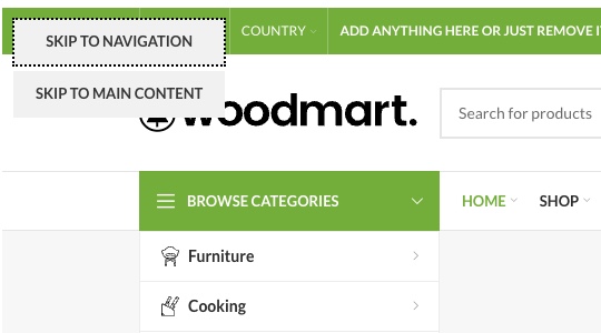
By default, our theme includes several accessibility enhancements and visual cues that make it easier to navigate the site using only a keyboard. When the Tab key is pressed, the active area is highlighted using an outline, allowing users to see which element is currently focused. When interacting with modal windows — such as the promo popup, cart, or full-screen search — the focus is automatically shifted inside the modal for seamless navigation. Additionally, a “Skip links” buttons is available at the top of the page, allowing users to bypass header links and go directly to the main navigation or content.
You can customize the style, thickness, or color of the focus outline using the “Keyboard focus outline” option located under Theme Settings → Styles and Colors → Styles. Similarly, the focus styles for form inputs can be adjusted using the “Form border color focus” option found in Theme Settings → Styles and Colors → Forms.
Conclusion
Ensuring accessibility means building a website that is welcoming and functional for all users, including those with disabilities, while also improving conversion rates and enhancing scores in Google PageSpeed Insights. While some accessibility enhancements can be applied directly through theme options, others depend on thoughtful content structure and design choices. Achieving full compliance often requires balancing visual aesthetics with functional accessibility, but even small adjustments can make a meaningful difference in user experience. With the flexibility of the WoodMart theme and a commitment to inclusive design, you can create a site that serves a wider audience without compromising quality.
You can discuss this article in our Facebook Group or on the support forum. We would be glad to hear your feedback and any further recommendations for accessibility improvements.