
Home › Forums › WoodMart support forum › Product Price colors in Search Results are Not reflecting as SET in Adv Typogra
Product Price colors in Search Results are Not reflecting as SET in Adv Typogra
- This topic has 35 replies, 3 voices, and was last updated 3 years, 8 months ago by
 Bogdan Donovan.
-
AuthorPosts
-
January 26, 2022 at 2:17 pm #348094
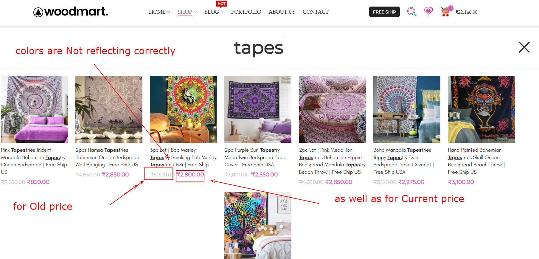
harshweParticipantHello Luke,
We have already set colors of Product prices in Product Grid and on Single product page through Advance Typography options. Also, with the use of Custom Selectors we updated and matched the same colors for other areas too.
However, the Colors of product prices are Not reflecting correctly in the Search Results, as shown below.
https://i2.paste.pics/FS566.pnghttps://watch.screencastify.com/v/0WrIvc9Lv6ayAnjWFLvu
Colors of Regular and Old price are not correctly reflecting even after Adv Typo – Woodmart
Can you please share the Custom Selector for this area too, in order to change the colors of both the current prices and the Old price, shown under Search Results
Also, can you please respond on this below post. It’s almost 2 days, and waiting from your side. Probably got skipped –
347541Regards
January 31, 2022 at 8:18 am #349058
Luke NielsenMemberHello,
Sorry for the delay.
Here are custom selectors for the prices in the search area.
Old price:
.autocomplete-suggestions .price del, .autocomplete-suggestions .price del .amountCurrent price:
.autocomplete-suggestions .price, .autocomplete-suggestions .price .amountIf there’s anything else we can do, please get in touch.
Cheers,
Kind RegardsJanuary 31, 2022 at 7:49 pm #349238
harshweParticipantHello Luke,
1. Yes, this worked. Thank you 🙂
Can you please ask the team to Add this custom selector also as a Pre-Built selector or update the relevant existing one (like – Product price and Old price), found in Theme Settings > Typo > Adv Typography section2. I used below code snippet (written in Pvt Content.) to show Number of Views (text changed to Loves instead of Views) in functions.php of the Child theme.
That works correctly. That is, the Total View Counter correctly gets updated everytime we Refresh the Browser or page or with each repeat Visit (even by same customer). That is for Logged-In users. And this is how it should or suppose to work and intended for.
However, the Total View Counts are not updating or increasing for Guest users or Visitors, with each Page or Browser refresh, or with repeat visit.
This is what I am referring to on Single product page-
https://i2.paste.pics/FUAS7.pngProduct Page URL- https://www.vasangini.com/product/pink-tapestries-trident-mandala-bohemian-tapestry-queen-bedspread-free-ship-us/
Reason – As why the View Counter is correctly updating for just Logged-in User-
For that, we explored further and found that, we have Set the Settings of Cache > Cache tab > Cache Logged-In users to OFF
Due to this, it is correctly working for Admin (or any logged-in user). That seems logical.
Means, that it is NOT getting cached for logged – In user.And hence, the Total views Counter might not be getting updated for a Guest User or visitor (probably due to being Cached. Or it may require some proper code to work for Guest users also.
Can you please check and share the Refine code, in order to make it work correctly for Guest users or visitors also. Or if it requires some sort of Class or rule to be excluded. Then can you please suggest what class or rule we need to add inside the “Excludes” section of Cache plugin.
Regards
February 1, 2022 at 9:37 am #349355
Luke NielsenMemberHello,
1. Of course, I will forward your proposal to the team.
2. Unfortunately, it requires customizations of the third party code and this is beyond our limitations and support policy.
You can get acquainted with Envato Support Policy here:
https://themeforest.net/page/item_support_policy
Don’t hesitate to reach out if you have any more questions or concerns. We’re thankful that you took the time to share your concerns with us.
Kind Regards
February 1, 2022 at 5:35 pm #349500
harshweParticipantHello Luke,
1. Thank you
3. Can you please suggest on this, whereby when a Product has both the Color and size attributes to choose from (before Adding it to Cart). And when a default Alert message displays, if user missed to choose any one of the Available attributes.
a). So, we updated the default Woo Alert message, when customer do NOT selects or forgot to select the Color attribute for a Variable product on Single product page. And click “Add to Cart” button by mistake.Custom Alert message that now displays is – “How can you miss the Color…”
As shown here – https://i2.paste.pics/FUMV8.pngb). And below different Alert display, if user selects only Color, but Not the Size–
“Oh! You missed the option…”
As shown here – https://i2.paste.pics/FUNFD.pngc). Now, point is, if customer do NOT selects any of the available attributes, then currently the SAME Alert is displaying, which we have set for Size attribute (that is when user missed to choose the Size)
(probably because, that is written at Top in custom snippet or JS code)Question
Q. Just wanted to know, what code shall additionally go here, in the scenario (Case C), when customer do NOT selects any of the available attribute (neither Color nor size) and Click on “Add to Cart” button.
PS: You can check the code from Custom JS area of the Theme optionsProduct URL to check this with – https://www.vasangini.com/product/big-flair-cotton-kurta-ankle-length-designer-kurti-partywear-dress-size-32-42/
Can you please share the updated code
Regards
February 2, 2022 at 10:29 am #349647
Luke NielsenMemberHello,
3. The below code change the default notification text of the WooCommerce, also you should add it to the functions.php file in your child theme.
if ( ! function_exists('wd_customizing_variable_product_message') ) {
    function wd_customizing_variable_product_message( $translated_text, $untranslated_text, $domain ) {
        if ($untranslated_text == 'Please select some product options before adding this product to your cart.') {
            $translated_text = __( 'Here goes your custom text', $domain );
        }
        return $translated_text;
    }

    add_filter( 'gettext', 'wd_customizing_variable_product_message', 97, 3 );
}
https://gyazo.com/aae15cf79f11a443a024653c5c405172
Unfortunately, this alert notification comes from WooCommerce so all we can do is change the default alert notification.
Kind Regards
-
This reply was modified 3 years, 10 months ago by
 Luke Nielsen.
February 2, 2022 at 3:55 pm #349739
harshweParticipantHello Luke,
3.
The below code change the default notification text…
I tried, but unfortunately this code is not working for me. Can you please check under functions.php of the Child theme on our site.
PS: Even after removing our custom JS code, this code snippet is not working.Do I need to replace the term “domain” from $domain, to our website URL. Or do we need to keep it as it is.
Q. Just wanted to know, what code shall additionally go here, in the scenario (Case C)…
I asked this, as we already have the JS code for this in Custom JS area (A Custom Alert for not selecting any one attribute).
Just looking for one additional line of code, so that if user do Not clicks any of the available attributes, then some other Alert message could have been displayed.Below is illustration of what I mean by and what we are looking for.
https://i2.paste.pics/FV3BU.png
I know this is possible somehow, but just missing something. If you could please help me on this.4. How can we have BG for Cross button shown in Quick View on Mobiles.
As when the black coloed Cross is interfering with the image BG, then it does Not gets visible.That is similarly to what is shown in left-right nav arrows and as below (with transparency and mouse hover action colors)
https://i2.paste.pics/FV3RR.png5. We encounter one strange issue (or bug), while using Search functionality.
When we click Search Icon (from frontend), and use the term “Porto” (previous theme name), then it displays few results. We are only concern about the products that we added on our own and not the ones that gets imported while installing Porto theme initially (which we will delete later-on)As can be seen from below video, it displays few of our own products also. When we check one of the product from backend (in the Editing page), we found that-
a). There are 20 reults displaying for term Porto (from chrome browser search), but there are only 10 of actual results, that gets highlighted in Yellow and Orange colors.
Can you please suggest where are other 10 results and why it is displaying 20 results at backend.
b). As it can be seen that the results are from the WPBakery Row, whereby the Row is DISABLED. So why the Search term still displays results from Porto, at frontend.
Should not those be omitted, when the Row is Disabled and has No such role and not displaying the contents at Frontend also.
c) Overall, how can we prevent displaying false results. As well as results displaying on the name of Theme or whatever, that is Not in the title and contents section, in Live state.
Can you please look into it thoroughly and resolve it.Video URL – https://watch.screencastify.com/v/wr4Sosi35hAmAqA7EBsE
Regards
February 4, 2022 at 10:16 am #350111
Luke NielsenMemberHello,
3. This code changes the alert that is by default (it also sets the same alert for all fields). In your case, you have your own custom code for that so hence the above code cannot help you, unfortunately.
Unfortunately, I haven’t any idea how to customize third party codes that are not related to our theme.
4. Please, try to use this code for changing the “Close” button on the “quick” view. Paste it to the “Custom CSS for mobile” area.
.popup-quick-view button.mfp-close {
    color: rgba(255,255,255, 0.8);
    background-color: #97979766 !important;
}
5. This “Search” is standard WordPress search functionality so our theme doesn’t influence it, unfortunately. Also, it searches the “Hidden” content.
b,c. The second “Search” that shows 20 results is related to the “Chrome” browser therefore it doesn’t relate to our theme. We also can’t influent it, unfortunately.
If you have any more questions or come across any other issue, let me know, I’ll be happy to help.
All the Best,
Kind RegardsFebruary 4, 2022 at 3:35 pm #350205
harshweParticipantHello Luke,
3. Point is, the code shared by you is also not working. Below is what I wrote earlier.
I tried, but unfortunately this code is not working for me. Can you please check under functions.php of the Child theme on our site.
PS: Even after removing our own custom JS code, the code snippet shared by you is not working.
May be I am doing something wrong. Can you please check and suggest.4. Please, try to use this code for changing the “Close” button on the “quick” view
I tried, but unfortunately, this seems not working for me. NO change.
Can you please whether the code is correct or not. Or may be I am doing some other way.
I even tried by adding it to Global CSS also, but still no change.5.
This “Search” is standard WordPress search…
There must be some sort of criteria to show results. That is on the basis of either Title or Content. That does not mean, that it should show results on anything or any term. What is the point then having Search functionality, within.
Can I ask the Criteria, on which Searching and Search results works.a). Also, there is an option within Theme Settings, to display Blog results also, which we have already set to OFF, that is Disabled. So something has been added within Theme also, apart from default WordPress function for Search results.
b,a) Also, the content is not only hidden, but the Row is actually been disabled. In that case, should not it omit the results that are under Disabled Row. Just wanted to know.
c). Testing – We tried to delete All the terms of Porto in one of the product (below URL), by editing it. And now this product is Not showing up in the results of Search at frontned.
d). However, there is a strange issue, that while using Woodmart, the search results displaying All the products, including ours own.
We then tested at backend (in the editing mode of the product), we found that there is NO Woodmart term in any of the product created by us. Then why the search results are displaying the products, with this term.
Now this is not a part of a WordPress functionality at all. As those of our product do Not contains the term Woodmart, neither in Title, nor in Content. So how come they are displaying.Can you please check it thoroughly. As this is also misleading to our own Visitors, some way or other. And is not good or correct to display.
Regards
February 7, 2022 at 2:57 pm #350947
Luke NielsenMemberHello,
3. This code gets the default notification (“Please select some product options before adding this product to your cart.”) and translates it to your custom.
https://gyazo.com/682bdf5f079ded47e4d96e52091044e5
https://gyazo.com/5dab0956fe6e999590fa390f04f477cc
I tested it on your site, and it really doesn’t work, however, you have your own custom JS code that is better because it has 2 custom notifications, but in the code that I was added, you can use only 1 custom notification.
4. You forgot the point before the
popup-quick-viewselector.https://monosnap.com/file/wXUrVVHRIzwkWH3HdG0TIU8GBaoIm5
https://gyazo.com/3e5c333a4c3bbf1948265c5d4ca3e26c
5. The “Search” searches by
contentand bytitleson the site.c. I didn’t find the link of the video, please send it again.
d. Please, provide some video for better understanding.
Cheers,
Kind RegardsFebruary 7, 2022 at 4:10 pm #351002
harshweParticipantHello Luke,
Related to New Forums, Not Theme–
A. First of all Many Congrats to Xtemos and Team, for this Big update !!
B. Secondly, I am very much thankful to the New Layout of the Support platform, as requested earlier. Specially with larger font size, dark-color font, clear white Background. This makes it too pleasant to read and write our own post, Viewing responses. Now feeling much convenient to look at and readable.C. But with this New Forum look or support system, unfortunately, I am not receiving emails now, which I used to receive earlier, when you responds on the Thread. Nor any other email, on other forums which I subscribed to.
D. Now, the Title is missing on the Top bar. It used to display the Title with previous forum type, when we search by click someone’s name and then try to view ALL the threads Started by him-her, or Replies created by him-her.
Take a reference, when I tried to view Replies created by Luke (you), this is what I am getting with current support forum. NO Titles are displaying with NO Hyperlink.https://i2.paste.pics/FX4T1.png
I could have clicked on the Title to view the desired Thread. Also, gets an Idea, whether I need to click and go to that thread or not, by just taking an Idea from the Title of the Post or Thread. (that used to display earlier with previous support forum)
Can that be Enabled. Means, can the Title be enabled back, in this New support forum also.E. If pagination could be shown at Top also, for each individual Thread. Just like it is being shown here-
https://i2.paste.pics/FX4Y1.pngBack to points–
3. Actually, I do not want to use the JS unnecessarily (until explicitly required), in order to maintain the loading times and make it Clean.
Normally, additional JS is not recommended, atleast if not necessary. And I prefer to use the PHP Code Snippet in such cases and for the same reason.
Also, still wondering, why the code that you shared is not working (even if we disabled or remove ours)4. Do you mean by Dot (.)
Thanks for pointing it out. Will update and check again5.
b,a) Also, the content is not only hidden, but the Row is actually been disabled. In that case, should not it omit the results that are under Disabled Row. Just wanted to know.
I still wanted to know on this. I this this is a Glitch or somewhat buggy. And should be resolved.
c. I meant by below product URL. This was showing in search results, as it had the term Porto in one of the Element (under Disabled Row).
So I removed all instances or Porto, or Deleted that Row itself. And then this product is now not showing in the Search Results, when we used the Term Porto.
https://www.vasangini.com/product/3pc-lot-bob-marley-tapestry-smoking-bob-marley-tapestries-twin-1-free-tapestry/
So this worked, for such instances.d.
that while using the Search Terms as Woodmart, the search results displaying All the products, including ours own.
We then tested at backend (in the editing mode of the product), we found that there is NO Woodmart term in any of the product created by us. Then why the search results are displaying the products, with this term.
Now this is not a part of a WordPress functionality at all. As those of our product do Not contains the term Woodmart, neither in Title, nor in Content. So how come they are displaying.As it can be seen from below Video, NONE of our products have the Term “Woodmart” neither as a Content, nor in the Title, still it is displaying in the Search results.
So how come they are displaying.https://watch.screencastify.com/v/ge1Q3GsAmfrrEtgv6YX8
The video is of just 1 product. And none of our products are using the Term Woodmart, neither in Title nor as a content. Still displaying up in Search results.
Can you please check it thoroughly. As this is also misleading to our own Visitors, some way or other. And is not good or correct to display.
Regards
-
This reply was modified 3 years, 9 months ago by
harshwe.
February 8, 2022 at 10:14 am #351332
Luke NielsenMemberHello,
I forwarded your message to the team, they will look at it.
4. Yes, of course.
5. It isn’t a bug, this is how search works.
d. The Page Builder reads content via shortcodes so if you click on the “Classic” tab in your product you will see that the content contains the names of shortcodes with the “Woodmart” terms, therefore such products are searched.
https://gyazo.com/ad2ea5f14af0484ad68933f1fcd286a2
Let me know if there is anything else I can help and have a good day!
Kind Regards
February 8, 2022 at 2:46 pm #351425
harshweParticipantHello Luke,
4. Unfortunately, this is not working for me. I tried to add this code in Mobile CSS area, then also in Global CSS area, but still not working. I tried by clearing the Cache completely, but still not working (Although we have disabled Cache for Logged-in users, and not requiring Purging of Cache, but still we did just to make sure)
Can you please check the code from your side, that we added. And check on our site again.
May be we are still missing something.5. But the Search should not work this way. This is really misleading and not the correct way.
It should be improved in order to avoid the Shortocodes and every such term coming from the codes.I think, this is not how it works or should work
The same is not working in few other themes like Flatsome theme also. You can try to replicate the same on that theme. Probably they may have refined the Search functionality or this is how it normally works and shown.We tried to use the term Flatsome, and found that None of the products displays, even though use the code. We then tried to use the term Row, then Column, and for none of these terms, it is displaying the Product.
Only displaying their relevant pages, where they have added these terms as actual content.https://watch.screencastify.com/v/ZtuQh9Y037lU1VwAdRi8
In a nutshell, Search functionality should read the contents that are displayed on the Frontend to users, visitors. And should display the results according to that only.
It should not read the programming or coding contents, and by no means.Alternative workaround – The solution is to OMIT the shortocodes (and all internal codes) from the Search functionality or terms.
New 6.3.0 version
6. I could not find the LAYOUT section anywhere inside the Dashboard,. Hence, unable to check the latest additions of creating Shop, product page, cart, checkout builders too.
I double check with the version, and found that the correct version in installed, with NO errors.
I updated and overwrite the previous version, that is 6.2.0 on the staging site.What could be the reason. Am I missing something.
The option to update the Core plugin, is also not showing up. There is No message, to update the plugin. Nothing like “Update Required” or so. Just like it says for other plugins. And can be seen here-
https://i2.paste.pics/FXJXC.pngI tried by Activating the Parent Woodmart theme also, and then check again the Plugins section. But still, the WMart Core, is not throwing up an New Version related message.
Can you please check and suggest
Credentials are same for the Staging site, that are for our Live site.
URL is inside the Pvt. content.Regards
-
This reply was modified 3 years, 9 months ago by
February 10, 2022 at 10:16 am #351930
Luke NielsenMemberHello,
4. It looks like you changed something and therefore made a mistake in the code, or rather look at the below screenshot.
https://monosnap.com/file/OJ0COgvyFeWeWOpMOzHOPFpFKP7D43
The
!importantvalue is out of thecolorproperty so the code isn’t working. You can also use theHEXcode for the color instead of thergba();5. The “Flatsom” theme doesn’t have shortcodes therefore in the search the products don’t appear. If you check how the search works on some default theme then we will know whether our theme problem or not.
6. The answer about update issues is in this thread https://xtemos.com/forums/topic/woodmart-6-3-0-beta-version-test-on-staging-site-few-issues-and-bugs-details/
Kind Regards
February 10, 2022 at 3:57 pm #352040
harshweParticipantHello Luke,
4. I tried the below one, as it is, earlier also, and again after your response. But still not working for me.
.popup-quick-view button.mfp-close {
    color: rgba(255,255,255, 0.8);
    background-color: #97979766 !important;
}
Then I tried this as Hex (instead of RGB), still not working, as shown below-
https://i2.paste.pics/FYHRL.png
Am I still missing something. Please check the CSS I added in Custom CSS for Mobile area.With this line of yours-
The !important value is out of the color property so the code isn’t working.Do you mean to say, it should be like this – rgba(255,255,255, 0.8 !important); that is within braces or brackets and not outside of color property.Strange thing is that even the Background color is Not reflecting, when we are using it as it is.
5. Even if one accepts, that this is how Search is currently working as default in WordPress. And Woodmart also follows the same.
But should not it be improved in order to avoid the Shortocodes and every such term coming from the codes, while Searching or getting results.In a nutshell, Search functionality should read the contents that are displayed on the Frontend to users, visitors.
Should not this workaround approach be taken into consideration – If atleast the shortcodes (and all internal codes) can be OMITTED from the Search functionality or terms.
6. Thank you
7. a) Where these light colors are coming from, for the links under Account Element, that are shown on Top bar of Header. Please see below, we are referring to this area, and color of each Text link-
https://i2.paste.pics/FYI3U.png
b). We checked under Top Bar’s color scheme, and it shows as Dark. So why the links are showing as lighter in color, that is Greyish.
c) Also, the Account Element is missing the Colors section or tab. So unable to further change the colors and mouse-hover, BG colors
d). Can you please share the Custom Selector for this, so as to change the Color, Mouse-Hover and BG colors of each Text link under Account. Element.8. Which areas does these Custom Selectors (from Main navigation) changes the Font attributes and Colors-
Main Navigation links
Menu Dropdown first level
Menu Dropdown Second level
as well as,
Menu links on Simple DropdownAs shown here (with different color markings)-
https://i2.paste.pics/FYIKE.png8.b. From where the colors of Level 1 Menus are coming from. I think, we have not defined them anywhere separately. Can’t find that even in the Adv Typo area.
8.c. If those are Black, then why the Sub-Menus (under each of these), are showing in Grey Color automatically. From where the colors of these are defined as Greyish. We have not defined colors of these, as well, in Adv Typo.
8.d. Even the column settings (for each Extra Menu list from the HTML Block) is showing the Color Scheme as Inherit (for both Extra Menu list and Menu list item)
https://i2.paste.pics/FYIQ4.png
Where are these actually being Inherited from. Where the color has been defined for each. And if the color for each is showing as same (that is Inherited) in HTML block, then why it is Black for Level 1 Menus, but Greyish for Sub-Menus inside it (that is separate for Title of Extra Menu list, and Extra Menu list item)8.e. From where can we change the colors of Nav. Links of Level 1 (shown in Green in screenshot), different to the colors for Nav links in Sub-menus (shown in Purple)
https://i2.paste.pics/FYIKE.pngRegards
February 11, 2022 at 10:37 am #352261
Luke NielsenMemberHello,
4. I checked your custom mobile area and I did a little upgrade to the code of the
popup-quick-view.https://monosnap.com/file/yNnh7KY34aQn1I2WoZ4jJBOz87mhf5
https://gyazo.com/0746aa68561dbcebde2b324fac5ad1e0
So now, as you can see from the above video all work well. Also, you can set another color for any property.
Sometimes small errors knock down the correct operation of the code. I mean that it should be like this
color: rgba(255,255,255, 0.8) !important;https://monosnap.com/file/LkGQ2XQ8mFSo2hB0yXDcX6FKKVq4gW
5. We will think about how to improve it in the future. Thank you for your suggestions.
7. These colors for the “My Account” dropdown come from the default styles of the theme. In such areas color can be changed by using the
Menu links on simple dropdownsselector in the advanced typography.https://gyazo.com/91d4abbbf6fb70fb733ef56f6b82ed8c
8. Please, look closely at the below screenshot.
1.
Main navigation links
2.Menu dropdowns first level
3.Menu dropdowns second levelMenu dropdowns first level and Menu dropdowns second level are related only for the Mega Menu (or rather for dropdowns with Set Sizes and Full width design).
The
Menu links on simple dropdownsstyles the default dropdowns and all their submenus.8b,c,d. These colors come from the default styles of the theme. Also, you can change it by using the below selectors.
Kind Regards
February 11, 2022 at 10:13 pm #352397
harshweParticipantHello Luke,
4. Thank you for revising the code in the Mobile CSS area itself. Yes, now it is working.
However, the default color for mouse-hover do not fits pretty well. What CSS do I need to add within same code to change the Mouse-Hover color of “X” (cross) button onlyThanks for clarifying on this.
color: rgba(255,255,255, 0.8) !important;
I now get your point. I think an extra semi-colon in between of color values and important was added in that code, by mistake. Thank you for pointing out.5. Wish, this would certainly be taken into consideration. Any other enhancement will be more than welcome.
7.a) By default, do you mean to say Internally, that is Hard-coded. As I could not see any Default color setting from within the Theme Settings. And set as Grey, with coding, internally.
c) We found that the Account Element is missing the Colors section or tab. If this could be added in the Upcoming update. That would also be helpful to have custom colors and settings.
As
Menu links on simple dropdowns, changes the colors of dropdowns under Main Menus too. And if someone wants to have separate colors for both of these, then this could help.d). Thank you. Yes, this works. However, how to change the Mouse-Hover background color, when one hover mouse one each menu or Nav link name.
8.b) c). Do you mean to say that, the Black color for Menu Level 1 and Grey for Level 2 is pre-defined Internally (that is hard-coded), and there is No setting within Theme options (even by default).
And can only be changed with the help of Pre-selectors.e). Yes selector changes the color for Dropdown Level 2 for Mega menu. Thank you 🙂
9. I checked, we have only 2 Shop filters in Widgets section. One is for Color, other is for Brand. But on the Shop Archive page, I can Price Filter also. From where it is coming. And where can i find the settings to Enable – Disable it.
10. We have Hide “To” prices set to ON in theme options > Shop settings > Variable products. But the from-To prices are visible on Shop Archive pages. Can I ask, why so. Is this a bug or some glitch.
How to resolve this.
https://i2.paste.pics/G03S2.png
https://i2.paste.pics/G03S5.png10. b) I want to Hide the Categories from the Title of the Shop Archive page. How can we do that.
Categories that want to hide – Women, and Chikankari
https://i2.paste.pics/G03TD.pngRegards
February 15, 2022 at 12:54 pm #353177
Luke NielsenMemberHello,
The code for changing default mouse hover..mfp-wrap .popup-quick-view button.mfp-close:hover { color: orange; }https://gyazo.com/1e8843232f8b412cb260d480f36a11c4
7a. Yes, it’s defined by default from our theme.
c. Thank you for your suggestion.
8.b,c. Yes, you are right.
9. These areas come from the theme by default so to be able to remove standard sorting and price filter widgets you should add the below custom code to the functions.php file in your child theme.
add_action( 'wp', function (){
	add_filter( 'woodmart_use_custom_order_widget', '__return_false' );
	add_filter( 'woodmart_use_custom_price_widget', '__return_false' );
}, 10 );
10. By default, it is impossible to hide a higher price in WooCommerce. We cannot change the HTML structure of WooCommerce to cut a higher price. In order to somehow allow customers to hide a higher price, we added the “Hide ‘to’ price” option, but this option hides the price only with the help of the CSS and is designed for a standard price structure. If a plugin changes the price structure, this option will not work properly and must be disabled. In your case, you have enabled the “WOOCS – WooCommerce Currency Switcher ” plugin that changes it (https://prnt.sc/26w8wpz).
10b. You can hide some categories with the help of the “Exclude categories” option that is situated in Theme Settings -> Product archive -> Page title.
https://monosnap.com/file/sce0JdNPpLuyxv6d4sGYAC9x6cAgRW
Kind Regards
February 16, 2022 at 8:30 pm #353610
harshweParticipantHello Luke,
7. a) 8. b) c). OK. Thank you.
9. Thank you. Will try these10. Are you sure, the “To” prices are getting affected by WOOCS.
a). Curious to know, how can any plugin influence the settings that we made within the Theme itself. How can those be overridden. I am bit surprised, as how can that takes the precedence.c). And if at all, that is taking precedence, then how can we over-write back, so as to Hide the “To” prices again.
Shall that again be overridden and achieved using Custom CSS (with !important rule or directly in Custom CSS area) or some other way.10. c). After adding the Country Flag icon, it is not visible on Top bar in Header. As shown here-
https://i2.paste.pics/G21YM.png
https://i2.paste.pics/G223B.png
I asked the Plugin author also, he says, this could be related to Theme style and CSS, and therefore I should contact them. And they will be able to resolve this.11. You previously shared some CSS to adjust the Bottom Margin below Title, Price, Short desc. and Extra Content Block (that is Above Add to Cart), for the Single Product page.
a). But that is not affecting in Quick View Box. Can I ask, why? Is this also suppose to work differently in Quick View box.
b). How to lower the Bottom margin space below Title, Price, Short Desc, and Extra Content block for the Quick View box.c). As far as I remember, the Colors of Old and Sale prices were correctly showing in the Quick view box. That is the one we have already set via Advance Typo. These are the colors, that were reflecting in Quick view box and should reflect – https://i2.paste.pics/G22RB.png
However, I think from last few days they are not correctly reflecting and now showing the Default colors. As shown below- https://i2.paste.pics/G22MK.png
Can I ask, why they are not displaying correctly now and how they might have reverted back.
Or these are not meant to reflect from the Advance Typo area of Theme Settings (and we may have a wrong perception of past)
In either case, can you please check and replicate at your end. And suggest the Custom Selector to update the prices in Quick View box also. (Same as per Advance Typo)12. Quick How to’s-
a). Change colors of Attribute’ terms Labels (say, like of Blue for Color and of 32,34 for Size) in the Sidebar Widgets of Shop Archive pages. As shown below
b). How to change Color and BG color for Titles of same Widget filters. That is Color, Size , others.
b) ii). How to lower bottom margin below Titles of Widgets Layered Nav filters in Shop archive pages. That is the Title – Color, Size, and others.
c). How to change Font Family, size and weight of Terms Labels showing in Widgets.
d). How to Hide the Numbers alone (Not the Labels). The numbers displaying besides each Term’s Label.
Say, if there are 4 predicts of Black color, then the number 4 is displaying at right side. How to Hide the numbers.Please refer below image [for points 12 a) to e) ]-
https://i2.paste.pics/G22D5.png
e). How to change the width of scroll bar by slightly increasing it. Currently, it is extremely small, and most of the times unable to pick using mouse and hence unable to scroll using it.
e) ii). How to change the color of this same Scroll bar. So as to easily distinguish it.Regards
February 18, 2022 at 2:19 pm #354265
Luke NielsenMemberHello,
10. As you can see on the below screenshot, this plugin changes the structure of the HTML.
Here is a structure without the “WOOCS” plugin:
a) “Prices” is related to the WooCommerce, hence the “Woocs” plugin works with WooCommerce and can influent on the HTML structure.
10. I checked the currency dropdown and found their CSS (of that plugin) that hides flags.
Also, I prepared the custom code that displays these flags.
body .whb-column form.woocommerce-currency-switcher-form .dd-options .dd-image-right {
    display: block;
}
https://gyazo.com/7cdfe0ad37e91635b76aab7d4df25fd1
11c. Selectors for the changing color of the price in the quick view.
New price:
html .product-quick-view .price .amountOld price:
html .product-quick-view .price del .amount
12. Changing scroll color:.woocommerce-shop .wd-widget .wd-scroll { --scrollbar-thumb-bg: #333; }12.b) Custom code for changing indentation after the title:
.woocommerce-shop .sidebar-container .widget-title {
    margin-bottom: 10px;
}
12d. Disabling swatches quantity:
.woocommerce-shop .wd-widget .wc-layered-nav-term .count {
    display: none;
}
12c. Changing font family, color, weight, size:
.woocommerce-shop .wd-widget .layer-term-name {
    font-family: "Palatino Linotype";
    font-weight: 900;
    font-size: 18px;
    color: #333;
}
Kind Regards
February 19, 2022 at 7:00 am #354429
harshweParticipantHello Luke,
10. c) Strange to see that CSS shows Flag as hidden. I tried to look at settings again and found that is is set to Enabled at backend of Plugin, as can be seen here-
https://i2.paste.pics/G378O.png
Do you have any idea on this. If you could please take a look at settings. And suggest further. May be, I missed something from settings area.Can you please clarify on these-
11. a). Does that mean it Is also suppose to work differently in Quick View box. And previous CSS will not work for the Quick View box. And I have to use the one you provided in your last response, in addition to that.
This got skipped-
b). How to lower the Bottom margin space below Title, Price, Short Desc, and Extra Content block for the Quick View box.I think these got skipped somehow-
12.
b). How to change Color and BG color for Attribute Titles of same Widget filters. That is the text named as Color, Size, and others. I mean by separate CSS for the Titles (other than CSS that you shared for the terms of Attributes.
Also for the reason, as I need to set BG color for the Titles of Attributes, and different text colors.e) i). How to change the width of scroll bar by slightly increasing it. Currently, it is extremely small, and most of the times unable to pick using mouse and hence unable to scroll using it.
e) ii). I tried and found that CSS for font styles works in mobile also, but the CSS for Scroll color is not working on Mobiles (that is the Sidebar filter having same purpose) Can you please check and try to replicate at your end.
I added the CSS in Global CSS area.Regards
February 22, 2022 at 9:04 am #355038
Luke NielsenMemberHello,
10c. Sorry, I don’t have any idea because the CSS that hides the flags comes from their CSS file. Also, you can use the custom code that shows it and forget about this problem.
11a. Selectors in the last response are for the price of the Quick View area.
11b. The custom code for reducing the indent from below for Title, Price, Short Desc.
.product-quick-view .product_title,
.product-quick-view .price,
.product-quick-view .woocommerce-product-details__short-description {
    margin-bottom: 10px;
}
Please clarify where the Extra Content block for the Quick View box.
12b.
Color and Bg. color for each widget’s title.
.woocommerce-shop .sidebar-widget .widget-title {
    color: blue;
    background-color: orange;
}
Changing title style for the “Color” widget.
#woodmart-woocommerce-layered-nav-13 .widget-title {
    color: red;
    background-color: yellow;
}
Changing title style for the “Color-B” widget.
#woodmart-woocommerce-layered-nav-15 .widget-title {
    color: green;
    background-color: yellow;
}
The “Size” widget title styles.
#woodmart-woocommerce-layered-nav-14 .widget-title {
    color: green;
    background-color: yellow;
}
12e.
1. The appearance of the scroll bar depends on the browser.
2. The width of the scroll bar on the desktop can be changed only on these browsers (Chrome, Opera, Edge). This scroll changes with the help of the below custom code.
body .wd-scroll ::-webkit-scrollbar {
	width: 10px;
}
3. Design, color, width, and position of the scroll bar on mobile devices depends on the browser, and changing it with the help of the custom CSS code is impossible.
Kind Regards
February 23, 2022 at 5:07 pm #355557
harshweParticipantHello Luke,
10.c. I can understand. No problem, I will use the code shared by you.
11a. By this, I just wanted to ask, that does that mean, Selector for Single product and Quick will be different. Isn’t it.
And we have to use both the Selectors to get the same colors for Regular and Sale Price11.b.
Please clarify where the Extra Content block for the Quick View box.
Oh! Yes, the ECB is not visible in Quick View
And how to reduce extra Space above the Title in Quick View box ONLY, as shown below
https://i2.paste.pics/G56EX.png12.b. `.woocommerce-shop .sidebar-widget .widget-title {
color: blue;
background-color: orange;
}`
Does that mean, the above CSS will change the Color and BG color of ALL of the Widget Title’s at once. And the remaining CSS is to change the colors for each Title separately.12. c) `.woocommerce-shop .wd-widget .layer-term-name {
font-family: “Palatino Linotype”;
font-weight: 900;
font-size: 18px;
color: #333;
}`
This above worked, but Only on the Shop page. The same is Not working on Category Archive pages.
Can you please share a Universal combined code, which will work for Shop Archive and Category pages, including
12 a) [ Scroll bar color ]Few Quick How to’s
13. a) The width of mouse-hover underline (below menus on Header) is showing Thicker on our site. Whereas, in your demo it is Thinner. As shown below-
https://i2.paste.pics/G56MQ.png
What is affecting to make it thicker on our site. If it is font family or size, then how come it is changing the width of Underline. In either case, the underline is a separate element and should NOT be affected.
How can we make it Thinner.
(PS: If you remember, in the past, width of this area is what I got mixed-up with the width Stock Qty progress bar)13. b) The Titles, Sub-T, Button Text, All are indented to left side and touching the left-edge of Promo Banner. As shown below-
https://i2.paste.pics/G55S3.png
Whereas, this is not the case in your demo site. Am I missing or something is wrong. Please suggest
https://i2.paste.pics/G56QC.png13.c) How to show BG color behind tags, categories on Single product page. And change their text colors accordingly.
13. d). What are the main differences between Top bar (from Header), and Header Banner.
I found that one can show Social icons, Text, HTML Block in both the places. So what are the major differences between to make one of these stand-out of the rest.13. e). Inside various Woodmart Elements, there is an option of Display Inline. What is the purpose of this exactly.
e) i) Can you please explain, and separately, if it has a different purpose for different Elements.
https://i2.paste.pics/G56VM.pngii) Can you please show the result of using it, with example screenshots. And how it affects.
iii) What is the core purpose and where shall we use it.Regards
February 27, 2022 at 10:04 am #356274
Luke NielsenMemberHello,
11a, 12b. Yes, you are right.
11b. Try to use the below code to reduce the extra space.
.mfp-content .quick-view-horizontal .wd-scroll-content {
    padding-top: 15px;
}
12c. So now it should work also on the category page.
.widget-area .wd-widget .layer-term-name {
    font-family: "Palatino Linotype";
    font-weight: 900;
    font-size: 18px;
    color: #333;
}
Scroll bar:
.widget-area .wd-widget .wd-scroll {
    --scrollbar-thumb-bg: #333;
}
13a.
.whb-header .wd-nav.wd-style-underline .nav-link-text:after {
    height: 1px;
}
13b. You should set the “padding” value for the “Promo banner” element so then the text will be aligned like on our demo.
https://gyazo.com/a7129c7e9a85bf78f6ca88755406a88c
13с. Seems that you have asked about this before (https://xtemos.com/forums/topic/how-can-we-make-video-appear-full-width-or-screen-default-404-page-and-custom/#post-348129)
https://gyazo.com/7bad8c2b9b52f31dd81d1c45f8806ba7
13d. Header Banner is used for showing some advertising or some info.
13e. This option is for aligning images or SVG in one line.
1. “Display inline” is disabled.
https://gyazo.com/1c8320caca29f39642c9f7361940eaf5
2. “Display inline” is enabled.
https://gyazo.com/637163b5f87fe17ad5389598d122b12b
Kind Regards
February 27, 2022 at 3:20 pm #356302
harshweParticipantHello Luke,
11.b) 12c) Worked. Thank you
13. a) Yes, this worked.
However still wanted to know, as what is affecting to make it thicker on our site. Is it due to some font size of family or some other reason, In either case, the underline is a separate element and should NOT be affected. Please correct me, If I am wrong.13.b. ii) By default, below is how it looks like while we use Text or Sub-Title in the Promo Banner
https://i2.paste.pics/G6YMR.png
I wanted to know, how can I achieve the same (as below).
https://paste.pics/G6YMR
That is, the BG color with equivalent height (to that of text), and NOT too high. Also, the text sits at bottom of image. And BG color touches left and right edges of image. Making it look like Real Promo-Banner and making the image clearly visible too (otherwise, it gets hidden by the BG color of the Text)
PS: I managed to do this once with Dev tool and CSS, but now forgot. Also, may by I did not used the perfect CSS.13с.
Seems that you have..
Yes, thank you for sharing. I missed that.
But I asked about changing the Text color also in this and that post response also. Can you please suggest. I tried adding the color properly, but that didn’t worked.
I want to change the Text colors only for Tags and Categories (and Not the SKU)13.e). Thank you for clarifying this. Also, the Display inline is available on other Elements also (other than SVG or image Element).
13.f). How to change color and BG color of Sign Up button, as shown below. (using on Home page)
https://i2.paste.pics/G6YR8.png
And to change the Border or Line color where email address needs to be entered.Screenshot for 13 f) g) h) – https://i2.paste.pics/G6YR8.png
g). How to change the mouse hover color in Center widget, where I am using Nav links in Footer on Home page.
h) The center widget is not Auto-collapsing in mobile, even though I have enabled the setting for it in Theme options > Footer > Collapse widgets on mobileCan you please take a look and answer to queries posted in other Topics. It’s been longer than usual. Not received any response during Thursday and Friday also for one of the ticket.
Regards
-
This reply was modified 3 years, 9 months ago by
March 2, 2022 at 8:30 pm #356991
Luke NielsenMemberHello,
Sorry, such a delay will not be repeated.
13a. On our demo site the underline is the same as on your site.
https://monosnap.com/file/VYRm52wZflEsj324EFM7WBohi8CiAA
13b. Sorry, but your second screenshot is the same as the first so I didn’t understand what you wanted to achieve. Please clarify it again with the proper screenshots.
13c. The color property is working well, I checked it on your site so you can just watch the below video to be convinced of it.
https://monosnap.com/file/cb7CDztwFqmUdl1Jbt48RC2xEU1JfI
13e. The “Display inline” option always aligns items in one line.
13f. Here is a code for adding the hover for the “Useful links” block.
.footer-container .info-box-inner span a:hover {
    color: red;
}
https://gyazo.com/19c786a5dacc038499d4a42b20114e85
The border of the form will be better to change by means of the
style="border-color:blue;"value, you should add it to the form itself like on the below screenshot.https://gyazo.com/723a389df7347f3ce08754412e4590bc
The “Collapse widgets on mobile” option work with the footer that was created with the help of the widgets (via Appearance -> Widgets)
https://gyazo.com/f8782e4c7840986d6c9bdbcb3e3a70da
Kind Regards
March 4, 2022 at 9:29 pm #357504
harshweParticipantHello Luke,
13.a. Yes, it seems same px height. But point is, even when I used 1px (as suggested by you), it still shows slightly thicker than your Demo, in Appearance
If I let it to default 2px on my site, then it appears TOO thicker as compared to your demo, in appearance.
Could this be due to the difference in font size or family (from our demo). In either case, the underline is a separate element and should NOT be affected. Can you please take a further look and resolve it, so that changing the font size or family won’t affect the height or thickness of line.PS: I think, the height or thickness is also changing on the basis of overall height of the Main Header. Which I think should not affect the height of the Mouse-hover underline. Please replicate it at your end, by changing the height of Main header.
We also found that the underline is showing very Thin, on Sticky header position (when we scroll down a bit on page to view the Sticky header), as the height of sticky header is lesser than the normal header position. So, this is also affecting. Please share your views.
And, should not this requires to be fixed.13.b. I missed that Screenshot now. Once I have it back, I will share it again.
13. c). Yes, it is working. Not sure, why it was not working earlier. Probably, the Alpha transparency, made me look like that.
c) ii). On product page, I found that the Tags in the 2nd line are touching the tags in the 1st line, when showing the Background color behind tags. As they might not have enough space in-between the two lines. As shown here-
https://i2.paste.pics/G9HMQ.png
So, how can can we increase the space or margin in between the lines, so that the BG color (of 2nd line tags) do Not overlap or touches the BG of 1st line tags13. f) g). Yes, This worked. Thank you 🙂
h) OK.
And, is there any way to Collapse the Menus, when NOT using through the Widgets named as Footer1-4.
Means, with current scenario, when using footer through HTML block, specially for Center one, named as Useful links.14. I am using Social button element (as Follow) on FAQs page. Our purpose is just to show the Whatsapp icon, in this area (below) and NOT all the icons.
https://i2.paste.pics/G9HF6.png
How can I hide all other icons except just the Whatsapp. Or else, how can we just show the Whatsapp icon.
PS: We only want to show Whatsapp icon for this page and for the Element used in this Row only. As we are using the same Element on other area of the same page also (where we want to show all or multiple the icons)
https://www.vasangini.com/faq/15. i)
I found that the variation swatch is still clickable, even if we set it as Out-of-Stock.
Product page for reference – https://www.vasangini.com/product/georgette-kurti-designer-indo-western-kaftaan-look-plus-size-gown-one-piece-dress/
Ruby Red color with All sizes is set to Out-of-Stock for this product. However only after clicking user will come to know about this.
So, How can we make the Out-of-Stock variations as Greyed-Out (not clickable) with a Red Cross over the variation swatch (or selected combination of variation), as below-
https://i2.paste.pics/G9HHU.pngii). Also, the Out-of-Stock message, is Not in the same line, where the price is showing up for the for the variation.
Please see below-
https://i2.paste.pics/G9HJT.png
How can we fix this.16. i) The Top and Bottom header rows are Not in 3 columns for the Mobile, just like the Main Header. And just like we have for Desktops. Due to which it is getting nearly impossible to align the contents. As well as not possible to distribute the content separately. Please see below-
https://i2.paste.pics/G9HKN.png
How to make these 3-Columns for Mobilesii). Also, how to align some content to Right side of the Top Header, while having some other content in the Left side. Why the content starts appearing from Left side only. Can we have more flexibility and control to assign the position and alignment (other than just spacing element)
As spacing Element alone do not works properly with different mobiles with variable widths
Screenshot same – https://i2.paste.pics/G9HKN.png
I want to align the Text Element (using for currency) to right with some spacing after it. And another Button Element to be at Very left edge. And another one in the Center.PS:
A kind request: From now onwards, If you want to Test anything (that requires some change), then please try to do on our Staging site. We have already shared the credentials here-
https://xtemos.com/forums/topic/woodmart-6-3-0-beta-version-test-on-staging-site-few-issues-and-bugs-details/
As we have put our site to Live, in actual (and as can be seen too).
Rest, you can still check on this Live site too, if and whenever required.
I completely trust you 🙂Regards
March 7, 2022 at 4:32 pm #358414
Luke NielsenMemberHello,
13a. Seems that it’s some glitch with rendering in the browser, so please replace the old code that makes the underline thinner on the below one. This one will be better.
https://gyazo.com/a1ef6364a0b9a2590723fc39a5f4fc2d
.whb-header .wd-nav.wd-style-underline .nav-link-text:after {
    height: 0.9px;
}
13c. Here is a code for adding indent from below for the “Tags”.
.single-product .tagged_as a {
    margin-bottom: 5px;
}
13h. Sorry but there is no way to collapse the menu in the HTML block for the footer.
14. The below code hides these social icons on the “faq” page.
.page-id-660 .wd-social-icons .social-facebook,
.page-id-660 .wd-social-icons .social-instagram,
.page-id-660 .wd-social-icons .social-youtube,
.page-id-660 .wd-social-icons .social-pinterest {
    display: none;
}
15i. Sorry, but the swatches functionality comes from WooCommerce so our theme cannot affect it.
15ii. Please, try to use this code for aligning the “Out of stock” text.
.single-product p.stock.out-of-stock {
    margin-bottom: 4px;
}
16i. Unfortunately, so far we don’t have such functionality to break into columns the “Header mobile”.
16ii. So you can use the “Space” element to align some content to the right side.
https://gyazo.com/7265a7848ce6b7e1b13b567fe863d747
Kind Regards
March 8, 2022 at 10:53 pm #358886
harshweParticipantHello Luke,
13. a). Have you checked this-
PS: I think, the height or thickness is also changing on the basis of overall ROW height of the Main Header. Which I think should not affect the height of the Mouse-hover underline. Please replicate it at your end, by changing the height of Main header.
We also found that the underline is showing very Thin, on Sticky header position (when we scroll down a bit on page to view the Sticky header), as the height of sticky header is lesser than the normal header position. So, this is also affecting. This is what I meant for both - https://i2.paste.pics/GARCF.png
And, should not this requires to be fixed. Please share your views.
13. c) This worked. Thank you 🙂
14.
The below code hides these social icons…
I asked this earlier also, that we want to hide it for this specific Social Share element alone. As we are using this same Social share element on other area of the same page (where we do NOT want to hide other social icons)
https://i2.paste.pics/GARDG.png
b). Also, how I can align the icon so as to show it just besides the text “Whatsapp“. Currently it is showing below (in next line).
https://i2.paste.pics/GARBN.png
I tried directly by using the shortcode, just after the test Whatsapp, but still it is not working and showing in next line.15. ii). Will try this code.
Will this be fixed or resolved in the next Theme update. As this is a kind of a glitch and needs to be aligned properly. And do not looks good at all.16. ii)
So you can use the “Space” element to align…
But this does Not seems the ideal solution. As we have to test with different spacing numbers everytime. And Refresh the browser and have to adjust again and again, to get close to desire result.
Also, it still do Not shows at correct area, even after many tries. Above all, it kept changing on different widths. This is really frustrating.
i) So, a request. If some alternative solution could be brought to overcome this situation and to get desire result. If a feature of 3 columns, as well as alignment (left, center, right) options could be added too, in the next update. Then that would be very much helpful.
Please suggestRegards
March 14, 2022 at 2:09 pm #360663
Bogdan DonovanKeymasterHi,
13. a). This behavior is caused by WebKit browser rendering and cant be completely fixed via CSS.
14. First try to add a custom class
custom-whatsapp-social-iconto desired social buttons element (https://prnt.sc/kJM_Wfoo8IE8), then add the following custom code:.custom-whatsapp-social-icon > .wd-social-icon:not(.social-whatsapp) { display: none; }14. b) WBAkery elements cannot be placed inline alongside regular text.
15. ii). Your issue is caused by the use of third-party plugins and customizations. In the default theme “Our of stock” lable is aligned properly (https://prnt.sc/Byr24a5TOr8w), so it cant be fixed in the theme update.
16. ii). For now, there are no other options. We will consider your request as a feature request.
Kind Regards
-
This reply was modified 3 years, 10 months ago by
-
AuthorPosts
Tagged: colors in search results, more selectors in Adv typo, price colors, product price Advance typography, product price in search results, update of Adv typo
- You must be logged in to create new topics. Login / Register