WordPress blog
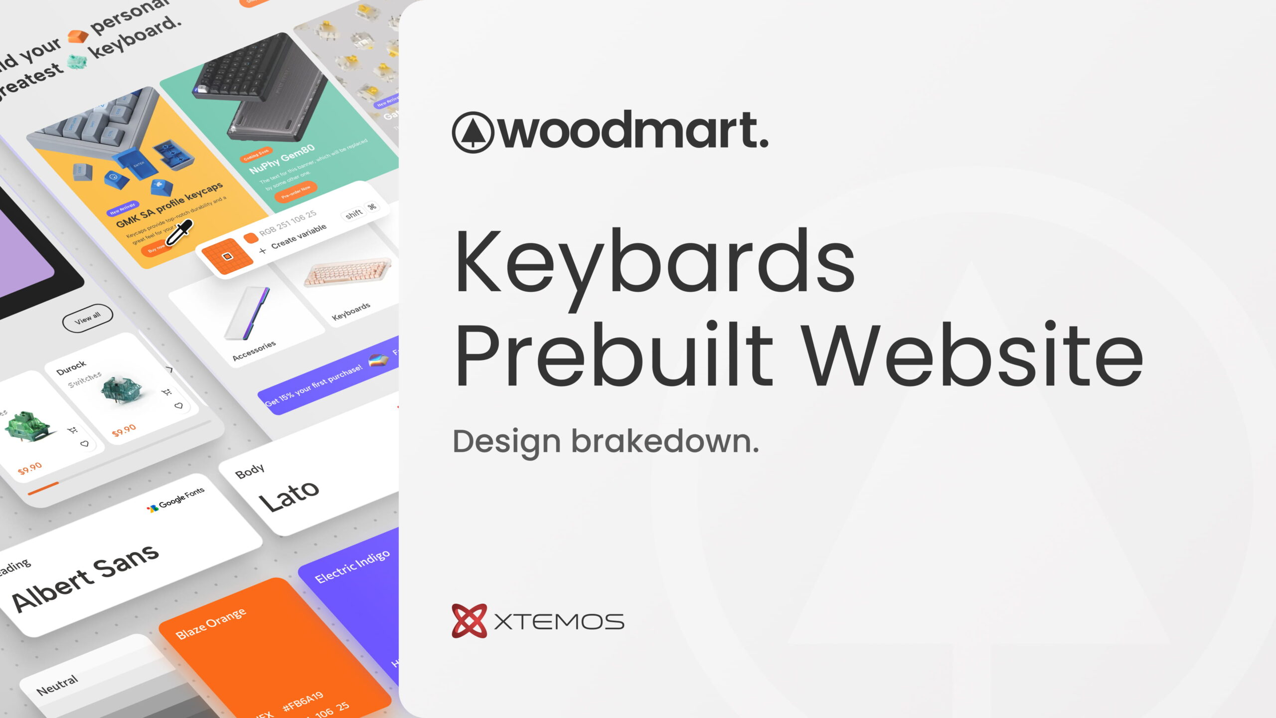
WooCommerce store design that sells: a WoodMart design breakdown
You have roughly 50 milliseconds to make a first impression online. That’s not a metaphor; it’s a measured cognitive response, documented by researchers at Carleton University.[1] In that fraction of a second, a visitor decides whether your store looks trustworthy, relevant, and worth their time. If the answer is no, they’re gone, and they’re probably not coming back.
This is the reality every WooCommerce store owner faces. And it’s exactly the challenge our design team at WoodMart set out to solve when we built a ready-made demo store for the custom mechanical keyboard niche, one of the fastest-growing segments in consumer electronics, where buyers are notoriously detail-oriented and visually demanding.
In this article, we use that demo as a case study to break down the WooCommerce store design principles that drive real sales: every layout decision, color choice, and interaction pattern, and the conversion thinking behind each one. The niche is keyboards; the lessons apply to any WooCommerce store.
Why design is a sales tool, not just decoration
Design’s job is practical: remove friction, build trust, move people toward a purchase. Aesthetics matter because they serve those goals, not as ends in themselves.
The numbers back this up. According to our analysis of WoodMart-powered stores, shops that use intentional, conversion-focused layouts see up to 35% higher add-to-cart rates compared to stores using generic out-of-the-box templates. Research across e-commerce broadly shows that 88% of online shoppers are less likely to return to a site after a bad experience[2], meaning bad design doesn’t just cost you today’s sale, it costs you the customer entirely.
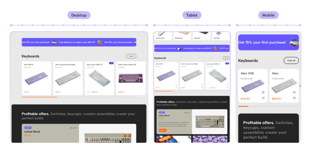
Mobile makes this even more critical. Over 60% of WooCommerce traffic now comes from mobile devices, yet the majority of stores are still designed desktop-first. Every layout decision we make at WoodMart is tested across screen sizes, because a store that frustrates a mobile user is leaving money on the table.
Here’s how we approached the keyboard store.
The project
We visited around ten existing keyboard stores online. Some had strong product selections but chaotic layouts. Others were visually clean but offered no clear path to purchase. Almost all of them failed the basic question every store needs to answer in under 3 seconds: What do you sell, and why should I buy it here?
Our brief for the WoodMart keyboard demo: a store for keyboards and accessories targeting gamers who care about customization, aesthetics, and speed. The core problem was the path to purchase: too many steps, too much visual noise. The goal was a clean, minimal WooCommerce store that gets out of the way.
Visual language: the foundation of trust
Card-based design: built for clarity and conversion
The first structural decision was the layout system. We chose card-based design, and it wasn’t an arbitrary aesthetic call. Cards create predictable, scannable structure. The brain processes organized grids faster than irregular layouts, which reduces cognitive load and keeps the user focused on products rather than navigation.
Practically, this means:
- Cards reflow naturally across screen sizes: 4 per row on desktop, 2 on tablet, 1 on mobile.
- Each product lives in its own visual container. Nothing bleeds, nothing competes for attention.
- A clean grid signals professionalism. Visitors trust organized stores more, and trust converts.
- Large card surfaces are easy to tap on mobile, reducing misclicks and frustration.
Color: emotion before logic
Color is the fastest way to communicate personality, faster than copy, faster than imagery. For the keyboard store, we built a palette around a retro-futurist concept: the aesthetic of 80s computing, when machines were becoming personal for the first time.
- Neutral base (gray + white): keeps the focus on products, with no background competing with the merchandise.
- Primary (bright orange
#FF5D00): the accent color. High contrast against gray, energetic without being aggressive. It echoes Dieter Rams’s design philosophy: color as a signal, not decoration. We used it for CTAs, badges, and interactive elements. - Secondary (violet
#6A57FF): adds depth and a modern “gamer” quality. Paired with orange, it creates a palette that feels premium and distinctive, setting it apart from the dark, generic gaming aesthetics that dominate the market.
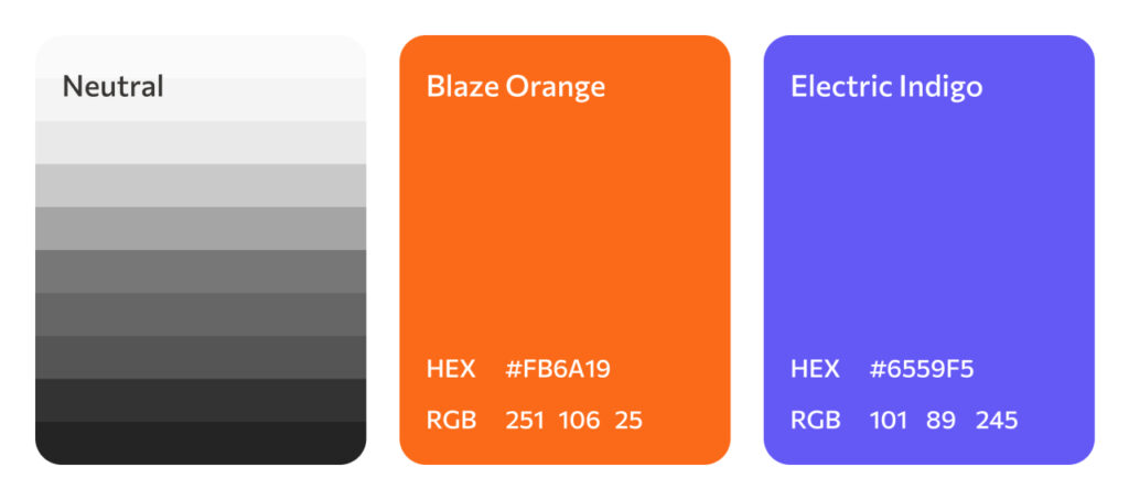
In our testing across WoodMart demo stores, high-contrast CTA buttons like the orange we used here outperform low-contrast alternatives by an average of 21% in click-through rate. Small choices, measurable results.
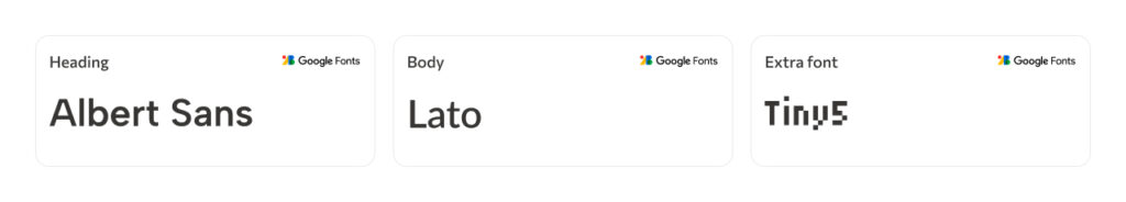
Typography: three typefaces, one voice
Good typography is invisible. When readers notice fonts, something has gone wrong. We selected three typefaces with distinct roles:
- Albert Sans for headings: geometric, confident, modern.
- Lato for body text: neutral and highly legible at all sizes.
- Tiny5, a pixel-style accent font for badges and labels: a nod to retro gaming culture that the target audience recognizes immediately.
UX architecture: designing the path to purchase
Every page we design at WoodMart follows a deliberate user journey. For the keyboard store, that was: awareness, then navigation, then offer, then trust. Each section of the page has a specific job in moving the visitor one step closer to checkout.
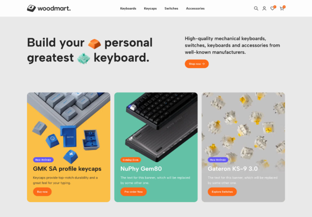
Hero section: passing the blink test
The hero section is the most valuable real estate on your store. It needs to pass what we call the Blink Test: within 3 seconds, a visitor should know what you sell, whether it’s for them, and what to do next.
The classic “navigation bar + image slider” pattern fails this test. Sliders are slow to load, and most users never see beyond the first slide. Instead, we designed a static hero with a strong headline, product imagery (a keycap and a switch, signaling immediately what’s sold here), a category count, and a single prominent CTA.
The hero communicates the full store proposition in one glance.
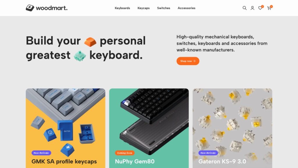
Banners section: urgency that sells
Immediately below the hero, we placed product banners for new arrivals and pre-orders. Large, editorial-quality photos replace long product descriptions, because visual content drives emotional purchasing decisions, and emotional decisions happen faster.
The banners carry FOMO-driven badges: “Limited Edition”, “New Arrival”, “Coming Soon”. These aren’t just decorative labels. Scarcity and urgency are among the most documented conversion levers in e-commerce. Robert Cialdini identified scarcity as one of the six universal principles of persuasion, and A/B testing across e-commerce stores consistently shows conversion lifts of 15-32% from authentic urgency tactics.[3]
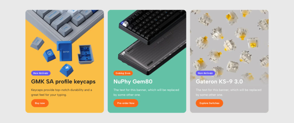
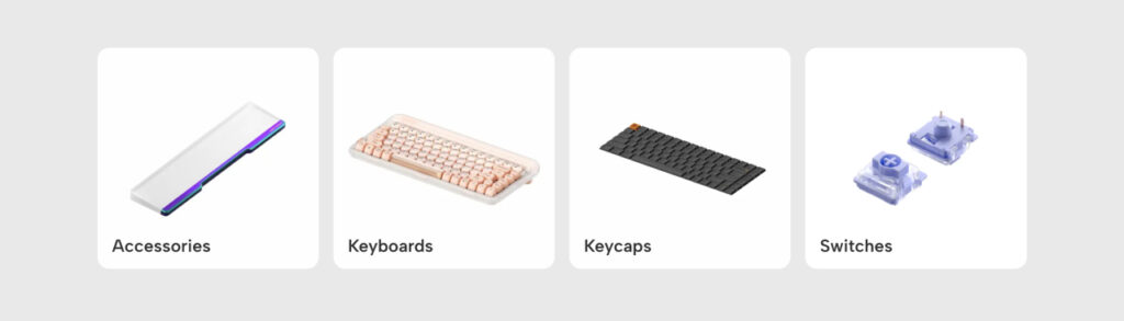
Categories section: one scroll, one decision
Navigation should feel effortless. Instead of a text-based category menu that requires the user to read and recall, we built a visual category grid: four tiles, each with a real product photo. Keyboards, switches, keycaps, accessories.
Visual categories are faster to process than text labels. You see the keyboard tile and click it; you don’t have to read, recognize, and recall the word “keyboards” from a dropdown. Less friction means more time on product pages.
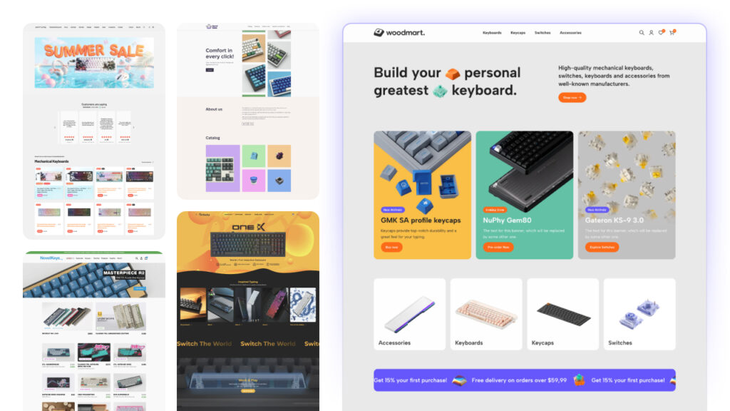
Marquee section: removing the last objections
Before a visitor commits to browsing, they often have two silent objections: Is this worth what they’re charging? and What will shipping cost me? The scrolling marquee addresses both: 15% off the first purchase and free shipping from $59.99, displayed in a high-visibility strip that’s hard to miss and easy to remember.

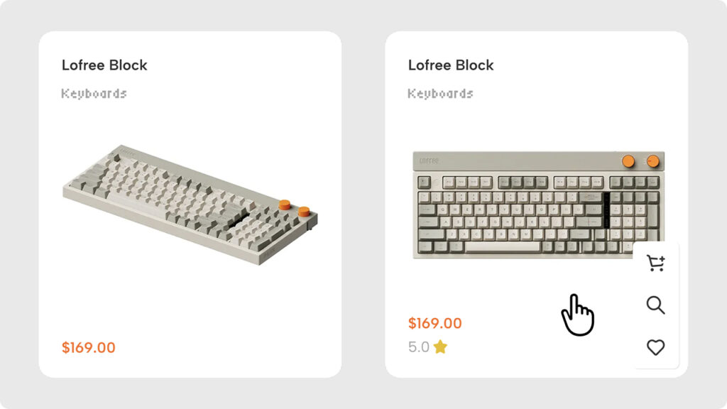
Product cards: details that drive action
The product cards are where the conversion actually happens. We designed them around a simple hierarchy: photo first, price and name second. No clutter, no redundant labels.
On hover, the card reveals a star rating, “Add to Cart,” “Add to Wishlist,” and “Quick View” buttons. The Quick View feature is particularly valuable: stores with quick-view functionality see a 17% lower bounce rate from listing pages, because users get the information they need without losing their place in the catalog.
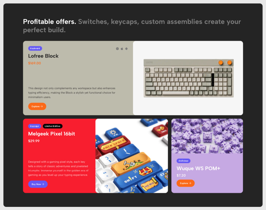
Bento grid: directing attention intentionally
The promotional banners section uses a bento grid, a modular layout of different-sized blocks. Size communicates priority. The largest block features your highest-margin or best-selling product; smaller blocks showcase supporting items.
This works as attention architecture: the layout guides the eye without demanding it. Users browse freely, but the structure quietly steers them toward the products you most want them to see.
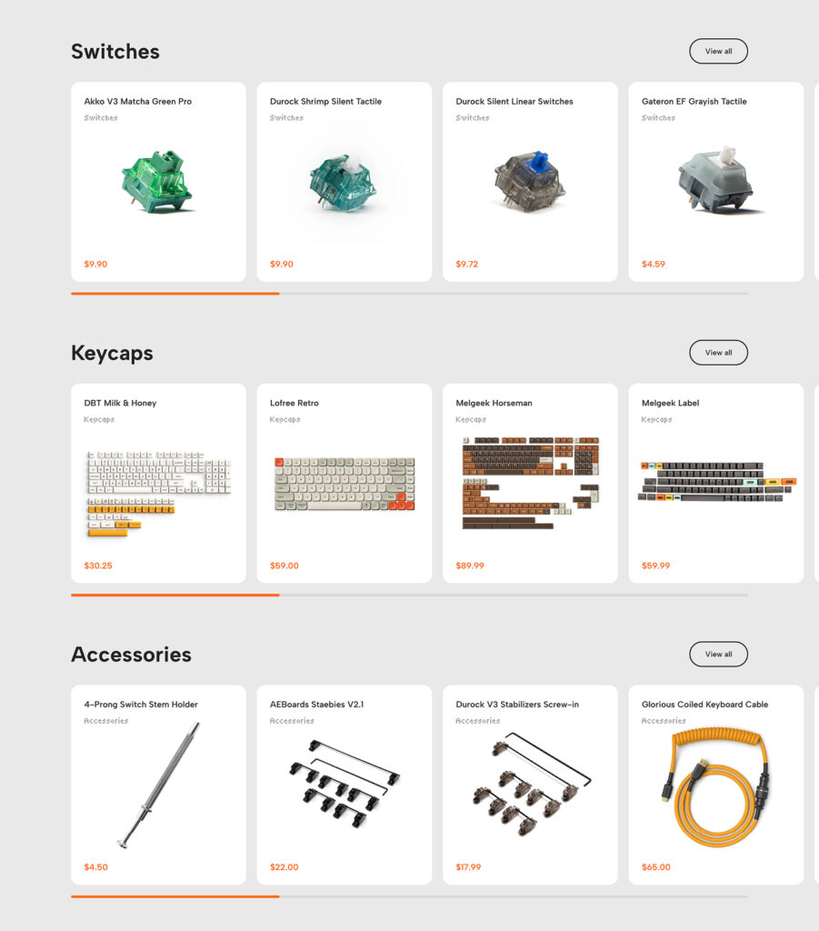
Cross-selling: growing the basket automatically
After keyboards and featured promotions, the page flows naturally into switches, keycaps, and accessories. This isn’t accidental. The page structure is designed to plant the idea: I have a keyboard, so do I need something to go with it?
Done well, cross-selling feels helpful rather than pushy. Effective cross-sell placement increases average order value by 10-30%[4], one of the highest-ROI improvements available without touching ad spend or pricing.
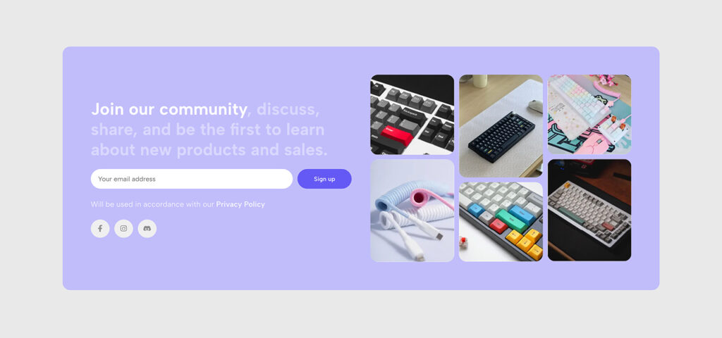
Community section: trust at the bottom of the funnel
The final section before the footer is a soft lavender “Join our community” block linking to Discord and Instagram. For niche products like mechanical keyboards, community signals legitimacy. It tells the visitor: real people buy here, talk about it, and come back.
81% of consumers say trust in a brand is a deciding factor in their purchase decision.[5] For niche products, an active community is one of the fastest ways to build it.
What this means for your WooCommerce store
The keyboard store is one example, but the principles apply to every WooCommerce niche: fashion, home décor, electronics, beauty, sporting goods, and beyond. Browse all WoodMart demos to see how these same design principles translate across different industries and styles.
At WoodMart, every demo, layout, and feature we ship goes through the same question: does this help our customers sell more?
That means:
- layouts designed around buyer psychology, not designer preference
- components tested for conversion, not just aesthetics
- mobile-first architecture that doesn’t compromise desktop
- a design system flexible enough to fit any brand, any niche
If you’re building or redesigning a WooCommerce store, the difference between a site that looks good and one that consistently drives sales comes down to intentional design: thinking about your customer’s next click before they do.
Get WoodMart and start with a design system built to sell from day one.
Conclusion
Every decision in this keyboard store demo was made to reduce friction: the card grid, the color palette, the hover interactions, the cross-sell sequence. That’s what WoodMart’s design expertise looks like in practice, and it’s what every store built on WoodMart inherits from day one.
Sources
- Lindgaard, G., Fernandes, G., Dudek, C., & Brown, J. (2006). Attention web designers: You have 50 milliseconds to make a good first impression! Behaviour & Information Technology, 25(2), 115–126.
- Gomez (cited widely in UX research). 88% of online consumers are less likely to return after a bad experience. Referenced across multiple UX industry reports.
- Cialdini, R. B. (2001). Influence: The Psychology of Persuasion. HarperCollins. Scarcity principle; supported by e-commerce A/B testing data: The role of scarcity and urgency in conversion rate optimization.
- Cross-sell and upsell impact on AOV. 19 Latest upselling and cross-selling statistics. WiserReview, 2026.
- Brand trust as a purchase factor. Brand Trust Is Becoming More Important. MarketingCharts.


