
WordPress blog
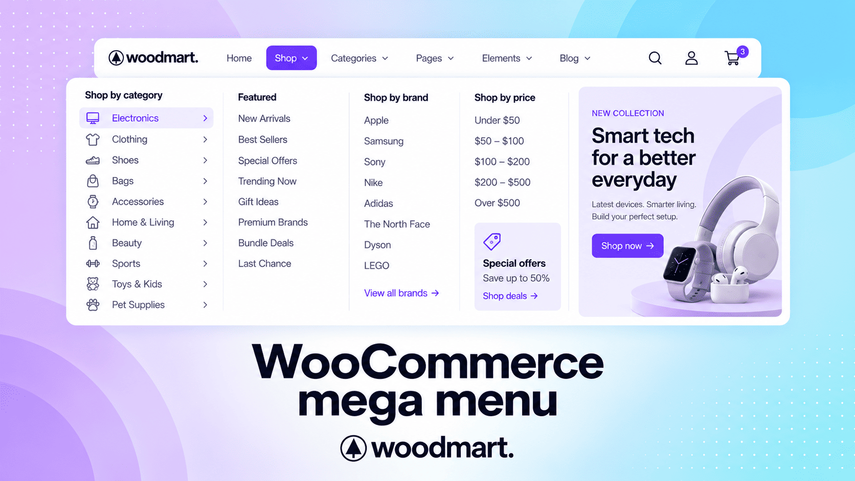
WooCommerce mega menu: how to organize product categories and improve navigation

As a WooCommerce store grows, navigation can quickly become difficult to manage. A simple dropdown may work for a small catalog, but stores with many product categories, brands, and product types need a clearer way to organize their navigation.
A WooCommerce mega menu can solve this by expanding a standard dropdown into a structured navigation area where related categories and links are grouped into sections. This makes it easier for shoppers to understand your catalog and reach the products they need.
But a mega menu is not the answer to every navigation problem. The goal is to use it where a larger, more organized menu can make browsing easier—not simply to add more links.
In this guide, you’ll learn when to use a WooCommerce mega menu, how to structure one for stores with many categories, common mistakes to avoid, and how WoodMart can simplify the process.
What is a WooCommerce mega menu?
A mega menu is an expanded navigation menu that displays multiple groups of links and content at the same time.
Instead of showing one long list, you can organize navigation into sections such as Clothing, Shoes, Accessories, and Featured.
This is particularly useful for stores with large catalogs because shoppers can see several relevant options without opening multiple levels of dropdowns.
WooCommerce product categories support hierarchical relationships, so parent categories and subcategories can form the foundation of your store navigation. WooCommerce also allows product categories to be added to site menus.
When should you use a mega menu in WooCommerce?
A mega menu is most useful when your store has enough categories, product types, or shopping paths that a standard dropdown becomes difficult to scan.
Consider using one if:
- Your store has many related categories or subcategories.
- Customers need to browse different product groups from the same main menu item.
- You want to organize categories into clear columns or sections.
- Visual elements such as category images can help shoppers identify products faster.
For smaller stores with only a few main categories, a standard dropdown may be simpler and more effective. The goal is not to make the menu larger, but to make navigation easier to understand.
1. Plan your navigation before designing the menu
Start with your catalog rather than the menu design.
Identify the main categories customers are most likely to use and make those your primary navigation items.
For example, an electronics store might use:
Computers | Smartphones | TVs | Gaming | Accessories | Brands
You don’t need to place every category in the main menu. Focus on the destinations that are most important to shoppers.
Keep the hierarchy simple
Avoid creating unnecessarily deep navigation such as:
Computers → Laptops → Business → Windows → 15-inch
Instead, expose useful choices earlier in the navigation.
The mega menu should act as a shortcut to important shopping destinations, not as a complete copy of your product database.
WooCommerce itself recommends keeping category structures as simple as possible, even though categories can be nested several levels deep.
2. Group related categories into clear sections
The main advantage of a mega menu is that you can organize many links without turning them into one long list.
Use columns and headings to separate related categories. The number of columns should depend on how much information customers need to see. Here are examples of how the same navigation can be organized into different mega-menu layouts:
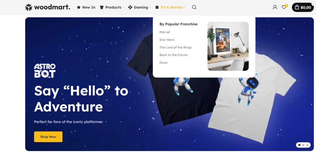
2-column mega menu
A compact option for grouping a smaller number of related categories.
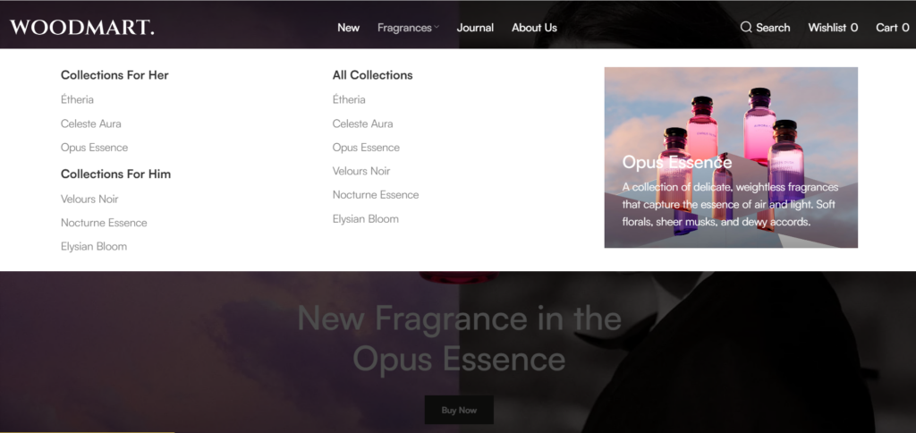
3-column mega menu
Useful when you need to separate several related category groups while keeping the menu easy to scan.
4-column mega menu
Better suited to larger category structures where more navigation options need to be visible at once.
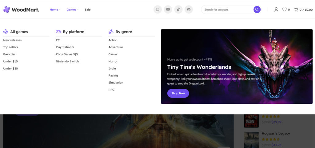
These examples show why the menu should be structured around the amount of information customers need, rather than simply using as many columns as possible.
3. Add images only when they improve navigation
Images can help shoppers recognize categories quickly, particularly for visual products such as fashion, furniture, or home decor.
WoodMart mega menus can include columns, images, banners, product grids, categories, text, and other page-builder content through an HTML Block.
However, images should support navigation rather than dominate it.
Avoid filling every section with large banners or product grids. A focused menu with clear category links will usually be easier to scan than a visually overloaded one.
4. Don’t forget mobile navigation
A desktop mega menu does not automatically make a good mobile menu.
On smaller screens, visitors need:
- Clear category names
- Easy-to-tap links
- Simple hierarchy
- Minimal clutter
- Predictable navigation
WoodMart lets you assign a menu to the Mobile Side Menu location and configure the mobile menu through Header Builder. It can also display a separate categories menu as a second tab.
One important detail is that HTML Block submenus are disabled in the mobile menu by default. If your mobile navigation needs to display HTML Block content, you can enable this option in the Mobile menu element. For complex menus, a separate simplified mobile menu may be easier to use.
5. Build the mega menu with WoodMart
A standard WordPress menu works well for basic navigation, but larger stores may need more control over the dropdown layout and content.
WoodMart extends the standard WordPress menu system with built-in mega-menu functionality. The dropdown content is created as an HTML Block and assigned to a parent menu item.
Step 1: Create an HTML block
Go to:
Dashboard → HTML blocks → Add New
Give the block a descriptive title and create the dropdown content using Gutenberg, Elementor, or WPBakery, depending on the page builder configured on your website. Then publish the HTML Block.
Step 2: Configure the parent menu item
Go to:
Appearance → Menus
Select the menu and expand the parent item that should open the mega menu.
WoodMart provides four mega-menu design options:
- Full width
- Full height
- Set sizes
- Aside
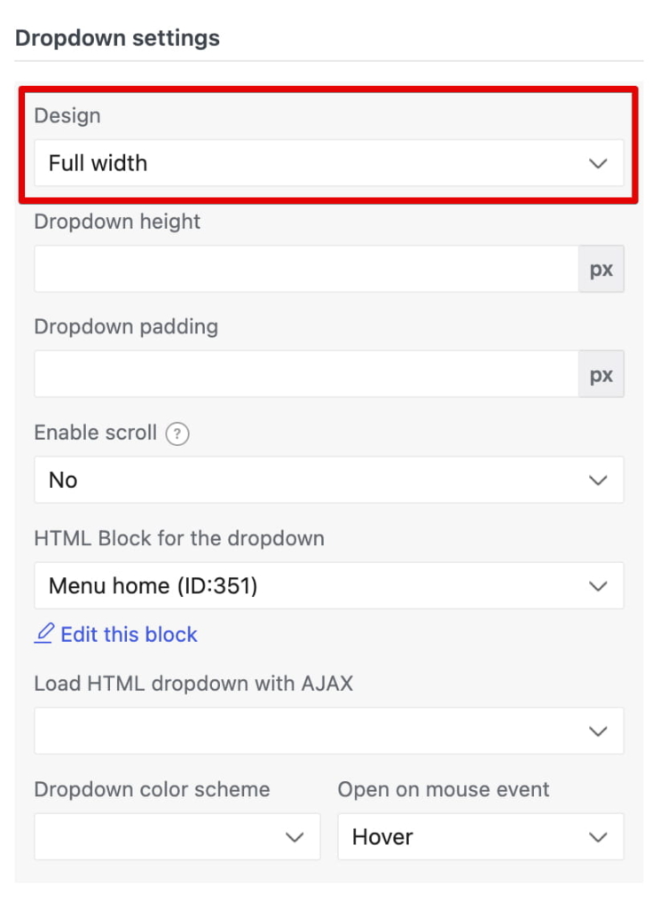
Then select the HTML Block created in the previous step.
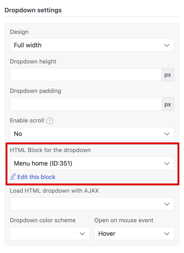
Step 3: Select the HTML block
After choosing the design, select your HTML Block in the HTML Block for the dropdown field and save the menu. WoodMart also provides additional options for dropdown height, padding, scrolling, AJAX loading, color scheme, and opening behavior.
6. Use WooCommerce categories as the foundation
Your WooCommerce categories should remain the foundation of your store navigation.
WooCommerce categories are hierarchical, allowing you to create parent categories and subcategories. They can also be added directly to your site’s menu.
WoodMart provides a Categories element in Header Builder that can display a WordPress menu as a category dropdown. You can choose which categories appear, arrange their order, add other menu items, and configure mega-menu dropdowns.
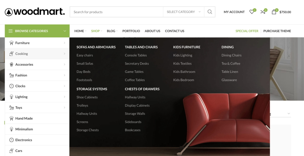
Using your existing WooCommerce categories also makes the navigation easier to maintain. When your catalog changes, you can update the underlying categories rather than rebuilding the entire navigation structure.
7. Keep performance in mind
A mega menu can contain much more than text links. Images, banners, product grids, and page-builder content can make a dropdown heavier, especially when several menu items contain complex layouts.
For larger or more complex mega menus, WoodMart provides Load HTML dropdown with AJAX. When enabled, the assigned HTML Block is loaded when the visitor opens the dropdown instead of including all of its content in the initial page markup. This can help reduce the amount of mega-menu content loaded with the initial page and is particularly useful when dropdowns contain images, product grids, or other complex elements.
However, AJAX loading is not a substitute for optimization. Keep images compressed, avoid unnecessary product grids, and limit complex elements to the dropdowns where they provide real value. Test the menu on both desktop and mobile after enabling AJAX loading.
8. Keep SEO and usability working together
Navigation can help users understand your store structure and reach important category pages.
Use descriptive category names such as:
- Running Shoes
- Gaming Laptops
- Women’s Dresses
- Office Furniture
rather than vague labels such as “Products” or “More.”
At the same time, don’t turn your mega menu into a list of hundreds of links simply for SEO.
The primary purpose of navigation is to help customers find products. SEO should support that goal rather than make the menu harder to use.
Common WooCommerce mega menu mistakes
Duplicating your category structure
Use your existing WooCommerce categories whenever possible instead of manually recreating the catalog.
Ignoring performance
Large images, product grids, and complex content can make a dropdown unnecessarily heavy.
What WoodMart adds to the standard WordPress menu system
WooCommerce provides the underlying product category structure and allows those categories to be added to site navigation. WoodMart builds on that foundation by providing tools for creating richer dropdown layouts and content.
| Feature | WooCommerce / WordPress | WoodMart |
|---|---|---|
| Product categories | ✓ | ✓ |
| Parent/child categories | ✓ | ✓ |
| Add categories to menus | ✓ | ✓ |
| Custom mega-menu content | Basic menu structure | ✓ |
| HTML Block dropdowns | — | ✓ |
| Gutenberg/Elementor/WPBakery content | — | ✓ |
| Multiple mega-menu layouts | — | ✓ |
| AJAX loading for large dropdowns | — | ✓ |
| Separate mobile menu options | Theme-dependent | ✓ |
The main WoodMart advantage is that it extends the existing WordPress menu system rather than requiring you to replace your WooCommerce category structure. You can continue using your existing categories while creating richer dropdown content through HTML Blocks.
Final checklist
Before publishing your mega menu, make sure:
- Main categories are easy to understand
- Related links are grouped logically
- Important categories are prioritized
- The menu isn’t overloaded
- Images are used only where useful
- Mobile navigation is easy to use
- Category links lead to the correct pages
- Images are optimized
- Large dropdowns are tested for performance
- The navigation works across different screen sizes
Build navigation around the way customers shop
A good WooCommerce mega menu should make it easier for visitors to understand your store and reach the right products with less effort.
Start with your WooCommerce category structure, group important destinations logically, and keep the menu focused. With WoodMart, you can extend the standard WordPress menu with customizable HTML Blocks, multiple dropdown layouts, and optional AJAX loading for more complex menus.
The result is a navigation system that is easier to manage and helps customers find products faster.
