Home › Forums › WoodMart support forum › Ergonomy of menu on mobile › Reply To: Ergonomy of menu on mobile
pierredemeudon
Hi there,
I read the whole doc again. And here are few points:
Original purpose:
It was to replicate what I had in Basel, ie a colored header row, with product categories in shop, and themes / topic, ie blog categories in “blog”. Like this for shop.
https://snipboard.io/NSCwEd.jpg
Behind that, the final purpose is to have an obviously visible way to select categories.
I understand that Woodmart does not enable it (2nd menu is only built for desktops). But understood that Woodmart is built differently.
Shop view on mobile with Woodmart:
This is the current outlay:
https://snipboard.io/1oJBr6.jpg
Here, I have different issues, which purely relate to UI / UX:
1. Overall, I see that the bottow nav bars are different on shop and blog, but did not find how to design each of them specifically
2. Icons are confusing.
Based on this image:
https://snipboard.io/cuzUqw.jpg
Hamburger (1) leads to menu. OK, that’s how all do
Filter icon (3) in bottom navber leads to shop filter / attributes filter. OK.
(2) is a hamburger icon (like 1), but leads to filters (like 3)! Not logical and confusing.
Further:
– since 2 and 3 do same job, one is needless and adds complexity (js, css, ui?)
– “show sidebar” means nothing for an average person, and, as far as I know, can’t be changed.
– “shop” icon is here useless since we are already in shop. But can it be changed without negatively impacting the UI / UX other pages? And shouldn’t it be “blog”, since the bottom navbar on blog proposes an icon to go to shop (vice versa)?
Minimum solution? Change the icon of 2 to have a filter instead of a hamburger? or withdraw 3, but again, is it possible without impacting the “blog” UI / UX? And how to change “show sidebar” in something more meaningful for Mr / Mrs Smith?
Let’s now look at blog mobile:
https://snipboard.io/ki16xF.jpg
Solely re. botton nav bar:
– shop icon is OK
– hamburger on top leading to menu is OK.
– Sorry, sidebar means nothing concrete. And unfortunately, can’t be changed, as far as I know.
It leads to blog sidebar, which can include what any look after (for me, get possibily to select theme / topic within blog / magazine).
– sorry, the “3 dots” icon means nothing clear for some, for me at least.
After:
– in the doc, it’s not said how we could change the mobile bottom navbar to include an icon leading to a given widget, and if this widget is suitable for mobile
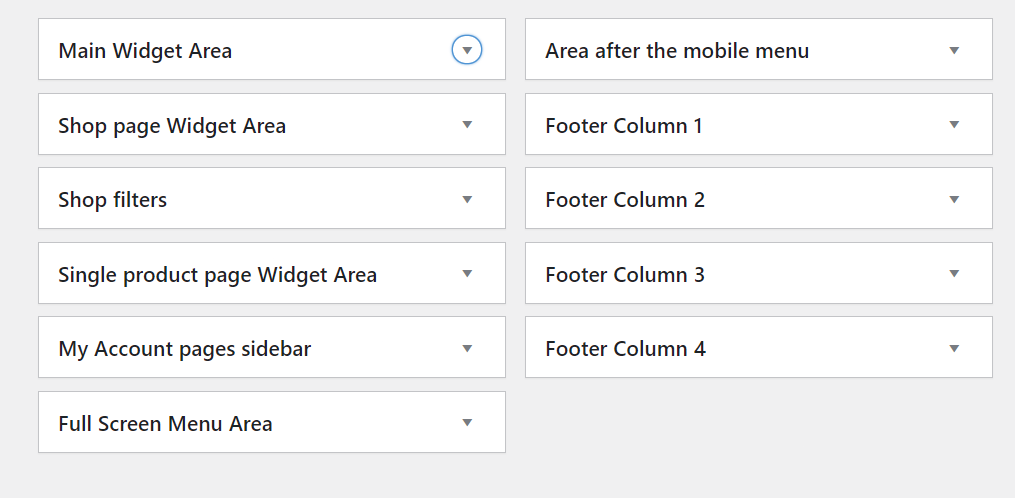
– your doc talks about widget areas that I don’t see or have
This is the doc:
https://snipboard.io/Zgp1dy.jpg
This is my widget area:
https://snipboard.io/xJUyeo.jpg
Missing magazine? missing posts in menu?
Re. widget, also, the incompatibility between gutenberg and woodmart in widgets is painful for me. Since breaking the sites, as already shared.
OK, all those are my comments re. ergonomy, ie UI / UX, so that, hopefully, people surf easily.
In short, beyond what others could need, this would mean for me:
– get all filter icons leading to filters, and hamburger icons leading to menus
– a specific icon in bottom navbar leading to “blog sidebar” or to “blog / post categories”
– integration without breaking site to gutenberg, which is really lighter, faster and much less CPU greedy than WP Bakery or Elementor
Waiting for your feedback
Best regards
pS: shall you need more precision / clarity, please ask, will do my best