Home / Forums / WoodMart support forum / Ergonomy of menu on mobile
Home › Forums › WoodMart support forum › Ergonomy of menu on mobile
Ergonomy of menu on mobile
- This topic has 12 replies, 3 voices, and was last updated 5 years, 1 month ago by
 Elise Noromit.
-
AuthorPosts
-
April 24, 2021 at 6:25 am #286148
pierredemeudonParticipantHi,
I have put a specific menu in header to choose the product category, which is the red horizontal that you can see here on the top of this page:
https://polinacouture.com/boutique/When you are there in shop via mobile, there are 2 issues:
1. when you click on it, the sub-categories are vanishing 9 times out of 10.
2. when you succeed to see them, then, the 3rd level is out of screen.How can I improve that?
On Basel, it was just perfect.Waiting for your feedback
Best regardsApril 24, 2021 at 10:11 am #286188Hello,
I have visited your website.
This is happening because you have added a simple menu for that and the dropdowns are set to be displayed for the simple menu on hover and the hover property doesn’t work for the mobile devices.
If you anyway succeed to open the menu then it displays the submenu to the right side of the menu and when you are at the second level then the third level submenu will definitely out of the device width.
Sorry but we could not help you with this because the standard submenu doesn’t set to be working for the mobile.
It requires customizations and this is beyond our limitations and support policy.
Best Regards
April 24, 2021 at 10:50 am #286213
pierredemeudonParticipantHi,
Contrary to others here within support theme, you are systematically negative to useless.
Thus, I will leave a negative review just for you
Take care though
ByeApril 24, 2021 at 12:37 pm #286240
Elise NoromitMemberHello,
We are sorry you are disappointed, we share your emotion, however, a negative review would not solve the problem. You know each time you contact us with any issue and we always help you.
Let’s take time and try to settle the issue, first of all, I am checking the desktop of the page and I do not see anything in the header: https://prnt.sc/11z1xxy
I suggest starting from determining your purpose, please describe in detail you want to show the categories? How they should look like on the desktop and on mobile. We will do our best to suggest the best solution within our theme options.
I do hope for understanding.
Best Regards
April 24, 2021 at 1:42 pm #286253
pierredemeudonParticipantHello,
Sorry for the situation. Your way to react is perfect, and sincerely, you should teach to Aizaz how to do it as well. He is certainly in an incomfortable situation because he probably does not know the capabilies of the themes like you do. But also because he does not try -like you perfectly do- to understand what is expected /targeted before answering. What annoyed me with him before was to find the “how to” thanks to your doc, forums and google, whereas, I swear, I know nothing about codes, html, …. I even don’t understand the words!
Re. my issue … I understood that there is a capability issue. And accepts that Woodmart differs from Basel. I will read again your doc to try to find how this could be achieved, and will then revert to you. The purpose can only be to find a win / win solution. Ie a win for both of us
Sorry for the stress
With my really kind regardsRe. my
April 25, 2021 at 2:37 pm #286414
pierredemeudonParticipantHi there,
I read the whole doc again. And here are few points:
Original purpose:
It was to replicate what I had in Basel, ie a colored header row, with product categories in shop, and themes / topic, ie blog categories in “blog”. Like this for shop.
https://snipboard.io/NSCwEd.jpg
Behind that, the final purpose is to have an obviously visible way to select categories.
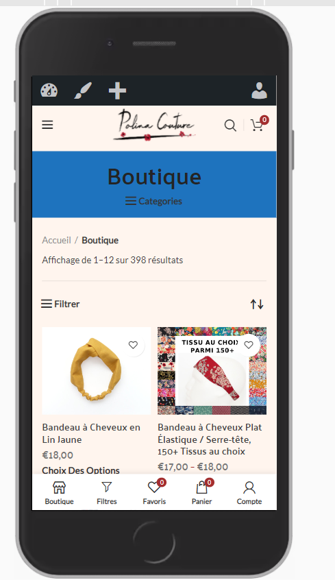
I understand that Woodmart does not enable it (2nd menu is only built for desktops). But understood that Woodmart is built differently.Shop view on mobile with Woodmart:
This is the current outlay:
https://snipboard.io/1oJBr6.jpg
Here, I have different issues, which purely relate to UI / UX:1. Overall, I see that the bottow nav bars are different on shop and blog, but did not find how to design each of them specifically
2. Icons are confusing.
Based on this image:
https://snipboard.io/cuzUqw.jpg
Hamburger (1) leads to menu. OK, that’s how all do
Filter icon (3) in bottom navber leads to shop filter / attributes filter. OK.
(2) is a hamburger icon (like 1), but leads to filters (like 3)! Not logical and confusing.
Further:
– since 2 and 3 do same job, one is needless and adds complexity (js, css, ui?)
– “show sidebar” means nothing for an average person, and, as far as I know, can’t be changed.
– “shop” icon is here useless since we are already in shop. But can it be changed without negatively impacting the UI / UX other pages? And shouldn’t it be “blog”, since the bottom navbar on blog proposes an icon to go to shop (vice versa)?
Minimum solution? Change the icon of 2 to have a filter instead of a hamburger? or withdraw 3, but again, is it possible without impacting the “blog” UI / UX? And how to change “show sidebar” in something more meaningful for Mr / Mrs Smith?Let’s now look at blog mobile:
https://snipboard.io/ki16xF.jpg
Solely re. botton nav bar:
– shop icon is OK
– hamburger on top leading to menu is OK.
– Sorry, sidebar means nothing concrete. And unfortunately, can’t be changed, as far as I know.
It leads to blog sidebar, which can include what any look after (for me, get possibily to select theme / topic within blog / magazine).
– sorry, the “3 dots” icon means nothing clear for some, for me at least.After:
– in the doc, it’s not said how we could change the mobile bottom navbar to include an icon leading to a given widget, and if this widget is suitable for mobile
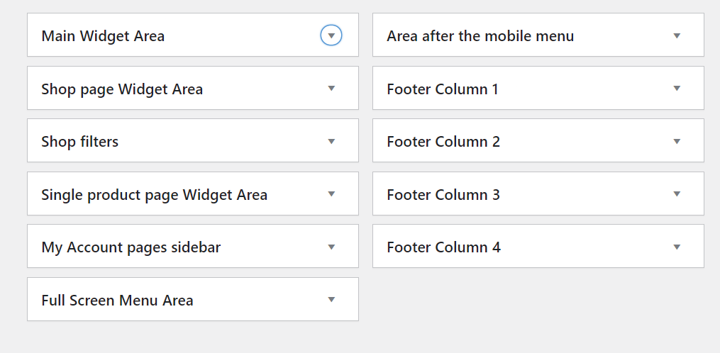
– your doc talks about widget areas that I don’t see or have
This is the doc:
https://snipboard.io/Zgp1dy.jpg
This is my widget area:
https://snipboard.io/xJUyeo.jpg
Missing magazine? missing posts in menu?Re. widget, also, the incompatibility between gutenberg and woodmart in widgets is painful for me. Since breaking the sites, as already shared.
OK, all those are my comments re. ergonomy, ie UI / UX, so that, hopefully, people surf easily.
In short, beyond what others could need, this would mean for me:
– get all filter icons leading to filters, and hamburger icons leading to menus
– a specific icon in bottom navbar leading to “blog sidebar” or to “blog / post categories”
– integration without breaking site to gutenberg, which is really lighter, faster and much less CPU greedy than WP Bakery or ElementorWaiting for your feedback
Best regardspS: shall you need more precision / clarity, please ask, will do my best
April 25, 2021 at 7:15 pm #286482
Elise NoromitMemberHello,
Thank you for your time and details.As for Colored header row, with product categories – WoodMart also provide the same option: https://gyazo.com/51085a7cb6cb7d548851d48c82891b68
You need to set “Small” for the page title and set the color: https://gyazo.com/5dbd7f8043c3de48c2db761144ccba95
You can change the icon by adding this code:
.wd-btn-show-cat > a:before{
    font-size: 18px!important;
    content: "\f129"!important;
    display:inline-block!important;
    padding-right: 30px;
}
Your categories should be arranged as parent-child categories to get the drop-down.
Now regarding Shop view on mobile with WoodMart:
The filter icon appears only on the shop page and disappears on other pages cause filters are effective on the Shop page only. It is the Woocommerce functionality and if you add a Woocommerce filter to a Blog sidebar it would not appear. We leave the option to show the filter icon in the Mobile bottom navbar cause some users do not always show the sidebar on the shop page. However, a filter option is necessary.
In addition, you have the option to remove the filters from the Mobile bottom navbar.
The mobile bottom navbar also works in the same way as Basel’s navbar works. Actually, it is an additional bar in case the site does not have a sticky header. That is why the Mobile bottom navbar in the same way as the main menu is not flexible and changeable depending on the page.
Show Sidebar icon
You can change the string with the Loco plugin, we can replace the icon with the custom CSS. Which one do you prefer?
Blog page
You say: Sorry, sidebar means nothing concrete. And unfortunately, can’t be changed
I cannot catch your problem. You can add or remove the sidebar from the blog page, you can add any widgets: recent posts and all the same which you could add in the Basel theme and another theme, please clarify the issue.After:
– in the doc, it’s not said how we could change the mobile bottom navbar to include an icon leading to a given widgetThe mobile bottom navbar works in the same way as any menu. No menu in any theme has the option to insert the icon leading to the widget on the blog page.
Our doc on Widgets has shown a couple of custom sidebars, You can create yours and chose different sidebars for different pages.Re. widget, also, the incompatibility between Gutenberg and WoodMart in widgets is painful for me. Since breaking the sites, as already shared.
WoodMart theme is compatible with either WP bakery page builder or Elelementor, we have never declared compatibility with the Guttenberg. We are not considering the Guttenberg integration in the nearest future as it is a very complicated and time-consuming process.
If you want to replace icons in the Mobile bottom navbar, provide the icons you would like to insert. We will give you custom CSS.
Best Regards
April 26, 2021 at 11:37 am #286739
pierredemeudonParticipantHi,
I appreciate your efforts, sincerely.
The title with categories is not a viable option, but I will really review your points in depth, will make trials in staging and revert to you.
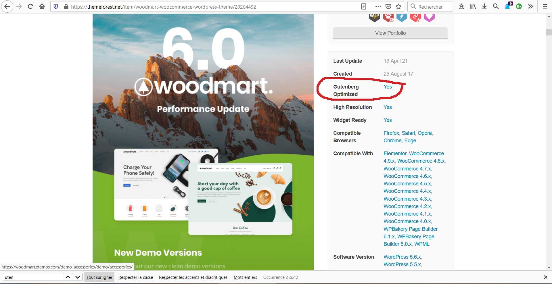
Re. Gutenberg, this is the description on theme forest:
https://snipboard.io/ZjiFzd.jpgOn my side, it’s “painful” but I can live with it if there is a superior UI / UX … indeed, there is a step by step process, when I work on site, to avoid that it gets broken. It also implies that I woke up very early to put the site in maintenance mode. The point is that Gutenberg, in terms of speed and CPU, is far superior to WP Bakery and Elementor. Anyway, OK, I can live with this pain, what matters the most is UX /UI. Let’s focus on that
Will write to you later, after tests.
Take care
April 26, 2021 at 5:16 pm #286862
pierredemeudonParticipantHi,
As a reminder, the purpose is to have a simple visible way to choose product categories in shop, and say “post categories” in blog. What is super important since mobile is now n°1 worldwide, and 65% of visits for me. On desktop, Woodmart is more than perfect, in terms of layout. The functions are of use of desktop should be, by definition, on mobile.
Colored header row, with product categories
a. the logical (for me) option would be to use your category dropdown:
https://snipboard.io/lmyLZr.jpg
It is use-able for products and posts, but unfortunately it’s not proposed on mobiles, though this is now the dominant device.b. Using the secondary works does not fully works. The categories can be integrated, but it’s hardly click-able, and the sub-categories are out of screen.
c. All in all, the “TITLE” does not fully do the job since it’s not reproduce-able / replicable on blog page. On shop page, looks like it’s the only option, but have this big “SHOP” title, when you already are in shop in useless; it takes space (and it’s very limited on mobile), without adding any value:
https://snipboard.io/w8AeyL.jpg
=> Question Q1: is it possible to have it without “SHOP” or “BOUTIQUE” or whatsoever?Mobile bottom navbar
You wrote that “Mobile bottom navbar in the same way as the main menu is not flexible and changeable depending on the page”. Well, the layout different on shop and blog pages:
https://snipboard.io/tNeJil.jpgThe confusing and misleading aspect on “SHOP” (in terms of UI / UX) is that there are 2 different icons (hamburger above products and filter in botton navbar) that leads to same result (filters), while being different.
=> Question Q2: what you wrote is that the hamburger above products can’t be replaced by a filter icon, correct?=> Question Q3: on blog, would it be possible to replace the “3 dots” icon on blog bottom navbar by something else, more explanatory?
My point about “sidebar” below the “3 dots” icon was: if you ask people in the street “what is a “sidebar” / боковая панель or what means “3 dots” on a mobile phone, how many will give the right answer? It’s too technical, too abstract. That said, I found how to modify, using WPML: you have to declare that “sidebar” is a language not used in the site (for instance esperanto), and then you can re-translate differently in English, and in any active language within WPML.
To make it short, since mobile matters more than desktop, the ideal would be to have the category dropdown. Though, till possible or you have anyother suggestion, the only way I see, would be to:
– use your TiTLE without the title being visible.Hoping it’s possible
Wishing you a nice evening
Kind regardsApril 27, 2021 at 12:15 pm #287176
Elise NoromitMemberHello,
Re. Gutenberg, this is the description on theme forest:
https://snipboard.io/ZjiFzd.jpgWhen I say compatible with I mean WoodMart elements in WP Bakery page builder or Elmentor widgets https://xtemos.com/docs/woodmart/shortcodes-2/ Guttenberg does not have such. Guttenberg is the base WordPress editor and all the themes work with it.
a. the logical (for me) option would be to use your category dropdown:
https://snipboard.io/lmyLZr.jpgMegamenu blocks are not supported in mobile, there is just no space enough to show the mega menu block. You can create a special multi-level Product category menu for mobile https://gyazo.com/6f7fc6d055095c480769002797176ba0 and assign it to the Mobile menu for Categories: https://gyazo.com/1f6bfa0d13e44b633b592ae9926b8bb8 You do not need to arrange the categories as parent and child you can configure the menu as per your needs.
You can show the Product category menu in the Shop title as I have already shown. And you can show the categories in the Product category widget. In this case, you will need to arrange the categories as parent and child to get the drop-downs.
I will get back to you soon for the rest issues in the topic.
Best Regards
April 27, 2021 at 10:06 pm #287399
Elise NoromitMemberHello,
I have moved the Product category in the separate topic as we will have a long discussion as I feel.
Re. Gutenberg, there is a conflict (ie breaking site, re. former thread) between woodmart and gutenberg. I gave you the opportunity to audit it. Claim that Woodmart is “Gutenberg optimised” is rather exagerated. Is it an issue? Woodmart has its own assets, there are pros and cons, like for any other. At the end of the game, what matters is performance, the judges are visitors and KPI (page speed, nb of pages / visit, bounce rate, …). If UX / UI is delivered , I am happy, even if I have to wake up at 5am to work on website because of Gutenberg incompatibility.
I will get back to you soon for the rest of the issues.
Best Regards
April 30, 2021 at 3:54 pm #288423
pierredemeudonParticipantHi,
Having no news ….
The target is to have an obvious category selector in shop / mobile like this one:
https://snipboard.io/Yxuw2s.jpgBeyond the tech words … maybe for you it’s a “megamenu blocks which does not work on mobile”, but for me, it’s a dropdown menu which works on Basel (the example above).
What is called 2ndary menu is proposed on mobile … but does work (original topic of thread).
Use the “shop title” … sorry, the layout is … poor re. visibility. The title is HUGE, taking space without bringing any value … the hamburger icon is almost invisible and confusing with the 2 others on screen.
Use your “sidebar” … the problem is that you use this sidebar for 3 purposes: menu, categories, and filters. On screen, there are 2 or 3 hamburger icons, to call filter and menu. As I see it on my hotjar records, this creates confusion for users … Nowadays, it has to be clear, simple and straightforward: If you click on hamburger to get a “menu”, you must receive a menu and not “shop filters” or “categories”… and vice-versa .. people don’t do any effort. Loot at this view on mobile
https://snipboard.io/aZ8Ug1.jpg
guess that you can select products via the word “categories”, provided that you notice it, if you are M. Ivanov or Ivan Petrov … (Sorry, don’t know the Ukrainian version of it).As to bottom navbar, that’s linked with above … if you click on “filters” and get “menu” or “categories”
We can disagree. Just let me know with something like: “we disagree, it’s nice as is”.
Best regards
May 2, 2021 at 7:51 am #288694
Elise NoromitMemberHello,
Guttenberg – You can create your layout with WoodMart, Guttenberg does not have the widgets which Elementor and WP bakery page builder have.
If your view is broken, set “OFF” for “Disable Gutenberg styles” in the Theme Settings > Performance > CSS.
The target is to have an obvious category selector in shop / mobile like this one:
https://snipboard.io/Yxuw2s.jpgI have double-checked with our dev team, we have a random issue with the categories on mobile,
Please add this code to the Theme Settigns > Custom JS and check:
woodmartThemeModule.$document.on('wdShopPageInit', function() {
	woodmartThemeModule.categoriesMenuBtns();
});
What is called the 2ndary menu is proposed on mobile … but does work (original topic of thread).
The secondary menu is the element of the Header builder, allows to show additional menu created in Appearance > Menu: https://xtemos.com/docs/woodmart/adding-menu-site/
Use the “shop title” … sorry, the layout is … poor re. visibility. The title is HUGE, taking space without bringing any value … the hamburger icon is almost invisible and confusing with the 2 others on screen.
You can disable the categories from the title and add a mega menu under the title. You can create any layout. As I told you WoodMart is multipurpose and provides a wide range of options.
Create a category menu or Product category grid in the HTML block.
1. Enable Top filters in the Theme Settings > Shop > Shop filters https://gyazo.com/3564df2a5d658a0010b6c0ebd0b537d4
2. Enable Shop filters area always opened
3. Shop filters content type should be set Custom content
4. You can choose the HTML block with the content from the Shop filters custom content drop-down.
This way allows you to create any layout as per your needs, use default Woocommerce widgets.
Use your “sidebar” … the problem is that you use this sidebar for 3 purposes: menu, categories, and filters.
You can add any content into the sidebar including any WoodMart widget by means of an HTML block widget.
As for the Sidebar and Navbar Icons, you can either give me icons you want to see instead (I will give you CSS) or disable the sticky sidebar option and use the default sidebar, you can disable the Footer navbar and enable sticky header.
If you have any questions please feel free to contact us.
Best Regards
-
AuthorPosts
Tagged: fter (
The topic ‘Ergonomy of menu on mobile’ is closed to new replies.
- You must be logged in to create new topics. Login / Register