Home / Forums / WoodMart support forum / Attribute terms are not showing border. While color not at all visible.
Home › Forums › WoodMart support forum › Attribute terms are not showing border. While color not at all visible.
Attribute terms are not showing border. While color not at all visible.
- This topic has 27 replies, 2 voices, and was last updated 4 years, 6 months ago by
 Luke Nielsen.
-
AuthorPosts
-
November 30, 2021 at 8:21 pm #335937
harshweParticipantHello Luke Neilson,
Can you please suggest-
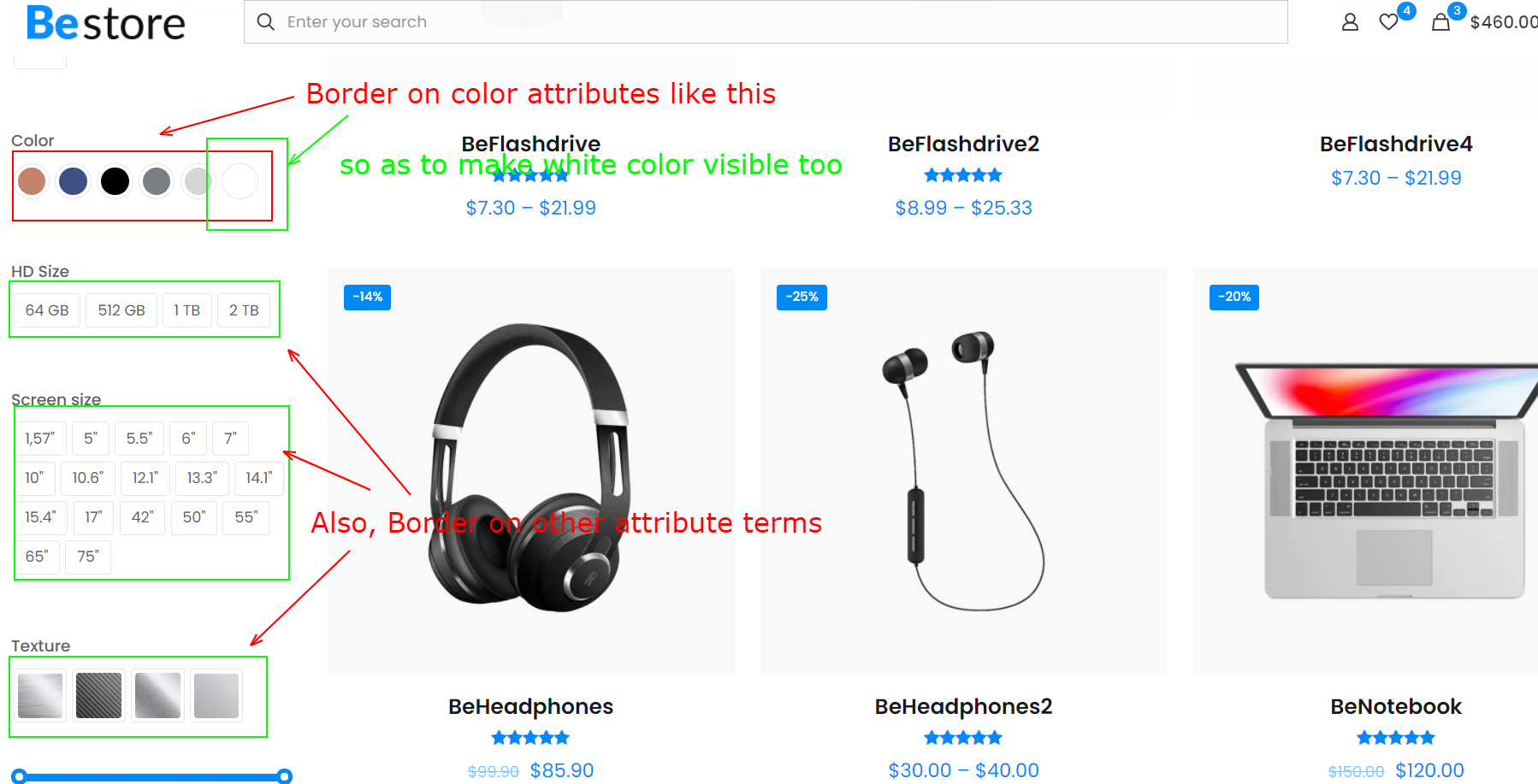
Attribute’s terms are not showing border around them. Due to which the White Colored attribute (and other light colors) is not visible at all. And terms don’t look separated-apart too.
https://bit.ly/3nWicg9It was earlier suggested by Author, that Attribute terms are having borders and white color will be visible too. (hence, below I asked them again)
https://themeforest.net/comments/27591151
However, those are not reflecting automatically, nor I could not find any such option too.How can we have borders for Attribute’s terms like below –
https://i2.paste.pics/F5YIX.png
Page URL for your kind reference – https://bit.ly/3xET4hgIf there is already an option, then where can I from Theme settings.
Regards
December 1, 2021 at 2:56 pm #336220
Luke NielsenMemberHello,
In order to highlight the white switch, please, try to add this custom CSS code in Theme Settings -> Custom CSS -> enter the code to the “Global Custom CSS” field.
.swatch-on-single[data-value="white"] {
  border: 1px solid #33333378;
}
Kind Regards
December 1, 2021 at 5:47 pm #336260
harshweParticipantHello Luke,
Thanks. I will try the CSS.
Just wanted to know, Author suggested earlier, that the border is there for swatches (or an option for attributes). Then, why we are needing a Custom CSS then, to show the Border.
https://i2.paste.pics/F6CX7.png
(or, was that was written by mistake, in error)As i asked earlier, can you please suggest, how can we have borders for All of the Attribute’s terms (that is Size, fabric..), Like below –
https://i2.paste.pics/F5YIX.png(so that it shows border Globally, to be visible at all locations. Wherever Attribute terms are displaying. That is, Product Grid on Shop and Category pages, On Single product page, On Sidebars, Widgets and others)
Can you please forward this to team, so that this can be implemented within the Theme, in next update. As this way, it would avoid extra and unwanted Custom CSS, and make it visibly Clean and better Appearance for Visitors.
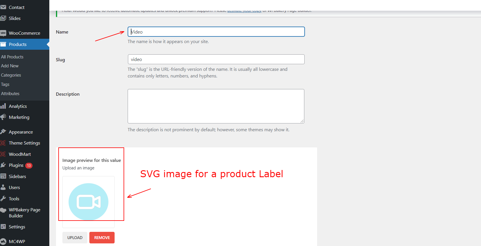
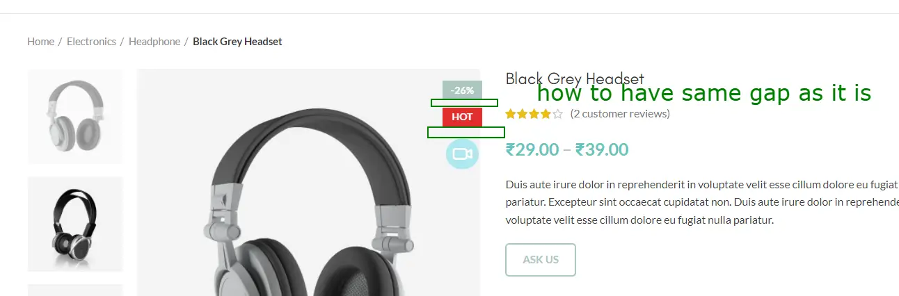
2. I uploaded the attribute term’s image for product label here – https://i2.paste.pics/F6DXW.png
This shows up centrally aligned with other labels like Hot, Sale (%).
However, the alignment begins to break in Mobile View and smaller devices.
Please see the Video – https://bit.ly/3rvKnonURL https://www.vasangini.com/product/black-grey-headset/
Even though the uploaded image is in SVG format. Should not the Term’s label image be also responsive like other Text labels, and shrinks in mobile view.
Even, if the image would not have been in the SVG format.Please suggest How to fix this
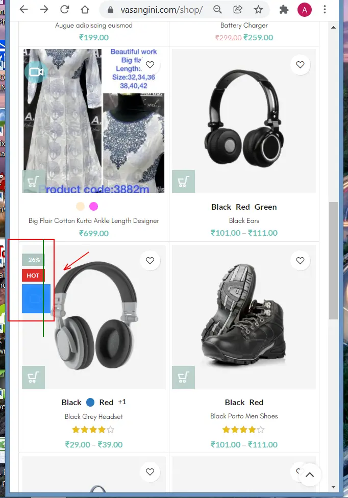
2.b. The same is happening in Product Grid (That is in Shop, Category pages, and other areas)
https://i2.paste.pics/F6E3N.png
URL – https://www.vasangini.com/shop/2.c. Also, there is some additional gap or margin in between attribute’s image and other Product labels. As can be seen from below screenshot.
https://i2.paste.pics/F6E58.png
URL https://www.vasangini.com/product/black-grey-headset/How can we fix these two also.
PS: I think this is pre-set or defined in backend.
Can you please take this as a suggestion and request the team to update the code so as to maintain the same Gap (for image labels also), as it is there in other Labels. I think extra Margin or padding is being added for image labels, if someone uses those.Regards
December 2, 2021 at 12:33 pm #336452
Luke NielsenMemberHello,
The black border appears on the white swatch when you set the color via HEX color code (
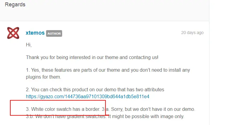
#ffffff) in your case, the color is set via RGB (RGB (255,255,255)). You can set the HEX color code for the white swatch for showing the border and remove custom CSS code that added a black border.Unfortunately, we don’t have such an option for adding borders for the swatches but I can prepare custom CSS code for that, just send me screenshots where you want to see it and I will prepare code.
I will contact them and pass on your proposal.
2, 2b. The text labels like Hot, Sale are not images so they are better responsive on a mobile device.
To be able to display the attribute term’s image correctly on a mobile device, try to add this custom CSS code to the “Custom CSS for mobile” area in Theme Settings -> Custom CSS.
.product-grid-item .product-labels .attribute-label,
.single-product-page .product-images .attribute-label {
    width: 40px;
}
2c. The indent from below for the product labels is equal, you can check it on the screenshot below.
It seems that there is a problem with the image that has a little indent from the top and bottom by default.
https://gyazo.com/0fd4d884ec2297ced3f97dfa61b521bd
In order to fix it, you should edit this image in the editor in which it was created or you can use this custom CSS code for the “Global Custom CSS” area.
.single-product-page .product-images .attribute-label {
    margin-top: -5px;
}
Kind Regards
December 2, 2021 at 8:15 pm #336557
harshweParticipantHello,
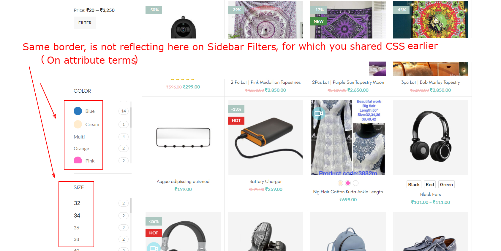
1. We want to show the Border for All of the Attribute terms like Color, size, fabric.. wherever the products are displaying. Whether it is Product Grid on Shop, Category pages, Single product page as well as Sidebar Filters, Widgets, or products using Woodmart Elements..
That is, also When filters (or terms) shows up on clicking Add to Cart for products having variations from Shop, Category pages.Will below code work to add Border for All Attribute terms, at once (irrespective of the above locations), or just on Single product page alone.
.swatch-on-single {
  border: 1px solid #33333378;
}
In either case, please share the correct code, as you suggested.
PS: We need to show the border around 2-3 pixels outside of the edge of the color terms, as it can be seen from below screenshot-
https://i2.paste.pics/F6UEX.png
URL – https://bit.ly/3xET4hgYes, please forward it to Team, so that they can implement it.
2, 2b. The text labels like Hot, Sale are not images so they are better responsive on a mobile device.
2. We already used SVG image, hence assuming it to be responsive too, the same way, text labels are. As this is one of the feature of SVG images. Should not it worked too.
2.b. Yes, this worked
Is this the code correct. Or do I need to use “.product-images” instead of .product-labels in the first line also. As below-
https://i2.paste.pics/F6ULI.png2.c. OK. Will surely test on Illustrator again, and if there is any indenting (extra space), then will remove it, for sure.
And try by re-uploading it.Is this below one the complete CSS-
In order to fix it, you can use this custom CSS code for the “Global Custom CSS” area.
.single-product-page .product-images .attribute-label {
margin-top: -5px;
}As, this is making No change in Product Grid area, but only works in Single product page.
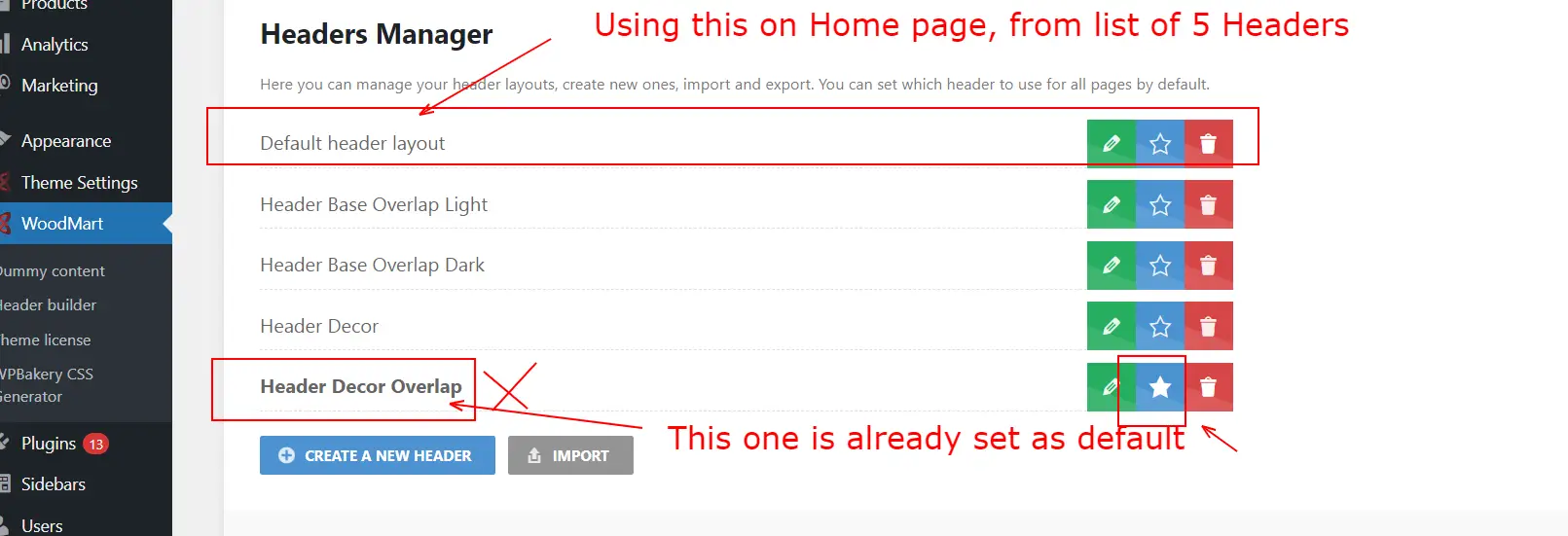
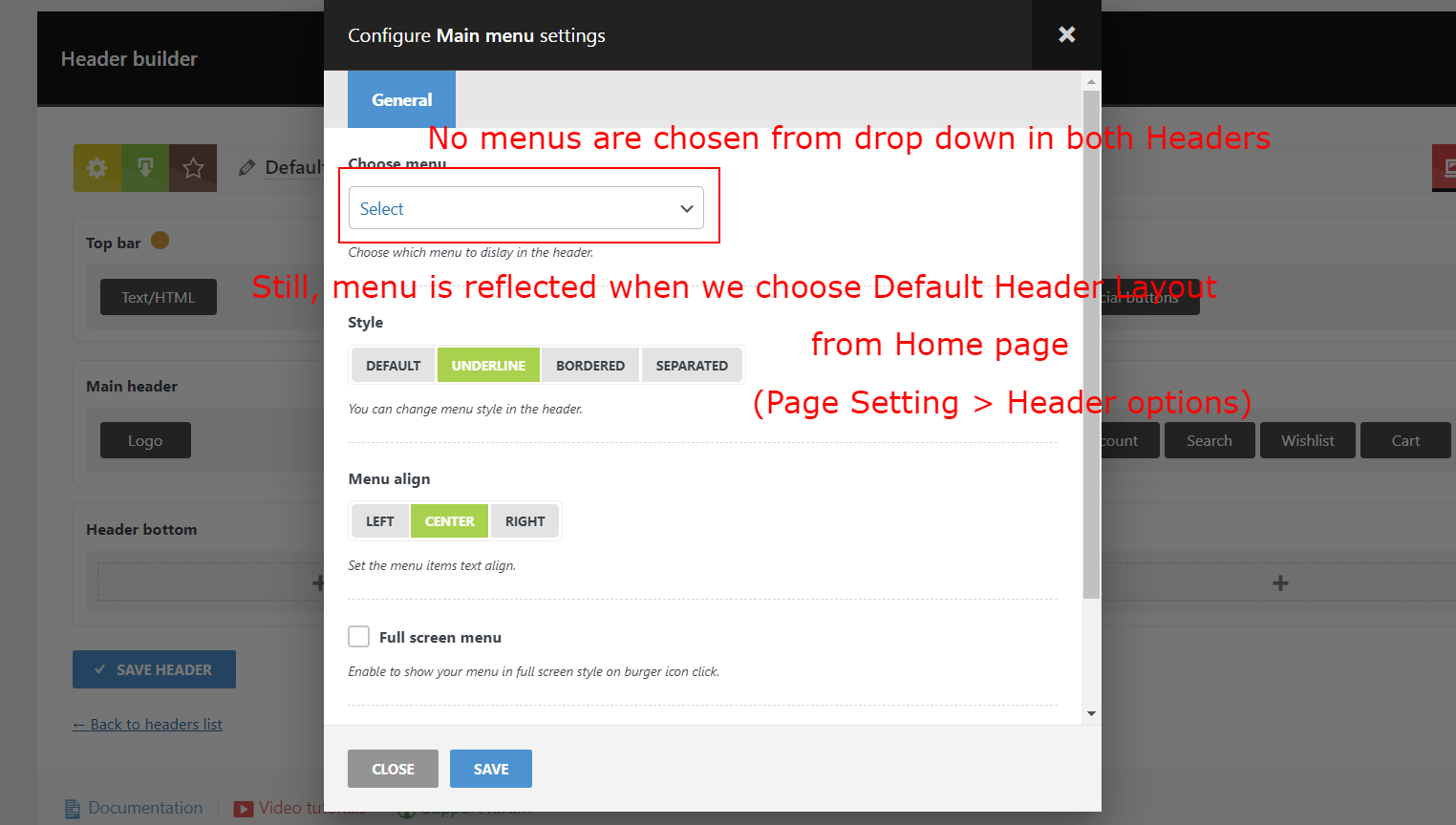
3. One Strange issue-To summarize: Currently, there are 5 headers that gets added automatically, during Import of Demo content (from Home Decor Demo), in the Header Builder area.
The one that is already marked as default is with the name – Header Decor Overlap – https://i2.paste.pics/F6V51.png
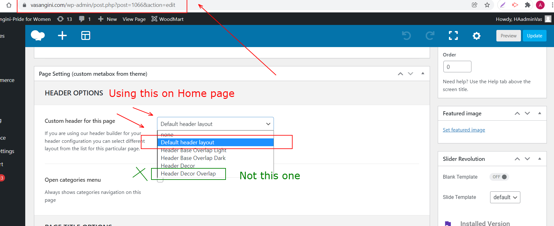
And the one, that we are using on the Home page itself is with name – Default header layout – https://i2.paste.pics/F6V3I.png
Please check below complete Video for both the issues (3a, 3b)
3.a. When we switch to the Header named – “Header Decor Overlap”, while editing Home page, then the Header gets Disappeared and Not visible on the Home page.
While it reappeared, when we again switch back to the previous Header named – “Default header layout” (Video will show)PS: Even though the Main Menus are Not selected in both the Headers. (However, other elements are added)
Now, Here comes up another issue, mentioned in 3.b below-
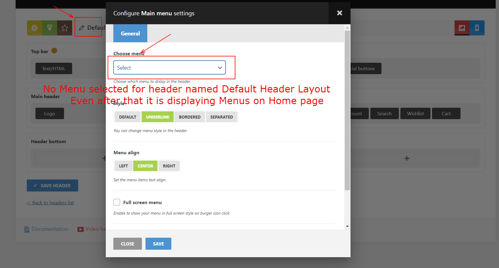
3.b. For Header named – “Default header layout” If there is No Main Menu selected from Header Builder settings – > Main Header -> Main Menu -> Settings -> Choose Menu
Then also, the Home page of site is displaying the Main menu. Please see below-
https://i2.paste.pics/F6V01.png
https://i2.paste.pics/F6V6P.png
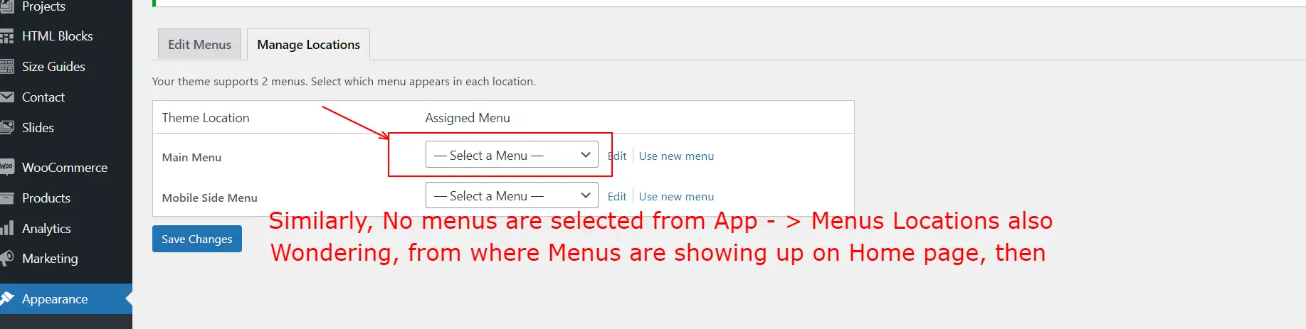
Just wondering how this is possible.Infact, No menus are currently selected under Appearance -> Menus -> Manage locations also.
Please see below-
https://i2.paste.pics/F6V0X.pngPoint is, then from where the Menus are getting populated from and reflecting on the Home page, as well.
Video for both point 3a, 3b – https://bit.ly/3IfwFfu
Regards
December 3, 2021 at 10:19 am #336661
Luke NielsenMemberHello,
1. In order to show the border on a white swatch without custom code, please navigate to Products -> Attributes -> Colors -> edit the “White” swatch and set the color via the HEX color code
#ffffff.https://www.loom.com/share/bd10a82f82fa43cca59b322b359fa835
Then the border will display without the custom CSS code that I added before.
Sorry for the inconvenience, but on the shop page, you will not see any changes with a white swatch because it’s a little bug in our theme. We will fix it in our next update.
In order to fix it now, and add for all product attributes border like there (https://themes.muffingroup.com/betheme-store/shop/), please add this custom CSS code to the “Global Custom CSS” area in Theme Settings -> Custom CSS.
.wd-swatch:after {
	display: none;
}

.wd-swatch.swatch-with-bg {
	border: 2px solid #FFF;
	box-shadow: 0 0 0 1px rgba(0,0,0,0.15);
}

.wd-swatch.swatch-with-bg.active-swatch {
	box-shadow: 0 0 0 1px #000;
}

.wd-swatch.swatch-with-bg:not(.active-swatch):hover {
	box-shadow: 0 0 0 1px rgba(0,0,0,0.4);
}

.wd-swatch:not(.swatch-with-bg) {
	border: 1px solid rgba(0,0,0,0.15);
	border-radius: 3px;
	padding: 4px;
}
.wd-swatch:not(.swatch-with-bg).active-swatch {
	border-color: #000;
}

.wd-swatch:not(.swatch-with-bg):not(.active-swatch):hover {
	border-color: rgba(0,0,0,0.4);
}
2b. This code is correct. The first line of code applies for the icon that is located on the shop page.
2c. I have reworked the code, now it will work on the product grid area too.
.product-grid-item .product-labels .attribute-label,
.single-product-page .product-images .attribute-label {
    margin-top: -5px;
}
3a. Your “Header Decor Overlap” header is not visible because it has in the settings the “Make it overlap” option that puts the header over the section and this header has the white color scheme so on the white background it will be not visible.
https://gyazo.com/4774da6b4a5068cbd96d17d7b4902339
https://gyazo.com/1221455017863716f067b38ef9367550
3b. The “Main navigation” menu is set by default even if there is no checkmark, you can select another menu and it will be replaced.Kind Regards
December 3, 2021 at 8:24 pm #336774
harshweParticipantHello Luke,
1.
please navigate to Products -> Attributes -> Colors -> edit the “White” swatch and set the color via the HEX color code #ffffff
Surprisingly, the Hex Value worked, and shows a Border. But just wondering, as this worked on White colored swatch, but when I try to add the Hex value for other colors, those did not shows up the Border. Any suggestions.
1. a). In either case, Your this Code worked perfectly 🙂
And displaying border (with some gap), for All attributer terms. This is what I was looking for.
Much thanksCan you please forward this to team, so that this can be implemented within the Theme, in upcoming update. Probably, as a Show – Hide option. So that those who do not want borders, can stay with current format. While those who want like this, can enable or Show it.
2.b. Really thanks for clarifying.
2.c. Yes, Glad to see the complete one. Thanks for revising it.3.a.
it has in the settings the “Make it overlap”
Yes, this was something I did not noticed and really driving me crazy. Most importantly, that happened due to color scheme of White BG.
Thanks for noticing and pointing it out in right direction.3.b.
The “Main navigation” menu is set by default
Yes, like a Hidden Gem. So, this is where it is coming from
Your screenshot helped. Thank you 🙂3.c. But still one thing is not cleared related to Main Menu.
There are 2 locations where we can Set or Define the Main Menu
First –
Header Builder -> Header type -> Main Menu settings -> Choose Menu
https://i2.paste.pics/F6V01.pngSecond –
Appearance – > Menus -> Manage locations
https://i2.paste.pics/F6V0X.pngPoint is, which one will take the precedence on which of the other one (if we Set or Define Main Menu only at one of the location, out of above two)
Or if we Define different Main Menus at above locations. Then what will happen.
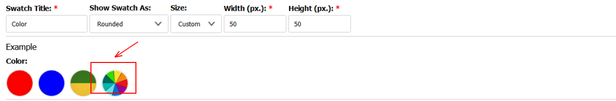
Which one will work.4.a. I can see that there is No option to show the “Colorful” swatch for Multicolor (for attribute name “Color” with its Term named “Multicolor”)
Is there a way to show that, within Theme itself
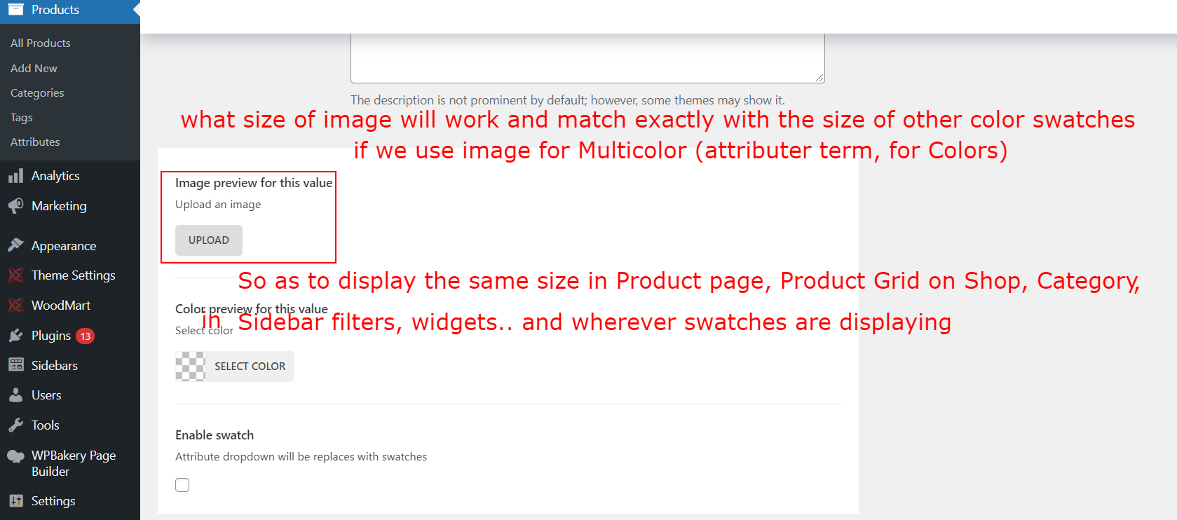
https://i2.paste.pics/F7E0C.png4.b. If we use Image (instead of color value, as shown below), for any attribute term, then what size is recommended. So that it matches the size with the size of other Color swatches
https://i2.paste.pics/F7D4O.png
We need to show something like below for Multicolor swatch.
https://i2.paste.pics/F7E0C.png (This also has got option to defines the size)That is, it will display the swatch in same size (with respect to Hex or RGB value swatches) for all the locations wherever swatches are displaying (On Single product page, Grid like Shop, Category pages, Sidebar filters, widgets, Woodmart elements..)
5. I cannot find these options while editing “Page Title options” on any individual page. The options that are available from Theme Settings -> Page title, as below –
What if we want to set different options (other than what we set from Theme settings -> Page title) for any specific Individual page.
Like Background size, Repeat, Position..Then how can one achieve that, through each specific page.
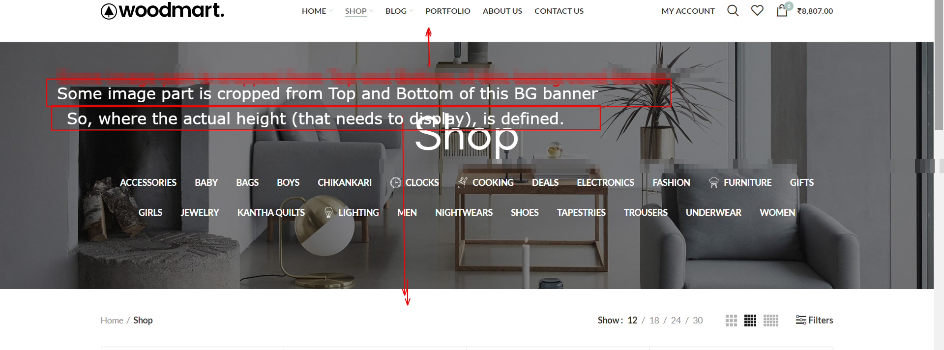
5.b. Where the display Height of the Page Title (when using background image) defined. I mean, currently, a banner of height 734 px is used (In Shop and other pages, as default) . However, it is Not showing In-Full, and some height is cropped (from Top and Bottom), when we view on Shop page (as below)
So where that height is defined, so that it is cropping extra height of the Background banner (from top and bottom).
https://i2.paste.pics/F7DT7.pngRegards
December 6, 2021 at 9:20 am #337120
Luke NielsenMemberHello,
1. It works only for the white color.
1a. I have forwarded your suggestion to the team. They will consider it.
3c. The main menu selected in the “Main menu” item from the header builder will have the highest priority so if you have defined both menus then the menu from the “Main menu” item will be displayed.
4a. Sorry, while we don’t have such an option for creating the “Multicolor” swatch. You have only one way to show the “Multicolor” swatch and it is using the “Image preview for this value” option in Products -> Attributes.
4b. You should use an image with equal proportions e.g 50×50 or 45×45 pixels.
5. In order to set different Page title’s options for any individual page, try to use our theme presets.
Here is the documentation providing more detailed instructions about Theme Settings presets:
https://xtemos.com/docs/woodmart/theme-settings-presets/
5b. The page title size you can define by means of the “Page title size” option in Theme Settings -> Page title.
Unfortunately, you can’t define the page title’s height in pixels because we don’t have such functionality.
Kind Regards
December 6, 2021 at 4:38 pm #337235
harshweParticipantHello Luke,
1.a.
The code you shared on your response post number here 336661 worked perfectly for all locations, except for below shown area –Hence, similarly, what additional code will show Border around Attribute terms that are displayed in Sidebar Filters on Shop and Category pages. The CSS that you shared earlier, is working in all other areas, except this below one –
https://i2.paste.pics/F7OSB.png
URL – https://www.vasangini.com/shop/3.c. Got it. Much thanks for clarifying.
4.b.
You should use an image with equal proportions e.g 50×50 or 45×45 pixels.
Can we use even a bit higher size dimension, and by similarly having equal ratio of height and width too, that is say, 100×100 or 150×150 px
Will it still reflect the same size, so as to match the size with other existing colored swatches in Single product page, Grid and other areas.5.
In order to set different Page title’s options for any individual page, try to use our theme presets
Although I will try, but this way it will be bit cumbersome, time-consuming and complicated too.
If these 3-4 options (shown below) could be provided in the Edit section of each Single Product page.
https://paste.pics/edit/F7DNQThere is another downside, say, if we have already created Pre-set rules for Title of few of the pages. Then when we start creating 10-15 New pages, we again have to switch to this area (from Theme settings), and then again have to Set (or Add) rules for these Newly created pages, in order to define the rules just for various available options for Title of the pages.
Rather that that, if such options could have been additionally be provided on Edit of each Single product page, then it would avoid such hassles. And we can have more control on one area alone. Rather than going through 2 or multiple areas, for such options.
I hope, I am able to explain the necessity and reason behind the request for this.
5.b.
The page title size you can define by means of the “Page title size” option in Theme Settings -> Page title -https://prnt.sc/21z8av9
Yes, I have seen that option. But does that mean, that the cropping that is occurring for the below banner, that is already 734px high, is due to the option choosen as “Small”
https://i2.paste.pics/F7DT7.png
Say, if we use a banner with the height 1050px, then also, it will crop exactly in the same height (just like it cropped for existing banner’s height), when we use “Small” option.5.c. Can you please suggest – the Title banner is being constrained upto what actual height, each separately for “Small”, Large and Default respectively.
Regards
December 8, 2021 at 3:14 pm #337817
Luke NielsenMemberHello,
1. Please, first of all, activate the “Enable swatch” option in Products -> Attributes.
Then you should add this custom CSS code to the “Global Custom CSS” area in Theme Settings -> Custom CSS.
.wc-layered-nav-term.with-swatch-color .filter-swatch {
	border: 2px solid #FFF;
	box-shadow: 0 0 0 1px rgba(0,0,0,0.15);
	border-radius: 50%;
	margin-left: 1px;
}

.wc-layered-nav-term.with-swatch-text .layer-term-name {
	border: 1px solid rgba(0,0,0,0.15);
	border-radius: 3px;
	padding: 4px;
}
If you activate this custom and for some attributes, it doesn’t apply (https://prnt.sc/22bfsa9) then you need to check whether you have the “Enable swatch” option enabled specifically for this attribute.
4b. Yes, the color swatches will reflect the same size.
5. The actual height is defined by the height of the page title.
Kind Regards
December 8, 2021 at 8:09 pm #337877
harshweParticipantHello Luke,
1. Yes, this worked. Thank you 🙂
If you activate this custom and for some attributes, it doesn’t apply..
Yes, I will “Enable Swatch” for attributes.
5. A request, if atleast the team can think on this –
..this way it will be bit cumbersome, time-consuming and complicated too.
If these 3-4 options (shown below) could be provided in the Edit section of each Single Product page, then it would avoid such hassles.
https://paste.pics/edit/F7DNQ
And we can have more control on one area alone. Rather than going through 2 or multiple areas, for such options.6. How to show different Background color behind the Category names, each separately for different category name.
Just like the BG color is showing up on for Labels. Say Red colored BG for HOT label.
Please refer below image-
https://i2.paste.pics/F8JLY.pngPlease suggest how can we do that.
7. I want to Set Transparency for Header Background color, only while it is showing during Sticky position (and Not during Fixed position, when it is very top of the page)
So that, if visitor scrolls down (whereby we had already enabled the Sticky header – Always ON, during scroll down also), then, the content of page (behind header bar) can be partly visible from behind the background color (due to having transparency)
PS: We tried below one, and do not want this. As this did not resolve our purpose completely.
https://i2.paste.pics/F8JTI.png
This also makes it transparent even when it is at very top. (fixed).Please suggest how to achieve that.
Regards
-
This reply was modified 4 years, 7 months ago by
harshwe.
December 10, 2021 at 2:02 pm #338544
Luke NielsenMemberHello,
5a. I have forwarded your suggestion to the team. They will consider it.
6. Sorry, but we don’t have such functionality for showing different background colors for the page title items. But you can change the color scheme by means of the “Text color for title” option which is situated in Dashboard -> Pages -> Shop page -> find the “Page Title Options” section.
7. You can set color only for the sticky header by means of the custom CSS code. Enter the code in the “Global Custom CSS” area.
.whb-sticked .whb-row {
    background-color: rgba(0, 0, 0, 0.5);
}
Kind Regards
December 10, 2021 at 5:15 pm #338587
harshweParticipantHello Luke,
I think you might have misunderstood my query. Can you please read it again-
6. How to show Background color behind each of the Category names. Each separately for different category name. (BG color, Just behind the category names itself)
Just like the BG color is showing up on for Labels. Say Red colored BG for HOT label.
Please refer below image-
https://i2.paste.pics/F8JLY.pngPlease suggest how can we do that.
7. Yes, the CSS worked. Thank you 🙂
8. A kind request and a suggestion –
Can the colors and font size of this support forum (Globally) be improved, a bit.
Currently, I found that Grey color font is being used and that is showing even on the Greyish BG color (for Team response), and Off-white BG (our response). Hence, lacking contrast and visibility.
And the font size is smaller. Due to which it becomes very hard to read our own message and reading other’s for solutions.
Specially on mobile or small screen devices, this is becoming almost impossible to read.You can see here, what I want to refer with my point-
https://bit.ly/3dEVpj3Here, they are using Pure White Background with complete Black colored text and comparatively bigger font size.
(And infact, very light-blue BG, thereon, for follow-up replies or from Support member). That way, it is way much easier to read it. Even in mobiles.I think there might be options, to make such adjustments and update these small things.
This will be helpful for all others visitors as well as customers of Woodmart.Regards
December 13, 2021 at 12:21 pm #339127
Luke NielsenMemberHello,
6. Unfortunately, we can’t change the background color for each of the category names because we don’t have such an option.
8. We are currently developing an updated version of the support forum. We will consider your suggestions.
Kind Regards
-
This reply was modified 4 years, 6 months ago by Luke Nielsen.
December 13, 2021 at 4:20 pm #339201
harshweParticipantHello Luke,
6. I managed to find one Custom CSS (as below in Private Content) to show BG color block behind each Category name in Title of Shop page.
Is this the correct code, or do I need some refinement here, in the Class or code.
b. I now only want to have Different BG color for each Category name. Can we now adjust or modify that shared Custom CSS or have additional CSS to achieve just that.
Say, By mentioning Category ID, name or some other way.8. Thank you 🙂
Will look forward for a favorable change, with new ones to come.Regards
-
This reply was modified 4 years, 6 months ago by
December 14, 2021 at 10:04 am #339367
Luke NielsenMemberHello,
6. This code is only suitable if you want to change the background for all items.
6b. If you want to set the background of each category separately then you need to use the ID of the category.
The code below adds the border radius and padding for all items.
.wd-nav-product-cat .nav-link-text {
  padding: 5px 7px !important;
  border-radius: 4px;
}
This code uses the ID of each category to provide a background color for each category separately.
.wd-nav-product-cat .cat-item-43 .nav-link-text {
     background-color: #fff;
     color: #333;
}

.wd-nav-product-cat .cat-item-44 .nav-link-text {
     background-color: red;
}

.wd-nav-product-cat .cat-item-156 .nav-link-text {
     background-color: yellow;
     color: #333;
}
You can change only the ID of the category after the
.cat-item-and set your color.https://gyazo.com/4b46c0837263747179f4c3c6cb605ca3
Kind Regards
-
This reply was modified 4 years, 6 months ago by Luke Nielsen.
-
This reply was modified 4 years, 6 months ago by Luke Nielsen.
December 14, 2021 at 5:53 pm #339518
harshweParticipantHello,
6. Yes, that is why I asked for one you shared in 6.b
6.b. That worked. Much thanks !!7. You suggested earlier, as below –
You can set color only for the sticky header by means of the custom CSS code. Enter the code in the “Global Custom CSS” area.
.whb-sticked .whb-row {
    background-color: rgba(0, 0, 0, 0.5);
}
This worked on the header, but affecting all other headers also, which have some other color scheme and layout. And hence, those are not visible properly. Please refer here- https://paste.pics/edit/FC1QM
Hence, How can I have this CSS (transparency for Sticky header), to be applied, as to header-specific only. I want it to be applied only for the Header named as “Default Header Layout”, as shown below-
https://i2.paste.pics/FC1RI.pngThe reason behind–
Because, we are using another Header on few other pages, as Header Overlap, and whose color scheme is set to light (with Dark BG automatically, in sticky position), and with this above CSS, it makes the light BG for that header also. Making that Non-readable, almost invisible.You can find here on the Checkout page – https://paste.pics/edit/FC1QM
https://www.vasangini.com/checkout/Regards
-
This reply was modified 4 years, 6 months ago by
December 16, 2021 at 8:55 am #339919
Luke NielsenMemberHello,
Please, try to use this custom CSS for changing the color where the visibility of the header is poor.
.whb-sticked  .whb-row.whb-color-light {
   background-color: #33333387;
}
Kind Regards
December 16, 2021 at 5:04 pm #340035
harshweParticipantHello Luke,
7. Yes, this worked. Thank you 🙂
9. How to show swatches (color) in square shape, just like it is displaying for Size. As with round shape, it gets cuts from all 4 corners, and hence, showing smaller comparatively.
9.a. How to show slightly bigger swatch icons in shop page (showing below product image)
https://i2.paste.pics/FCWEK.png9.b. I used below CSS to make the BG color of Quick icons, bit transparent for Wishlist, Quick View, Compare. So that product image be partly visible from behind these icons. And not obstruct it completely.
.wd-buttons.wd-pos-r-t {
background-color: rgba(255, 255, 255, 0.6);
}
Is this the correct one. Will it work everywhere, wherever product grid is showing with these icons, on top on.
10. Quick View is not showing up the “Below or After Cart” html code or data. How to make it appear, in Quick View also.
10.b. Quick view is not showing up Video icon, on Main image (for a product having video). Just like it is showing up Single product page. How to enable the video icon on Main image, in Quick View.10.c. In mobile, the Quick view icon itself, is not showing up at all, for this Demo. How to make this enable, for this demo and product style itself.
Regards
December 21, 2021 at 12:51 pm #340943
Luke NielsenMemberHello,
9. Here is a code for changing the swatch’s shape.
.wd-swatch.swatch-with-bg {
	border-radius: 0;
}
9a. To be able to show slightly bigger swatch icons, try to add this code to the “Global Custom CSS” field in Theme Settings -> Custom CSS.
.product-grid-item .swatch-on-grid.swatch-with-bg {
    width: 18px;
    height: 18px;
}
9b. This code will be better.
.product-grid-item .wd-buttons.wd-pos-r-t {
    background-color: rgba(255, 255, 255, 0.6);
}
10, 10b. I’m very sorry but at the moment we don’t have any custom code for that.
10c. Please, enter this code to the “Custom CSS for mobile” area for displaying the “Quick view” icon.
.product-grid-item  .wd-buttons .wd-quick-view-icon {
    display: inline-flex;
}
Kind Regards
December 21, 2021 at 4:43 pm #341023
harshweParticipantHello Luke,
9.
Here is a code for changing the swatch’s shape.
Yes, this worked. Now this really looks much visible and better.
However, this worked only on the Shop Grid area. But not on Sidebars Widgets and Filters area.
9a.
To be able to show slightly bigger swatch icons.
Yes, this worked and makes it even more visible and better. Thank you 🙂
9b.
This code will be better…
Thank you for looking into it and sharing the Refine code. Will use this instead.
10, 10b.
I’m very sorry but at the moment we don’t have any custom code for that.
Can you please forward the request to team. Atleast for 10.b) So that visitors come to know about that, and we can retain their engagement for such products. Thereby, may result in conversion of Sales.
Until then, atleast, if there could be some way, for below-
10.b. How to enable the video icon on Main image, in Quick View box, just like it is showing up on Single product page.10.c.
Please, enter this code to the “Custom CSS for mobile” area for displaying the “Quick view” icon.
Unfortunately, this is not working. I tried by clearing Cache too. Above ones(from point 9), worked, but this is not showing any icon of Quick View. Neither in mobile view nor in mobile device itself.
PS: I had kept CSS enabled, please try to replicate at your end.1.a. Earlier, you suggested CSS to display border around swatch and text terms of Attributes in one of your response 337817.
That works for color value swatches. However, that does not apply, if we use Image for any term, as can be seen here-
https://i2.paste.pics/FESLP.png
To enable border, the same way, should I use below code. Or some other one-.wc-layered-nav-term.with-swatch-image .filter-swatch { border: 2px solid #FFF; box-shadow: 0 0 0 1px rgba(0,0,0,0.15); border-radius: 50%; margin-left: 1px; }If some other refine code, then please suggest.
1.b. Currently, the custom image (say for Multi color) that I am using for attribute terms,
looks slightly smaller as compared to other Colored Value terms of the same Attribute. [In Sidebar filters, widgets]. And, as can be seem from same above screenshot, in 1.a)I am using 50x50px custom image for attribute term as swatch
Does that mean, I need to prepare a bigger one, say about 64×64 px size. Or the bigger size can be achieved using custom CSS only. If so, can you please suggest the one.
Also, wanted to know, what px size is currently set for the color values, showing for “Color” Attribute terms.11. There is a glitch–
We changed the Primary color of site (from Styles and colors) . It reflects most of the places, but not reflecting at one place, where also, it actually intends to work and should reflect too.Currently, Pink (set as Primary) color reflects on “Add to Cart” (or Select options) button in Shop Grid.
However, when we click “Select options” button for Variable product (on Shop page), it then shows some other color (I thin, the one which was originally set as Primary color for Demo – Decor).
Means, this area is Not updating, when we change the Primary color. And this should work to maintain Uniformity too. Otherwise, it looks very ODD. Please see here-
https://bit.ly/3FjDJpqCurrently, we had set it to Pinkish tone, but moment someone clicks on “Select option” (for variable product), it then shows, Blueish-Green colored button for “Add to Cart” on same product. Thereby Not consistent and is kind of an Odd looking.
So, two things-
11.a. Please ask the team to update the code for Primary color, in order to maintain Uniformity across. Atleast in same relevant areas.
11.b. Until then, please suggest, how to resolve this, as of now.
Do we need to achieve using custom CSS or some other way from Theme settings.PS: We cannot use the Buttons > Shop button Color option, as this will then change the colors even for the Checkout buttons on Mini-Cart, on Main Cart page, and Place Order button on checkout page. Which ofcourse, we do not want. And want them to have separate colors.
And these areas (Checkout buttons) are not relevant to the Buttons on the Shop Grid page (Add to Cart).
But the buttons that are showing on the Shop Grid itself, for “Select options” and then for “Add to Cart” for variable product are relevant to each other. And should maintain consistency across.Regards
-
This reply was modified 4 years, 6 months ago by
December 24, 2021 at 10:18 am #341715
Luke NielsenMemberHello,
10, 10b, 11. Okay, I will forward your suggestions to the team.
10c. Please, add custom code to the “Custom CSS for mobile” and “Custom CSS for tablet” fields and then check it.
I have tested a custom code on my demo and it works well (see below video).
https://monosnap.com/file/gSChRhUixhKNkUS7GtRvEbK5oasHJq
1a. Please, replace the early suggested custom CSS (https://prnt.sc/24b74tu, https://prnt.sc/24b720j) on this:
.wc-layered-nav-term.with-swatch-color .filter-swatch,
.wc-layered-nav-term.with-swatch-image .filter-swatch {
	border: 2px solid #FFF;
	box-shadow: 0 0 0 1px rgba(0,0,0,0.15);
	margin-left: 1px;
}
9. Here is a code for changing the swatch’s shape on the Sidebars Widgets and Filters area.
.woodmart-woocommerce-layered-nav .filter-swatch>span, .woodmart-woocommerce-layered-nav .filter-swatch>span:after { border-radius: 0; }1b. Try to upload a bigger image. As for the color attributes there shows a colored background with the square 25×25.
11. When you click “Select options” button for Variable products (on the Shop page), it then shows a button from the single product page. To be able to change color there, please try to use the below custom CSS code.
.single_add_to_cart_button {
    background-color: blue;
}

.single_add_to_cart_button:hover {
    background-color: red;
}
https://monosnap.com/file/79BdXvmIcmI8IVm04oKpSL7YB2udrZ
Kind Regards
-
This reply was modified 4 years, 6 months ago by Luke Nielsen.
December 24, 2021 at 4:12 pm #341805
harshweParticipantHello Luke,
10, 10b, 11. OK, thank you. Wish, team will surely take these into consideration.
10c. Right. I did the mistaken. I now replaced with correct location, and then It worked.
Thanks you.1.a. Yes, this now worked. Thanks for sharing Refine code (2-in-1). However, you might have missed Border-Radius, due to which it shows square border for Round swatches.
https://i2.paste.pics/FG4S6.png
So, I added this border-radius: 50%; again and it then worked, like previously (for Round shaped swatches)
https://i2.paste.pics/FG4YM.png1.b.
Try to upload a bigger image. As for the color attributes there shows a colored background with the square 25×25.
I found that I have already uploaded 100×100 sized image for swatches (sorry, not 50×50, as I wrote earlier). And this is still bigger than 25×25 BG color, as you suggested.
So, what could be the reason, that image-swatch is displaying slightly smaller than color-swatch, at frontend.PS: I checked at backend, Products > Attributes > configure terms, and found that, there the size is displaying in exactly same for color-swatch as well as image-swatch. It is only at frontend, that changes somewhat.
Can you please try to replicate at your end too. How can we resolve this.9. Thanks for sharing. I will replace it.
11.
When you click “Select options” button for Variable products (on the Shop page), it then shows a button from the single product page.
Yes, this is what I was referring. The button color is partially getting reflected and updated from Styles Colors > Buttons > Shop buttons options. Which ofcourse, we do not want.
As we have already set that for Single product page, Checkout buttons..And On the Shop page (buttons on Product Grid), are coming from Primary color option.
The buttons that are showing on the Shop Grid itself, for “Select options” and then for “Add to Cart” for variable product are relevant to each other. And should maintain consistency across. And Partial colors of buttons should not get updated from within these areas (Single product page, Checkout buttons..)
Also, when we have updated the Primary Color of Site (shop, from Settings), then the color of Add to Cart as well as Select options button (initial position) gets reflected (for both Simple and Variable products) on Shop and archive pages.
So in order to maintain uniformity, the further Add to Cart button should also reflect the same color and in same way in the Shop and Archive pages. And should show the same color, that was set from Primary Color option. Isn’t it.
11.b. Hence, I may not be able to use below CSS, as this will also change the button color on Single Product page as well.
.single_add_to_cart_button {
    background-color: blue;
}

.single_add_to_cart_button:hover {
    background-color: red;
}
So, can you please provide the CSS, just to change the color of buttons on Shop and Archive pages on Product Grid. (so as not to change the colors for buttons on Single product page)
So as to match with the color, that we set as Primary Color from Theme Settings > Style and Colors > Primary color.
11.a. Please ask the team to update the code for Primary color, in order to maintain Uniformity across. Atleast in same relevant areas. So that button color for Variable products, also reflects same color as it is showing for Simple products, for product grids on the Shop and Archive pages.
2 Different colors, exactly on Same-Area, same-purpose, does not looks good at all.In short, this is the Only ODD-One out. Please check below-
https://i2.paste.pics/FG5OW.png10.c.
I have tested a custom code on my demo and it works well (see below video).
https://monosnap.com/file/gSChRhUixhKNkUS7GtRvEbK5oasHJqThank you for taking this to another level. And by showing it for Tablet also, in the video.
Much appreciableRegards
-
This reply was modified 4 years, 6 months ago by
December 27, 2021 at 1:27 pm #342129
Luke NielsenMemberHello,
1a. I didn’t add a border radius because you wrote that you want swatches with square shapes so the code from points 1a and 9 are made for making swatches with square shapes in the sidebar.
https://gyazo.com/9ebaf69f94fa1afd1fa8cad0dfaf9c3b
https://gyazo.com/220f8a998105da05e258d60562b6c960
1b. The image swatches have a little border so they may look smaller. Please, try to activate this code and look at the image swatches.
.woodmart-woocommerce-layered-nav .filter-swatch>span[style^="background-image"] {
    border: none;
}
11. The following code makes the “Add to cart” buttons on variable products with primary color.
.product-grid-item .single_add_to_cart_button {
    background-color: var(--wd-primary-color);
}
Our team will surely take all your suggestions into consideration.
Kind Regards
December 27, 2021 at 8:36 pm #342206
harshweParticipantHello Luke,
1.a. Yes, you are right. I earlier expected, that this could be the reason.
1.b. This is amazing. This really worked, and make the image-swatches of similar size to that of color-swatches. And looks really much better now.
Glad, you identified the cause. Much thanks 🙂11. This worked too. And glad to find that you shared CSS keeping for “Primary color” itself as, “
var(--wd-primary-color);"
As, that way, whenever I change the Primary color in future also, this CSS will retain the color of Add to Cart button with chosen Primary color, and will match with it too.Just wanted to know–
11. If we use “Export” button from Theme settings, then will it Export only the Settings (from General Tab to all the way down to Others tab). Or else, it will also Export the settings for-
a. Existing “Pre-Set Filters” with their defined Rules
b. Custom CSS
c. Custom JS
d. All Selectors and their Values from existing Custom Selectors (under Adv Typography)12. What this option is all about in Theme Settings > Other > Viewport tag > Scalable
Does that mean, user will be able to Pinch-Zoom In and Zoom Out on Mobile devices and even on Touch sensitive Laptops too..
Does that mean, this much only, or some thing more.Or it means, completely something else.
Regards
-
This reply was modified 4 years, 6 months ago by
December 28, 2021 at 12:58 pm #342330
Luke NielsenMemberHello,
You are welcome!
11. It exports all settings from Theme Settings except theme presets (https://prnt.sc/24y60v5).
12. Yes, you are right, it means, that the user will be able to Pinch-Zoom In and Zoom Out on Mobile devices.
Kind Regards
December 28, 2021 at 10:57 pm #342424
harshweParticipantHello,
11. OK. But would appreciate, if the option Pre-sets or their settings could also be Exported out. As this is the one that takes some reasonable time to create and define with Rules or Conditions. If anyone set with multiple conditions and for multiple pages, terms or taxanomies.
And that would be a huge loss, if those cannot be recovered or Imported back, anyhow.This option Pre-Set feature alone is pretty much time consuming and can sometimes become bit complicated too.
11.a. I found that when I first installed Woodmart theme, there were already few Default Option Pre-Sets available in Theme settings. Are those one already created by Woodmart team.
Are those provided just for get some idea, on how they works.11.b. I did not find any of the Default Option Pre-Set, with any custom defined Rule or condition, so far. It seems All of those are actually Empty ones. Just created and left empty, as it is, for the purpose on how they works. Is it so.
11.c. And what if someone Deletes any Option Pre-Set by mistake. Is there any way to recover those.
12. Thanks for clarifying.
Regards
December 29, 2021 at 2:51 pm #342581
Luke NielsenMemberHello,
11. Team will surely take these into consideration.
11c. In this case, it can’t be recovered.
11a. Also, you can read our detailed documentation about presets.
https://xtemos.com/docs/woodmart/theme-settings-presets/
If you have any questions please feel free to contact us.
Kind Regards
-
This reply was modified 4 years, 6 months ago by Luke Nielsen.
-
This reply was modified 4 years, 6 months ago by Luke Nielsen.
-
This reply was modified 4 years, 7 months ago by
-
AuthorPosts
Tagged: attribute terms borders, border around attributes, header disappears, Menus not chosen still showing, No border in filter attributes, where to enable border for filter attributes
- You must be logged in to create new topics. Login / Register