Categorie menu on product page: mobile
-
Hello, I have a problem viewing the category menu on the mobile.
Within a product category menu is very wide, does not enter the mobile screen
In the shop page the category menu it looks good.
I touched a little code to correct it and I was able to correct in the shop page but in product page it looks very wide.
@media (max-width: 480px) {

.basel-product-categories {
	width:250px!important;
	}
.title-shop.title-design-centered .basel-back-btn+h1+.basel-show-categories+.basel-product-categories {
    padding-left: 0px;
    padding-right: 0px;
    width: 250px!important;
}

.title-shop .nav-shop {
     padding-left: 0px;
    padding-right: 0px;
	width: 250px!important;

}
ul.basel-product-categories {
	 padding-left: 0px;
    padding-right: 0px;
	width:250px!important;
	}

.basel-product-categories .categories-opened{
	 padding-left: 0px;
    padding-right: 0px;
	width:250px!important;
	}
}
In this url it looks fine (mobile):
http://www.kitkasa.com/tienda/
In this product page not (mobile):
http://www.kitkasa.com/producto-categoria/publicidad-eventos/#


Thanks!
Hello,
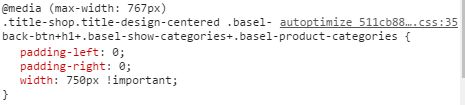
We just investigated your website and see that the menu is so wide on this page because of this code snippet. Try to remove it
Regards
Hello,
Thank you so much I removed this code.
But I have the same problem in iPad and tablet portrait, in tablet portrait when I click in categories the page reduce the size to to adapt the menu


Can you help me with this, please?
Thank you so much!
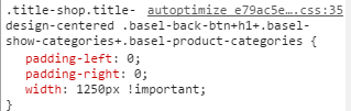
Here is an another code snippet that breaks your menu on iPad. Try to remove it also. Probably, you need to remove all your custom CSS and add it step by step to see is it working correctly or not.
Regards
Hello,
You have reason I removed !important from width, make some changes on media query code and now works fine.
Thanks!
 .
.