Home / Forums / WoodMart support forum / Regarding responsive Horizontally Table content in Mobile view
Home › Forums › WoodMart support forum › Regarding responsive Horizontally Table content in Mobile view
Regarding responsive Horizontally Table content in Mobile view
- This topic has 15 replies, 4 voices, and was last updated 4 months ago by
 Artem Temos.
-
AuthorPosts
-
March 19, 2026 at 7:01 pm #713400
weeglypvtltdParticipantRespected,
I was try both Table widget which are available in Gutenberg Plugin.
I am adding my particular product page link in private section please look.
I want like this which you show in your website demo: https://woodmart.xtemos.com/table/
[Particular mobile responsive size or more lower then that. ]
I want to make my table content Horizontally scroll.
Please give me all possible solution with step by step guide. If any video available then please send me a link.Waiting for your response.
March 20, 2026 at 5:26 pm #713518Hello,
Please use the custom table gutenberg widget in the product page and set the style and other table settings accordingly.
Add the table in the single prodcut page layout:
https://xtemos.com/docs-topic/single-product-page-builder/Then if you are not able to set the table responsive, please share your Site WP-ADMIN Login details in the Private Content field so that we can check this concern on your Site and help you out accordingly.
Best Regards
March 20, 2026 at 5:29 pm #713520
weeglypvtltdParticipantI will already share my product page url in previous message. Where I was use both table. Please look once and check brother. How could you reply without check my URL!
March 20, 2026 at 5:31 pm #713522Hello,
I have checked the URL but I need your site logins to check the issue.
Best Regards.
March 20, 2026 at 5:42 pm #713523
weeglypvtltdParticipantHere is my details. Please check as soon as possible.
After that please write all process step by step. So, I will understand easily.
Waiting for your response.March 22, 2026 at 10:43 am #713614Hello,
You are using the standard Gutenberg table, but need to use our theme’s custom table instead. Check the following screenshot
Kind Regards
March 22, 2026 at 11:51 am #713619
weeglypvtltdParticipantI kindly request to you please read my all message before sending message and lose time for both of us.
I was use both table, Please check my same page again and look.
Same problem in both table. I was already use theme’s custom table as well, but same issue.
Please give me solution as soon as possible.
Look at my screenshot as well.
You already have my access. So, You can check directly as well.Attachments:
You must be logged in to view attached files.March 22, 2026 at 11:58 am #713622Hello,
Sorry, I didn’t notice that you are using our theme’s table already. As we can see, it works correctly. And if you add more columns to the table, you will see the horizontal scroll as on our demo.
Kind Regards
March 22, 2026 at 12:17 pm #713629
weeglypvtltdParticipantNo, It’s not working in mobile view.
Please look screenshot.
Please send me little video or screenshot where you check and working properly.
Waiting for your response.Attachments:
You must be logged in to view attached files.March 22, 2026 at 4:38 pm #713636Hello,
Could you please clarify what exactly is wrong in your screenshot? You have all three columns visible. If there were more columns (5-7), you would see the horizontal scroll.
Kind Regards
March 22, 2026 at 5:04 pm #713647
weeglypvtltdParticipantLook at this screenshot, I have assign as red mark: Those words are single word
Like: Parametro, REC-150H, Personalizzazione etc. many other words as well.If those important long words are break in responsive style that’s not easy to customer read and understand. Specially when you sell some high price value product with very hard to understand technology of my particular products.
Please give me some easy solution.
Waiting for your reply.
Attachments:
You must be logged in to view attached files.March 23, 2026 at 11:20 am #713715Hello,
Words in the table are breaking because the
word-break: break-wordproperty is applied to them:
https://monosnap.ai/file/MP9XmOyK4aj2XYYvSTjIuBVpUACAEJThis property is applied to the table for two different reasons:
1. The
Fixed width table cellsoption is enabled in the table, which appliesbreak-wordto the table text:
https://monosnap.ai/file/R7h5t9taGYml76C0QlSbasXatAAlyZ2. Both of the tables is placed inside a
Columnelement, which appliesbreak-wordto all of its content:
https://monosnap.ai/file/oaiRw8fyF89cx7iu1vSuPxJvjiq7QmTo resolve this issue, make sure both of the following conditions are met when displaying the table on the page:
The
Fixed width table cellsoption is disabled
The table is not placed inside aColumnblock or any other wrapper block that applies thebreak-wordpropertyKind Regards
March 23, 2026 at 1:05 pm #713734
weeglypvtltdParticipantI was try everything as per your suggestion but still didn’t work.
Please check once again because I cant find break-word option in my column setting.
Please check again .March 23, 2026 at 4:46 pm #713773As we mentioned in our previous response, to prevent words from breaking in your table, you need to take two steps:
- Go to the table settings and disable the Fixed width table cells option.
- Place the table block so that it is not inside a Column block. This includes the product description and the product layout.
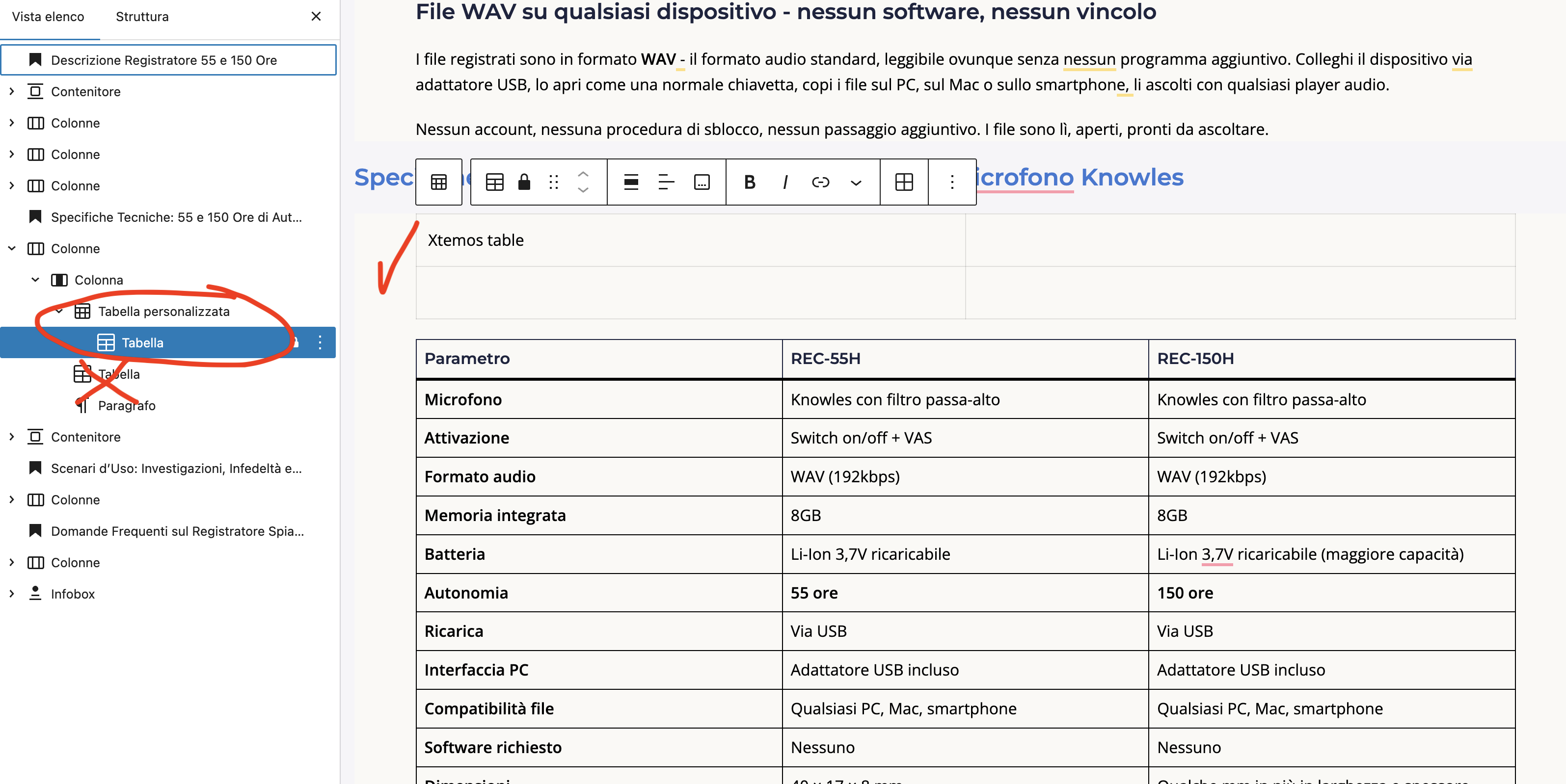
We checked your product description and layout settings but did not see the requested changes. The option in the table remains enabled (https://monosnap.ai/file/FVtfw0Y2RYuvnOep22MOxUcVCtDTz7), and the table itself is still located within one of the Column blocks (https://monosnap.ai/file/AfSS8hIYRfTjjB31yGg0FgloXWeUm9). Additionally, the entire product description section at the layout level is placed inside a columns block (https://monosnap.ai/file/hISQlfsVHTAgluRa2jZgxIzFfRh06I).
It is important to note that the column block does not have a specific
word-breaksetting you can toggle; these properties are simply present in its styles as part of the standard WordPress CSS. Without the described changes, the word-break: break-word property will continue to function, causing the words to wrap.To resolve this, you need to disable “Fixed width table cells” in your tables and replace all Column blocks containing the table with Containers. But if for some reason you prefer to keep the columns, you can add the following custom code to the Global Custom CSS Area in Theme Settings:
.wd .wp-block-column {
	word-break: unset;
}
This code will disable the word-break property inherited from the columns. In that case, you will only need to turn off the Fixed width table cells option in your tables.
Kind Regards
March 23, 2026 at 4:58 pm #713777
weeglypvtltdParticipantThank you so much. Now it’s working.
Thanks for your support.March 23, 2026 at 6:39 pm #713796You are always welcome. Feel free to contact us if you have any further questions.
-
AuthorPosts
The topic ‘Regarding responsive Horizontally Table content in Mobile view’ is closed to new replies.
- You must be logged in to create new topics. Login / Register