Home › Forums › WoodMart support forum › Woodmart Slider and a Size Guide – Few Issues and Queries
Woodmart Slider and a Size Guide – Few Issues and Queries
- This topic has 9 replies, 2 voices, and was last updated 2 years ago by
 Bogdan Donovan.
-
AuthorPosts
-
March 6, 2022 at 5:16 pm #357972
harshweParticipantHello Luke,
1. I enabled the border around Main slider (for 1st Slide) on Home page. The borders are showing on two sides (or probably three) only, but not on the right side (and probably not even on left side). As shown below-
https://i2.paste.pics/GA2GG.png
Can I ask why so, and how to resolve this.2. There is No option to enable and set transparency for white colored BG behind prev-next arrows in Sliders. Due to this it is obstructing the visibility of images in Slider. Also, no option to make those smaller.
Can you please take this as a suggestion and ask the team to add these options in the next update.
Until then, can you please suggest how to make those white squares transparent.
I used below CSS code. Although it makes it transparent, but not sure, whether the CSS is completely correct or not..arrows-style-2 .flickity-button, .arrows-style-3 .flickity-button { background-color: rgba(255, 255, 255, 0.3) !important; }If not, can you please share the perfect CSS for this.
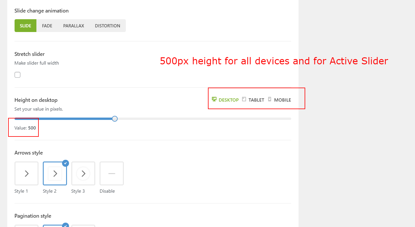
3. a) I am using 500px height Globally for the Main Slider.
https://i2.paste.pics/GA35X.png
When I am using the Image element within left part (column) of the Slide, then the height of Slider is getting auto-adjusted. And the Slide’s height gets increased, even If I use 450+px height for the image.This is really disappointing. As it breaks the layout and the right side of the slider.
Also, the purpose of defining the height of the Slider gets defeated, when it is getting affected by the inside contents. (Hence, currently using only 440px height for the image, to maintain the height). Please refer below video
https://watch.screencastify.com/v/AUI5wt4D4qLzGEaWa0QN
Image representation, of what I am using and where – https://i2.paste.pics/GA36K.pngReferring to all 3 slides currently visible on our site. One of such slide’s URL is (1st Slide) –
https://www.vasangini.com/woodmart_slide/decor-slide-1-2-2-2-2-2-2-2/b). Should not the image from SVG Image element gets cropped or adjusted according to the actual height of the Slider itself, defined Globally (that is 500px). Just like the BG image is getting cropped (right side image in right column) or adjusted according to height of the slider and is not changing or affecting the Slider’s height, even if we use more than 500px high BG image in right side of the Slide’s Row
c) No matter whatever size dimension image I use (from SVG image element- in the left column of Slide’s row), there is always a huge gap (empty space) across all 4 sides of the image. As shown in same image –
https://i2.paste.pics/GA2JI.png
How to reduce this space. And how to take complete use of this space, so as to accommodate empty space with the image. What are all the possible ways. (Except using it as BG image)d). I wanted to use images ONLY as BG image for Columns (both left and right) for one of the specific Slide and nothing else as a Top content (means do not want to use any Element). However, when I approach this way (images only as BG), then the Slide do NOT appear at all. Due to which further slides also do Not appears.
So, 2 issues from this point-
i) If one wanted to use Only the BG images (for whole Slide, either it being a 1 or 2-column), so as to FILL the whole Slide’s space with the images (and so as not to leave empty space across all sides), then One can’t do that. Because then, the Slide do Not appear at all (or a thin line of image), until we add the Inside content or use any Image Element (with some reasonable height).
PS: I found that if I use Button element with just BG images, then also, Slide do Not appears.
Sometimes empty – https://i2.paste.pics/GA39T.png
Sometimes like this- https://i2.paste.pics/GA390.png
And Sometimes like this – https://i2.paste.pics/GA395.png
There seems no uniformity too.ii) Even if, that Slide won’t appear somehow (due to above point), then why the left-right arrows disappears and other slides do Not appears. Also, in this case, there should Not be big White empty space for that Empty-looking Slide, rather it should then starts to show from the Next visible slide automatically (or a previous visible one), instead of showing just the Huge White Empty space.
PS: All 3 Slides have same size dimensions of image added through SVG-Image element in left column of each slide. And all 3 Slides have almost same dimension of BG image in right side column of the slide. The Design option for all 3 are configured exactly the same way (if I do not miss anything).
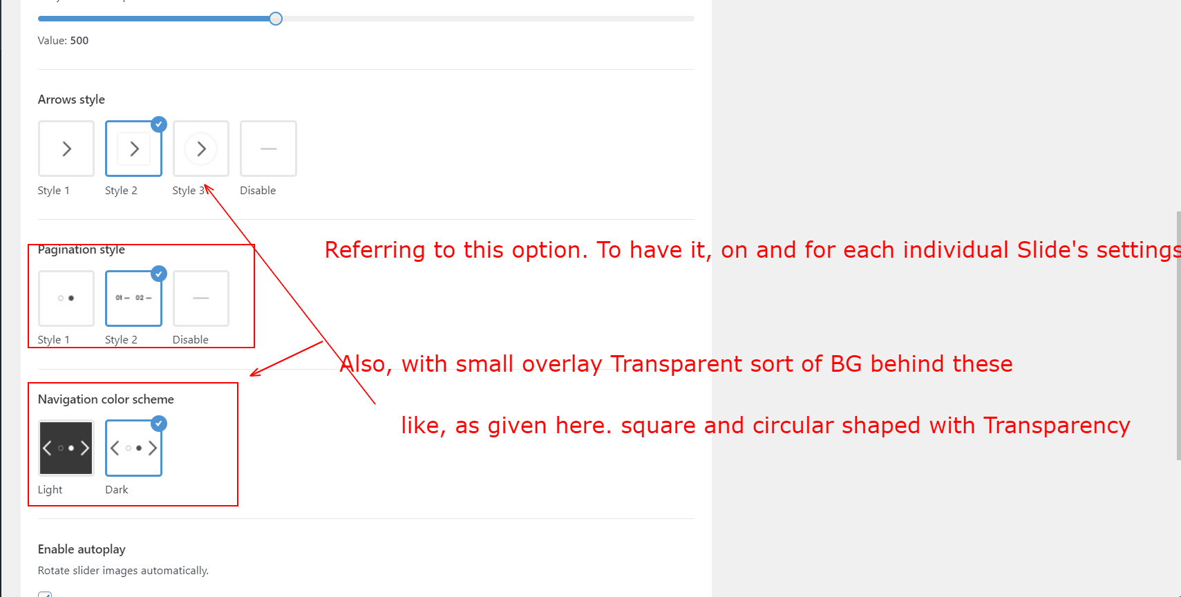
4. There is No color schemes for Pagination styles per Slide, rather it is just Globally. Also missing BG overlay (circular or square shapes behind numbers or dots). Due to which they are hardly visible on similar color-scheme slide’s image.
i) A request, if the Color scheme option could be transferred or Added to Each Slide also, that way one can choose the Dark color scheme for lighter BG of that Slide. And vice-versa.
ii). Also, a small BG (circle or square shaped) behind numbers or dots (navigational), that way, the navigational buttons will be easier to catch and visible too.
This is what I am referring to – https://i2.paste.pics/GA3CK.pngUntil then, can you please suggest, how to show small circular shaped BG with transparency behind navigational numbers (just behind numbers)
Regards
-
This topic was modified 2 years, 1 month ago by
harshwe.
March 8, 2022 at 3:01 pm #358789
Bogdan DonovanKeymaster1. You have moved the edges of the slider to the sides by setting negative left\right margins (https://prnt.sc/evmCo6D6WFIt). If you still want to add a border to slide content first you need to reorganize the margin and paddings of your slide row and columns or increase border-width until it will start to be visible.
2. We will consider your feature request, however, we cannot guarantee to implement in the nearest updates. Try to use the following custom code:
.wd-slider .arrows-style-2 .flickity-button,
.wd-slider .arrows-style-3 .flickity-button {
	background-color: rgba(255, 255, 255, .3);
}
3. а). Slide height option controls the minimum height of the slider. If a slide content has more height than is set in the “slider height” option – slide height will be increased to the height of its content. If you want to make all sliders in the same height, you should set all their content strictly in the same way for all slides including image dimensions and elements, row, column margins, and paddings.
3. b). Slides content height work as described in the “3. а)”.
3. c). The gap between the column and its content can be visible because you set padding to the column, try to remove it first (https://prnt.sc/Y0DzIYd1-9Jo). Also, the gap can be visible on the sides because the dimensions of the image and the width of the column won’t match. This cant be fixed on all possible screen sizes, instead, we recommend you use your image as a column background.
3. d). i). In that case, your column is not visible because it does not have any content and does not have height. To make flexible column background images we suggest you to set your image to column background and place the “empty space” element inside the following column to “give” the column desired height (https://prnt.sc/8dlfaZ6iWZZw).
Also to make identical slides we suggest you create one slider with only one slide. Fully customize its images, contents dimensions, spacing, view on the desktop and responsive and only after that duplicate those slides with only replacing the image and text.
4. Pagination color scheme cant be set individually for each slide because it is not a part of an individual slide. This also cant be changed in the future because of the restriction of slider structure.
4. ii). You can control the hover area of pagination items by using the following custom code. Change padding values to the desired ones.
body .pagin-style-2 .flickity-page-dots li {
        padding: 15px 15px;
}
If after changing previous values your pagination change its vertical position you can adjust it by changing “bottom” value in the following custom code
body .pagin-style-2 .flickity-page-dots {
	bottom: 0px;
}
Kind Regards
March 8, 2022 at 9:12 pm #358868
harshweParticipantHello Bogdan,
Thank you for answering queries Inline, and with details. Much appreciable.
One thing, before proceeding further. Wanted to know, where the Luke Neilson is, these days. Just missing her presence and responses from her side.
I wish, everything is OK, and she is fine too.Coming back to the points-
1. Actually, I have Not moved the edges of sides of Slider. Neither I set the margins as -6%. It was actually Set in the Default Sliders (Demo content). I just Duplicated it and added my own content and images on Top of it.
However, as per your suggestion, I managed to Edit the Margin from -6% to 5.6% (only right margin of the ROW), and the Border is visible now (by not affecting the Left side of the slider or Row too)
Thank you 🙂2.
We will consider your feature request,
Thank you. Will use your custom code.
3. a). b) Thank you for clarifying, that it is Minimum and not the fixed or Maximum height. I understood this point.
In this case, just a suggestion, please make the Text read as “Minimum” Height for Desktop, rather than it be as – Height for Desktop.
https://i2.paste.pics/GAQCO.png
This will avoid further confusion and will be helpful for other users also3.c). Again, the padding space (top and bottom) showing as 6vh came, while after I Duplicate the default Slider (I did not set this either).
But, as per your suggestion. I will remove this and check how this works. Will let you know for sure.
I hope there won’t be any space left further (on Top and Bottom) once I remove this. Please suggest and clarify.Also, you suggested –
the gap can be visible on the sides because the dimensions of the image and the width of the column won’t match.
Can I ask what is the size or width of column in pixels. I mean what width size I should use for the image to fit the Left Column of the Slide. Atleast in this case, and whereby the Row is split in 1/3+2/3.
Similarly, what width size of image (in pixels) I should use for right size column considering the point. And point in query number 1.
Ps: Site Width is set to Full Width (probably 1222px) in Genera Layout3.d)
i)and place the “empty space” element inside…
OK, I will try this workaround tip. Will check this when I create New Slide or on Inactive Slider’s slide.
However, there is One-Catch. As per your suggestion in point 1) below
https://prnt.sc/evmCo6D6WFIt
If I remove the values, that are set for Margins as -6% (left and right side) in the Row for each Slide (that came from Default sliders), then it leaves a Huge space at extreme sides (left and right). Even if we use the BG image inside column and even if we use the “Cover” option too (in Design Option > Background of the Column).
I think, probably this is why even your team set the Margin values as -6%, as this seems a sort of a glitch.
Please try to replicate at your end. And suggest what could be the solution to show BG image edge-to-edge, once we remove -6% values from Margins. (that is after using BG image for and inside the column)ii) You suggested –
Also to make identical slides we suggest you create one slider with only one slide. Fully customize its images…
Thank you for the Tip. Yes, I am already following this approach only, That is why All the existing slides of the Active Slider are exactly same, as of now.
4. ii)
You can control the hover area of pagination items…
I tried the custom css, but it did not changed anything. I think the code seems incomplete. Also, there is no code entry for BG image, that we asked for.
Can you please read my previous query again and check the code accordingly.
This is what I asked earlier and looking for – https://i2.paste.pics/GAQVH.png
That way, the navigational buttons will be easier to catch and visible too.Regards
-
This reply was modified 2 years, 1 month ago by
March 14, 2022 at 10:09 am #360519
Bogdan DonovanKeymasterHi,
Luke Neilson is on vacation now.
3. a). b) We will consider these description changes for the next theme updates.
3.c). WPBakery page builder didn’t have options to set custom width to a column in pixels. You can set column width only in proportion using WPBakery column settings.
3.d) i). Some demo content may contain obsolete values due to new options added by recent updates, some demo content may have the following values because it is needed by a specific design.
By default, any slide has padding 35px from top and bottom and 5% from left and right. This padding can be removed by “Content no space” option in the slide meta box section (https://prnt.sc/Qcnlf3GvOIoY).
In your case, you can:
– Enable “Content no space” option (https://prnt.sc/8NGc35SvsGKE).
– Remove all padding that is set to the main slider row (https://prnt.sc/H50aBv0jb8iK).4. ii) There is no such design in our theme sliders. Slider pagination that you referring to cant be styled in the same way as you described on your screenshot.
Kind Regards
March 23, 2022 at 2:48 pm #363393
harshweParticipantHello Bogdan,
Luke Neilson is on vacation now.
May I know, when He (or She) will be back and join the Team. Just missing his (her) presence, a bit.
3.c). Can you please atleast suggest –
“What width or size in pixels I should use for the image to fit the either side edges of the Left Column of the Slide. That is edge-to-edge
Similarly, what width size of image (in pixels) I should use for right size column considering the point.
I want to show image edge-to-edge in sides (and Top-bottom as well) without leaving any extra space.By using Woodmart Slider and WP Bakery where Row is split in 1/3+2/3
And, we can remove all previous (or default) values too, from the Design Options tab of SVG image Element (and of respective WP bakery Columns) regarding Margins – PaddingsPs: Site Width is set to Full Width (probably 1222px) in Genera Layout
5. Currently, we are using 6.2.6 version of Woodmart theme. We wanted to know-
Is it compulsory to use the New LAYOUT tab (option) to create Single product page, Shop, Cart or checkout, while after we update to 6.3.0 or later versions.
Or else, we can still have the existing Default Layout (that is without the use of New LAYOUT) for Single product – Shop page, Cart, Checkout, that we are having currently with 6.2.6 versionii) To elaborate further, will my Single product and Shop pages goes Blank the moment I switch to 6.3.0 (or later), as there will NO such page created using the New Layout. And until I create the relevant pages from Layout, these pages won’t be visible and won’t Go Live.
iii). Will everything be intact when we switch from 6.2.6 to 6.3.0 (or later version) and work the same way, as they are currently working for us with 6.2.6 version
iv) Has the Sidebar Widgets (Layered navigation filters) issue been resolved, which appeared recently (probably a woocommerce related issue).
Please suggest, as we want to switch to the latest version of Theme and Woo.Regards
-
This reply was modified 2 years, 1 month ago by
March 31, 2022 at 7:21 am #365369
Bogdan DonovanKeymasterHi,
3.c). We can’t suggest you any pixel values, because to stay responsive WPBakery columns need to be set in percentages values that are done by default in the following page builder plugin.
5. The use of layouts is optional.
5. ii). If the required page does not match the predefined filters, the standard page structure will be used.
5. iii). iv). Check Woodmart 6.3 changelog to see what was changed or fixed.
Kind Regards
March 31, 2022 at 12:32 pm #365440
harshweParticipantHello Bogdan,
5. ii). If the required page does not match the predefined filters, the standard page structure will be used.
This is Not clear to me. Can you please clarify with details.
Also, what is meant by standard page structure here. And what it refers to match the predefined filters.5. iii). iv). Check Woodmart 6.3 changelog to see what was changed or fixed.
I have already gone through the Changelog. But this does not answer my specific query.
Can you please ready iii) point again and answer accordingly.regarding iv). point, the issue that I am talking about, appears after the 6.3.0 update
I am referring to the one, whereby the Layered Navigation Widget filters disappears suddenly when users update to latest version. (And that might be due to some Woocommerce update also)Regards
April 8, 2022 at 8:47 am #366981
Bogdan DonovanKeymasterHi,
5. ii). “standard page structure” – it’s the default shop page\product page layout that comes with the theme, without of use of any layout page builders. “predefined filters” – each created layout can be shown under different conditions. For example, you can create a unique layout for “toy” category, but at the same time, other categories remain standart. More about layout builder and conditions you can check in the documentation https://xtemos.com/docs-cat/woocommerce-layouts-builder/?theme=woodmart
5. iii). If you don’t find any mentions about options or elements that you use, that means it is will be working like it was in previous updates.
5. iv). 6.4 didn’t have any changes related to the “Layered Navigation Widget”
Kind Regards
April 8, 2022 at 5:56 pm #367076
harshweParticipantURGENT:
Hello Bogdan,6. I created and Set the Sale scheduling for an Item that is On-Sale. However, after saving I found that the Sale Counter is Not visible on the product page.
Please see here – https://i2.paste.pics/GMWAL.png
(product ID 9548)Not visible, as can be seen here – https://i2.paste.pics/GMWBC.png
Product page URL – https://www.vasangini.com/product/pure-cotton-short-frowk-style-designer-kurti/Am I missing something. Or there is some sort of glitch or issue.
Can you please check further and suggest me.
Please help to resolve this issue.PS: It looks like that the glitch is on the Variable product only. As the Sale Counter is showing on the Simple product type. As can be seen here-
https://i2.paste.pics/GMWGX.png
Product URL – https://www.vasangini.com/product/black-white-tapestries-elephant-mandala-tapestry-boho/
ID – 9455Site Admin Credentials already shared in the very first response
Regards
April 14, 2022 at 10:41 am #368419
Bogdan DonovanKeymasterHi,
Try to enable “Countdown for variable products” option (https://prnt.sc/RvikQ2gdcPUh). The sale end date will be based on the first variation date of the product.
Kind Regards
-
This topic was modified 2 years, 1 month ago by
-
AuthorPosts
- You must be logged in to create new topics. Login / Register