Home / Forums / WoodMart support forum / Woodmart Slider Design Not Working (Text disappears) – HTML Block
Home › Forums › WoodMart support forum › Woodmart Slider Design Not Working (Text disappears) – HTML Block
Woodmart Slider Design Not Working (Text disappears) – HTML Block
- This topic has 11 replies, 3 voices, and was last updated 3 years, 4 months ago by
 Bogdan Donovan.
-
AuthorPosts
-
January 26, 2023 at 8:21 pm #438095
Bhaskar satywaliParticipantHi Team,
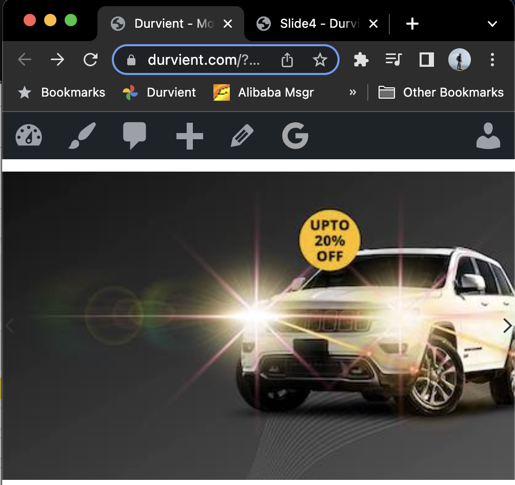
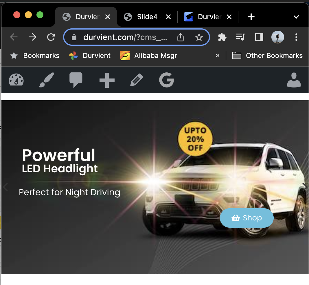
I am trying to create a custom mobile site and working on woodmart sliders. Created 1 slide (2nd slide) with elementon, background image size is 500×250 px which has also been set on the slider’s settings.
However, while previewing, the slider designed with elementon does not show text until window is re-sized. This happens irrespective of the window size (i.e. forces to make it small or bigger for the text to appear).
I am confused and not sure what I am missing on it.
A screen recording is here to explain you the problem: https://gyazo.com/47fada0c295a6be969397523342fd9d5
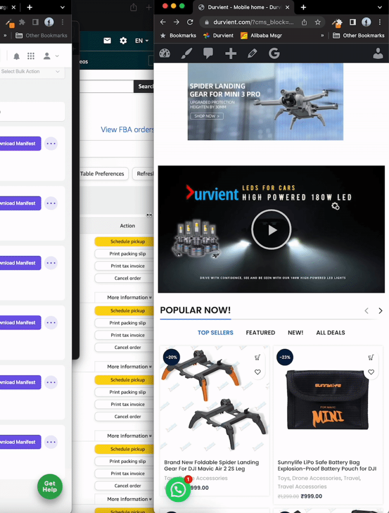
Screenshot 1 – when page reloaded:
Screenshot 2 – when window re-sized:
January 26, 2023 at 8:33 pm #438097
Bhaskar satywaliParticipantMissed to attach correct image of 2nd screenshot. Reposting.
 January 27, 2023 at 8:16 am #438200
Elise NoromitMemberHello,
Please check every row and section and make its width “default”.
You can set full-width in the slider settings: https://xtemos.com/docs-topic/slider-settings/
If you have any questions please feel free to contact us.
Best Regards
January 28, 2023 at 10:38 pm #438605
Bhaskar satywaliParticipantHi Elise, I have given up the text on elementor part however need your help on related issue:
While reloading the page, the slider leaves a big white space above/below (mobile) or left/right (desktop) each time which does not look nice and creates bad UX for a customer. What might be causing this?
 January 30, 2023 at 3:17 am #438801
Elise NoromitMemberHello,
I am checking the HTML block, I see the text on the slide as it is part of the background image.
In order to avoid the gaps you need to set the background in slide settings: https://gyazo.com/328c5a8a18988898be7f0d9d9ead63fc
You can set the image on the background and insert the text in the content by means of Elementor.
You need to set “boxed” or “default” width for the main section: https://gyazo.com/148794c0e2401c6da9b4cd369f0673ec
If you want to have a full-width slider, you need to configure the width of the slide: https://xtemos.com/docs-topic/slider-settings/
If you have any questions please feel free to contact us.
Best Regards
January 30, 2023 at 11:37 am #438896
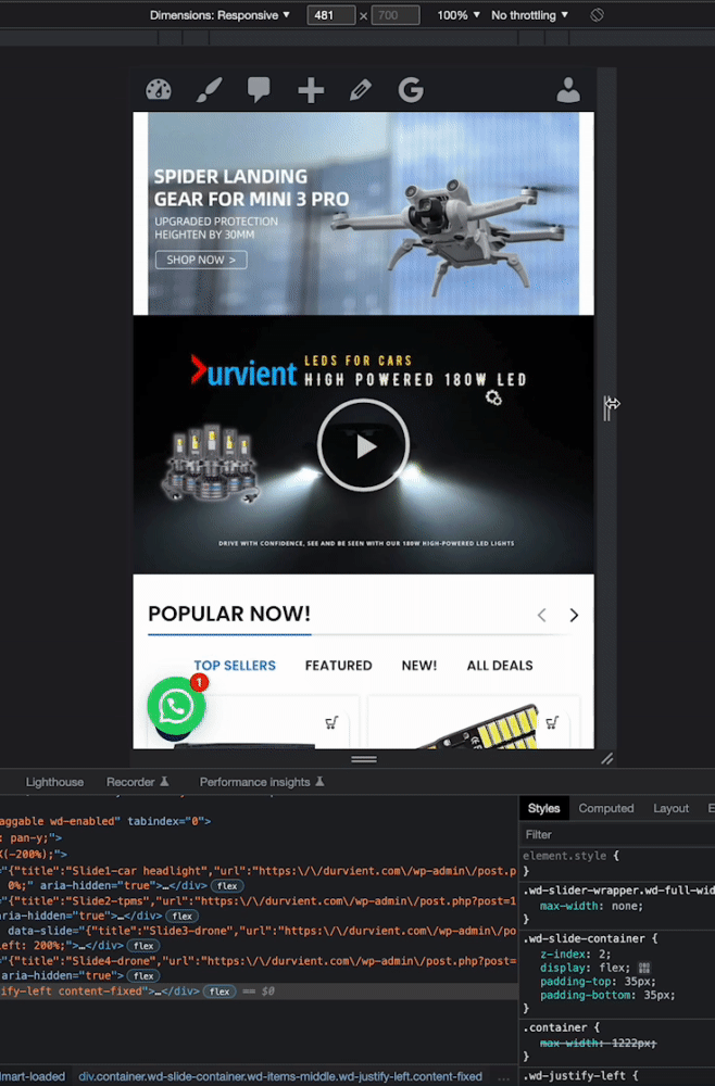
Bhaskar satywaliParticipantHi Elise, I have changed it to “boxed” now but the problem still persists. 2 problems now:
1. There is a lot of white space above and below the section while refreshing the tab/window.
2. While resizing the window, the banner does not resize properly, watch the GIF below to understand more.
 January 30, 2023 at 1:53 pm #438954
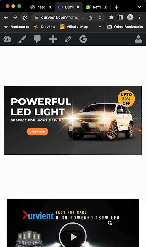
Bhaskar satywaliParticipantAttaching more images to show the problem, I have tried all the options but not sure what is required to fix it.

The banner size ratio is 2:1 (1000 x 500 or 500 x 250px).
Resizing the window in mobile mockup also shift content on 1 corner (with unnecessary white space as well)
 January 31, 2023 at 3:21 am #439124
Elise NoromitMemberHello,
Please set the image as the background in the slide settings: https://gyazo.com/328c5a8a18988898be7f0d9d9ead63fc
and let us know if you still have the problem.
When you an image, the image is scaled, and white gaps appear, the image on the background is responsive. Pay attention that there is the option to set different images on different devices, try to upload square proportional images.
If you have any questions please feel free to contact us.
Best Regards
January 31, 2023 at 10:24 am #439177
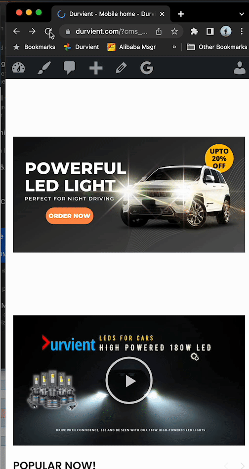
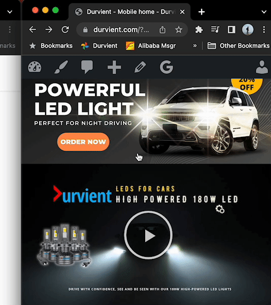
Bhaskar satywaliParticipantThanks Elise for the detail, there are too many options to put the image, just realized it was meant to be put as “background” in the settings.
I have done what you said however now running into another issue that slider’s (tried only 1 slider right now) top and bottom portions are getting cut. I have tried background size as with “Contain” “Cover” and “Inherit” on the “mobile background tab”
If this gets fixed, my query will be resolved. This is 1st slide where I have replicated your recommendations.
Slider1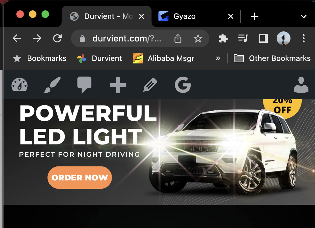
P.S. intentionally NOT using square as these sliders are exclusive for the mobile site and square image may take a lot of space on the homepage.
February 1, 2023 at 3:32 am #439396
Elise NoromitMemberHello,
Please create three image sizes for every device and upload a separate image for a separate device. There is no option to correct that with CSS or else.
If you have any questions please feel free to contact us.
Best Regards
February 1, 2023 at 9:27 pm #439691
Bhaskar satywaliParticipantElise, you didn’t answer my question.
Watch the video I shared again, the slider on the upper and lower side is clearly cut. The image is in 2:1 ratio and so is the px setup in the slider settings, how will creating 3 images (for desktop, tab, mobile) solve this problem when the view is cut in mobile view which is where the slider image is uploaded?
February 2, 2023 at 11:23 am #439825Hi,
Sorry for misunderstanding. Our theme slider is created to be used similar to the Revolution Slider where background image (color, gradient, photo, image pattern) and slider content (text and buttons) are separate layers where slide background is set via Slider background options (https://prnt.sc/0jcMZRd2hqim) and slide content text and buttons is created via Elementor builder text and buttons elements (https://prnt.sc/mZqoDmM8X5vt). As an example, you can check the following demo page (https://woodmart.xtemos.com/demo-retail/demo/retail/).
If you use pre-created images in a graphic editor that already contain text and buttons, then they cannot be used as a background for slides, because at certain resolutions the aspect ratio of the screen may not match the ratio of the size of the slider and the screen of the device and the text on the image can be cut. The following issue is can’t be fixed because is the default behavior of the CSS
backgroundproperty.For such images, we do not recommend using the Revolution Slider or Woodmart Slider, but use a simple image carousel (https://woodmart.xtemos.com/images-gallery/) or banner carousel (https://woodmart.xtemos.com/banners/) elements.
Also, your previous issue (https://xtemos.com/forums/topic/woodmart-slider-design-not-working-text-disappears-html-block/#post-438896) with content jump during loading is caused by a square 1200x1200px image that you set (https://prnt.sc/XanXi–4IZGs) as a custom placeholder for lazy loading. Try to remove the following image and use auto-generated placeholders in theme settings.
Kind Regards
-
AuthorPosts
Tagged: woodmart slider
- You must be logged in to create new topics. Login / Register