Home / Forums / WoodMart support forum / how to Change mobile sticky nav button icon
Home › Forums › WoodMart support forum › how to Change mobile sticky nav button icon
how to Change mobile sticky nav button icon
- This topic has 26 replies, 2 voices, and was last updated 3 years, 5 months ago by
 Aizaz Imtiaz Awan.
-
AuthorPosts
-
December 9, 2022 at 8:05 am #427536
porihutParticipanti wnat to change mobile nav menu
icon and title to anotner icon and title.
but function should be same.
How can i do it?
screenshort added which icon i want to
change i marked.
thank you.Attachments:
You must be logged in to view attached files.December 9, 2022 at 2:57 pm #427656Hello,
Sorry to say but right now under the Mobile bottom nav bar, some items are predefined, which are just selected from the dropdown selection and for them right now there isn’t an option available to change their Icons or Text, like the one you mentioned Mobile Menu: https://snipboard.io/xUq0Rr.jpg
Best Regards
December 9, 2022 at 4:40 pm #427707
porihutParticipanti saw change in another website made by your woodmart theme.
link: gadstyle.com.
That’s why i asked.
December 10, 2022 at 10:26 am #427835Hello,
The Site that you have referenced having WoodMart Theme, does have the Mobile bottom nav bar but there isn’t any Mobile Menu element added there with a change icon. Please refer to the following Screenshot: https://snipboard.io/qTBZCr.jpg
Like we mentioned, you can add Custom Items having Custom Icon and Link but for the predefined Items, right now there isn’t any option available to change their Icons. Their text might be changed with the Translation plugins if tried out.
Hope you can understand !
Best Regards
December 10, 2022 at 10:26 pm #427921
porihutParticipantI marked the icon on screenshort .
Which using as menu.Attachments:
You must be logged in to view attached files.December 12, 2022 at 2:14 pm #428157Hello,
Please share the WP admin login details of your site so I will check and resolve the issue. Also, share the icon code in which you want to change the menu icon.
Best Regards.
January 2, 2023 at 6:55 pm #432648
porihutParticipantHi! hope you are well. sorry for replying after long time. i had an accident that’s why.
Though i am gving you access, & i do not want to disturb you many time. So if you can fix this
4 problem it ll be kind & helpful. ( For problem 1 & 3 screenshort added. you may need)1/menu icon & title = same as given screenshrot. function same as menu.
2/do not show products hover effect/icon desktop or mobile ,in home & shop.
3/ want to make this slide, demo from your site,screenshort added. tried but no option on elementor.
3.1/ how to build slide, without edit home page everytime. tried with your slide option but slide not showing ellementor. Only Slider Revolution slide show.
3.2/Reduce slide hight 30% mobile.4/ using wp rocket but mobile page speed not good. in google. if you can fix.
note#if i enable JS deffer, infinite scroll not work auto.If you say ok i m giving you access.
Thank you.
Attachments:
You must be logged in to view attached files.January 3, 2023 at 10:53 am #432759Hello,
1- Regarding the Menu Icon and Label change under the Mobile bottom nav bar, the thing is we exactly don’t know how the reference Site that you shared earlier has achieved this change on his Site but you can try out the following below Custom CSS on your Site and paste it under the Dashboard >> Theme Settings >> Custom CSS >> Custom CSS for mobile section:
.wd-header-mobile-nav .wd-tools-icon:before { content: "\f130"; }

.wd-header-mobile-nav.whb-wd-header-mobile-nav a .wd-toolbar-label {
    visibility: hidden;
}

.wd-header-mobile-nav.whb-wd-header-mobile-nav a .wd-toolbar-label:before {
    visibility: visible !important;
    content: "Search";
    margin-left: 1em;
}
2- To disable the Hover over the Product Images on your Site, you can go to Theme Settings > Product archive > Product styles > Elements > there you will find the toggle option of Hover image > just disable it: https://snipboard.io/9yFwCp.jpg
Regarding the icons removal on hover, right now there is a different Product style selected on your Site which only shows Compare Icon and Add to Cart button inside the Product Image on hover. So, please elaborate on this: what specifically do you want to hide? So that we can provide you with the Custom CSS for that. Further, if you are using common Product style in which Action Icons appear just above the Product titles, then you can try out the following Custom CSS in Global Custom CSS as well as Custom CSS for mobile area too:
.wd-hover-icons .wrapp-buttons { display: none !important; }3- Regarding the Slider guide under the Theme, you can follow-up the following Documentation thread related to WoodMart Slider: https://xtemos.com/docs-cat/woodmart-slider/?theme=woodmart
4- Regarding the Site Speed related concerns, kindly if possible create a separate Topic so that we can thoroughly check and assist you there specifically for that. Hope you can understand !
Best Regards
January 3, 2023 at 1:27 pm #432795
porihutParticipantHI! THANS A LOT FOR KIND REPLY.
HAPPY NEW YEAR.I AM GIVING YOU ACCESSB TO MY SITE: COZ PROBLEMS NOT SOLVED. DETAIL BELOW. PIC added. inform me after you done.
……………..Credentials………………………
GIVEN IN PRIVATE CONTENT
……………………………………………………………1/ Problem 1 : Not Solved. given CSS only chage title not icon. #PIC ADDED.
2/ problem. 2: not Solve. after adding css.
its show add to cart icon on hover. DESKTOP. for mobile & tablet its ok.
#pic added
3/ NOT properly solved: able to add slide but image hight with issu.
#pic added
if you can add a exaple slide like this link:
https://woodmart.xtemos.com/infinite-scrolling/Attachments:
You must be logged in to view attached files.January 3, 2023 at 4:07 pm #432839Hello,
1- The Search icon wasn’t changed because we mistakenly forgot to add a !important attribute with the content code CSS, which we have now directly rectified on your Site and now the Icon & Label appear accordingly: https://snipboard.io/C1MmDz.jpg
2- Regarding the Add to Cart and Compare button removal from Hover, the thing is we can hide them with CSS but right now the Product style that you have selected is an overlay one. So, if we hide the Icons through CSS then a black overlay will still appear which will not be clickable and it can create a doubt with Products clicking. So, we would suggest you to first select a different Product style on your Site other than the overlay ones and then mention us so that we can apply the Custom CSS to hide Icons related to Add to Cart and others that will appear on the Product. Hope you can now understand this !
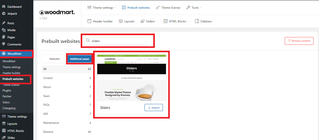
3- Firstly, to import all the default Sliders on your Site you can go to Dashboard > WoodMart > Prebuilt websites > there click on Additional Pages > there you can search for Sliders > and you will get to import the Sliders page where you can find all the Sliders: https://snipboard.io/DtIHK0.jpg
Regarding the Slider height adjustment for three viewports, you can go to Dashboard > Slides > Sliders > there edit your Slider which you are currently using on your Site > under the Layout area, you will find the option of defining the height: https://snipboard.io/1TJn9q.jpg
Hope this helps !
Best Regards
January 3, 2023 at 5:25 pm #432858
porihutParticipantthanks! problem 2 & 3 solved.
No1# menu icon also changed in mobile heder. BUT i want change only in bottom footer. please can you fix?
& // HOW i can i change This Icon to another in css. i am able to change title in css. but if you mark css, how to change that icon by my self future.
Attachments:
You must be logged in to view attached files.January 3, 2023 at 6:32 pm #432877
porihutParticipantoh i found it for icon css Content :
“/f130”i need id for… Screenshot mark icon.
or you can give me full icon id list.
& please i dont want to change menu icon in mobile heder.
Attachments:
You must be logged in to view attached files.January 4, 2023 at 10:39 am #432987Hello,
We are glad that we could be of some help !
Regarding the icon concern, like we mentioned you earlier for the predefined items under the Mobile bottom nav bar there isn’t a separate option available to change their Icon, so we took the alternative way of using Custom CSS to change the Icon here.
Now, how it’s done for your ease of understanding; It is done by changing the content code of the Icon forcefully through Custom CSS which you now got the way yourself too, which is great to hear.
There was a minor mistake from our end in the CSS that we didn’t put the Mobile bottom nav bar class before the Custom CSS applied. That’s why that CSS was also applied on the Header Mobile menu icon too which we have now rectified on your Site.
For the Category type icon that you have mentioned, this is the Content Code for it: “\f122”
And if you want to apply it on the Shop Icon of your Site, then you need to apply the following Custom CSS on your Site under the Dashboard > Theme Settings > Custom CSS > Custom CSS for mobile area:
.wd-toolbar.wd-toolbar-label-show .wd-toolbar-shop .wd-tools-icon:before {
	content: "\f122" ;
	font-weight: 900 ;
}
Hope this helps !
Best Regards
January 4, 2023 at 11:31 am #433008
porihutParticipantThanks you are great man.
Last asking: what is the id for
the icon? marked in screenshort?
screen short added.
or for the icon th-large?example : \f130= search icon, \f122= shop icon ,\ f135 etc…
Coz menu icon is now= search icon.
i wat to change it to category icon like sncreenshort.
it ll be same as my app.i must ask you before but i didn’t tthough that before.
Attachments:
You must be logged in to view attached files.January 4, 2023 at 1:07 pm #433026
porihutParticipantOH! One more thing.
How can i make round cornner slide?Attachments:
You must be logged in to view attached files.January 4, 2023 at 1:51 pm #433042
porihutParticipant#Note Porbem: I am seeing new search icon & txt has layout issu in different mobile.
look like text moved left or right 1 or 2 pixel.Attachments:
You must be logged in to view attached files.January 4, 2023 at 3:09 pm #433063Hello,
We have already shared with you the Icon Code in this regard, the following below is the Content Code for the Icon that you shared with us under the Screenshot:
content: “\f122” !important;
Now, if you want to use this Icon in place of the Search one for the Menu then you can just replace the earlier applied content code for the Menu with the above one and it will get changed accordingly.
Hope this helps !
Best Regards
January 4, 2023 at 5:26 pm #433107
porihutParticipantOH! One more thing.
How can i make round cornner slide?Attachments:
You must be logged in to view attached files.January 4, 2023 at 7:14 pm #433128
porihutParticipant#problem note: You changed moble icon with css.
but Icon & title text has align layout issu.
in different big screen size mobile.Would you please fix CSS Align text center with New Custom icon.
January 4, 2023 at 7:16 pm #433129
porihutParticipantyou set mergin left 1 em but it doesn’t solve text layout issu for all mobile device.
Would you please make it fix with icon.January 4, 2023 at 9:03 pm #433155
porihutParticipantHAPPY#NEWS:
I added 1 line code with your code.
Position: Absolute;
That’s solved text & icon layout issu.####So i think 1-3 all problem solved.
♥♥Now: I Only need to make slide image cornner round.
if you provid me code for that..Thank you
Attachments:
You must be logged in to view attached files.January 4, 2023 at 9:21 pm #433161
porihutParticipantTEST Reasult 2 for pb 1# making
content
position :abosulute
Does not solve layout issu properly.
if i use another icon/ text.if you could provide me a better code for this?
i m not a coding guy.
January 5, 2023 at 3:37 pm #433337Hello,
Firstly, we are glad to hear that you were able & managed to resolve your issues yourself. You are great !
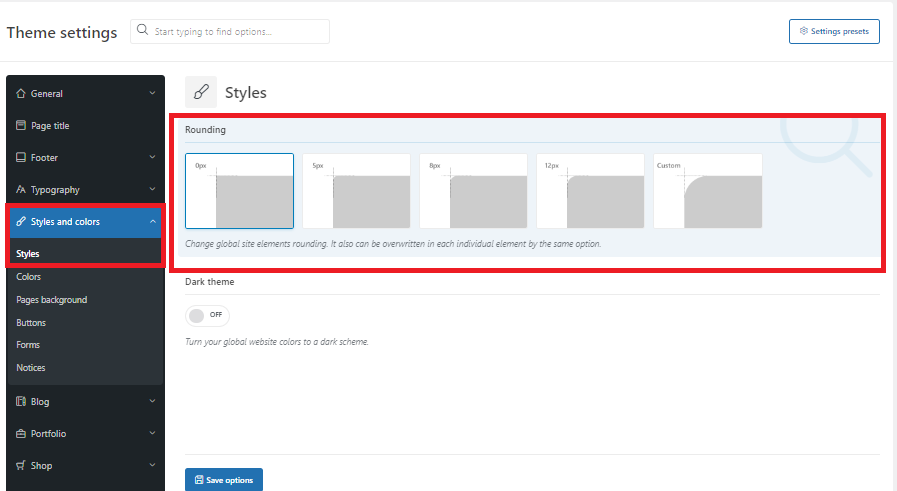
Regarding the Rounding effect, under the Theme Settings > Styles and colors > Styles > there is a Rounding option available for generalize rounding effect on the Site which you can make use of: https://snipboard.io/zxWrmg.jpg
Best Regards
January 5, 2023 at 7:22 pm #433420
porihutParticipantI Know that. that option enable
rounding option for everything include products.
#i wnat round cornner only on slide
image.( set in feature image)
if you can help?January 6, 2023 at 10:19 am #433503Hello,
Please try using the below Custom CSS code and paste it to Dashboard >> Theme Settings >> Custom CSS >> Global CSS section:
.flickity-enabled.is-draggable .flickity-viewport { border-radius: 15px !important; }Hope this works out for you !
Best Regards
January 6, 2023 at 11:19 am #433518
porihutParticipantThanks a lot for help.
i think now all 1-3 pbm solved.
wish you best.#Now I want to know more about, Speed Up my Site & Security Suggestion
Should I open a new topic for that?January 6, 2023 at 1:26 pm #433565Most Welcome!!!.
I’m so happy to hear you are pleased with the Theme and Support. XTEMOS strives to deliver the best customer experience, and it makes our day to hear we have accomplished that.
We count ourselves lucky to have you as a customer. You can always reach us at any time. We are always here to help you.
Yes, You should open the new topic for the new issues.
Thanks for contacting us.
Have a great day.Topic Closed.
Best Regards. -
AuthorPosts
The topic ‘how to Change mobile sticky nav button icon’ is closed to new replies.
- You must be logged in to create new topics. Login / Register