Product Grid/Carousel element
Product Grid/Carousel element is a flexible tool to present WooCoomerce products.Product Grid/Carousel allows to configure a grid with 1-6 items in a row and show the products by category, tag or ID. In addition, you can display products by type: Sales products, Featured products, New products and Bestsellers. There is also an option to choose Hover on product effect: Base, Alternative, Show button on hover on image, Full info on hover, Button on hover, Standard button, With excerpt, Quick shop
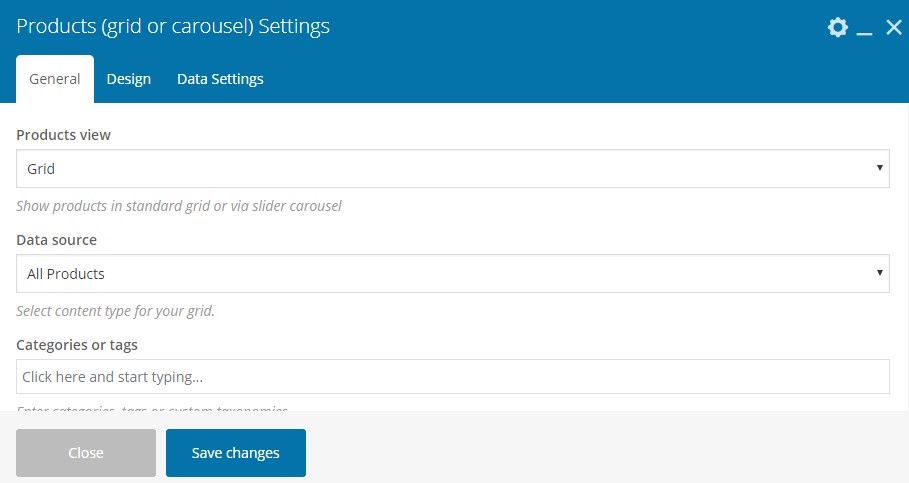
Product Grid/Carousel has three main tabs with options: General, Design and Data Settings.
The general tab provides the options as follows:
Products view – Grid, List or Carousel – option to present products in a list, grid or carousel.
Data source – option to narrow the displayed product range by:
- All products – all the existing products would be displayed.
- Featured products – products marked as featured in Dashboard -> Products -> products having star sign.

- Sale Products – Products having regular and sales price.

Products with NEW label – in order to show products with this label, you will need to activate labels in Theme Settings -> Shop > Product labels -> “New” label on products > “On”. Then it is necessary to configure a product to have “New” label: enter the product editing mode, navigate down to Product Settings (custom meta box from theme) and mark up the checkbox for Add “New” label.

- Bestsellers – products most often purchased.
- List of ID– option to insert product ID regardless category, tag, or product type.
Categories or tags – option to display products from one or more categories or from one or more tags. You can choose to display products either by category/categories or by tag/tags but not both. At the same time, you can set category and featured products. In this case, the featured product from the selected category will be shown.
Items per page – the number of products shown per page.
Pagination – if you set the number of products in “Item per page ” less than its real quantity, you can configure pagination which suggests four options:
- No pagination – leave the field empty;
- Load more button – will load more products by clicking.
- Infinite scrolling – more products will be loaded when you scroll the page down.
- Arrows – will appear on grid hover and the next set of products stipulated in “Items per page” of the product would fade in.
Masonry grid – opportunity to enable Masonry type of grid.
Products grid with different sizes – opportunity to enable the different size of grid item.
Design tab provides the following options
Products hover – suggests different effects on hover:
Base

Alternative

Button on hover

Quick Shop

With excerpt

Full info on hover

Show button on hover on image

Standart Button

Columns – option to configure the product grid in 1, 2,3,4,6 columns.
Images size – enter image size. Example: “thumbnail”, “medium”, “large”, “full” or other sizes defined by current theme. Alternatively enter image size in pixels: 200×100 (Width x Height).
Sale countdown – the checkbox enabling countdown to the end sale date will be shown. Be sure you have set the final date of the product sale price.
Data settings provide such options as
Order by – enables ordering products by Date, Post ID, Author, Title, Last modified date, Number of comments, Menu Order/Page order, Meta value, Meta value number, Matches same order you passed via the included parameter, Random order, Price.
Query type: OR / AND –
Sorting – all the above configuration may be set to be descending or ascending.
Offset – Number of grid elements to displace or pass over means the specified number of products would be offset from the grid.
Exclude – exclude product by title.
Provided carousel is enabled, Carousel Settings Tab will appear with the following set of options:
Slider speed – duration of animation between slides (in ms).
Slides per view – set numbers of slides you want to display at the same time on slider’s container for carousel mode.
Scroll per page checkbox – Scroll per page not per item. This affect next/prev buttons and mouse/touch dragging.
Slider autoplay checkbox – enables autoplay mode.
Hide pagination control checkbox – if “YES” pagination control will be removed.
Hide prev/next buttons checkbox – prev/next control will be removed.
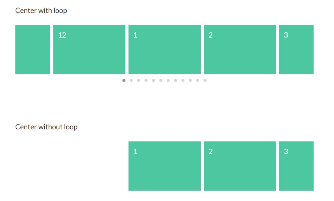
Center mode checkbox – this option put the first slider element always in the center, in order to get a better view there should be paired elements and slider loop enabled. The picture below shows the difference between slider loop enabled and slider loop disabled, applying center mode:
Slider loop checkbox – enables loop mode that is continuous full rotation without stopping/breaking on the last slide.
 Last updated: December 27, 2021