WordPress blog
Creating a modern electronics store requires non-standard solutions. In the new Electronics 3 demo, we implemented a number of WoodMart tools that significantly enhance the user experience (UX) and simplify administration.
In this case study, we explain how we created Electronics 3 – a project that combines the complex structure of a marketplace with the visual clarity of a modern gadget store.
Explore the live demo: https://woodmart.xtemos.com/electronics-3/
Website Structure
WoodMart makes it easy to build a cohesive, professional online store with pre-designed pages that are both beautiful and fully customizable.
Header Builder
One of the main features of Electronics 3 is the integration of the Aside Menu for categories.
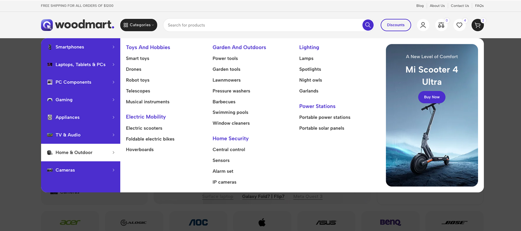
Instead of a traditional horizontal menu, we used a vertical category stack. It is integrated directly into the left side of the content or can slide out as a separate panel.
This frees up the central part of the header for a large search bar and essential system icons – a critical element for large online stores.
For more details on create Header builder, please refer to our documentation.
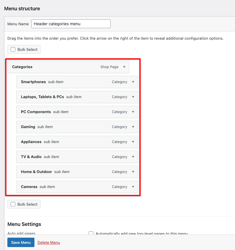
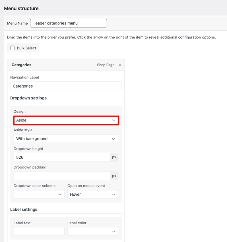
Creating your first mega menu
- Before adding mega menu functionality to a menu item, you need to create the content that will appear in the dropdown.
- In the “Design” dropdown, select either the “Aside”
- Select your HTML block
For more details on create mega menu, please refer to our documentation.
The Header Builder settings are now even more flexible
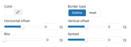
New customization options for dropdown menus have been added to the Menu, Main Menu, and My Account elements. Users can choose a custom background color and configure the box shadow for dropdown menus. This makes it possible to perfectly align the interface design with the overall site style, adding depth and visual accents without writing third-party code.
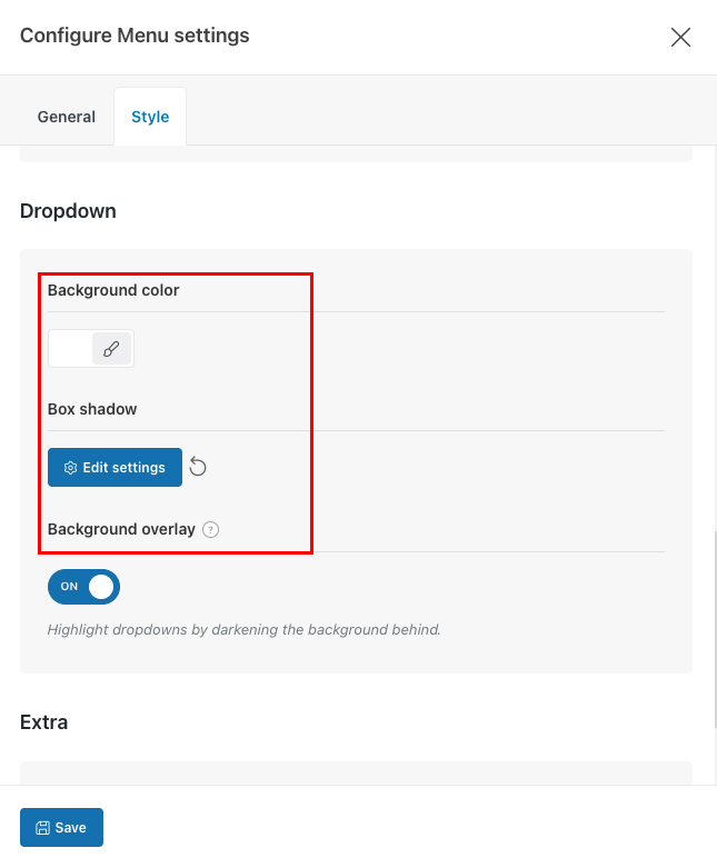
Box Shadow settings — simply setting the Blur value to 0 effectively removes the default shadow.
Exploring the Home Page
The home page of the WoodMart “Electronics 3” demo demonstrates a modern approach to eCommerce, with a strong emphasis on interactivity and customer journey optimization.
With the release of WoodMart 8.4, we introduced even more styling options for slider navigation. In Electronics 3, we utilized the new Design (Style 4) for pagination.
Unlike traditional dots, Style 4 features a more refined, bar-based aesthetic that aligns perfectly with a high-end interface. It provides a sleek, modern way for users to navigate through promotional banners, ensuring that the slider controls feel like a deliberate part of the design rather than just a functional overlay.
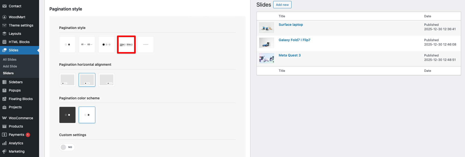
For more details on create WoodMart Slider, please refer to our documentation.
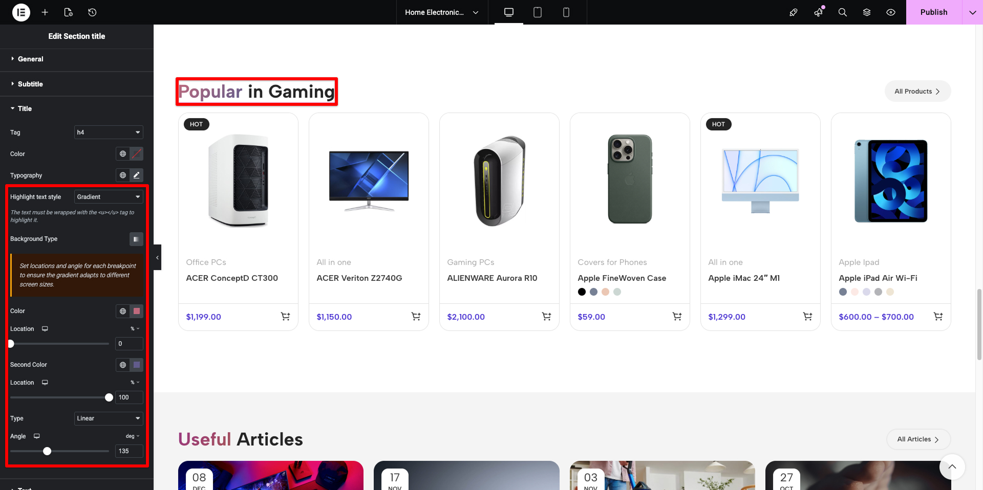
To give the site a premium look, we used the Gradient Typography feature. Section headers now feature a smooth color transition (e.g., from deep blue to bright blue). This creates visual depth and draws attention to key sections without relying on heavy graphic banners.
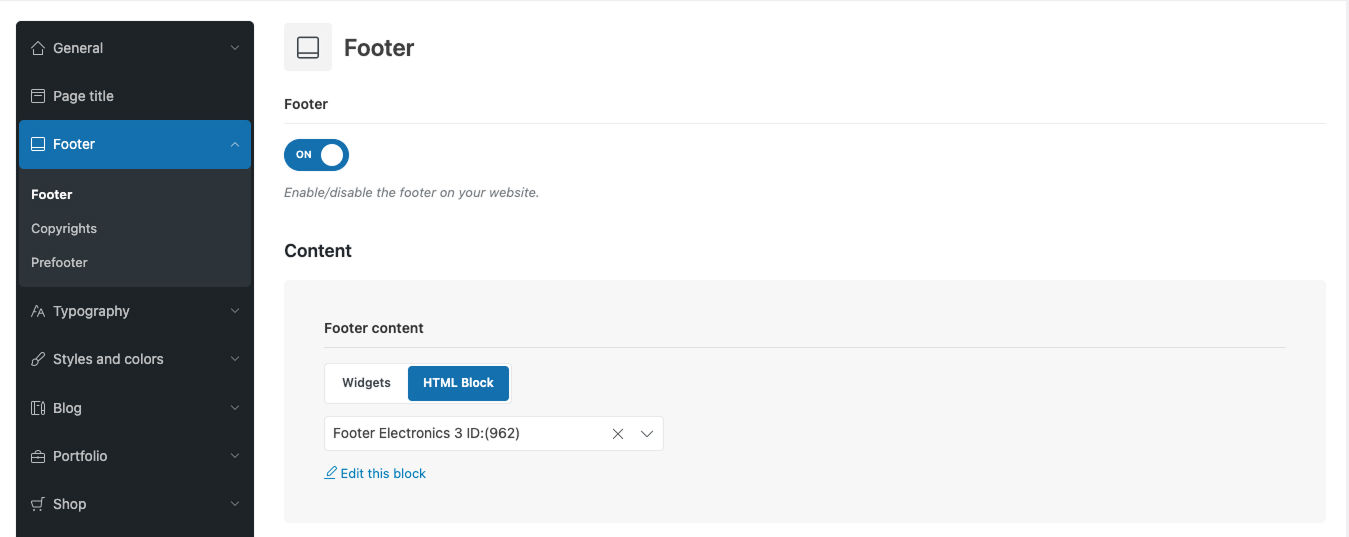
The Footer
The footer is built using an HTML block, allowing full use of page builders such as Elementor, Gutenberg, or WPBakery to create complex layouts. Navigate to Theme Settings → Footer and select “HTML Block” as your Footer Content option.
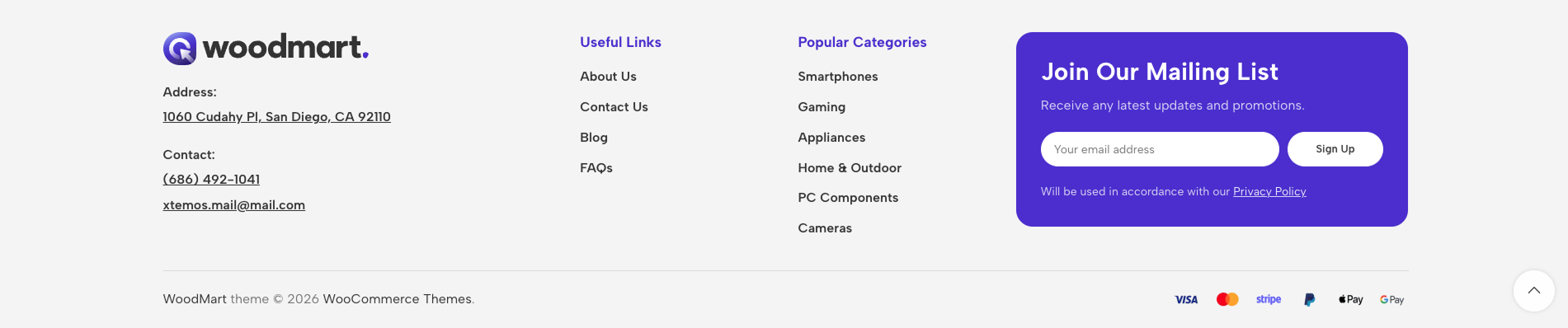
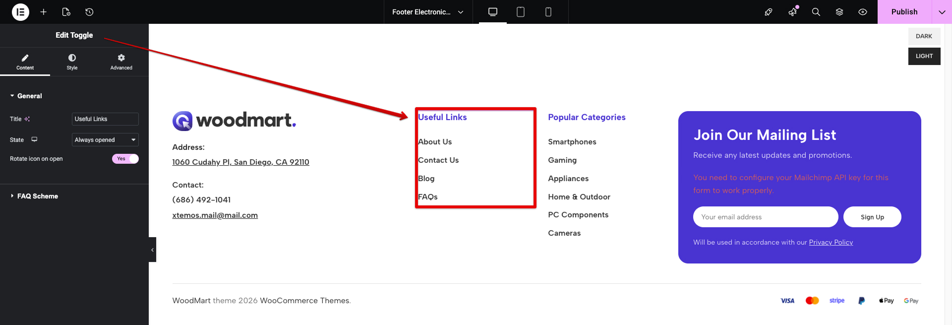
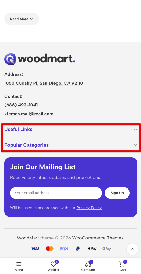
We also implemented the “Toggle” element to make the footer compact and mobile-friendly.
For more details on create Set up footer, please refer to our documentation.
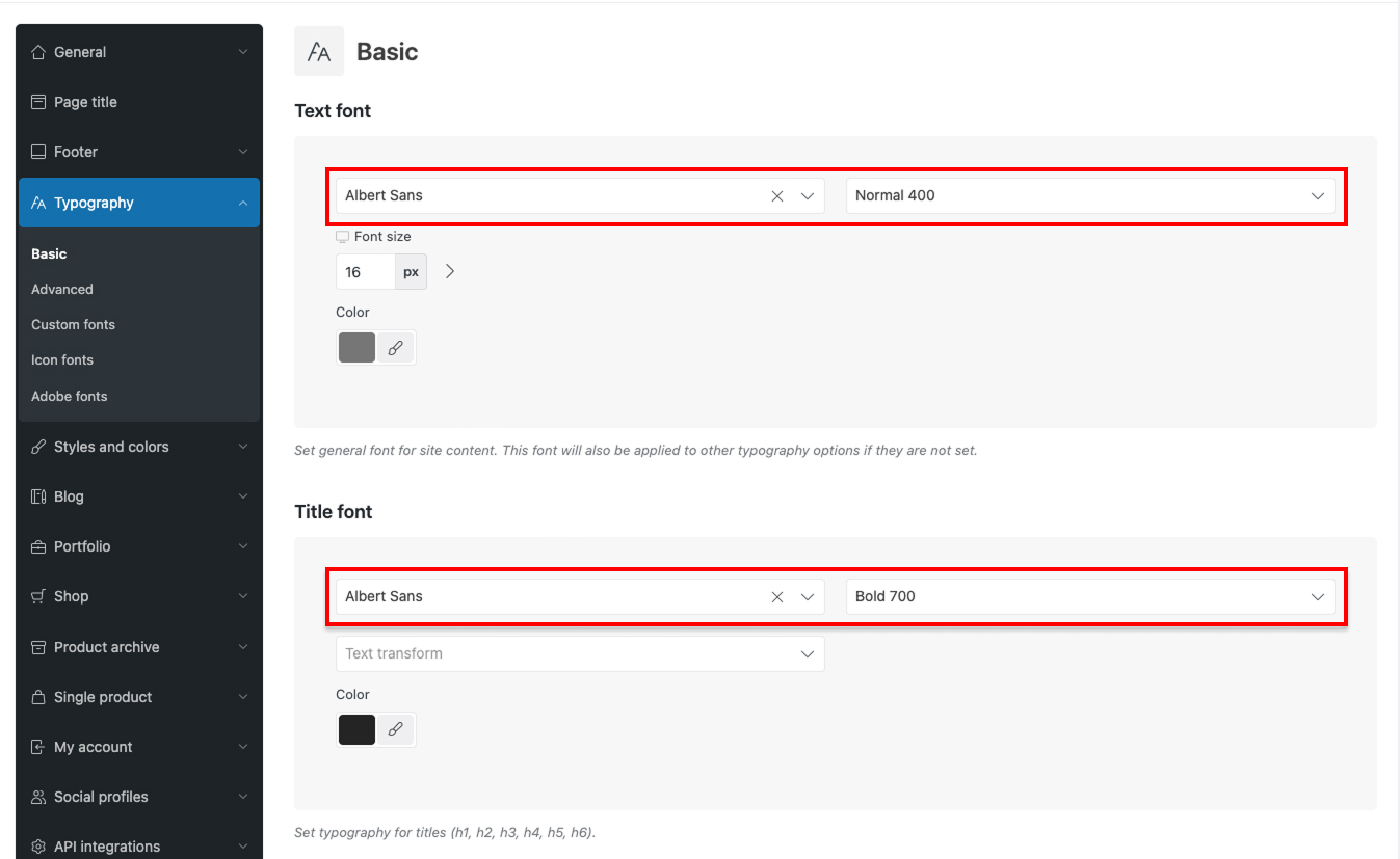
Typography & Styles
The fonts Albert Sans are applied globally through Theme Settings → Typography.
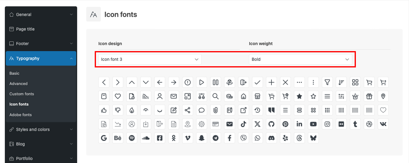
The demo uses Design Icons 3 with a bold font weight
For more details on create Typography settings, please refer to our documentation.
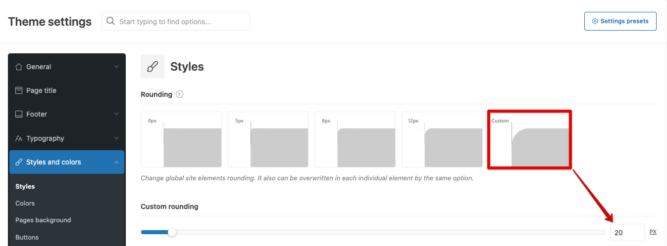
Styles & Colors
A global 20px rounding is configured in the Theme Settings.
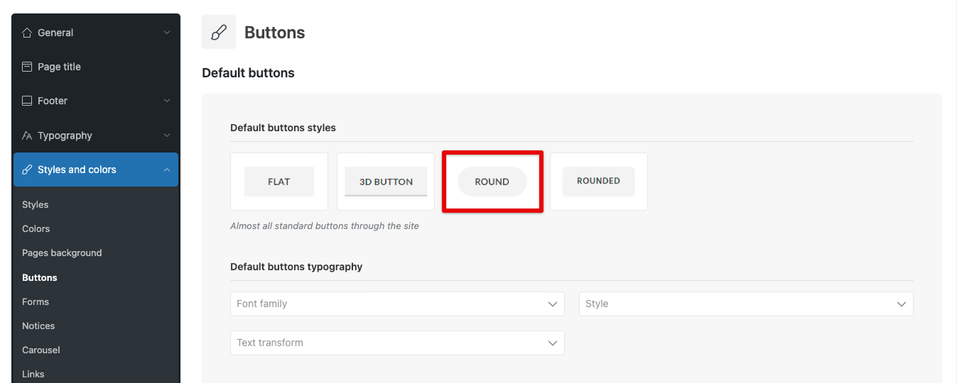
Default and Accent buttons are setted as Round.
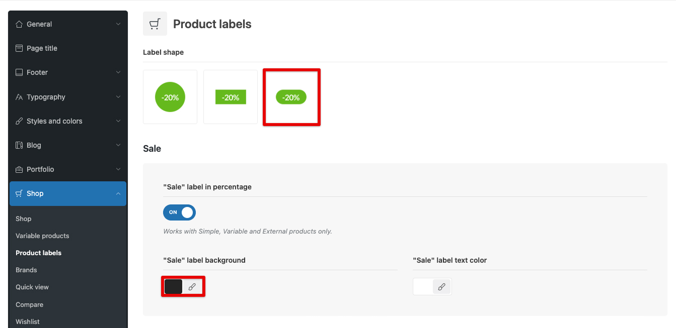
In Theme Settings → Shop → Product Labels, we applied the “Rounded Small” label shape design.
Additionally, we configured a custom background for these labels. For the “New,” “Sale,” “Hot,” and “Out of stock” badges, we ensured they remain clearly visible while maintaining a refined look on top of high-fashion product photography.
WoodMart Custom Layout Builder
Electronics 3 utilizes custom layouts for every major part of the site:
- Product loop item layout
- Product archive layout (Shop)
- Single product layout
- Cart & Checkout layouts
- My Account layout
- Single post & Blog archive layouts
Product loop item layout: Complete Freedom in Card Design
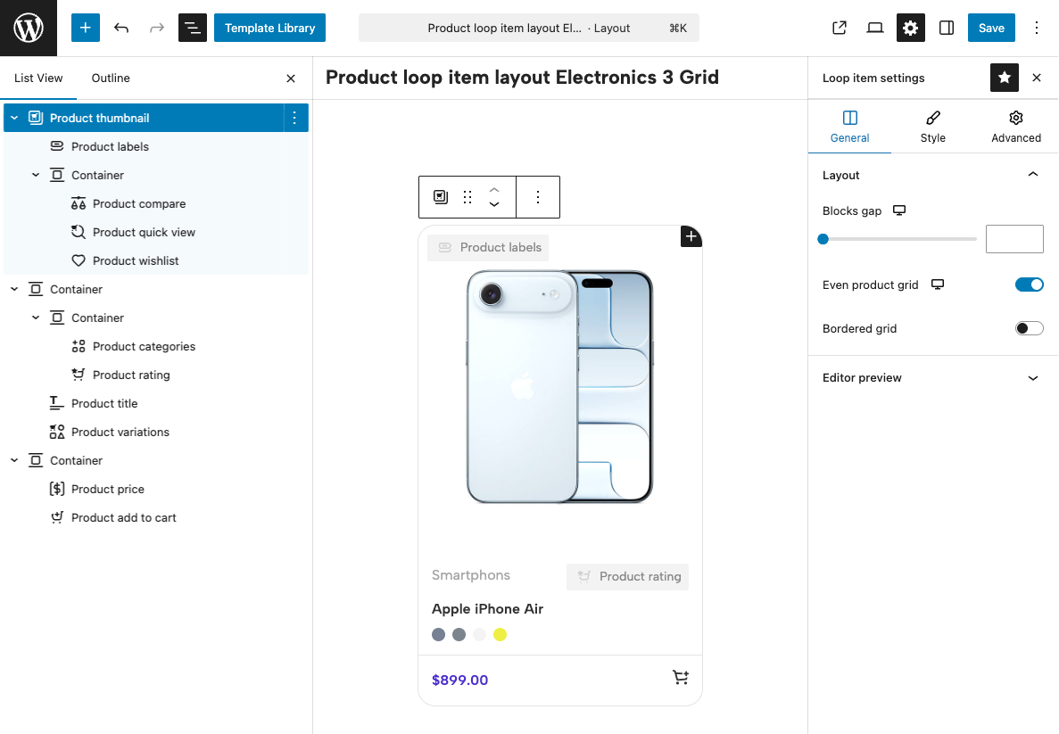
Important note: Although the Product Loop Layout Builder is available on sites using any page builder supported by the theme, product designs can only be created using the native WordPress Gutenberg editor. This decision was made due to the limitations of WPBakery and Elementor regarding absolute positioning, nested element restrictions, and the lack of global “Parent Hover” functionality — all of which are critical for building medium-to-high complexity product designs. Find more details about the Product Loop Layout Builder in our documentation here.
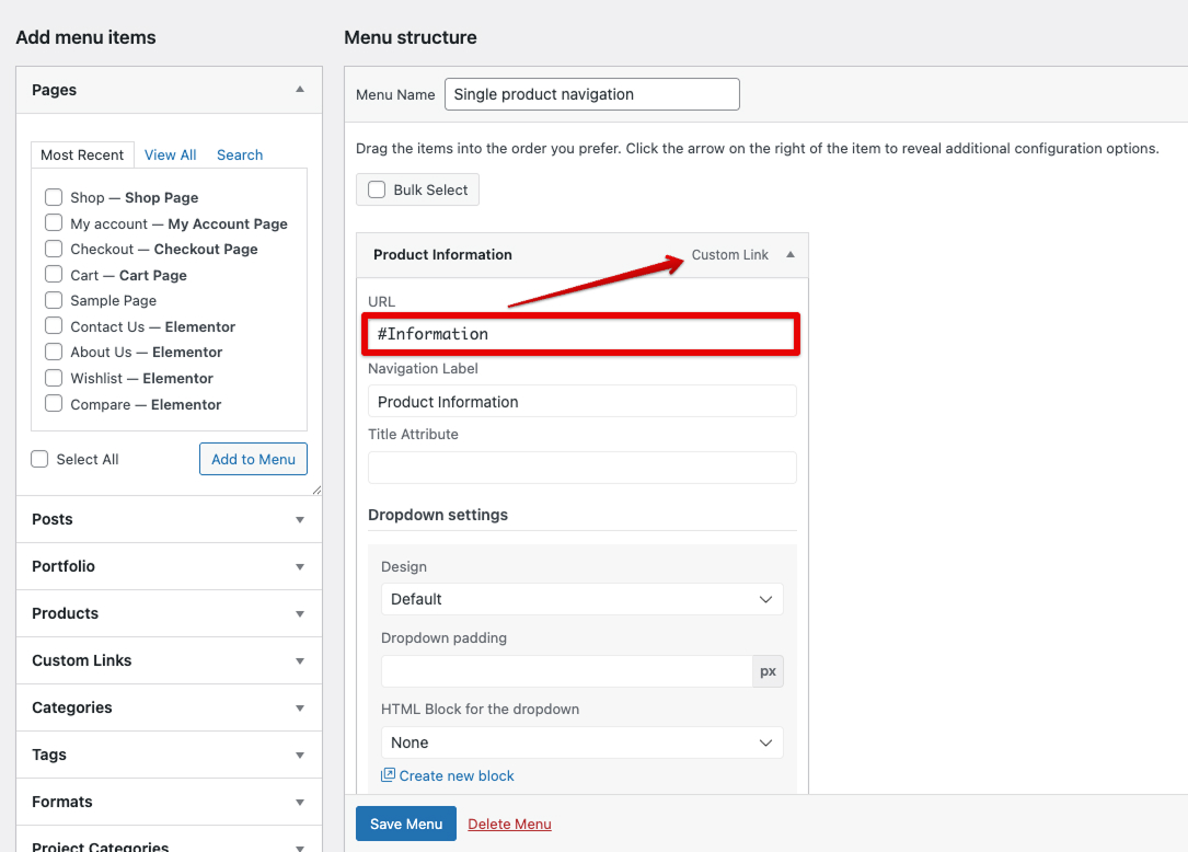
Single Product Layout: Menu as a Navigation Tool
To maximize the user experience (UX) on the product page, we moved away from standard tabs in favor of a Sticky Navigation system. This allows customers to instantly switch between specifications, descriptions, and reviews without the need for tedious manual scrolling through a long page.
In the WordPress dashboard (Appearance → Menus), we created a dedicated “Single Product Navigation” menu. Instead of linking to pages, we used Custom Links, specifying anchor IDs in the URL field (e.g., #Information, #Specifications, #Reviews).
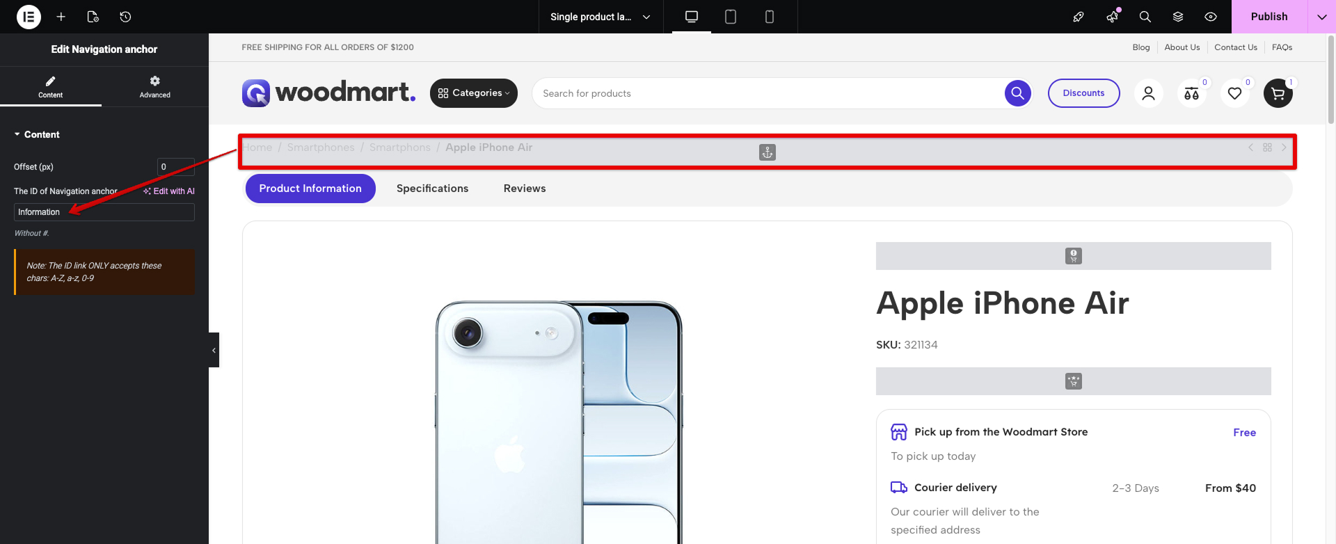
We divided the product page content into logical blocks using the Navigation Anchor widget, where we assigned unique IDs to each section.
We divided the product page content into logical blocks using the Navigation Anchor widget, where we assigned unique IDs to each section.
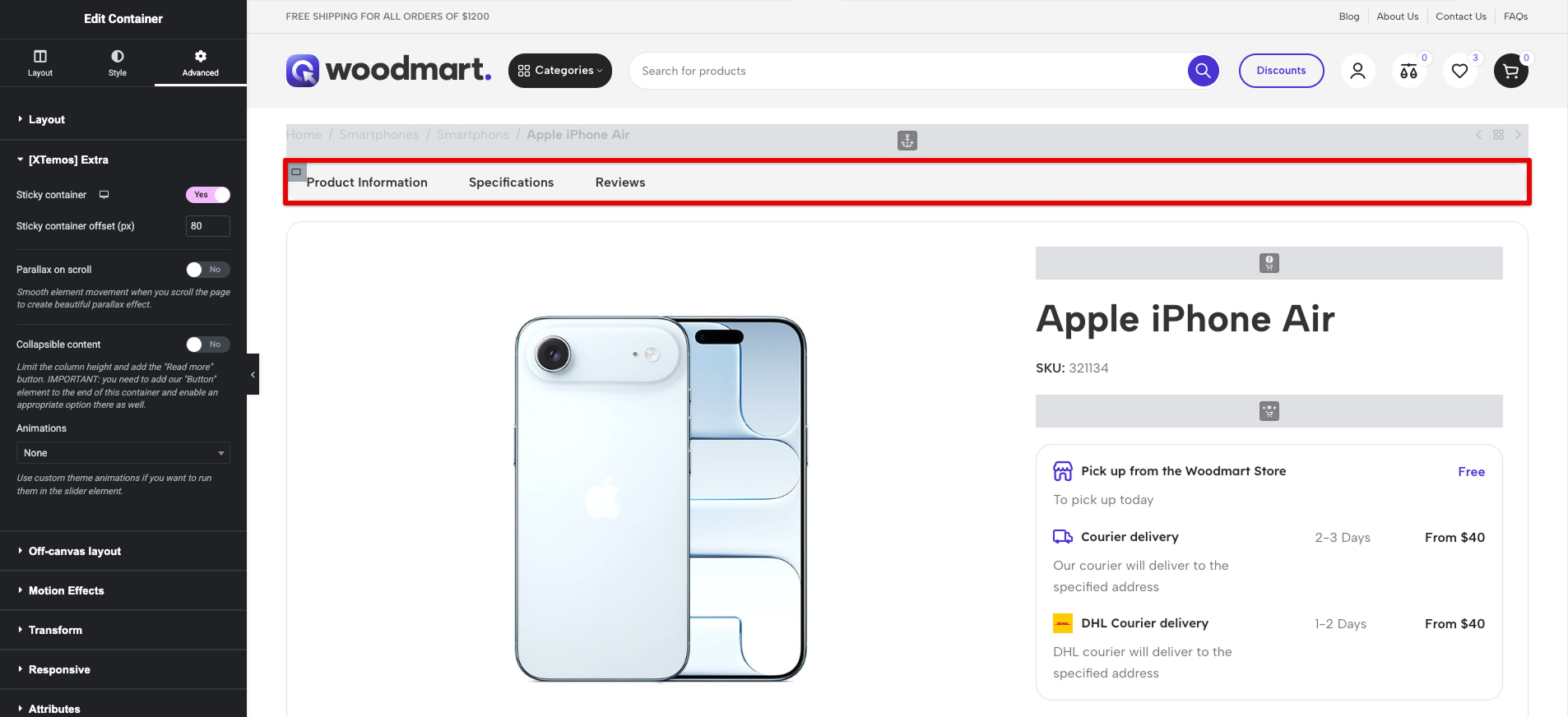
To ensure the navigation remains visible at all times, we placed the Menu widget within a section configured with the Sticky Column option. Additionally, we enabled the Sticky Header setting in WoodMart, ensuring a smooth “sticking” effect at the top of the screen as the user scrolls.
Leveraging WoodMart’s built-in scripts, the anchor transitions are executed via Smooth Scroll. This creates a modern Single Page Application (SPA)-like feel directly within the product page, significantly improving navigation for data-heavy electronics categories.
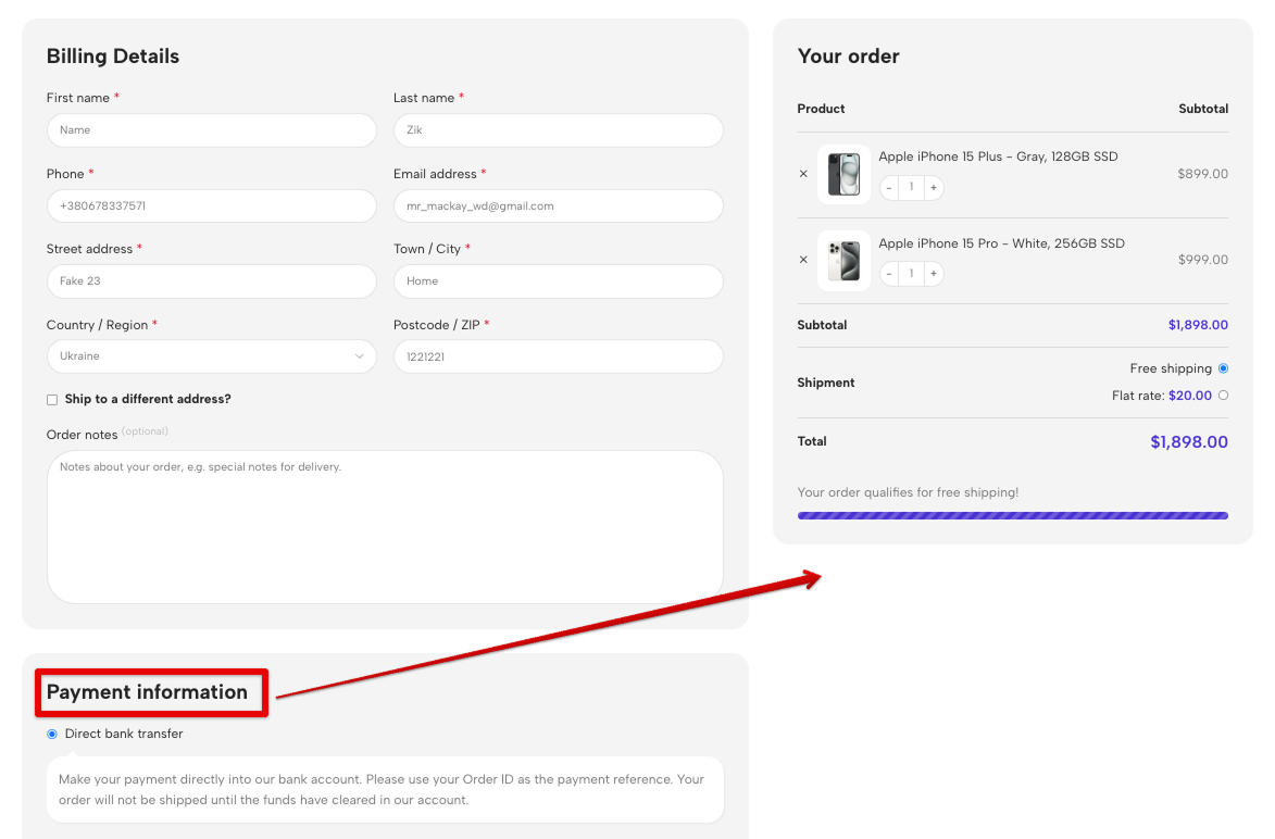
Checkout Features
In this demo, the standard checkout layout has been optimized. Payment methods have been repositioned according to updated UX logic to improve conversion rates.
Additionally, a Shipping Progress Bar (free shipping indicator) has been added to the cart to encourage higher order values.
More details on how to adjust the Checkout layout is here.
Conclusion
Everything you see in the Electronics 3 demo – from gradient headers to synchronized carousels – can be customized through the WoodMart visual interface.
If your project requires clarity, powerful filtering, and a modern aesthetic, Electronics 3 provides a strong foundation for a successful launch.
We’d love to hear from you! What aspects of the demo Electronics 3 caught your attention? Are you planning to use any of these techniques in your own WoodMart project? Share your thoughts, questions, or experiences in the comments below — your feedback helps us create even better demos and tutorials for the WoodMart community.


