
Set up the footer
WoodMart supports two ways to build a footer. The recommended method is to create the complete footer as an HTML Block with Gutenberg, Elementor, or WPBakery because it provides greater design flexibility. You can also build the footer with standard WordPress widgets and a predefined column layout.
Choose a footer method
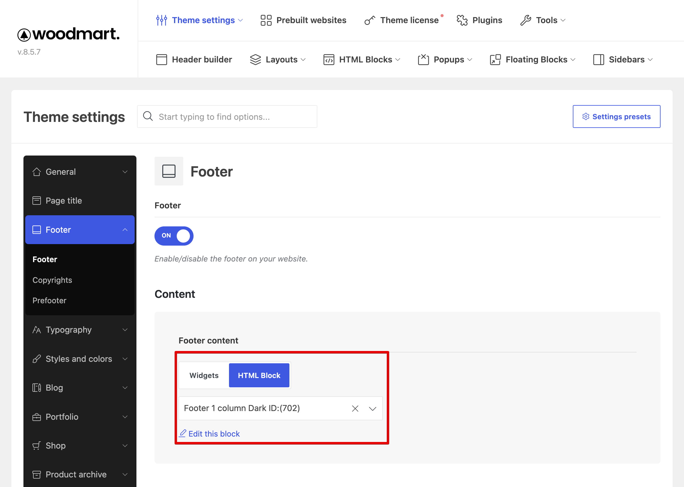
Navigate to Theme Settings -> Footer to enable the footer and choose its content type.
- HTML Block: the recommended method. It provides complete control over the footer structure, content, responsive behavior, and styling through your page builder.
- Widgets: uses standard WordPress widgets arranged in a predefined column layout.
Create a footer with an HTML Block
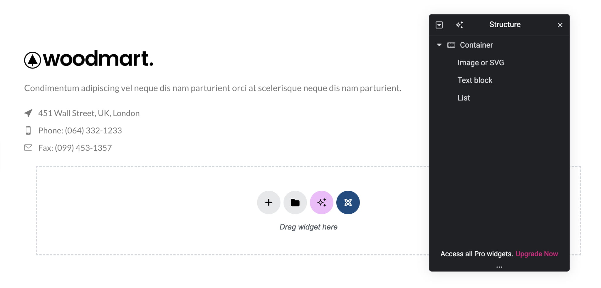
An HTML Block footer can contain columns, menus, newsletter forms, social links, images, payment icons, banners, and any other elements available in your selected page builder.
- Navigate to Dashboard -> HTML Blocks -> Add New.
- Enter a descriptive title and build the complete footer with Gutenberg, Elementor, or WPBakery.
- Configure the layout for desktop, tablet, and mobile devices, then publish the HTML Block.
- Navigate to Theme Settings -> Footer.
- Make sure the Footer option is enabled.
- Set Footer content to HTML Block.
- Select the published block in the HTML Block field and save Theme Settings.
For more information about creating and reusing HTML Blocks, see the HTML Blocks usage guide.
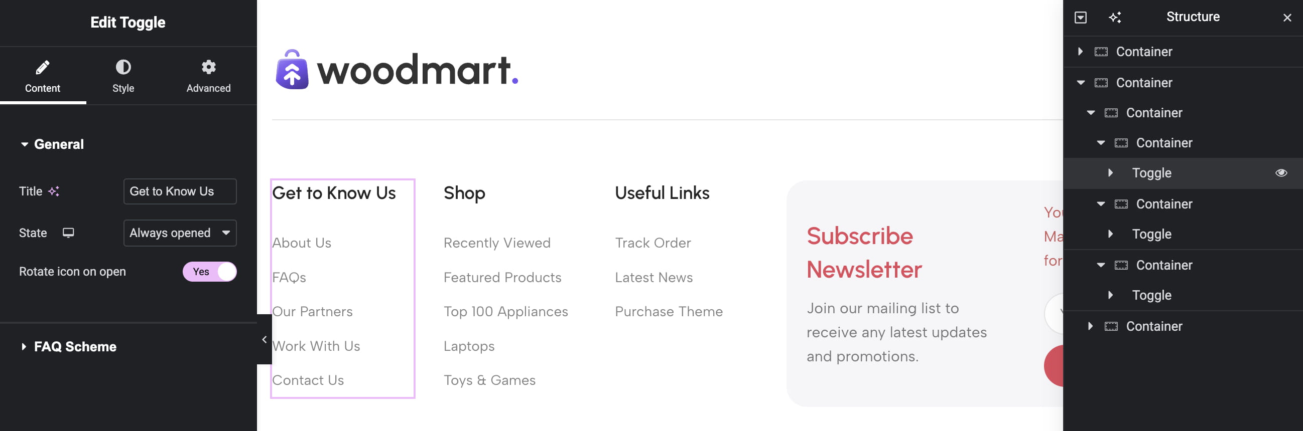
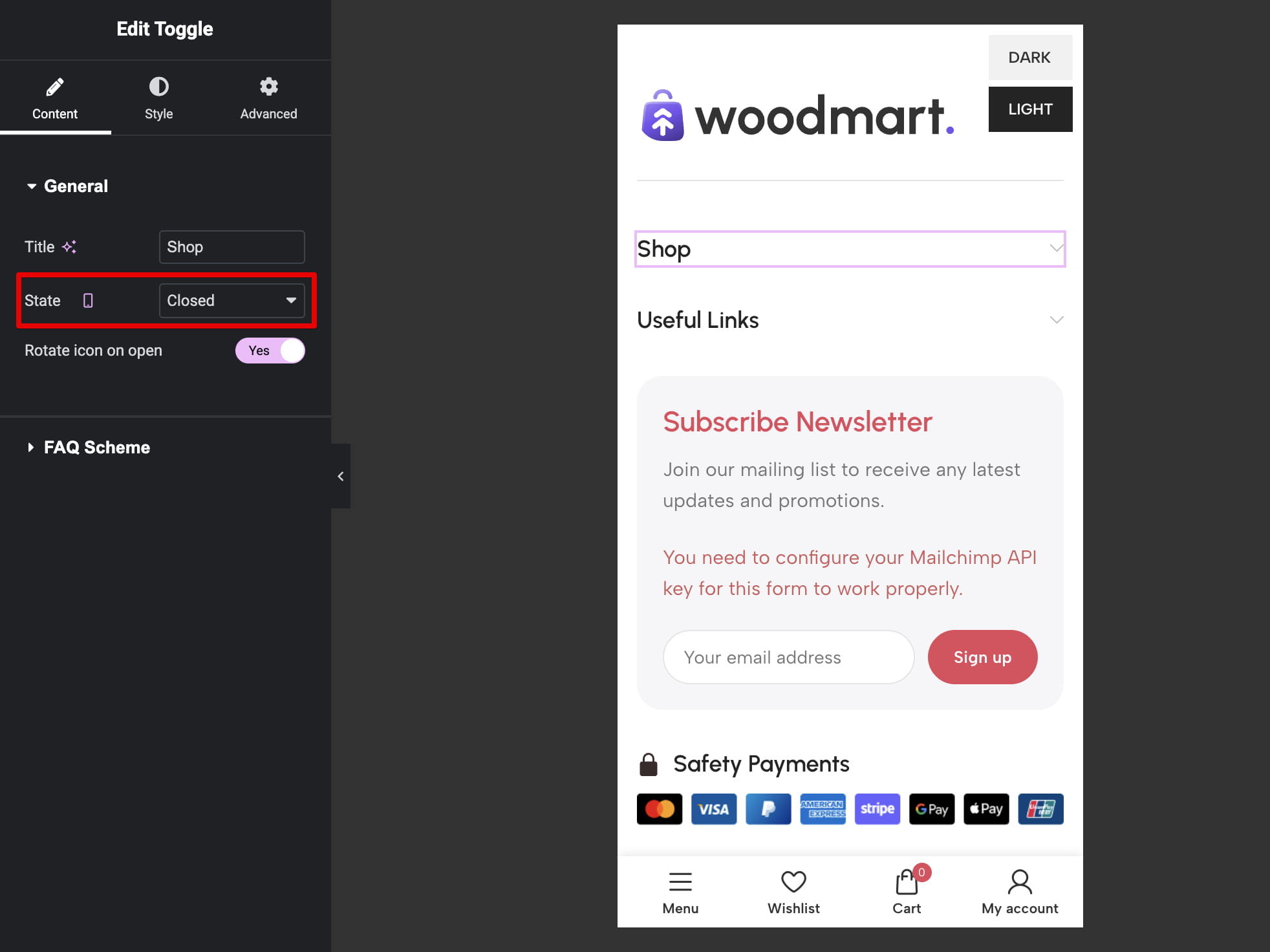
Collapsible content on mobile
The Collapse widgets on mobile setting does not control content created inside an HTML Block. To create collapsible sections in an HTML Block footer, use an Accordion, Toggle, or another suitable element provided by your page builder.
Create a footer with widgets
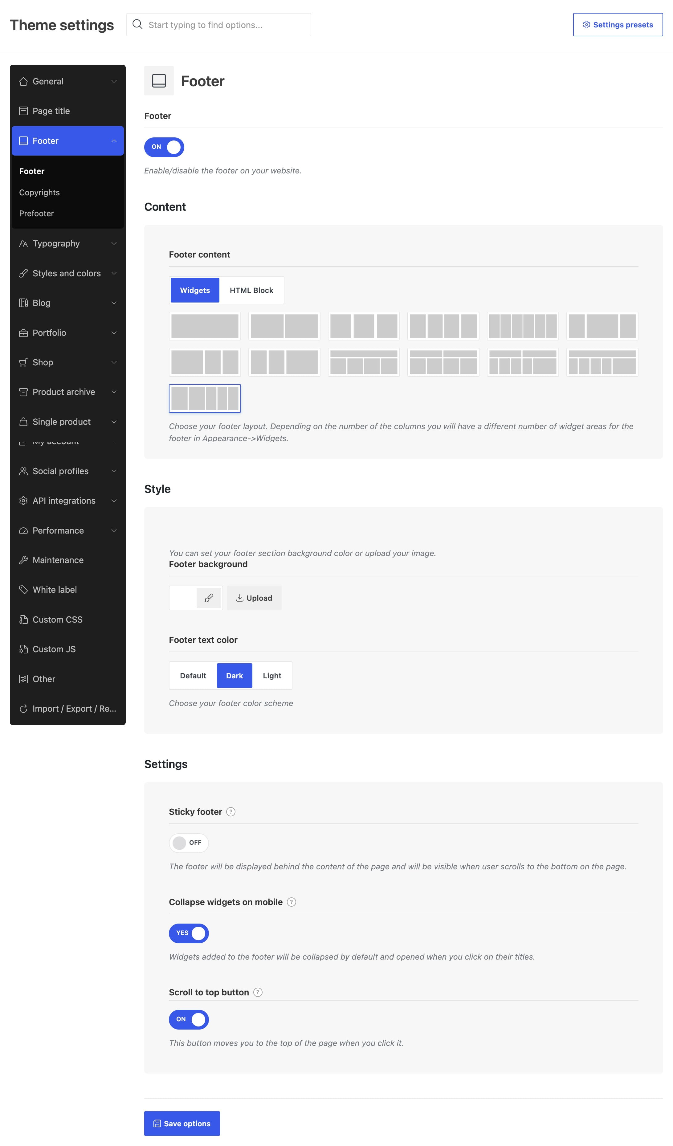
The widget-based method uses a predefined footer layout. Each column in the selected layout creates a corresponding footer widget area in WordPress.
- Navigate to Theme Settings -> Footer.
- Make sure the Footer option is enabled.
- Set Footer content to Widgets.
- Select a structure in Footer layout and save Theme Settings.
- Navigate to Appearance -> Widgets.
- Add content to the generated Footer Column widget areas.
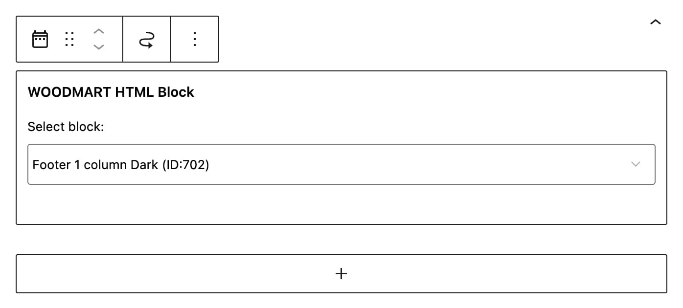
For example, the Three Columns layout creates three footer widget areas. You can place standard WordPress widgets or a WoodMart HTML Block widget in each area. However, when the entire footer requires a custom design, selecting one HTML Block as the footer content is usually more straightforward.
Footer style and behavior
The following options are available in Theme Settings -> Footer.
- Footer background: sets the background color or image for the main footer area.
- Footer text color: selects the Default, Dark, or Light color scheme for footer text.
- Sticky footer: displays the footer behind the page content and reveals it when the visitor reaches the bottom of the page.
- Collapse widgets on mobile: collapses footer widget areas on mobile devices and opens them when visitors select their titles. This setting applies only to the Widgets footer content type.
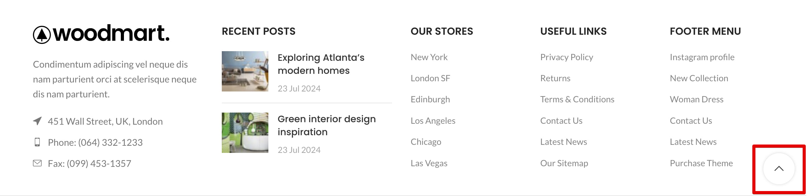
- Scroll to top button: displays a button that returns visitors to the top of the page.
Copyrights
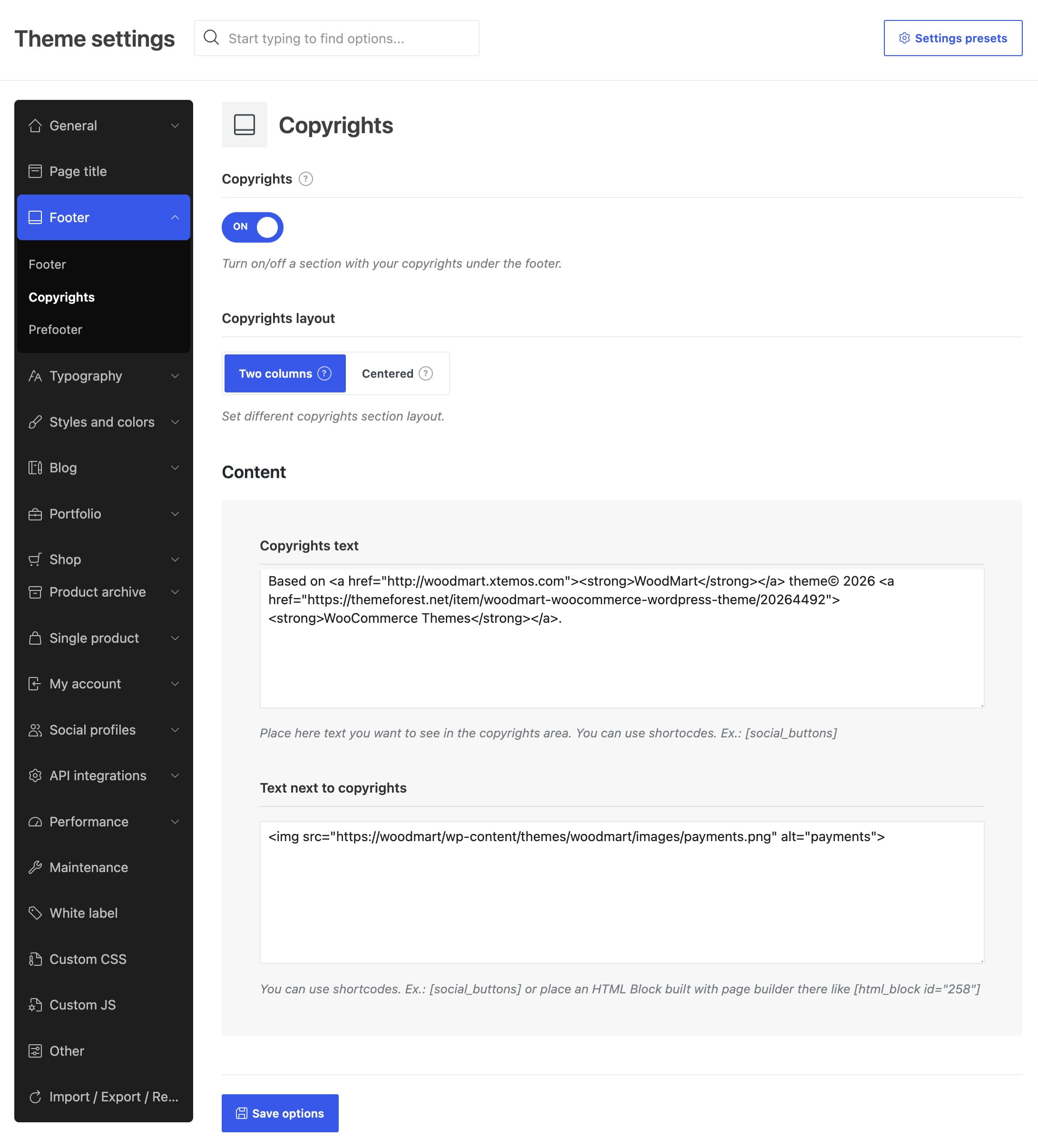
The Copyrights section is displayed below the main footer. Navigate to Theme Settings -> Footer -> Copyrights to configure it.
- Enable the Copyrights option.
- Set Copyrights layout to Two columns or Centered.
- Add the primary content to Copyrights text.
- For a two-column layout, add optional secondary content to Text next to copyrights.
- Save Theme Settings.
Both content fields support shortcodes. The secondary field can be used for payment icons, social buttons, an HTML Block shortcode, or other supplementary content.

Prefooter
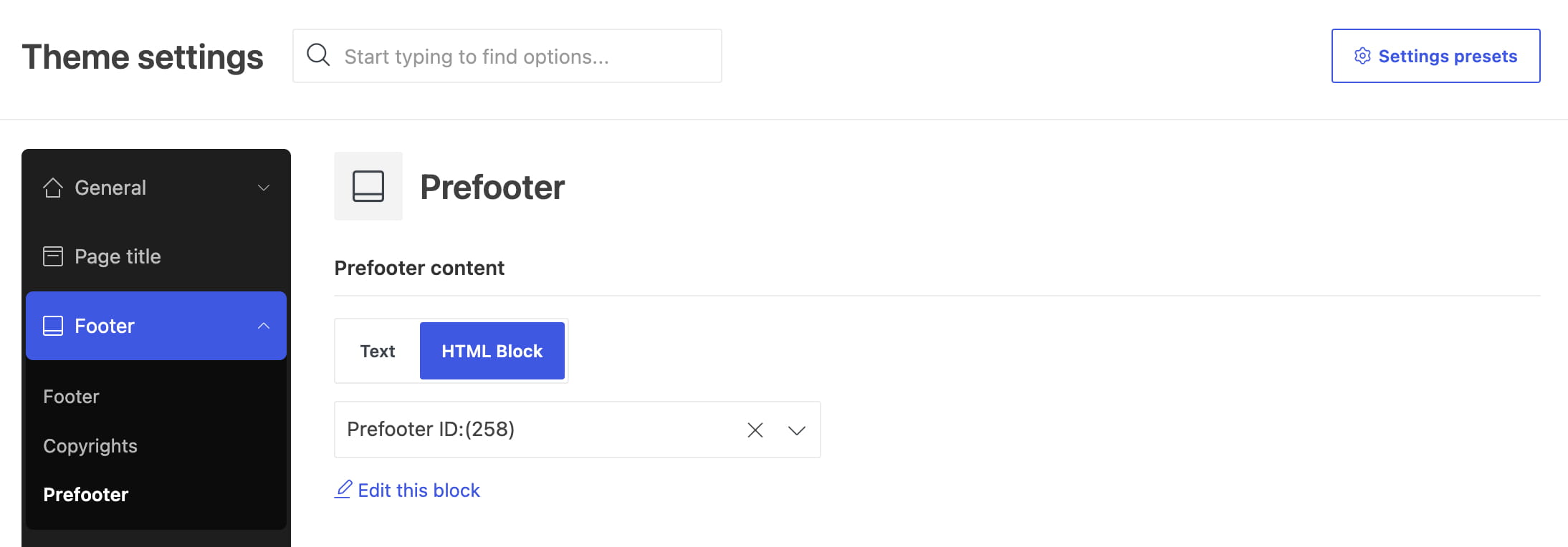
The prefooter is an optional content area displayed immediately before the main footer. Navigate to Theme Settings -> Footer -> Prefooter to configure it.
- Set Prefooter content to Text or HTML Block.
- If Text is selected, enter the content in the Text field.
- If HTML Block is selected, choose a published block in the HTML Block field.
- Save Theme Settings.

Disable footer sections on individual pages
WoodMart lets you override the global footer configuration for individual pages. Edit the required page, open its WoodMart page settings, and use Disable footer, Disable prefooter, or Disable copyrights as needed.
Don’t miss WoodMart updates
Receive feature updates, tutorials, and WoodMart news via email.
 Last updated: September 21, 2026