WordPress blog
The fashion industry is all about visual storytelling and seamless interaction. With our new Fashion 2 demo, we aimed to create a concept that blends “clean” UX with powerful commercial technologies. In this post, we’ll walk you through how we built this demo using standard WoodMart tools — from immersive video backgrounds to complex carousel synchronization.
Explore the live demo: https://woodmart.xtemos.com/fashion-2/
Website Structure
WoodMart makes it easy to build a cohesive, professional online store with pre-designed pages that are both beautiful and fully customizable.
Header Builder
In Fashion 2, we paid special attention to the dropdown menus to ensure they feel like a natural extension of the design.
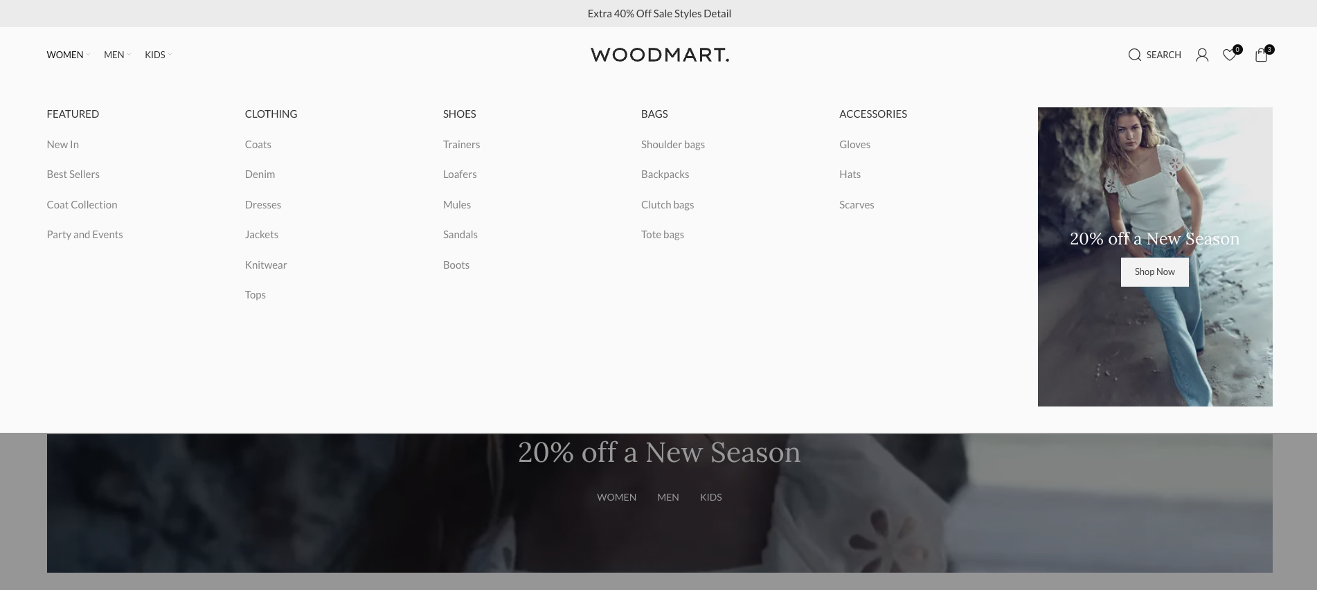
We applied a subtle #FAFAFA background to the dropdown menus. This soft, off-white tint provides a clean, premium feel that avoids the harshness of pure white while maintaining visual clarity.
To maintain a modern, “flat” aesthetic, we completely removed the default drop shadows. By accessing the Box Shadow settings and setting the Blur value to 0, we eliminated the depth effect, resulting in a crisp, clean interface that aligns with current design trends.
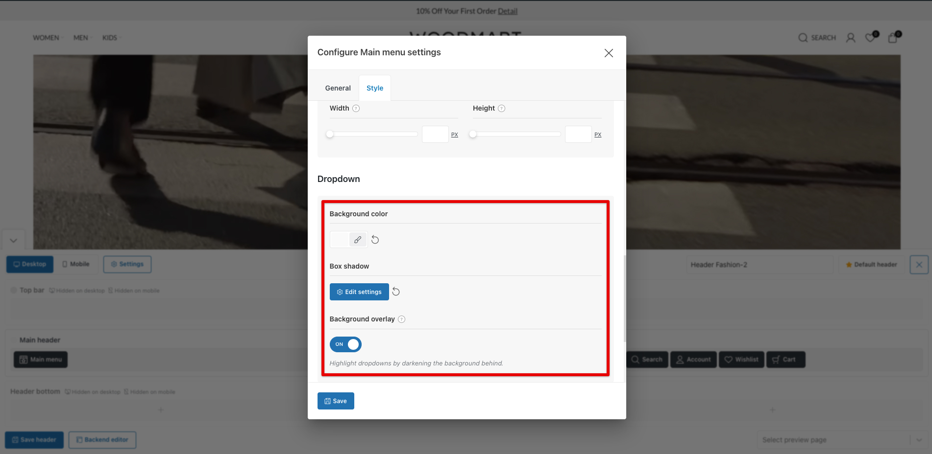
To help users focus entirely on navigation, we enabled the Background Overlay option. This feature highlights dropdown menus by darkening the background behind them, ensuring that the user’s attention is directed solely toward the product categories and navigation links.
For more details on creating the Header Builder, please refer to our documentation.
Exploring the Home Page
On the first screen, we moved away from classic static layouts and implemented a high-impact Hero section, where a background video serves as the foundation.
We layered the Main Title and the Product Category Menu directly over the moving footage. This creates a cinematic feel where navigation is integrated into the brand’s story.
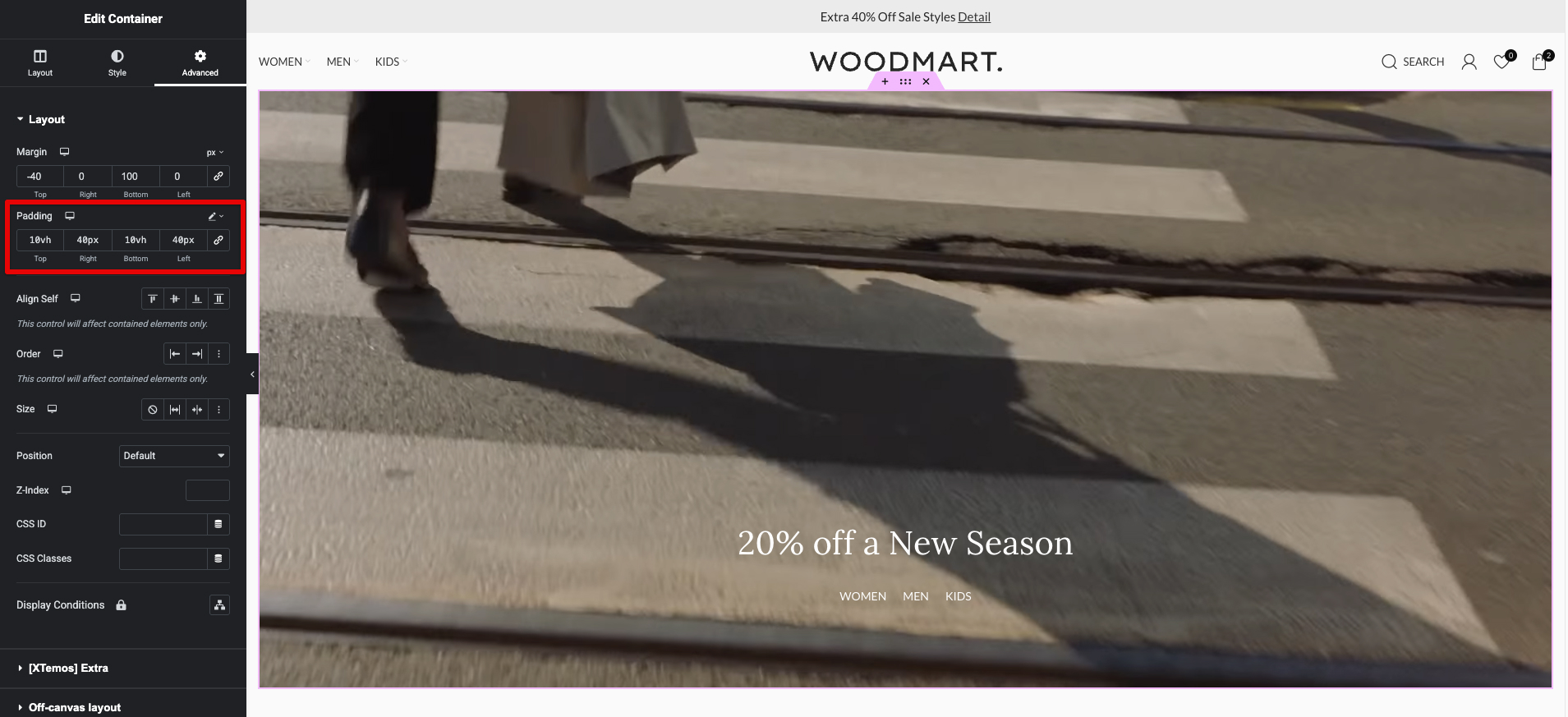
For the Container element with a video background, we configured the video directly in the Style → Background settings by pasting the link to the uploaded video file (MP4/WebM).
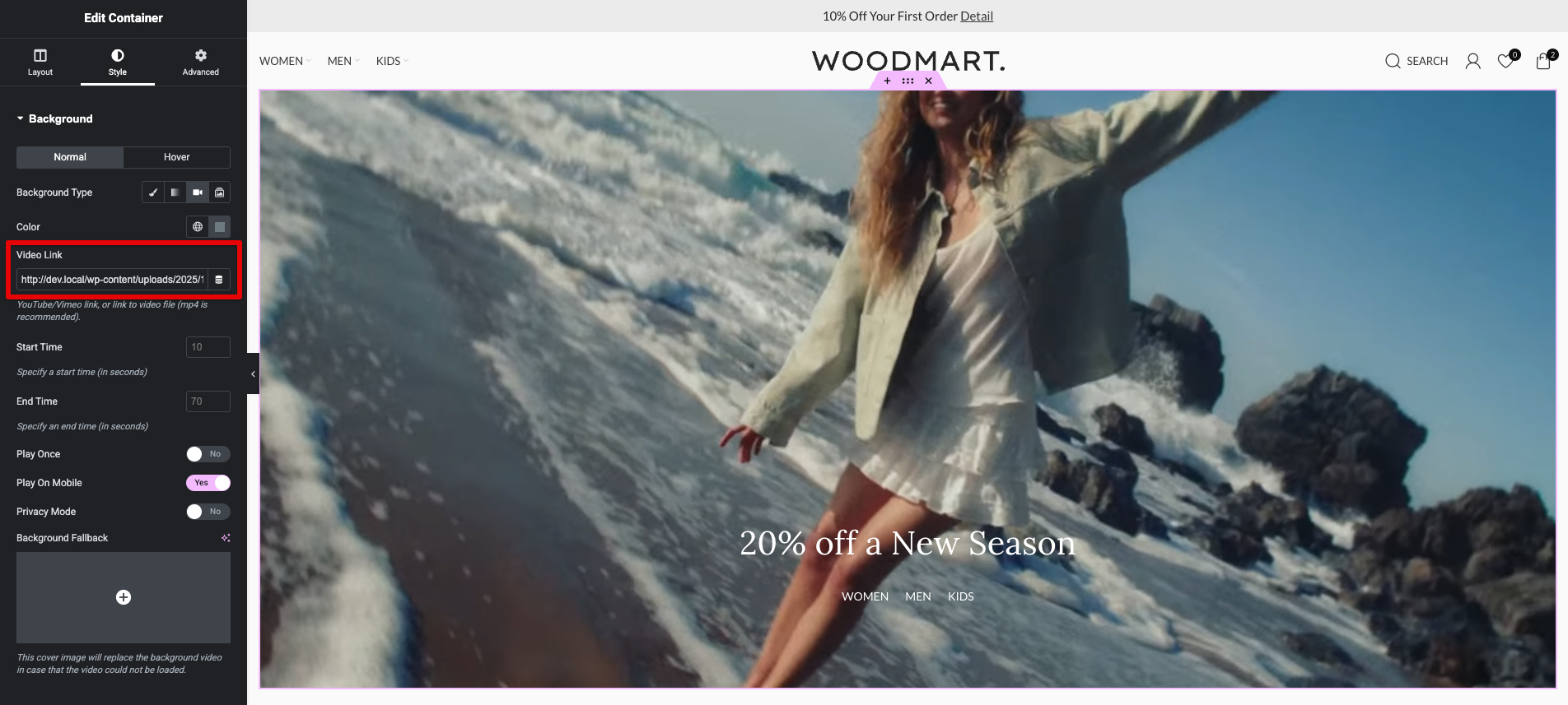
To achieve a balanced, not-quite-edge-to-edge composition while maintaining immersion, we set custom padding on the container: 10vh top + bottom (using viewport height units for responsive vertical breathing room) and 40px right + left (fixed pixels for consistent horizontal margins across devices). This creates elegant space around the content without breaking the full-width feel, especially useful when overlaying text or navigation on video.
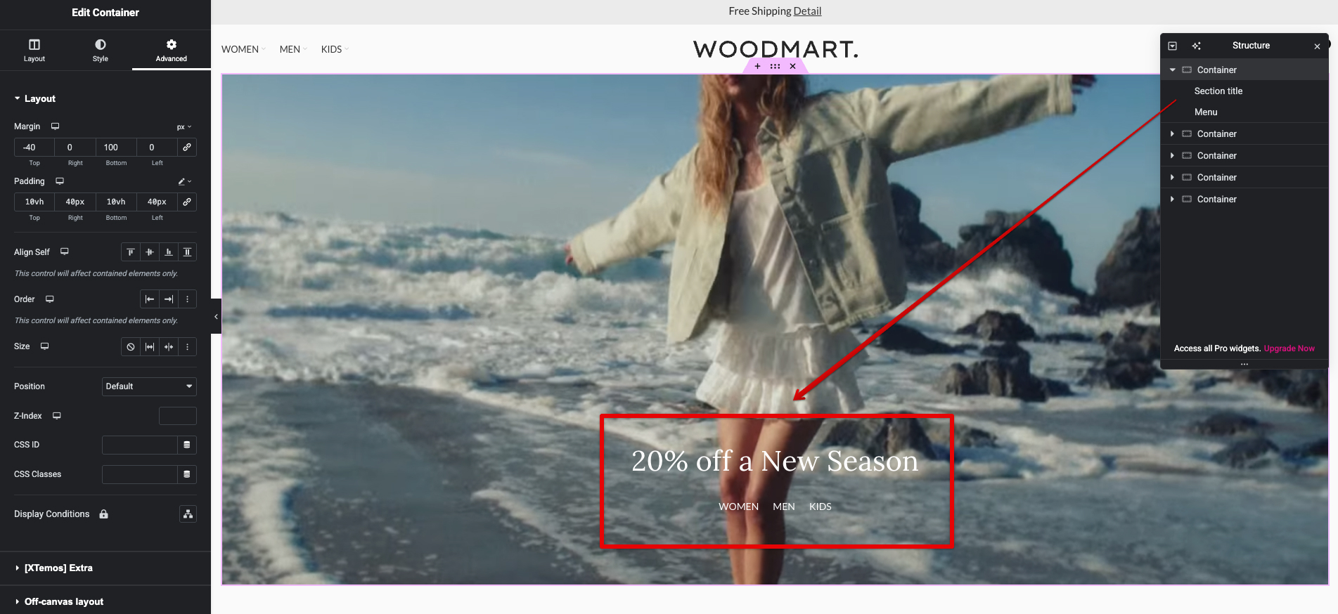
Inside this container, we added key overlaid elements via the drag-and-drop builder: the Section Title and Menu.
These elements are positioned using Flexbox alignment options in the Container.
The combination of video background + padding + overlaid Title and Menu creates a sophisticated, magazine-cover-like hero that draws users in while providing immediate navigation cues.
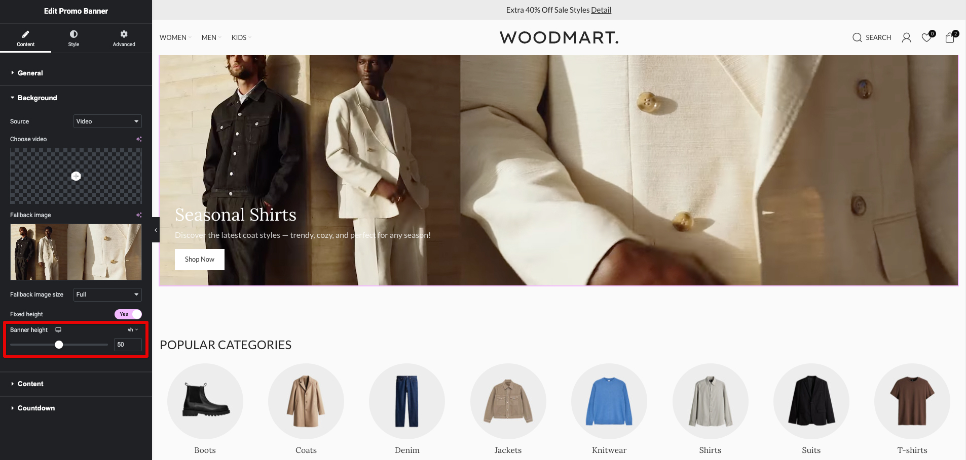
A key highlight of this demo — and one of the newest features we actively utilized — is the VH unit support for Banner Height in the Promo Banner element. This capability was added in WoodMart version 8.4, allowing designers to set banner height directly in VH (viewport height) units right within the element settings.
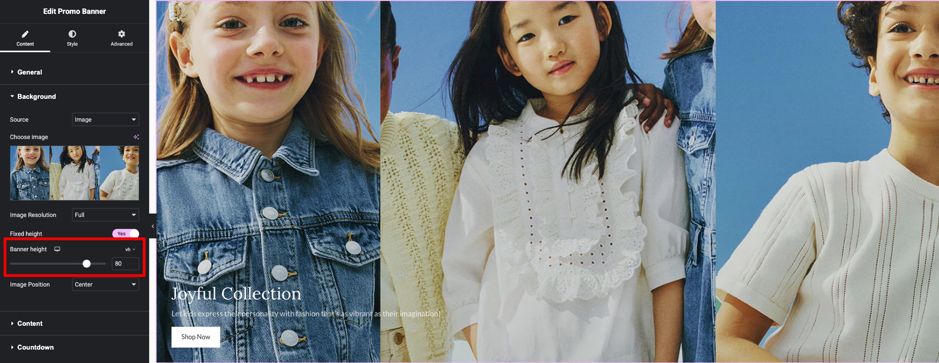
Now, with native VH support, you can override that behavior and set precise viewport-based heights (e.g., 100vh, 80vh, 120vh) independently of the image’s original proportions. In the Fashion 2 demo, we set the primary hero section and several large category/promo banners to 100vh.
Another powerful interactive feature on the home page banners is the “View Products” button functionality. When a visitor clicks the “View Products” button on certain promo or category banners, a right-side off-canvas sidebar slides in smoothly. This sidebar displays a curated selection of products tailored to the specific style or category highlighted by the banner (for example, matching outfits, seasonal picks, or thematic collections).
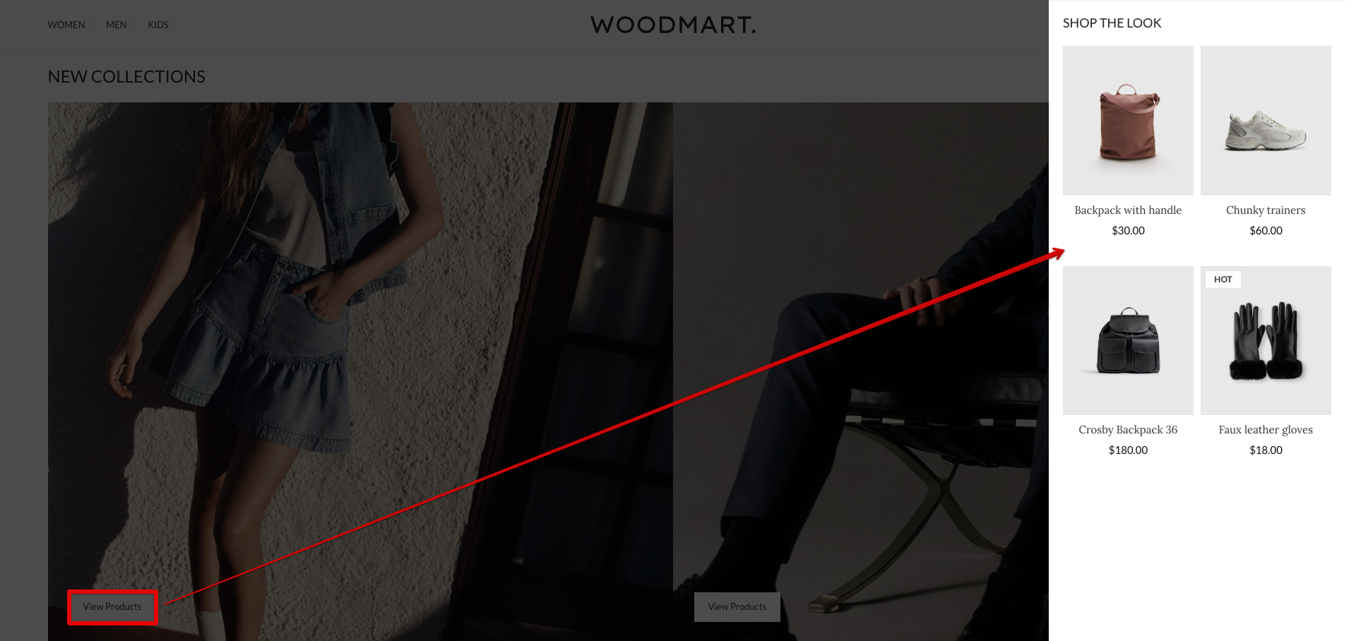
This dropdown sidebar is implemented entirely using WoodMart native Popup blocks functionality — no third-party plugins needed. In the Popup block settings, under the Advanced tab, we defined a custom CSS selector that controls when and how the popup appears.
For more details on creating Popup Block trigger settings, please refer to our documentation.
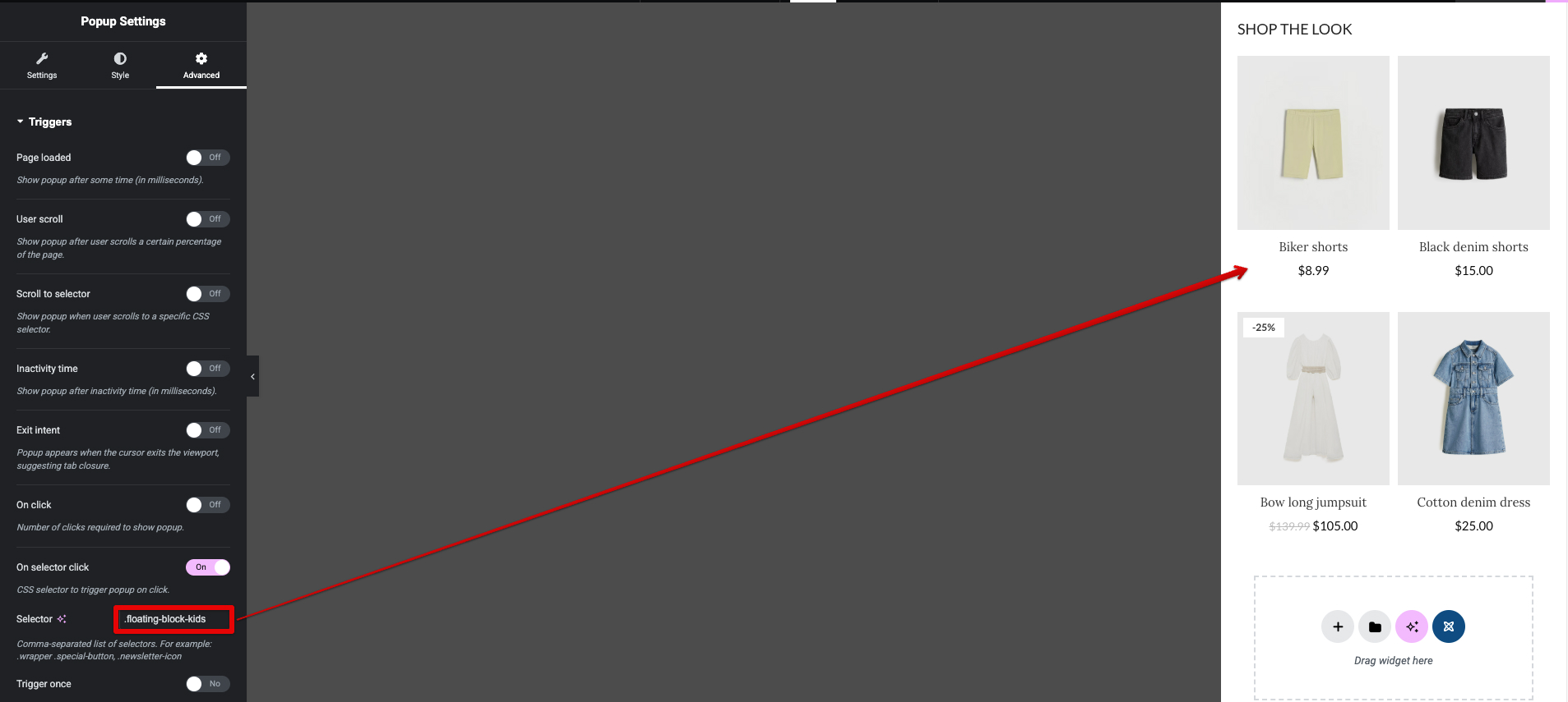
Correspondingly, in each relevant Promo Banner element, we went to the Advanced tab and added the matching custom selector to the CSS Classes field.
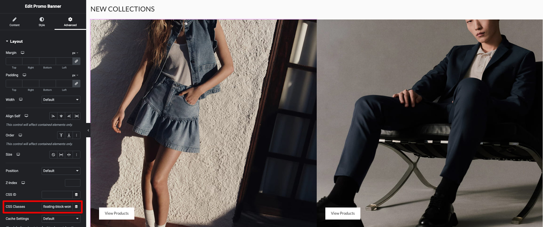
This clever pairing of a custom class on the banner (trigger element) with the selector-based trigger in the Popup block settings allows the right-side sidebar to open precisely when the button is clicked. It provides an elegant, non-disruptive way to present product recommendations while keeping the user on the home page — enhancing discovery and potentially increasing add-to-cart actions without full page reloads.
The Footer
The footer is built using an HTML block, allowing full use of page builders such as Elementor, Gutenberg, or WPBakery to create complex layouts. Navigate to Theme Settings → Footer and select “HTML Block” as your Footer Content option.
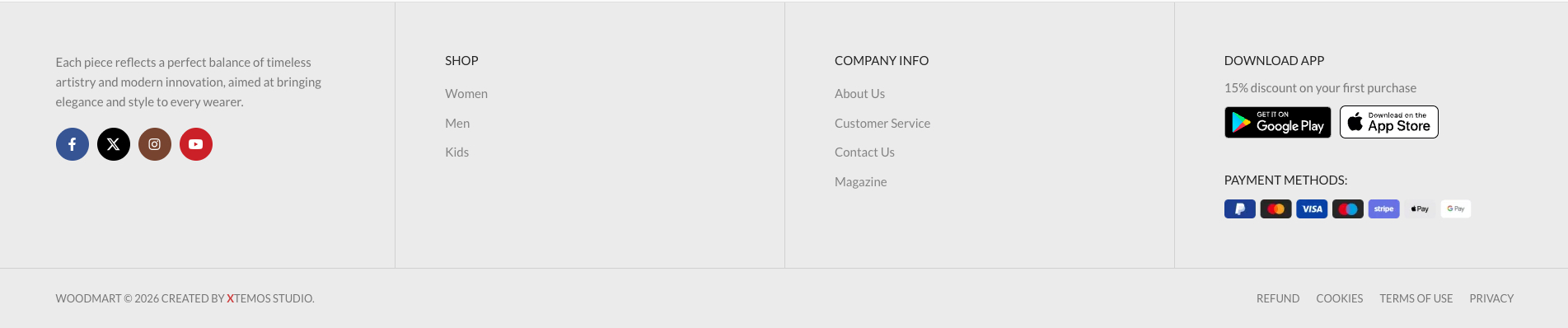
For more details on setting up the footer, please refer to our documentation.
Typography & Styles
Typography plays a pivotal role in achieving the editorial, premium feel of the Fashion 2 demo. All global font settings are configured directly in Theme Settings → Typography, giving full control over body text, headings, product titles, and more — without any custom CSS required.
Primary Font — We selected Lato as the main font family for body text, paragraphs, product descriptions, and general content. Lato is a clean, highly legible sans-serif Google Font with excellent readability at various sizes and weights. It provides a modern, professional look while maintaining a light and airy quality that complements the minimalist monochrome palette and high-fashion imagery.
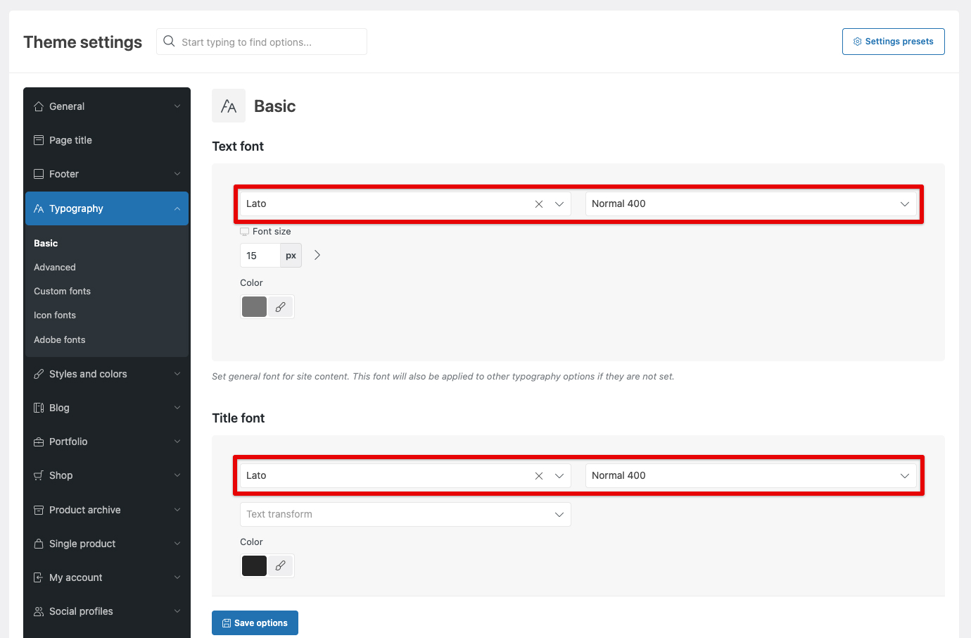
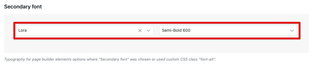
Secondary Font — we chose Lora. This elegant serif font adds a touch of sophistication and editorial flair, evoking the style of luxury fashion magazines. The contrast between the sans-serif body text (Lato) and serif headings (Lora) creates visual hierarchy and interest without overwhelming the design.
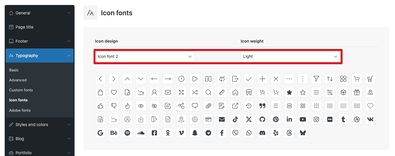
The demo uses Design Icons 2 with a light font weight
For more details on create Typography settings, please refer to our documentation.
WoodMart Custom Layout Builder
Fashion 2 utilizes custom layouts for every major part of the site:
- Product loop item layout
- Product archive layout (Shop)
- Product archive layout Categories: Women, Men, Kids
- Single product layout
- Cart & Checkout layouts
- My Account layout
- Single post & Blog archive layouts
Product loop item layout
In line with the overall minimalism philosophy, the product cards in grids and carousels are intentionally stripped down to show only the most essential information. We deliberately removed visual noise so the photography remains dominant and the browsing experience feels calm, curated, and luxurious — exactly what high-end fashion shoppers expect.
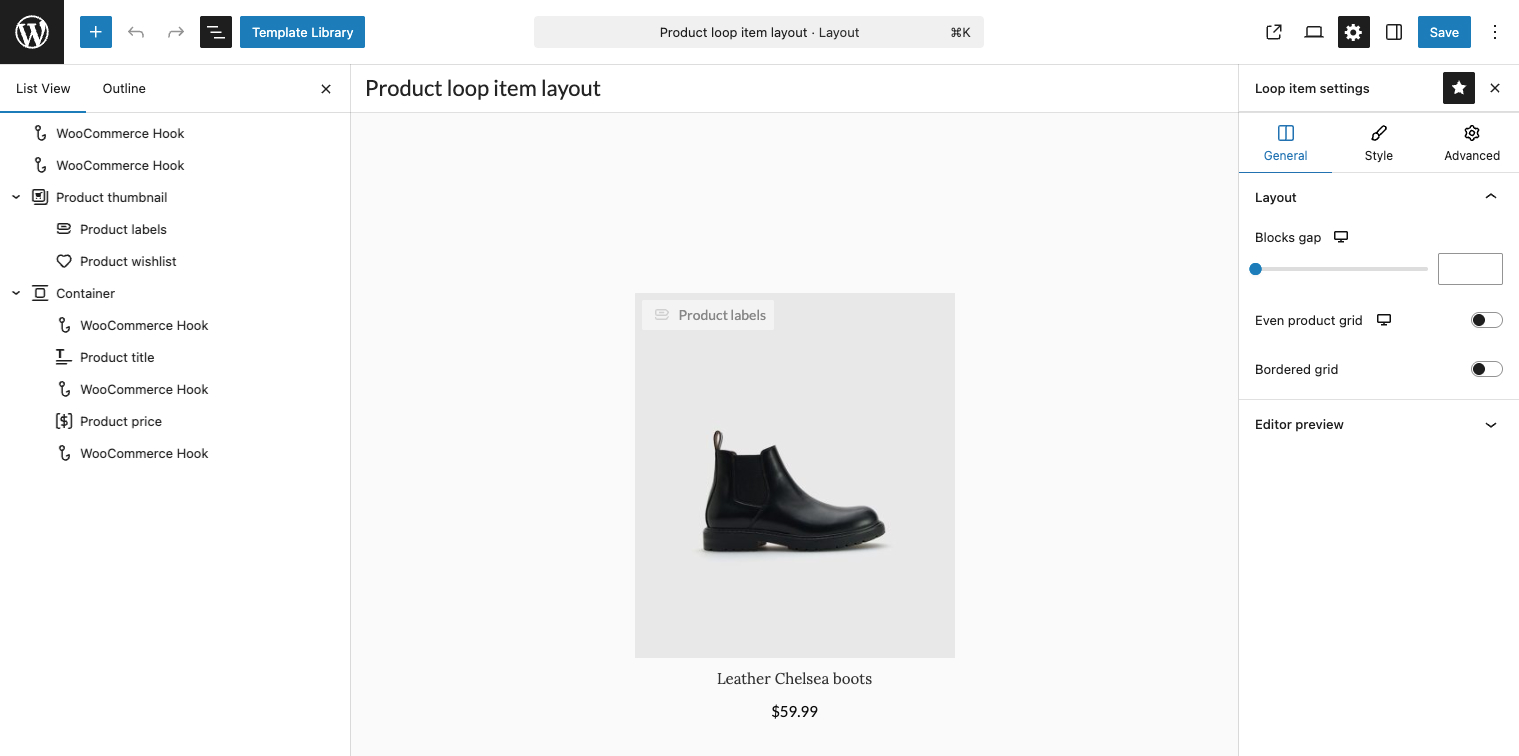
Important note: Although the Product Loop Layout Builder is available on sites using any page builder supported by the theme, product designs can only be created using the native WordPress Gutenberg editor. This decision was made due to the limitations of WPBakery and Elementor regarding absolute positioning, nested element restrictions, and the lack of global “Parent Hover” functionality — all of which are critical for building medium-to-high complexity product designs. Find more details about the Product Loop Layout Builder in our documentation here.
Product archive layout Categories: Woomen, Men, Kids
On all category pages — including Women, Men, and Kids — the first screen (above the fold) features a prominent banner with a background video. Just like on the homepage, we set its height to 50vh using the new VH unit support in the Promo Banner element.
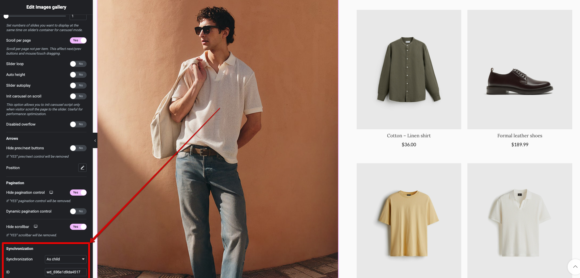
The Men’s category page stands out with additional innovative interactions powered by WoodMart carousel tools. Here we implemented synchronized product carousels.
This synchronization is configured natively in WoodMart Carousel element settings (Synchronization), making it easy to pair visual inspiration with shoppable products.
Single Product Layout
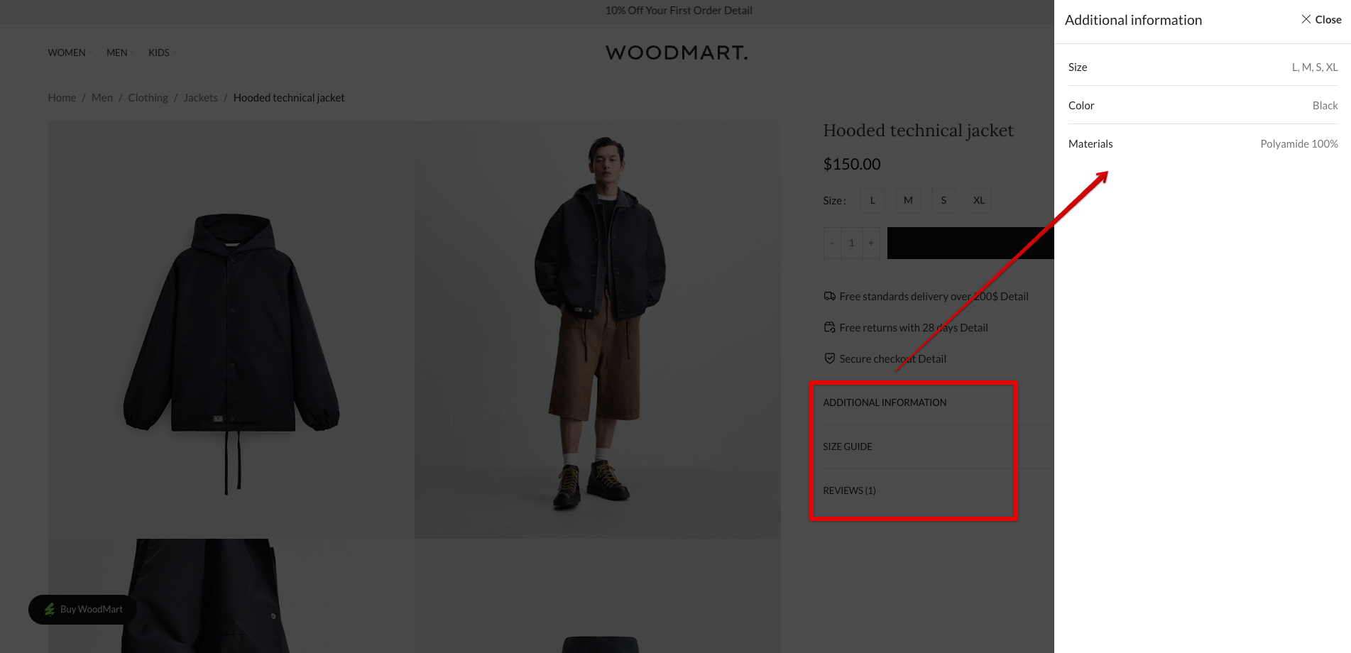
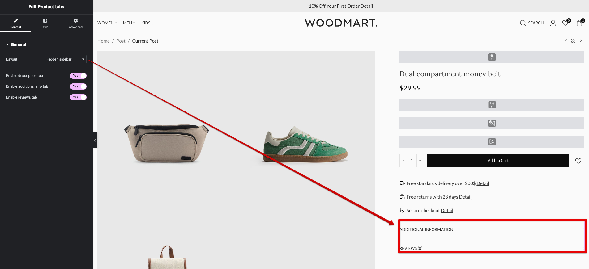
For a more compact display of detailed content, we moved the Description, Additional Information (attributes, specs), and Reviews sections into a right-side off-canvas sidebar (a popup-style panel) that opens on demand. Instead of traditional tabs or long accordions below the fold, users click a dedicated button to trigger this sidebar.
WoodMart natively supports embedding videos directly into the main gallery carousel (via the Product Gallery element settings). In Fashion 2, we incorporated short, looping product videos alongside static images, allowing customers to see fabric movement, the fit on a model, or details in action. This elevates the shopping experience, reduces returns by providing better context, and aligns perfectly with fashion’s emphasis on motion and lifestyle.
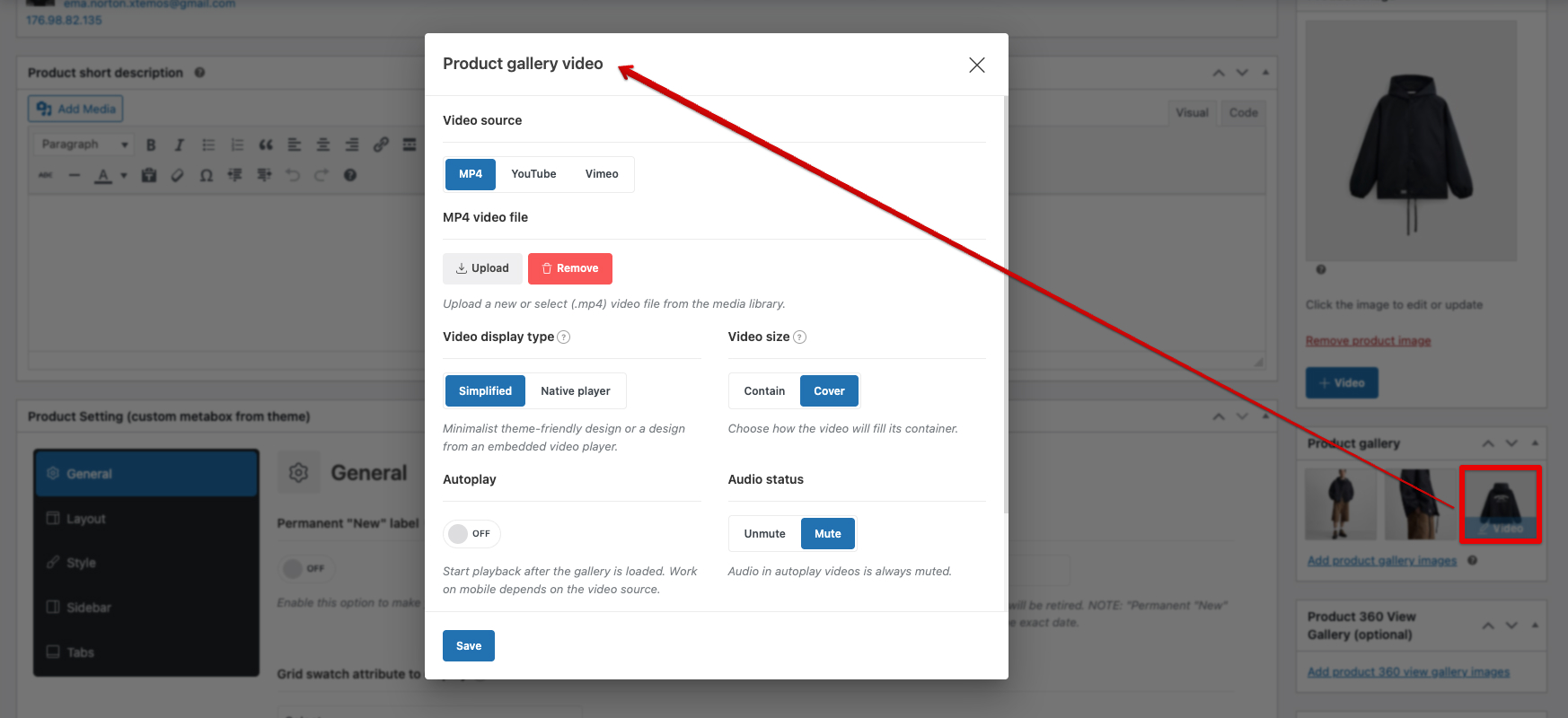
For more details on creating a Product Video, please refer to our documentation.
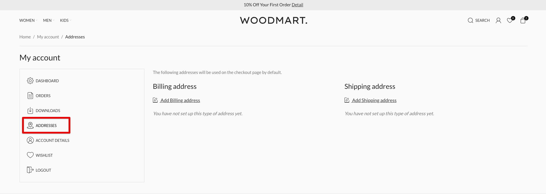
Modern “My Account” Dashboard
Transformed into a stylish card-based layout using the WoodMart Layout Builder.
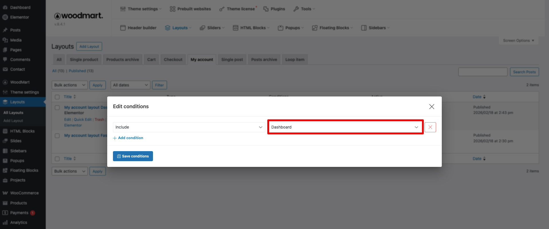
A key innovation here: we created two separate layouts and applied them using conditions. This allows the same endpoint (/my-account/) to display different designs depending on the user’s activity state or specific sub-page.
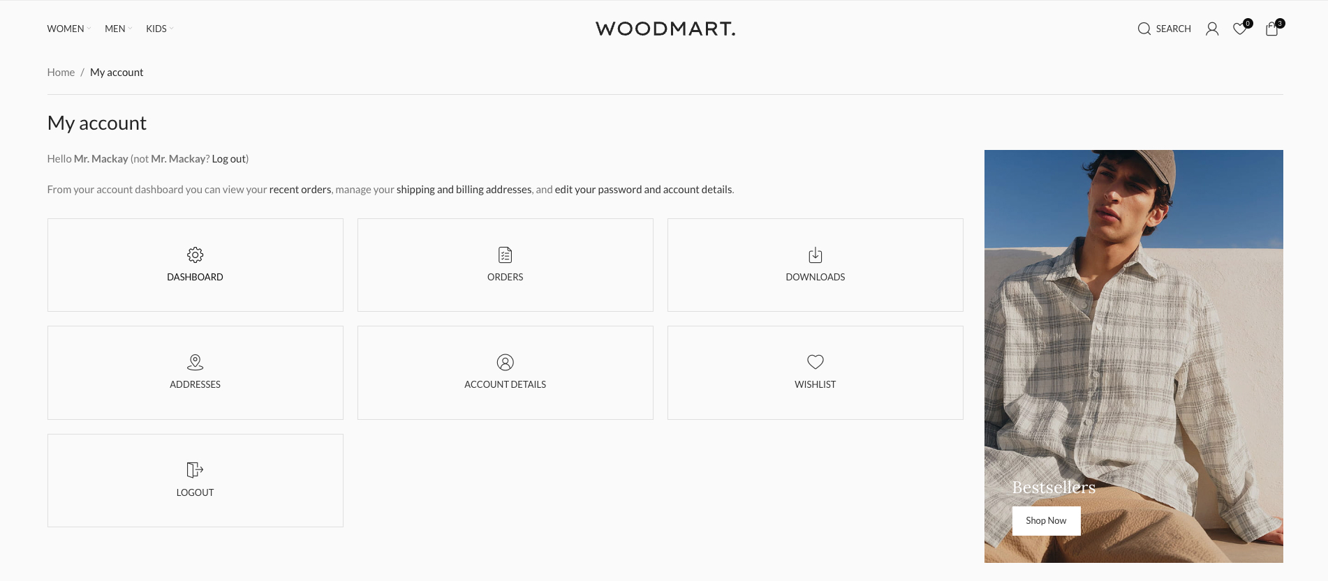
One layout serves as the main dashboard view (after login) — elegant cards for recent orders, wishlist summary, addresses overview, account details quick links, perhaps personalized greetings or promotions.
Conditions are set directly in the Layout editing popup under the My Account Page Builder options.
The second layout applies conditionally to specific endpoints (e.g., Orders, Downloads, Addresses, Account details, Payment methods) — providing a tailored, card-based or tabbed interface optimized for that section.
For more details on create My account page builder, please refer to our documentation.
Conclusion
Fashion 2 proves that a luxurious, conversion-focused fashion store can be built entirely within WoodMart — without dozens of third-party plugins.
Every element — from full-viewport VH video banners on categories, selector-triggered sidebars, synchronized style + product carousels, ultra-minimal product loops, video-integrated single product galleries with compact sidebar content, and refined Lato/Lora typography — is achievable through WoodMart visual builders: Header Builder, Layout Builder, Popup builder and native WooCommerce enhancements.
We’d love to hear from you! What aspects of the demo Fashion 2 caught your attention? Are you planning to use any of these techniques in your own WoodMart project? Share your thoughts, questions, or experiences in the comments below — your feedback helps us create even better demos and tutorials for the WoodMart community.
Leave a Reply
You must be logged in to post a comment.


One thought on “How we built the Fashion 2 demo website with WoodMart”
I really love this breakdown! What makes these tutorials so valuable isn’t just the “how,” but the deep dive into the actual design philosophy and decisions behind the functionality, like choosing the Lato/Lora font pairing for that premium editorial feel or completely removing dropdown shadows to achieve a crisp, modern aesthetic.
It’s also fantastic to see how the newly released features are being utilized practically. Seeing the new native VH unit support for banner heights in action and learning how to leverage the Popup block settings for an off-canvas sidebar without needing third-party plugins is incredibly helpful. Your tutorials really do give me ideas to rethink elements of my own designs. I often look at these posts and think, oh thats how to use that function, oh I didnt realise you could do that! Keep these behind-the-scenes looks coming! Thanks Team