
Adding a menu to the site
WoodMart lets you display an existing WordPress menu in several areas of your website, including the desktop header, mobile navigation, sticky navigation, mobile bottom navbar, and page content. This guide explains how to place a menu after you have created it.
Create or select a menu
Create and organize your menu in Appearance -> Menus. If you need help adding menu items or arranging parent and child items, see the official WordPress Appearance Menus Screen guide.
This article covers menu placement only. To create a wide dropdown with columns, images, products, or other HTML Block content, see the Create mega menu guide.
Main menu
Use the Main menu element to display a menu in the desktop header.
- Navigate to Dashboard -> WoodMart -> Header Builder.
- Edit the header assigned to your website.
- Add the Main menu element to the required desktop header row, or open the settings of an existing Main menu element.
- Use Choose menu to select the WordPress menu you want to display.
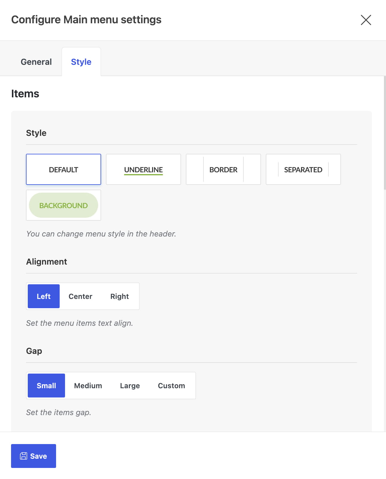
- Configure its appearance in the Style tab, then save the element and the header.
The Main menu element includes controls for its style, alignment, item spacing, colors, icons, and dropdown appearance. For more information about managing Header Builder elements, see How to add and edit builder elements.
Mobile menu
The primary mobile navigation is opened by the Mobile menu element in the mobile header.
- Navigate to Appearance -> Menus -> Manage Locations.
- Assign the required menu to the Mobile Side Menu location and save the changes.
- Navigate to WoodMart -> Header Builder and edit the active header.
- Switch to the mobile header layout and add the Mobile menu element, or open its existing settings.
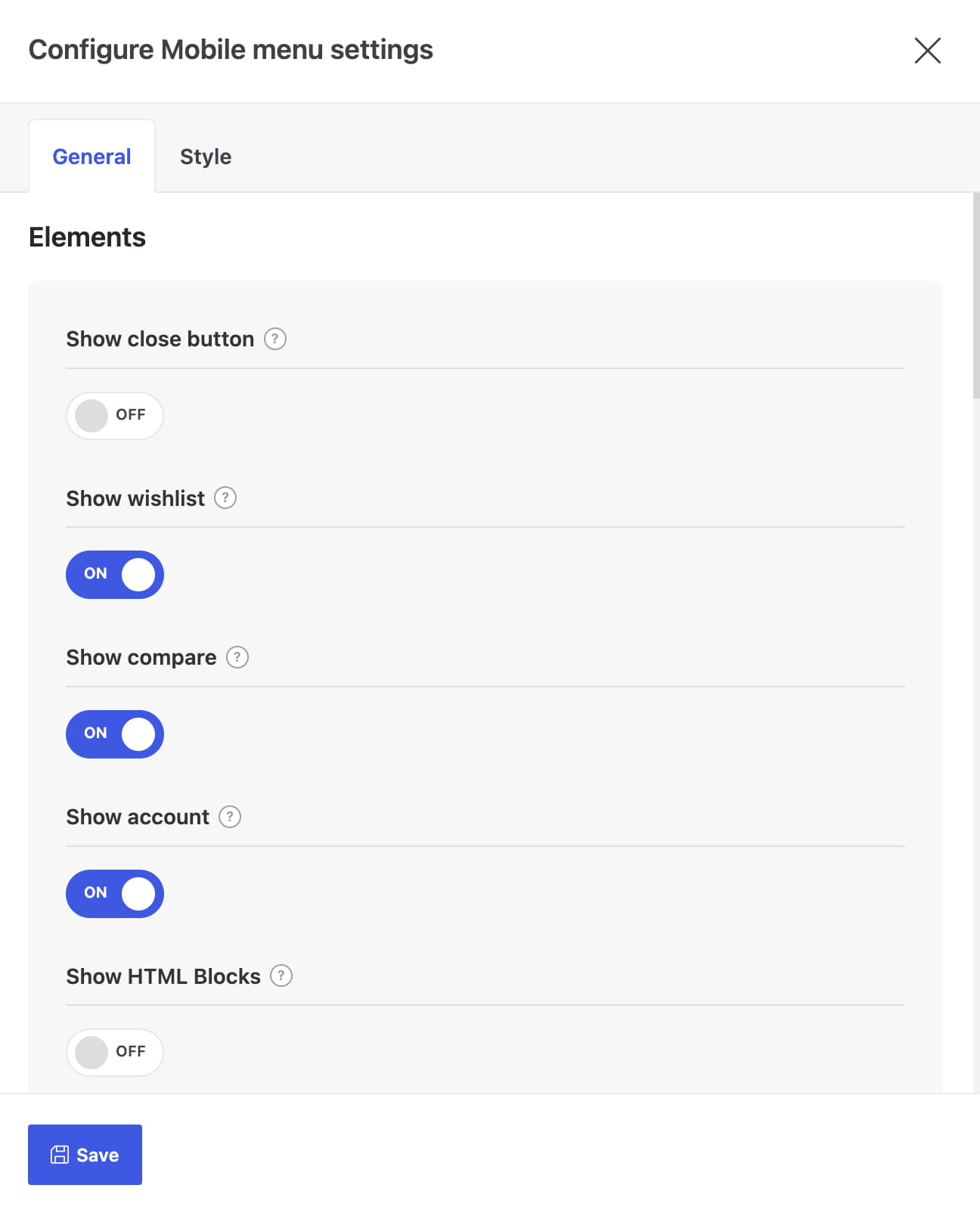
- Configure the mobile menu layout, opening action, position, search form, and other available options, then save the header.
If no menu is assigned to the Mobile Side Menu location, WoodMart uses the menu assigned to the main menu location as a fallback.
Add a categories tab to the mobile menu
The Mobile menu element can display a second tab containing a separate categories menu.
- Open the Mobile menu element in Header Builder.
- In the General tab, enable Show categories menu.
- Use Choose menu to select the menu displayed in the categories tab.
- Optionally change the tab titles or enable Swap menus, then save the header.
Sticky navigation
Sticky navigation displays a menu in a vertical panel that remains available while visitors browse the website. It is separate from the sticky header and the mobile bottom navbar.
- Navigate to Theme Settings -> General -> Sticky navigation.
- Use Select menu to choose the menu for the panel.
- Optionally configure its title and bottom content.
- Open Header Builder and add the Sticky navigation element to the desktop header.
- Save the header and Theme Settings.
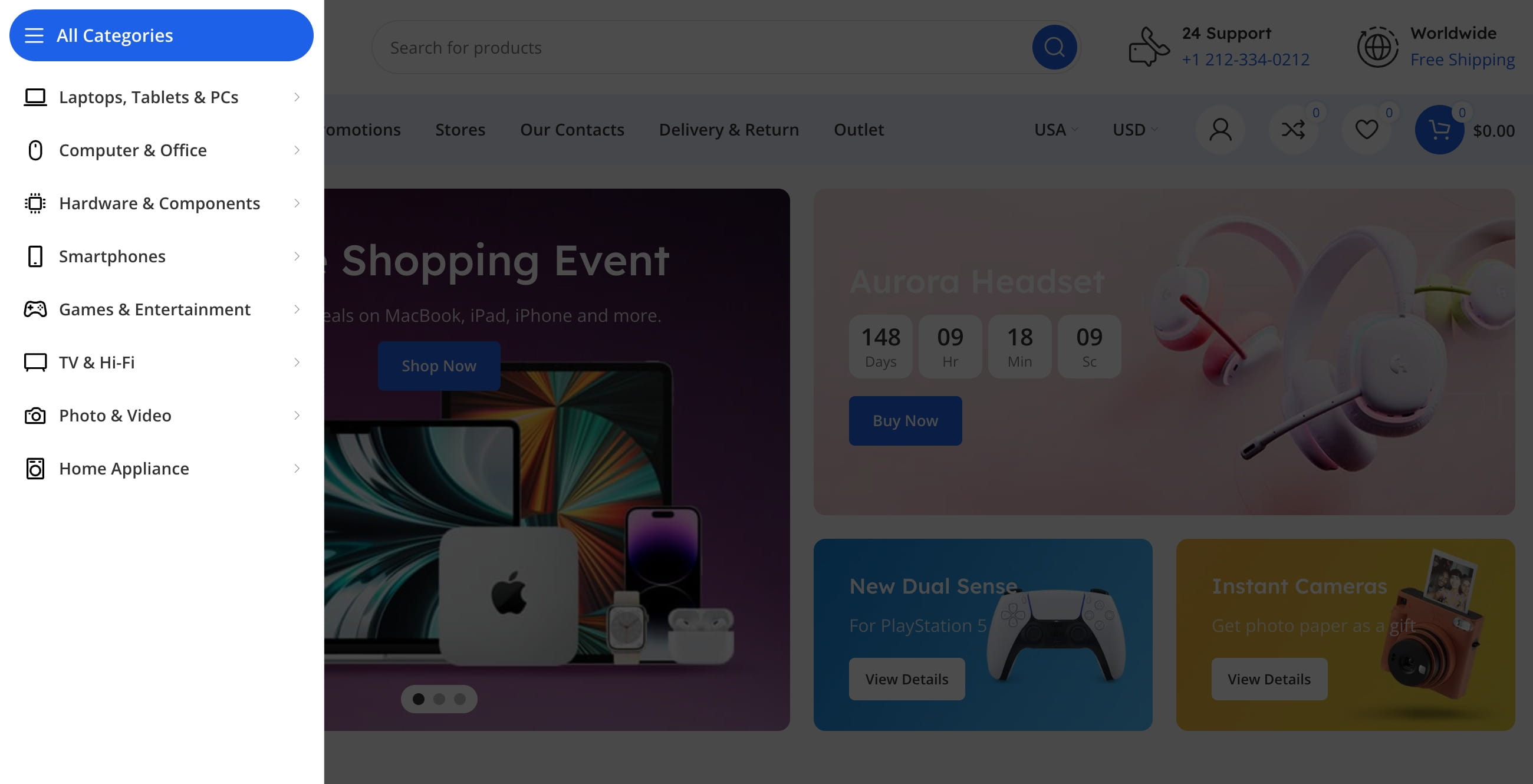
For a complete description of this feature, see the Sticky navigation documentation.
Mobile bottom navbar
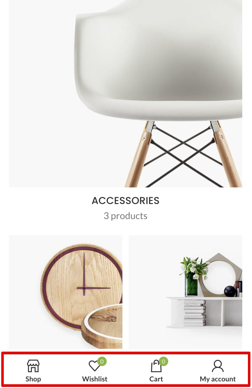
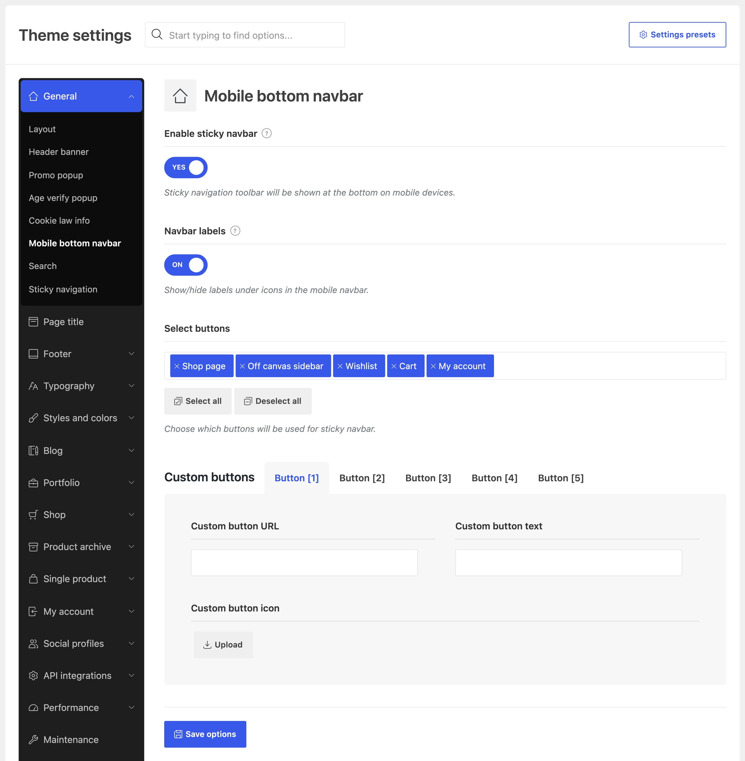
The mobile bottom navbar is a fixed toolbar displayed at the bottom of the screen on mobile devices. It does not contain a complete WordPress menu itself, but it can include buttons that open the mobile menu or mobile categories menu.
- Navigate to Theme Settings -> General -> Mobile bottom navbar.
- Enable Enable sticky navbar.
- Use Navbar labels to show or hide text below the icons.
- In Select buttons, choose the actions displayed in the navbar. To provide access to navigation, add Mobile menu or Mobile categories menu.
- Save Theme Settings.
The navbar can also contain page links, WooCommerce actions, the off-canvas sidebar, and up to five custom buttons. Each custom button can have its own URL, text, and icon.
Additional menu in the header
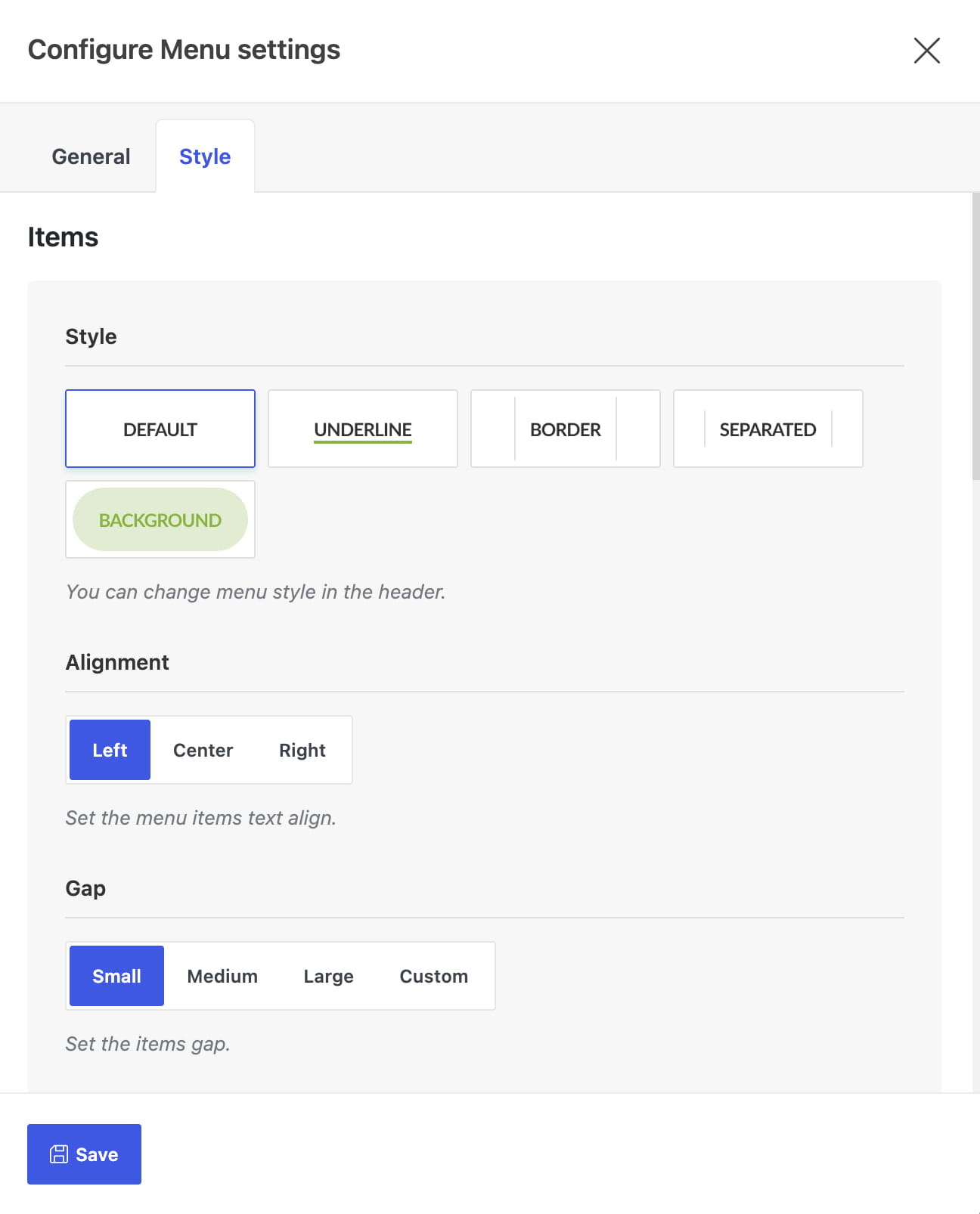
Use the Menu element in Header Builder when you need to display an additional WordPress menu alongside the main navigation. It is commonly used for short groups of supplementary links such as FAQs, contact information, or a newsletter page.
- Navigate to WoodMart -> Header Builder and edit the active header.
- Add the Menu element to the required header row.
- Use Choose menu to select the menu you want to display.
- Configure its style and alignment, then save the element and the header.
Menu in page content
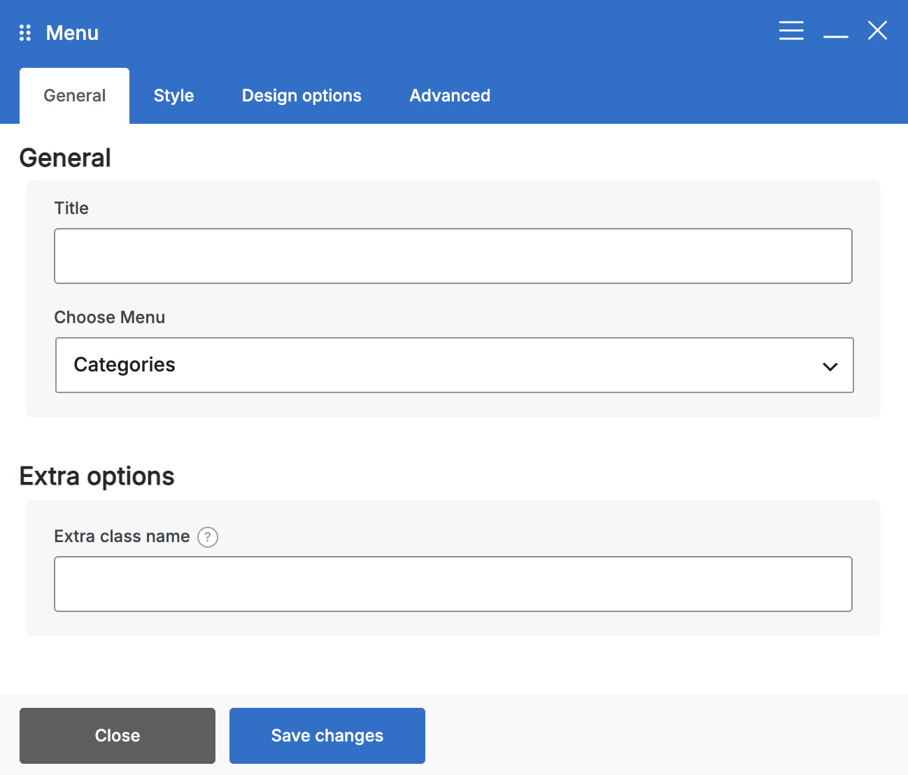
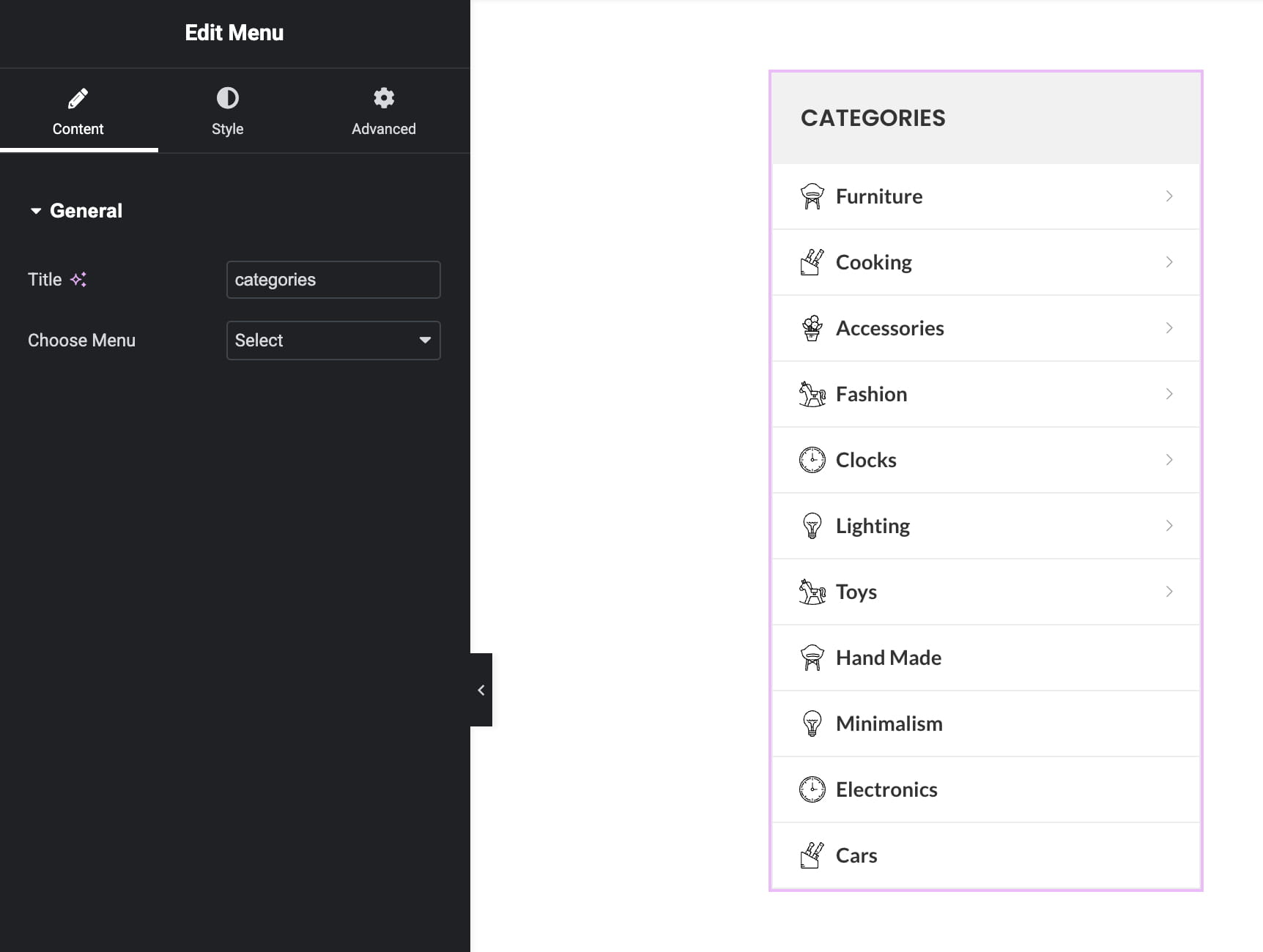
To display a WordPress menu outside the header, add the WoodMart Menu element to a page or HTML Block in Elementor or WPBakery. Select the required menu in Choose Menu, then configure its vertical or horizontal orientation and appearance.
The Menu element supports standard WordPress submenus and WoodMart mega menu settings. For example, it can be used to display a vertical categories menu inside page content instead of the header.
Don’t miss WoodMart updates
Receive feature updates, tutorials, and WoodMart news via email.
 Last updated: August 10, 2026