
Variable products and swatches
Variable products let customers choose between product options such as color, size, or material. WooCommerce displays these options as dropdowns by default, while WoodMart can present global attribute terms as text, color, or image swatches.
WoodMart swatches are available only for global WooCommerce attributes created under Dashboard -> Products -> Attributes. Attributes created directly inside an individual product use the standard WooCommerce dropdown.
Create a variable product
- Navigate to Dashboard -> Products -> Attributes, create a global attribute, and add its terms. For example, create a Color attribute with Black, Blue, and Red terms.
- Edit the product and set Product data to Variable product.
- Open the Attributes tab, add the global attribute, select its values, and enable Used for variations.
- Open the Variations tab, create the required variations, and configure their prices, stock, images, and other product data.
For complete instructions on variable product data and variation management, see the official WooCommerce Variable Products guide.
Configure the swatch type
- Navigate to Dashboard -> Products -> Attributes.
- Click Configure terms for the required attribute.
- Add a new term or edit an existing one.
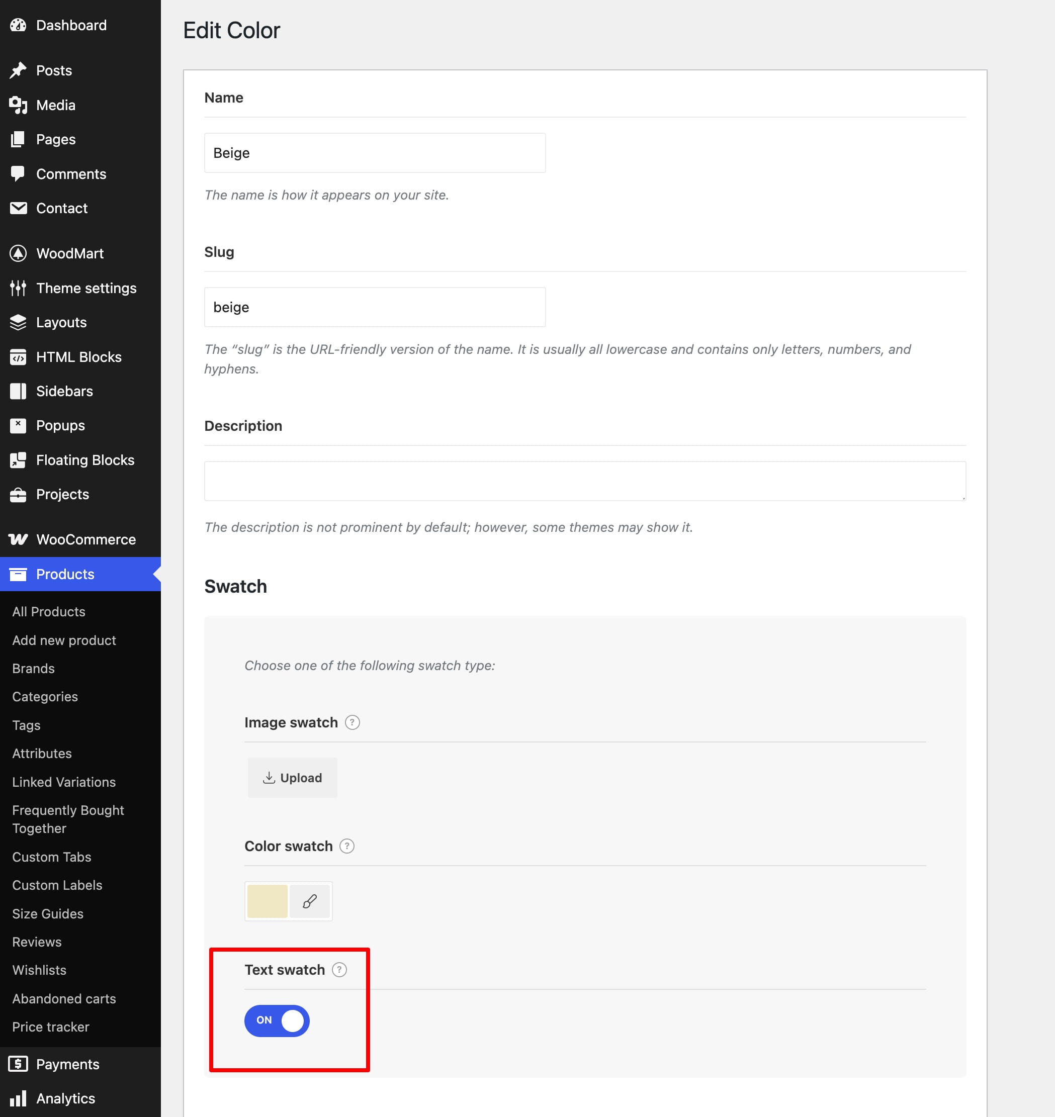
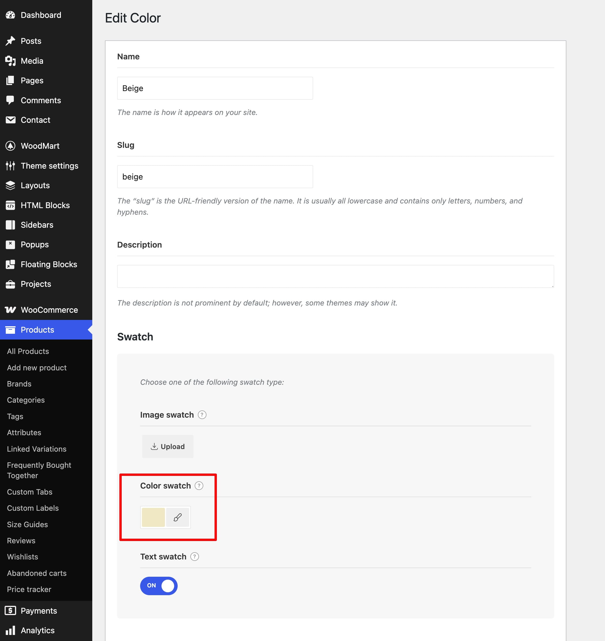
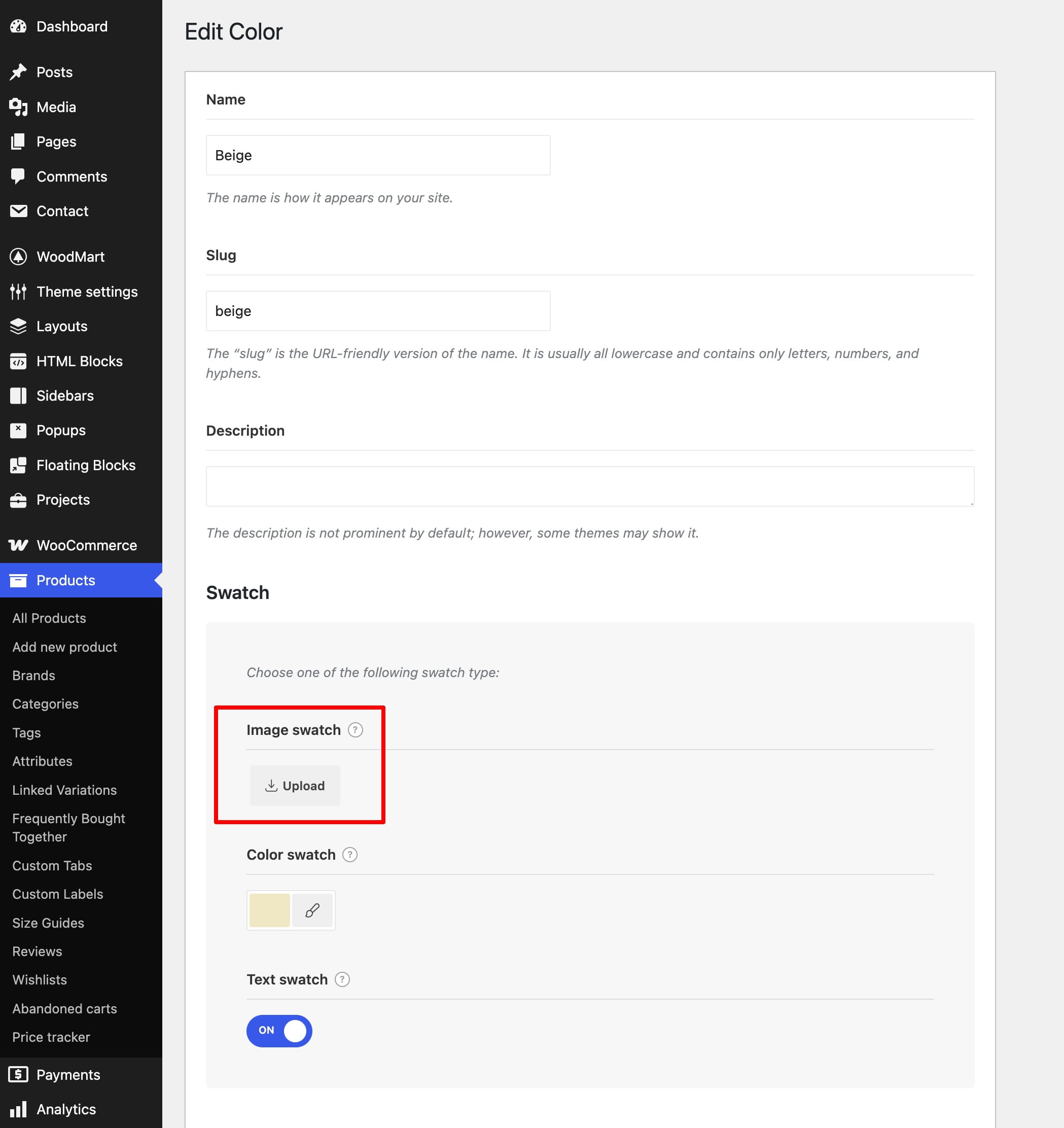
- In the Swatch settings, configure one of the available types and save the term.
- Image swatch — upload an image that represents the attribute term.
- Color swatch — select a color for the term.
- Text swatch — display the term name as a clickable text option.
Configure the swatch appearance
Return to Dashboard -> Products -> Attributes and edit the global attribute itself. The WoodMart settings let you configure the appearance shared by its terms:
- Swatch style — controls the general appearance of available swatches.
- Disabled swatch style — controls how unavailable variation options appear.
- Swatch shape — sets round, rounded, or square swatches.
- Swatch size — sets the size used for the attribute swatches.
Display swatches on the product grid
Navigate to Dashboard -> Theme Settings -> Shop -> Variable products and select an attribute in Grid swatch attribute to display. WoodMart will show that attribute below variable products in shop grids when the products contain the corresponding variations.
If a particular product needs a different grid attribute, use its Grid swatch attribute to display option in the WoodMart product settings to override the global selection.
Use variation images as swatches
WoodMart can fill the selected attribute’s swatches with the primary images assigned to product variations:
- Navigate to Dashboard -> Theme Settings -> Shop -> Variable products.
- Select the required attribute in Grid swatch attribute to display.
- Enable Use images from product variations.
- Assign a primary image to every variation that should appear as an image swatch.
- For each attribute term, remove the Color swatch value and configure an Image swatch or Text swatch as a fallback.
When a variation image is available, WoodMart uses it instead of the term’s Image swatch. If no variation image is assigned, the configured term swatch is used as the fallback.
Video tutorial
Don’t miss WoodMart updates
Receive feature updates, tutorials, and WoodMart news via email.
 Last updated: September 21, 2026