
Sticky navigation
Sticky navigation displays a compact vertical menu at the side of the website. Visitors can open it from an element in the desktop header and access the selected WordPress menu without returning to the top of the page.
This feature is designed for desktop navigation and is separate from the mobile sticky navbar displayed at the bottom of the screen.
Prepare the navigation menu
Sticky navigation uses an existing WordPress menu. Before selecting it in Theme Settings, prepare the menu and add an image to each top-level item that will appear in the compact navigation.
- Navigate to Dashboard -> Appearance -> Menus.
- Create a menu or select an existing one.
- Add and arrange the required menu items.
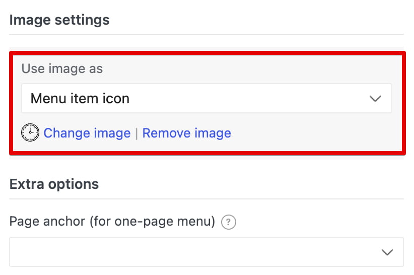
- Expand each top-level menu item and locate Image settings.
- Upload an image and select Menu item icon in Use image as.
- Click Save Menu.
Configure sticky navigation
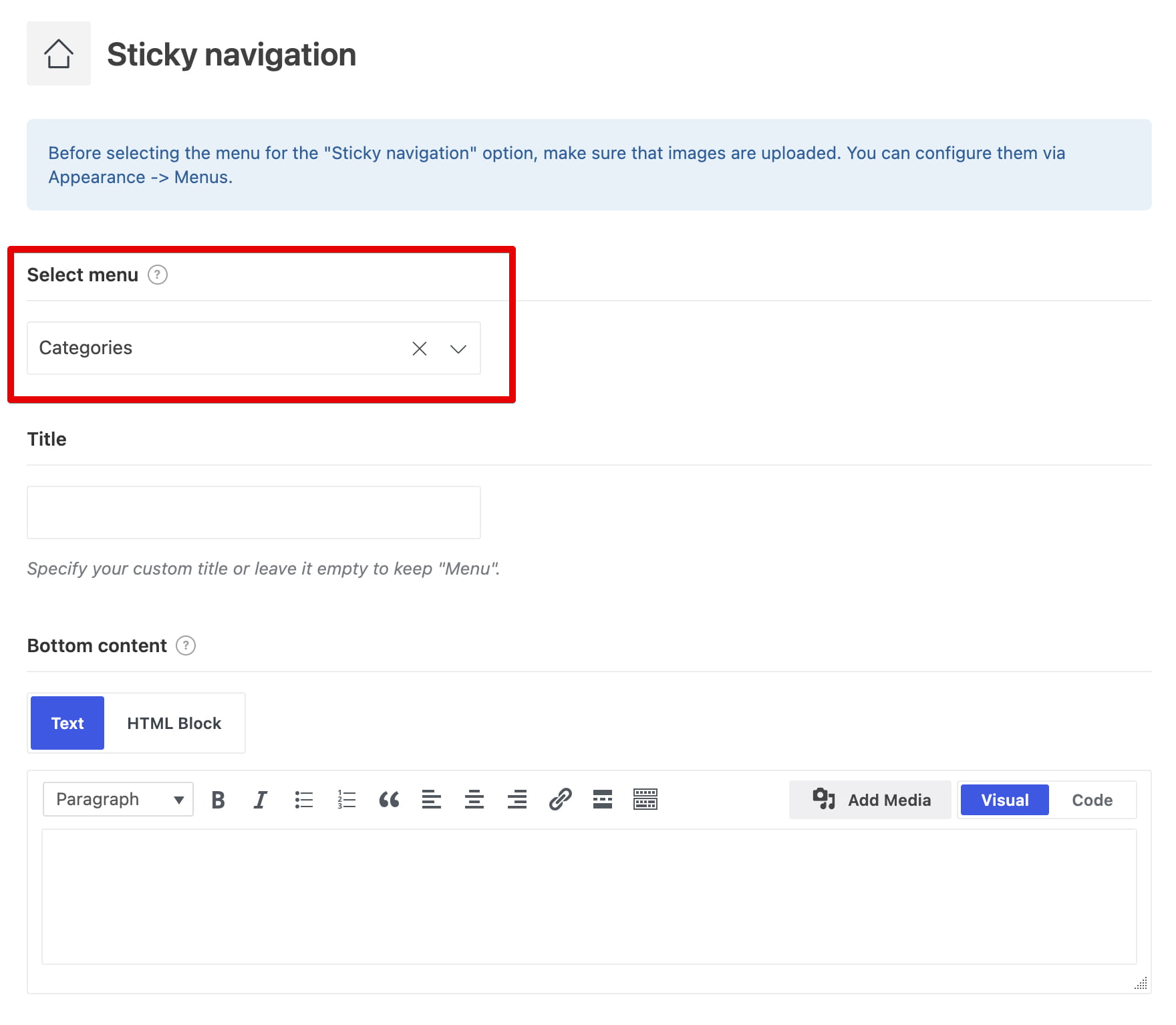
Navigate to Dashboard -> Theme Settings -> General -> Sticky navigation and configure the following options:
- Select menu — selects the prepared WordPress menu. Choosing a menu activates sticky navigation on the website.
- Title — sets the heading displayed at the top of the opened navigation panel. Leave it empty to use Menu.
- Bottom content — selects optional content displayed below the menu:
- Text — enter content directly in the editor.
- HTML Block — select a reusable HTML Block.
Add the opener to the header
After configuring the menu, add the element that visitors will use to open it.
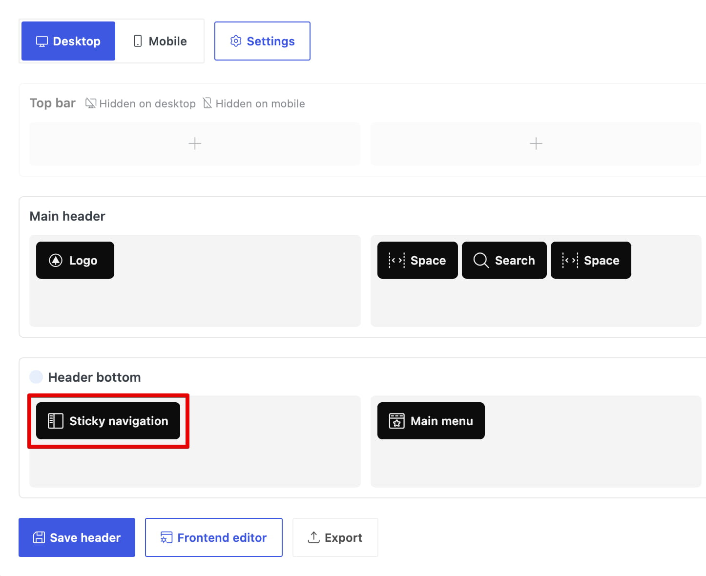
- Navigate to Dashboard -> WoodMart -> Header Builder and edit the required header.
- Add the Sticky navigation element to a desktop header row.
- Open the element settings and configure its appearance.
- Save the header.
The main element settings include:
- Display — shows Text, Icon, or Icon with text.
- Custom text — changes the text displayed in the header opener. Leave it empty to use Menu.
- Design and color controls — customize the icon, text, background, and hover appearance.
Don’t miss WoodMart updates
Receive feature updates, tutorials, and WoodMart news via email.
 Last updated: September 18, 2026