
Configure header rows and columns
Every header contains three structural rows: Top bar, Main header, and Header bottom. Each row has separate desktop and mobile containers, and elements can be dragged between the available columns.
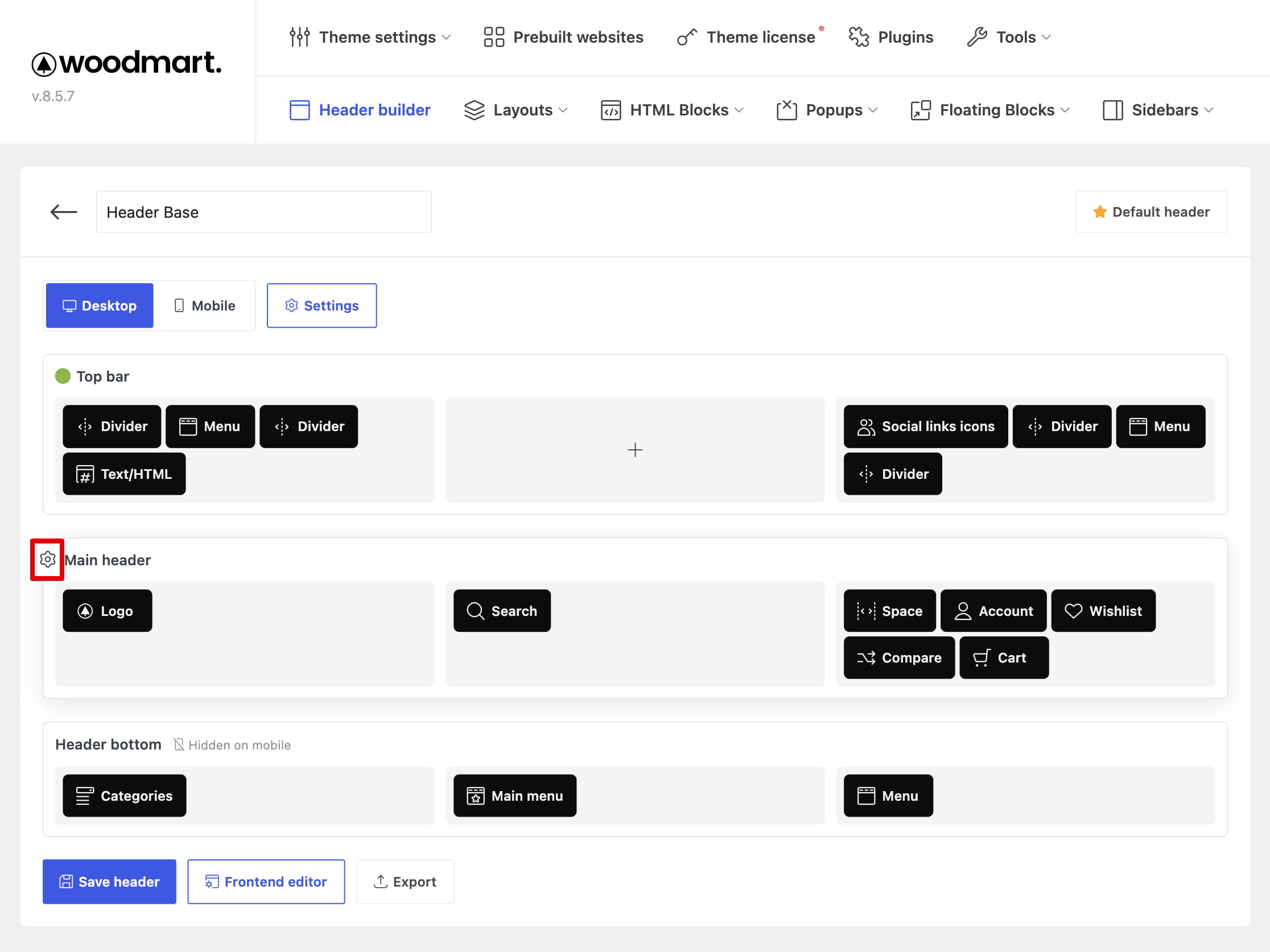
Configure columns
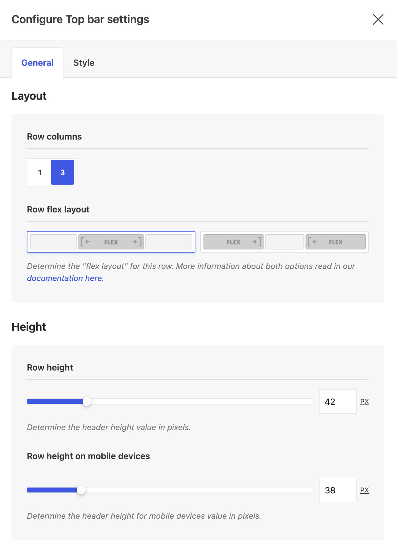
Open a row’s settings and use Row columns to choose a one-column or three-column structure. When three columns are enabled, use Row flex layout to control how the left, center, and right columns share the available width.
For details about the two three-column layouts, see Configure header row layouts.
Configure a row
Click the row’s Edit settings control. Its options are organized into two tabs:
- General — column structure, desktop and mobile heights, responsive visibility, and sticky behavior.
- Style — text color scheme, background, bottom border, backdrop effects, and shadow.
Don’t miss WoodMart updates
Receive feature updates, tutorials, and WoodMart news via email.
 Last updated: August 11, 2026