
Row and Container block configuration
WoodMart blocks can be added directly to the editor without placing every element inside a layout wrapper. Use a Row when you need a column-based layout and a Container when you need a flexible wrapper for arranging or grouping content.
Row and columns
The Row block creates a layout containing from 1 to 12 Column blocks. After adding a Row, choose a predefined column layout or configure the number of columns manually.
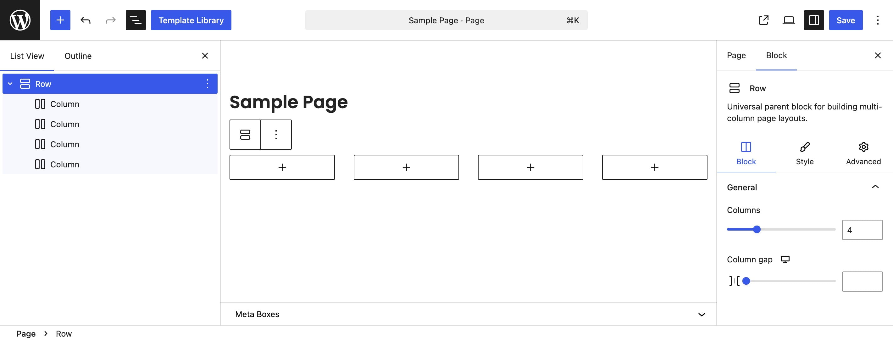
Use the Columns option to add or remove columns and Layout to select a predefined width ratio. You can also set each column width as a percentage or resize adjacent columns directly in the editor by dragging their shared edge.
Each Column arranges its inner blocks vertically. Its settings control content alignment and the spacing between the blocks inside it.
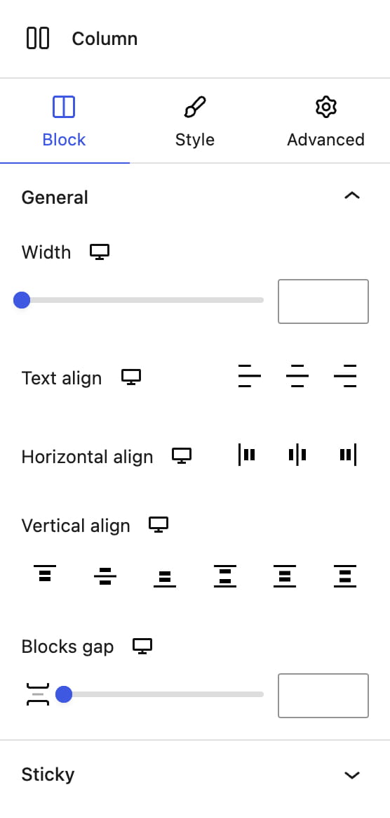
Column widths are responsive. You can assign different percentages for desktop, tablet, and mobile, causing columns to wrap onto additional lines when their combined width exceeds the Row width.
For breakpoints, responsive inheritance, and a complete editing example, see Responsive editing for tablets and mobile.
Container
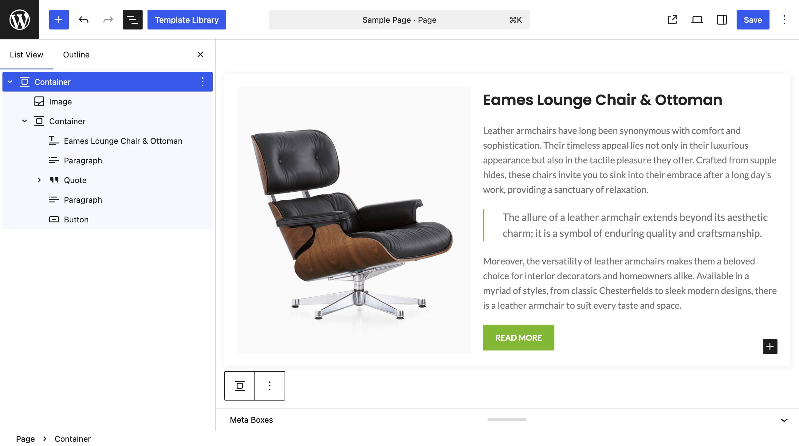
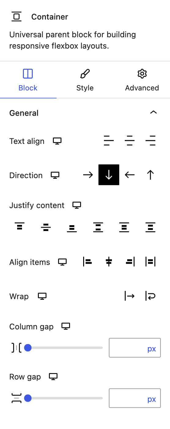
The Container block is a general-purpose Flexbox wrapper. Use it to group blocks under a common background, place elements next to one another, stack them vertically, control alignment, or create a flexible layout without the fixed Row and Column structure.
Its main layout controls are Direction, Justify content, Align items, Wrap, Column gap, and Row gap. These controls are responsive, so the same Container can use a horizontal layout on desktop and a vertical layout on smaller screens.
Rows and Containers can be nested when a design requires multiple layout levels. Keep the structure as simple as possible and add wrappers only when they are needed for layout, spacing, backgrounds, or shared behavior.
For more information about the underlying layout model, see the basic concepts of CSS Flexbox.
Don’t miss WoodMart updates
Receive feature updates, tutorials, and WoodMart news via email.
 Last updated: August 17, 2026