
Products (grid or carousel)
The Products (grid or carousel) element displays WooCommerce products in a grid, list, or carousel. You can choose the products by source, filter them by taxonomy, control their order, and customize the product-card design.
The element is available in Gutenberg, Elementor, and WPBakery. The controls are grouped differently in each builder, but the main settings and their behavior are the same.
Add the Products element
- Edit the required page or layout with your page builder.
- Add the Products (grid or carousel) element.
- Optionally enter an Element title, then configure the product query and layout as described below.
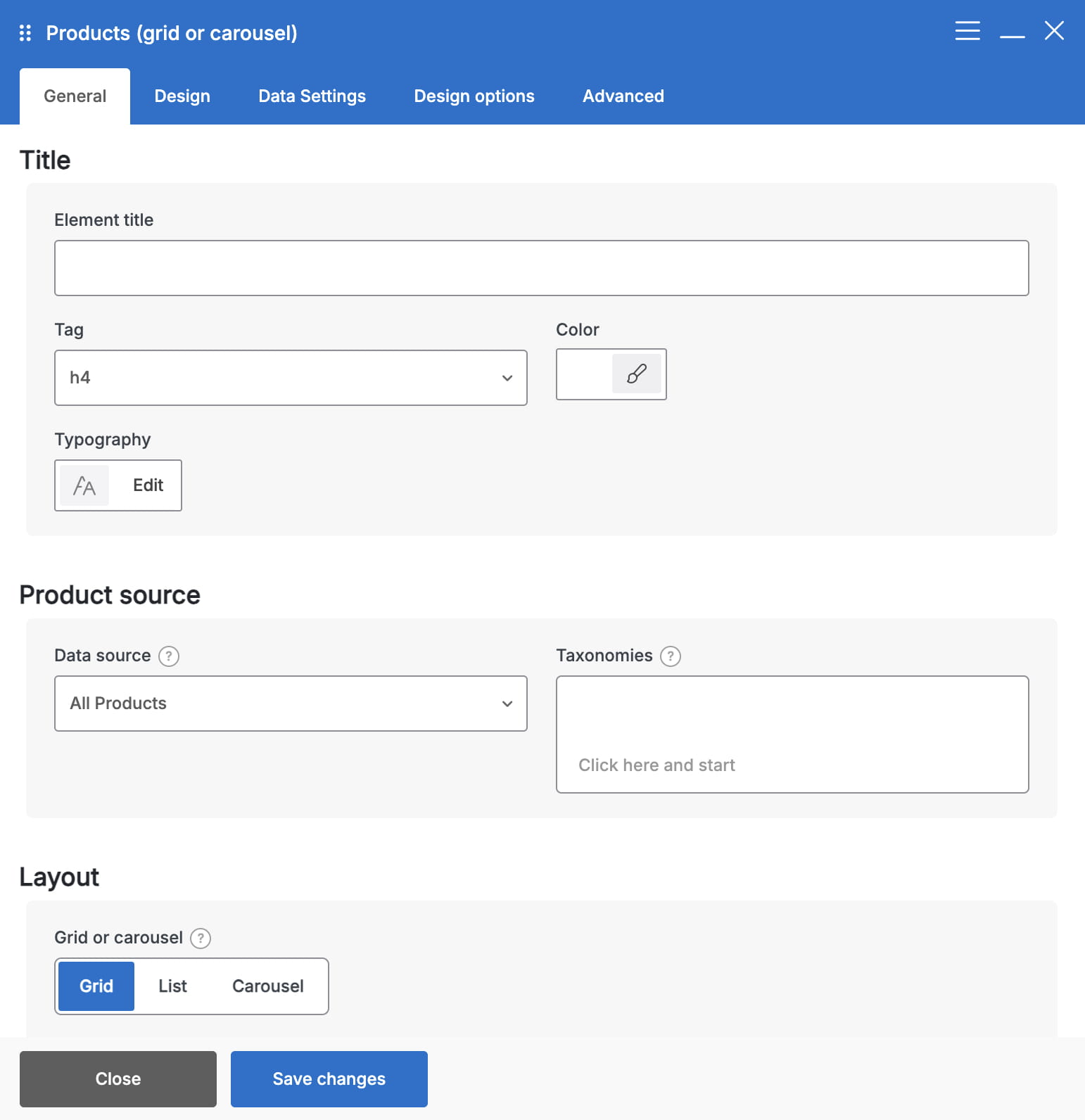
Choose which products to display
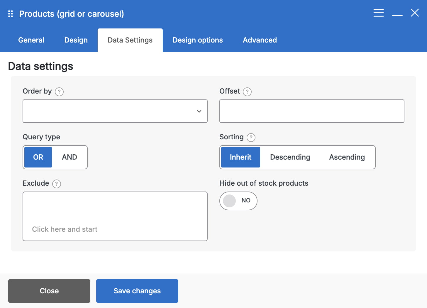
The Data source determines the initial set of products:
- All Products — displays products without applying a special product status.
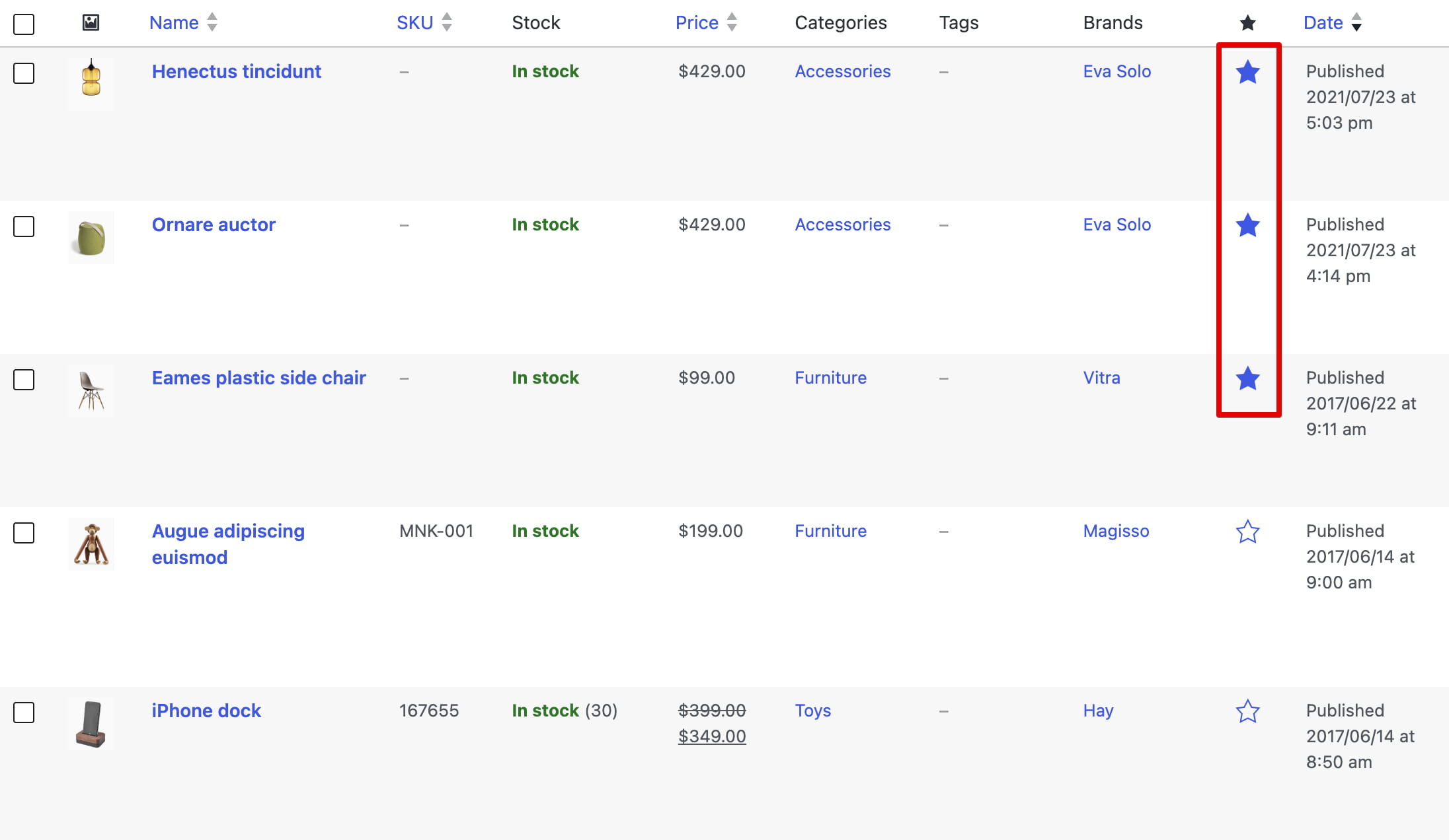
- Featured Products — displays products marked with the Featured star in Dashboard -> Products -> All Products.
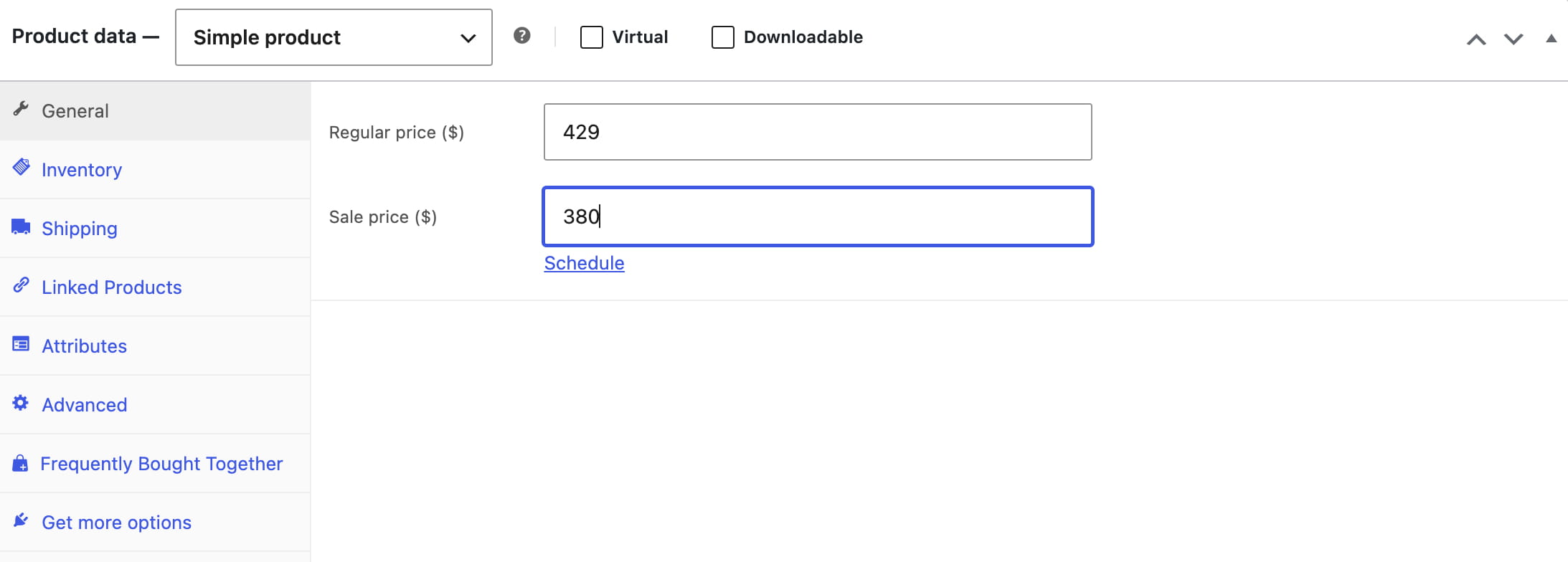
- Sale Products — displays products with an active sale price.
- New products — displays products that currently have WoodMart’s New status.
- Bestsellers — orders products by the number of purchases.
- Top Rated Products — displays products with the highest customer ratings.
- List of IDs — lets you select specific products in Include only.
- Recently Viewed Products — displays products viewed by the current visitor.
When the element is used in a WoodMart custom layout, additional contextual sources may be available: Related and Upsells in a Single Product layout, and Cross Sells in a Cart layout.
For Recently Viewed Products, enable Update with AJAX on page load when full-page caching is used. This prevents one visitor’s cached recently viewed list from being shown to another visitor.
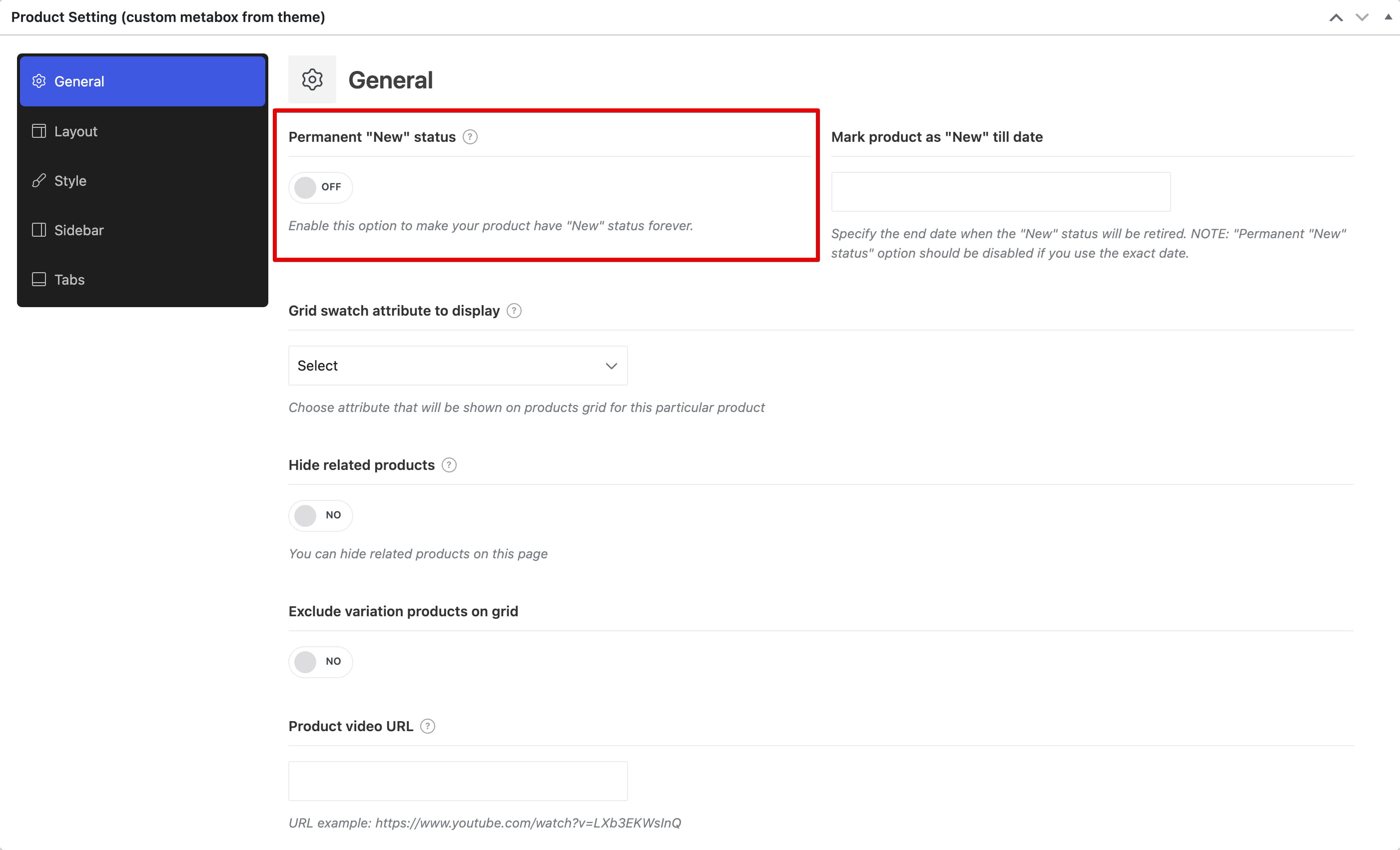
New status can be assigned in the WoodMart product settings with Permanent “New” status or Mark product as “New” till date. You can also automatically mark recently created products under Theme Settings -> Shop -> Mark product as “New” for period. The visibility of the New label does not control whether the product is included in the New products data source.
Filter and order the products
- Taxonomies — filter the selected source by product categories, tags, brands, or global attribute terms. Some builders display these as separate controls.
- Query type — use OR to match any selected taxonomy term or AND to require all selected terms.
- Order by — sort by date, ID, author, title, last modified date, comment count, menu order, price, a meta value, or random order.
- Sort order — use ascending or descending order when the selected data source supports manual ordering.
- Offset — skips the specified number of products at the beginning of the query.
- Meta key — required when ordering by Meta value or Meta value number.
- Hide out of stock products — removes unavailable products from this element.
- Exclude — removes selected products from the result.
Controls that do not apply to the selected data source are hidden automatically. For example, Bestsellers and Top Rated Products already define their own ordering.
Choose the layout
- Grid — displays responsive columns. You can configure 1–6 columns for desktop, tablet, and mobile.
- List — displays products in a vertical list with separate responsive spacing controls.
- Carousel — displays products in a horizontal slider with responsive slides and navigation controls.
For Grid and List layouts, Items per page sets the initial number of products. The available Pagination modes can vary slightly between builders and include a load-more button, infinite scrolling, AJAX arrows, and traditional page links. Leave pagination disabled when only the initial products should be displayed.
The Grid layout also provides controls for larger grid items, allowing selected products to occupy more space. Space between controls the responsive gap for Grid and Carousel layouts.
Customize the product cards
Open the element’s design or style settings to configure the product cards:
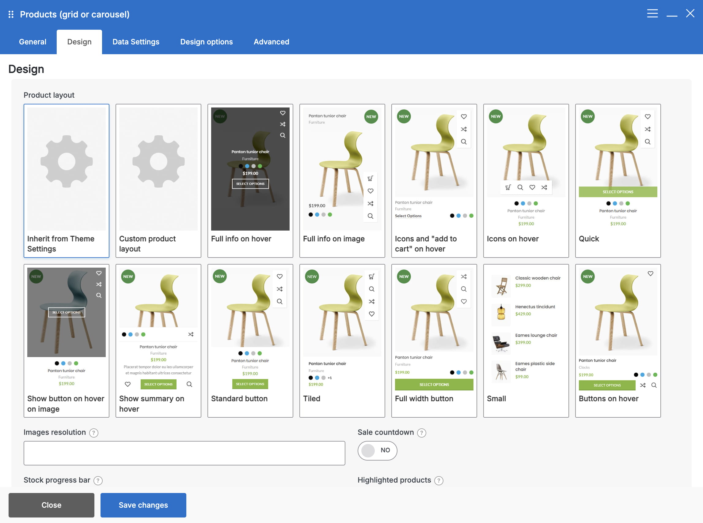
- Product layout — inherits the global Theme Settings layout, uses one of the predefined product-card layouts, or applies a custom Product Loop Item layout.
- Image resolution — selects a registered image size. Choose Custom to set a specific width or height.
- Rounding and Products color scheme — adjust the card shape and text color scheme.
- Sale countdown — displays a countdown when the product’s sale price has an end date.
- Stock progress bar — shows the sold and remaining stock values as a progress bar.
- Product gallery — lets visitors browse product gallery images directly in the product loop.
- Products border, Products background, and Products shadow — add visual separation between product cards.
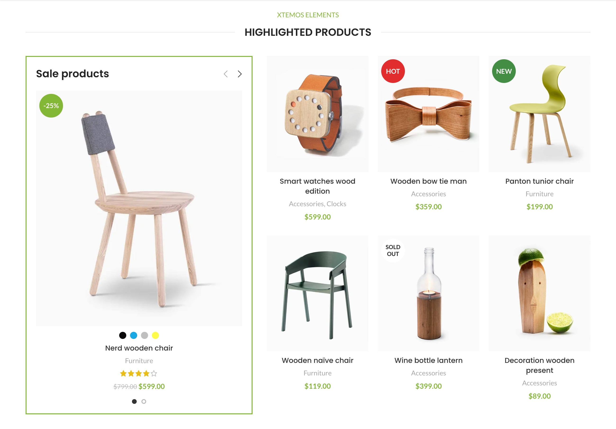
When available in the selected builder and product layout, Highlighted products creates a promotional grid in which some product cards are enlarged for greater visual emphasis.
Configure a carousel
When Layout is set to Carousel, additional controls become available:
- Slides per view — sets the visible products for desktop, tablet, and mobile. Values from 1 to 8, including half-step values, are supported.
- Scroll per page — moves a complete visible group instead of one product at a time.
- Center mode — centers the active product and is available when Scroll per page is disabled.
- Slider loop — continues from the last slide back to the first.
- Auto height — adjusts the carousel height to the active slide content.
- Slider autoplay and Slider speed — enable automatic movement and set its timing.
- Disabled overflow — clips carousel content that extends outside the element container.
- Arrows — show or hide previous and next buttons and configure their position and responsive offsets.
- Pagination and Scrollbar — configure the additional carousel navigation indicators.
- Synchronization — links two or more carousels so that they navigate together.
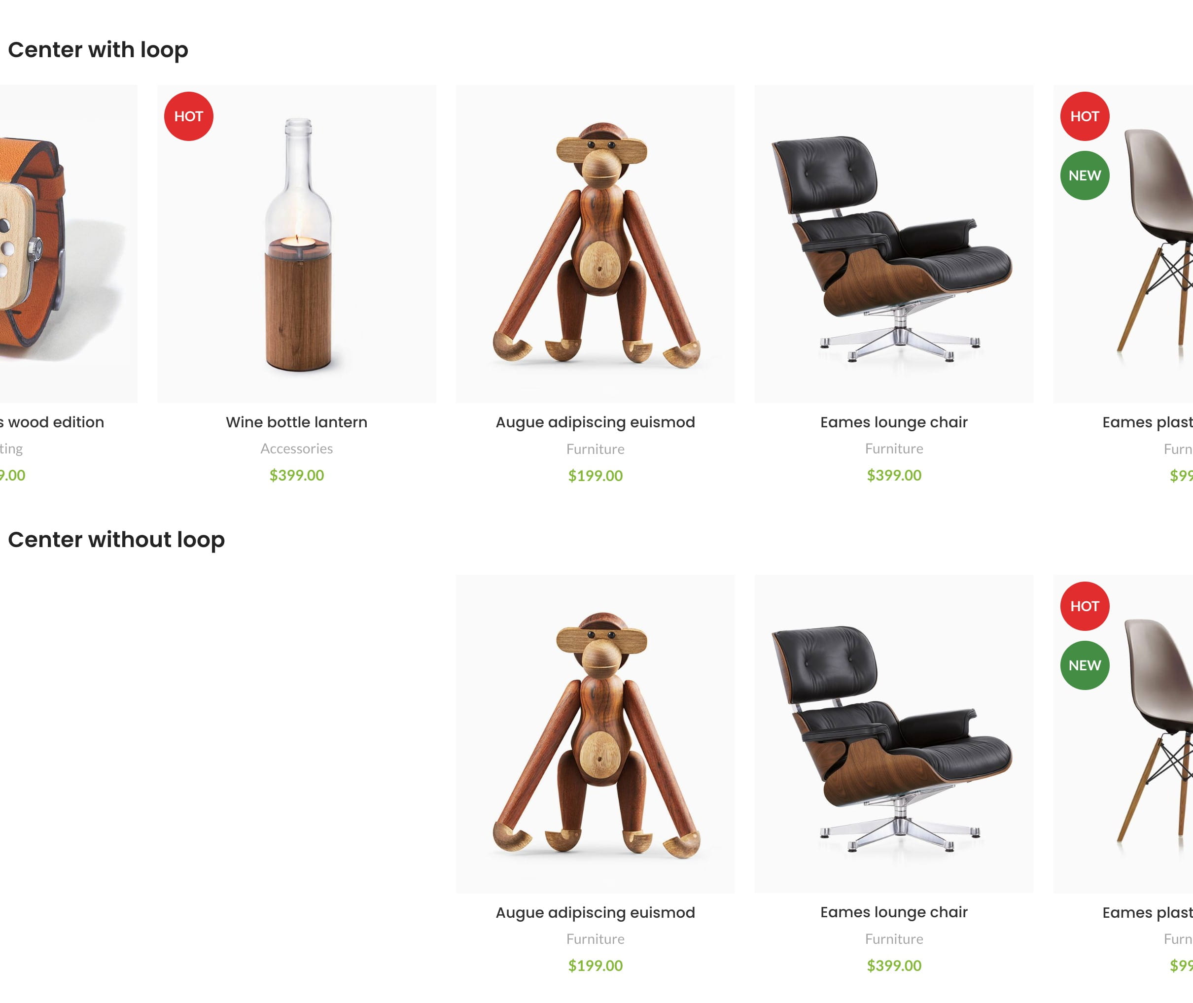
See the available layouts and pagination examples on the Products grid demo.
Don’t miss WoodMart updates
Receive feature updates, tutorials, and WoodMart news via email.
 Last updated: September 21, 2026