
Product page configuration
WoodMart lets you configure product pages globally, override settings for an individual product, or build a completely custom product page layout.
How product page settings work
- Theme Settings define the default configuration for all product pages.
- Individual product settings override matching global settings for one product.
- Layouts Builder gives you full control over the structure and elements of the product page.
Global product page settings
Navigate to Dashboard -> Theme Settings -> Single product to configure the default appearance and functionality of product pages. The available options are organized into the following sections.
Single product
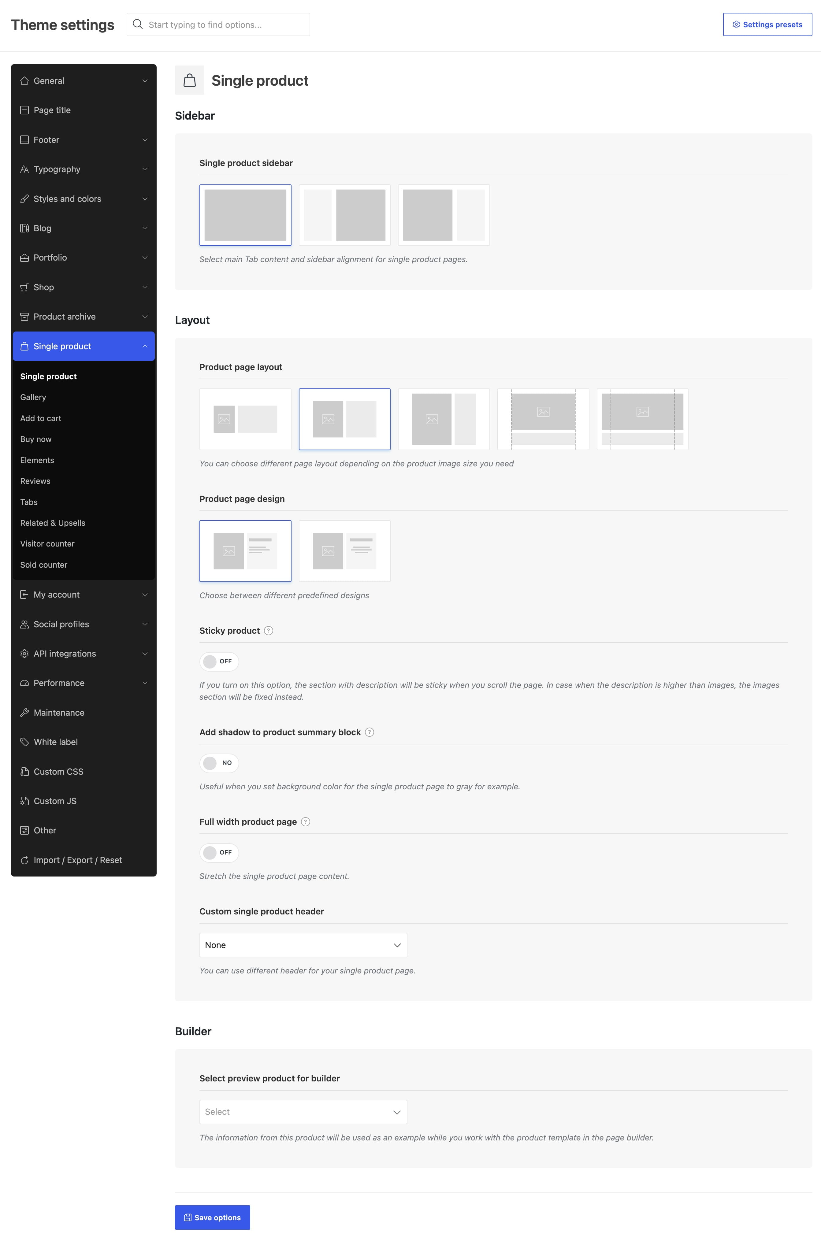
Configure the main page layout, sidebar position and size, product page design, sticky product behavior, content width, product summary shadow, and custom header. The Select preview product for builder option supplies example product data while you edit a single product template.
Gallery
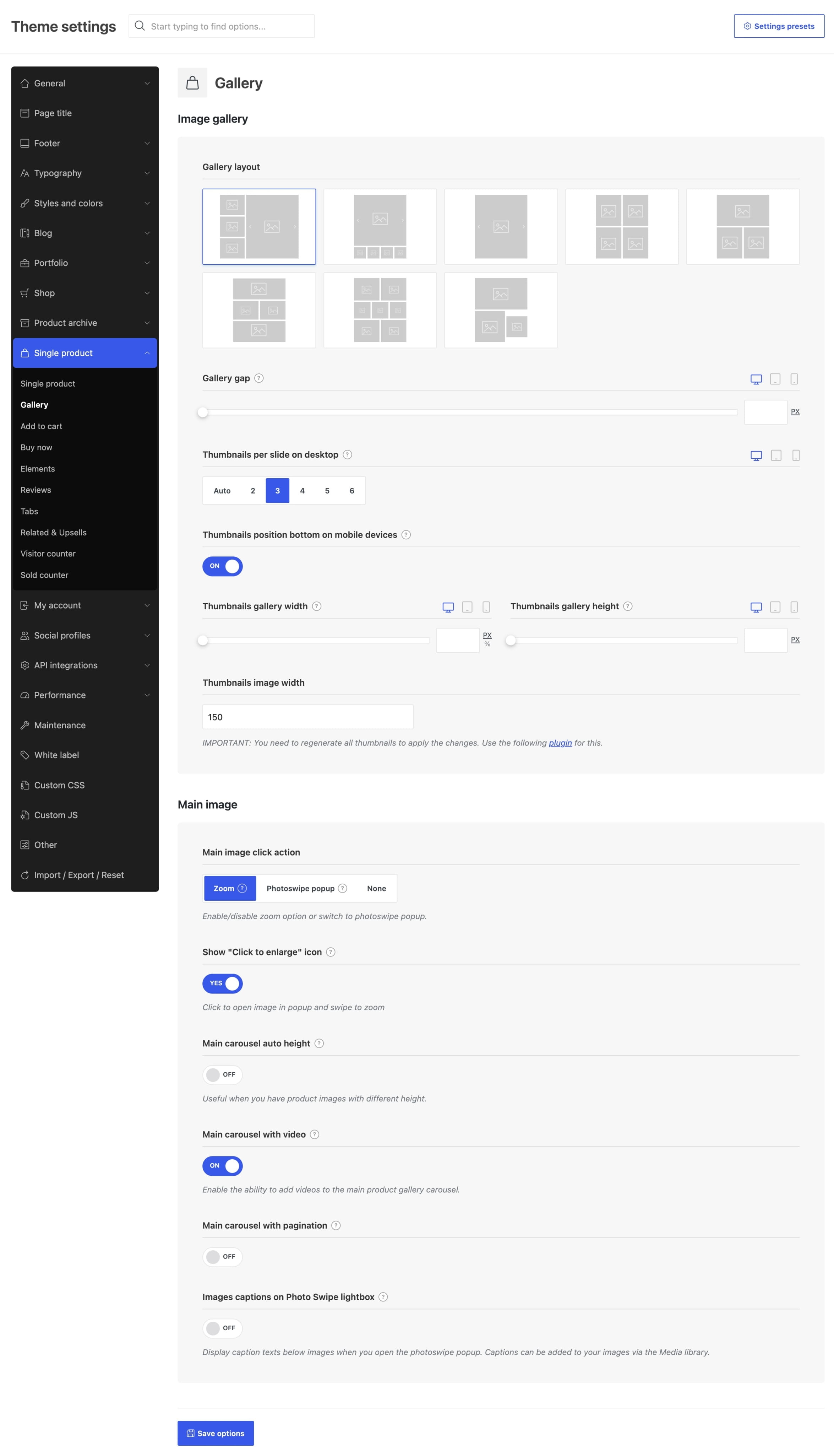
Choose the product gallery layout and control how customers interact with product images. This section includes the main image click action, image captions, gallery spacing, responsive columns, carousel behavior, thumbnail position, and thumbnail dimensions.
Add to cart
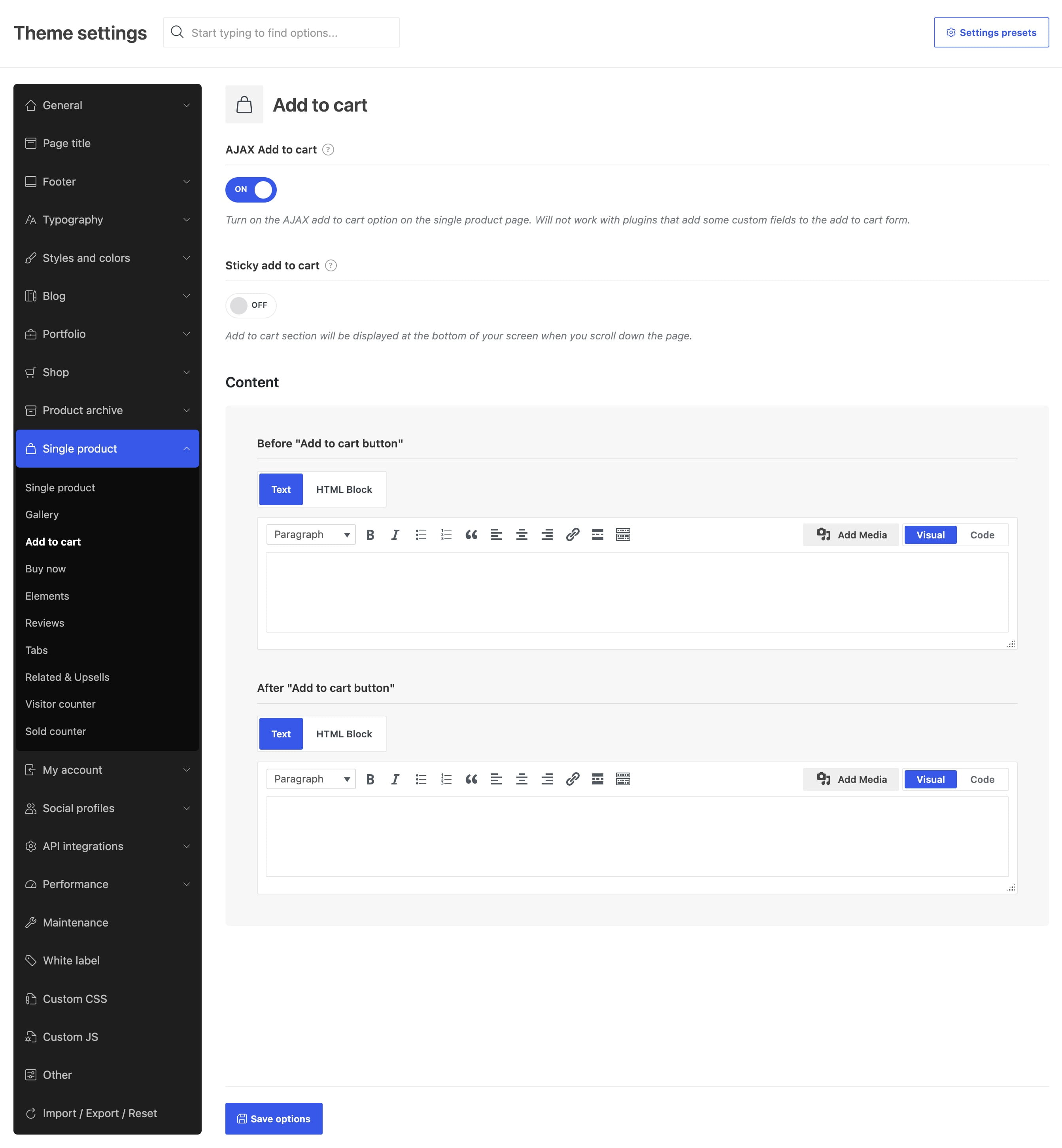
Enable AJAX add to cart, configure the sticky add to cart panel for different devices, and add text or an HTML Block before or after the add to cart button.
Elements
Control the standard elements displayed on the product page, including breadcrumbs, product navigation, short description, attributes, stock status, countdown timer, product meta, brands, and social sharing buttons.
Reviews
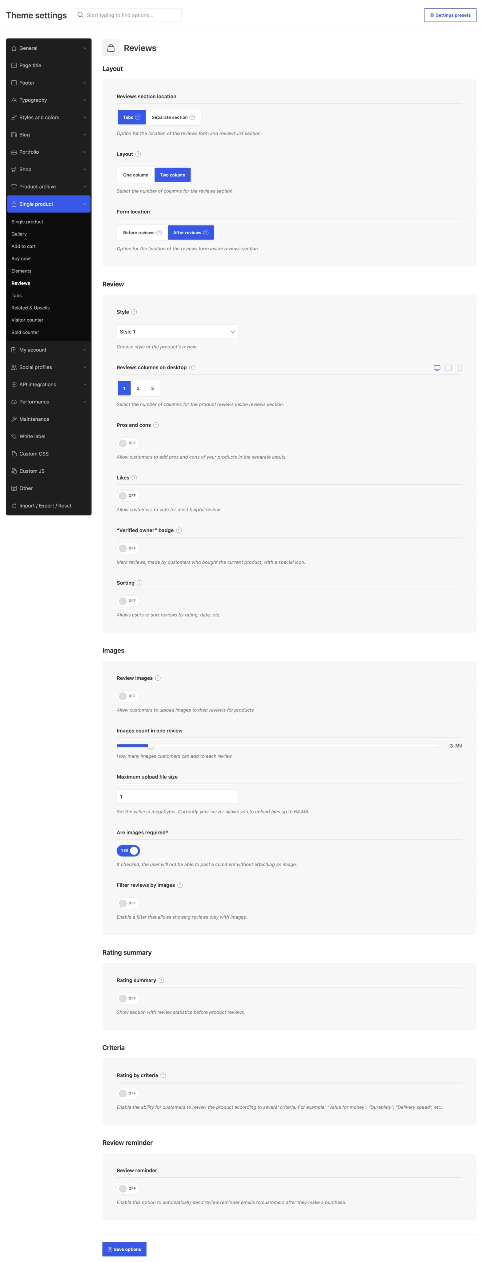
Choose whether reviews appear in a tab or a separate section, configure the review form and responsive layout, and enable additional features such as pros and cons, likes, sorting, verified owner badges, review images, rating summaries, and rating criteria.
Tabs
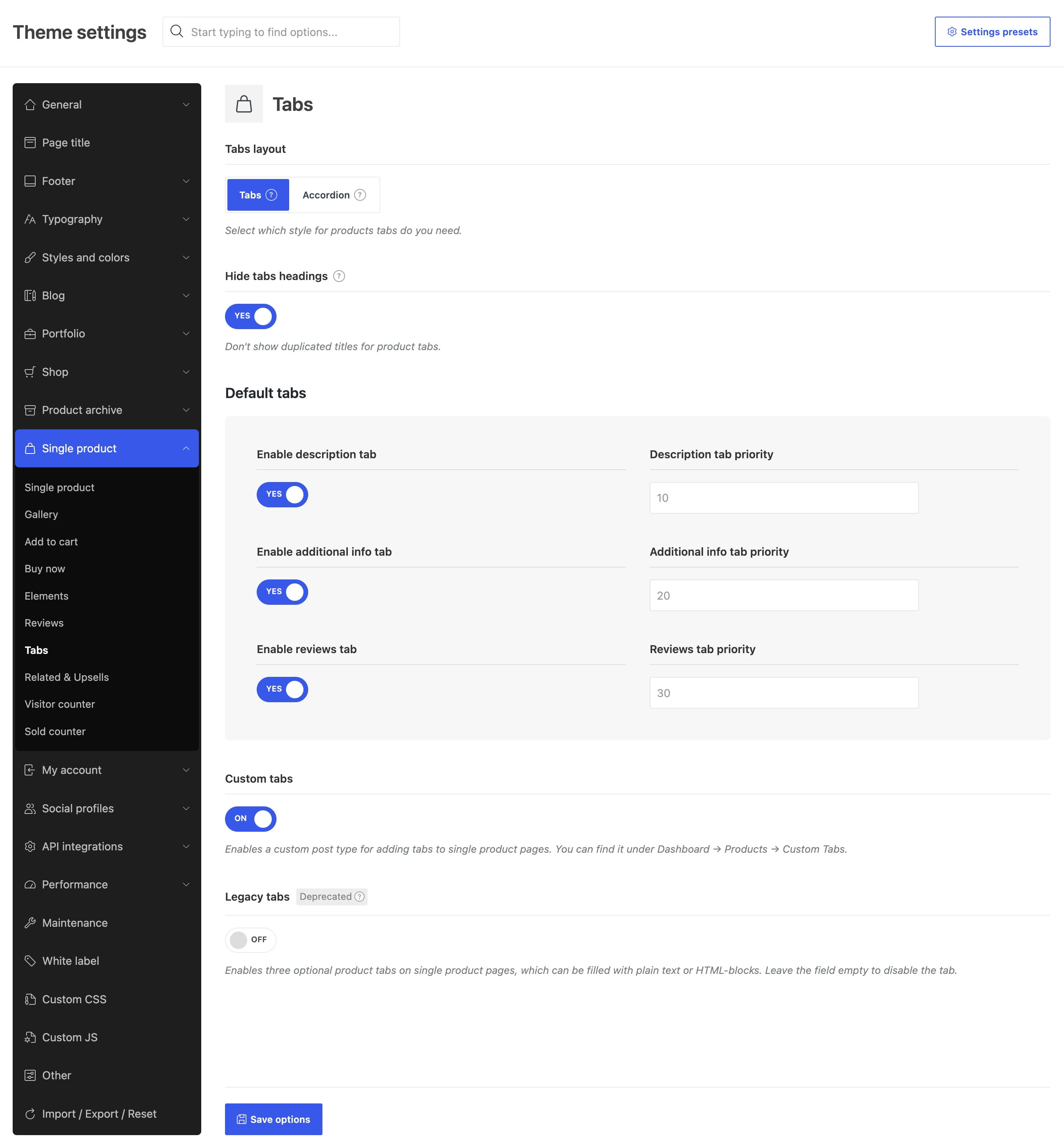
Display product information as tabs or accordions, choose their location and initial accordion state, and manage the Description, Additional information, and Reviews tabs. You can also configure legacy additional tabs or create custom product tabs.
Related & Upsells
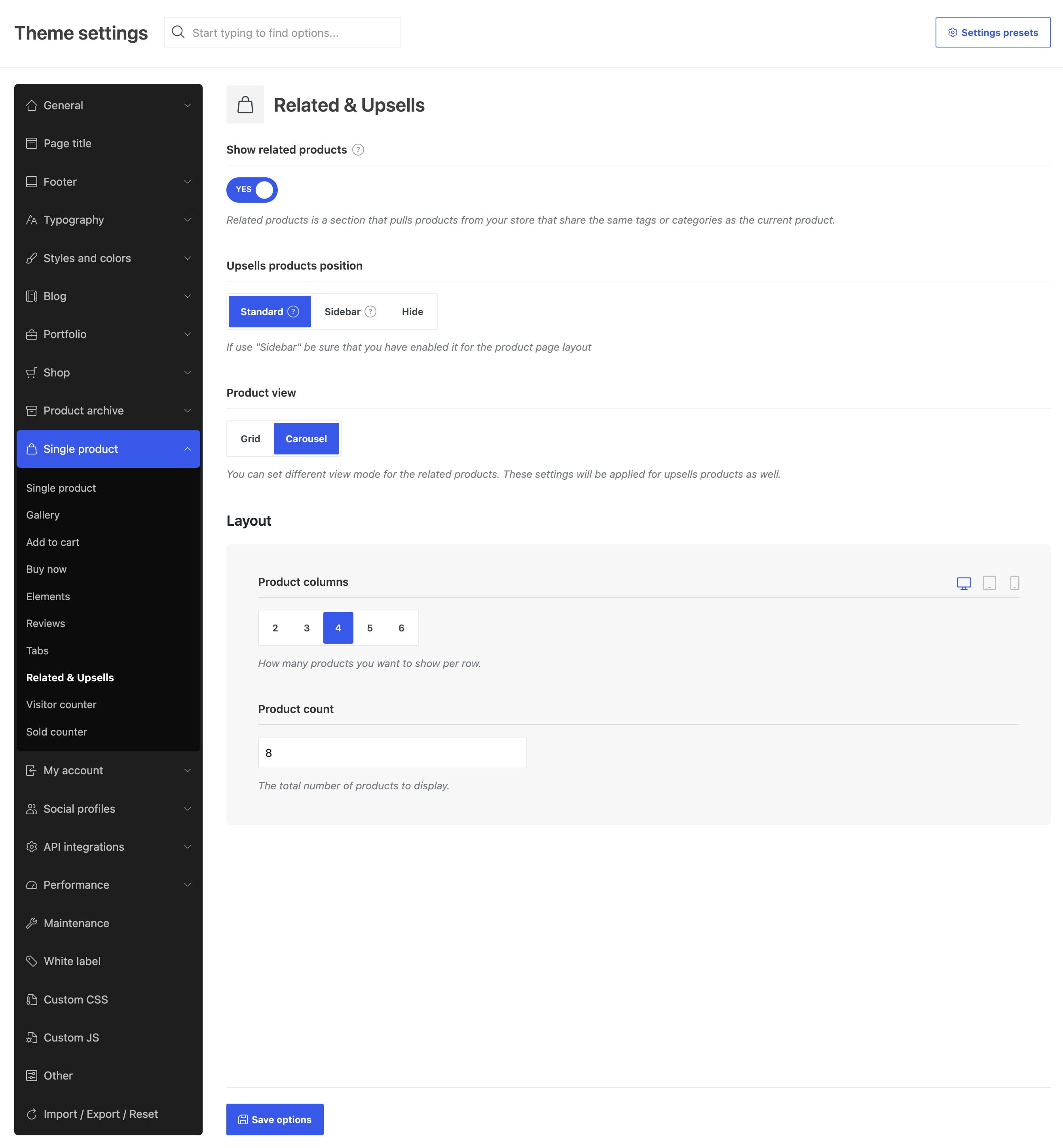
Show or hide related products, choose the upsells position, switch between grid and carousel views, and configure the number of products and responsive columns.
Configure an individual product
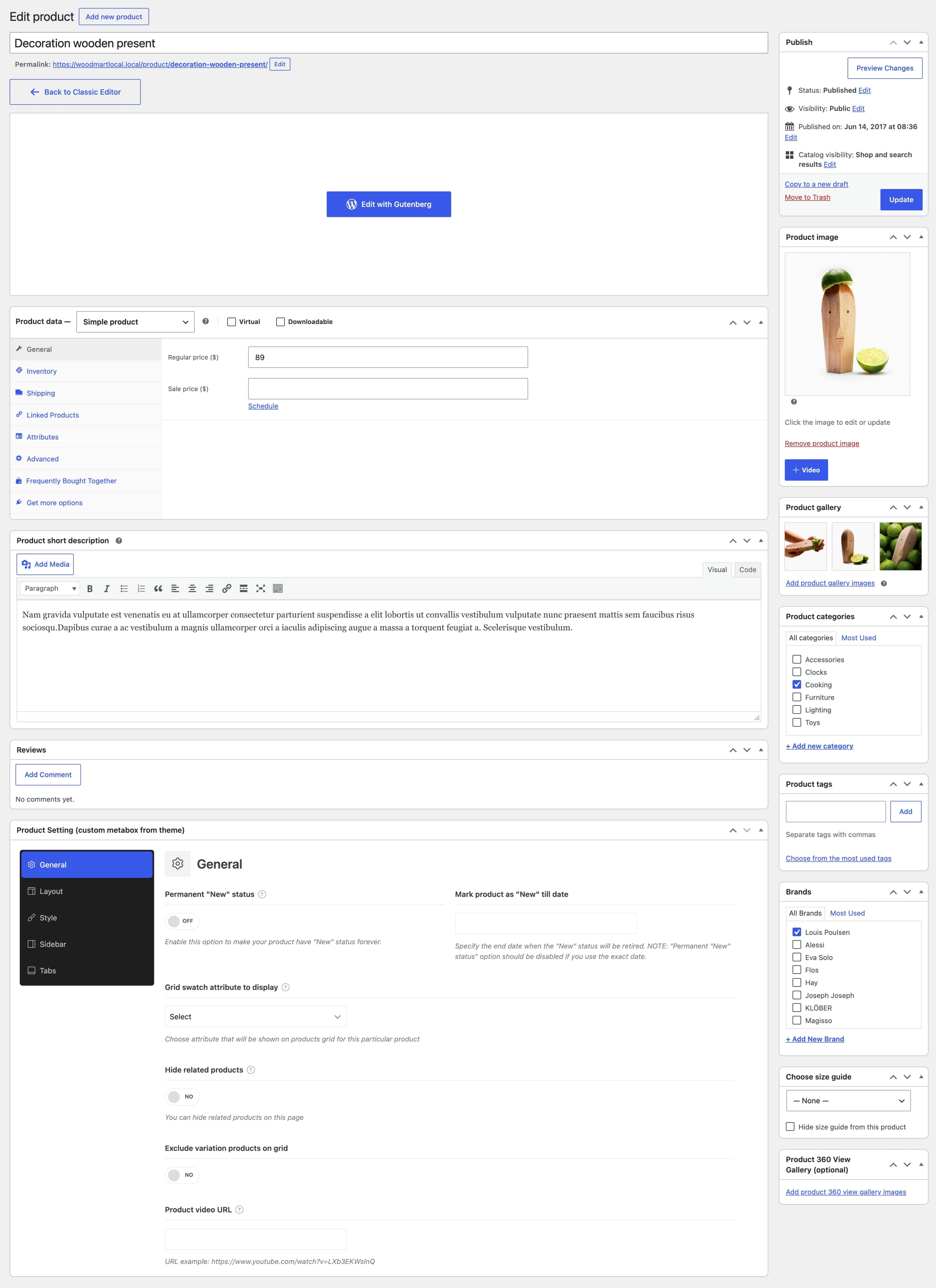
Navigate to Dashboard -> Products -> All Products, edit a product, and find the Product Setting (custom metabox from theme) panel. Its options are divided into five sections:
- General — configure the “New” status, grid swatch attribute, related products visibility, and product video.
- Layout — select a product page layout, custom header, and extra content block with its position.
- Style — override the product page design and background color.
- Sidebar — change the sidebar position, size, or widget area for this product.
- Tabs — hide tab headings or add product-specific tabs using text or HTML Blocks.
Create a custom product page layout
Use Layouts Builder when you need to change the product page structure, arrange product elements manually, or create different templates for specific products and categories. See the Single product page builder guide for detailed instructions.
Don’t miss WoodMart updates
Receive feature updates, tutorials, and WoodMart news via email.
 Last updated: August 7, 2026