
Create collapsible content
The Collapsible content feature limits the visible height of long content and lets visitors reveal the rest with a button. You can use it for text, images, and other elements in Gutenberg, Elementor, or WPBakery.
Set up collapsible content in Gutenberg
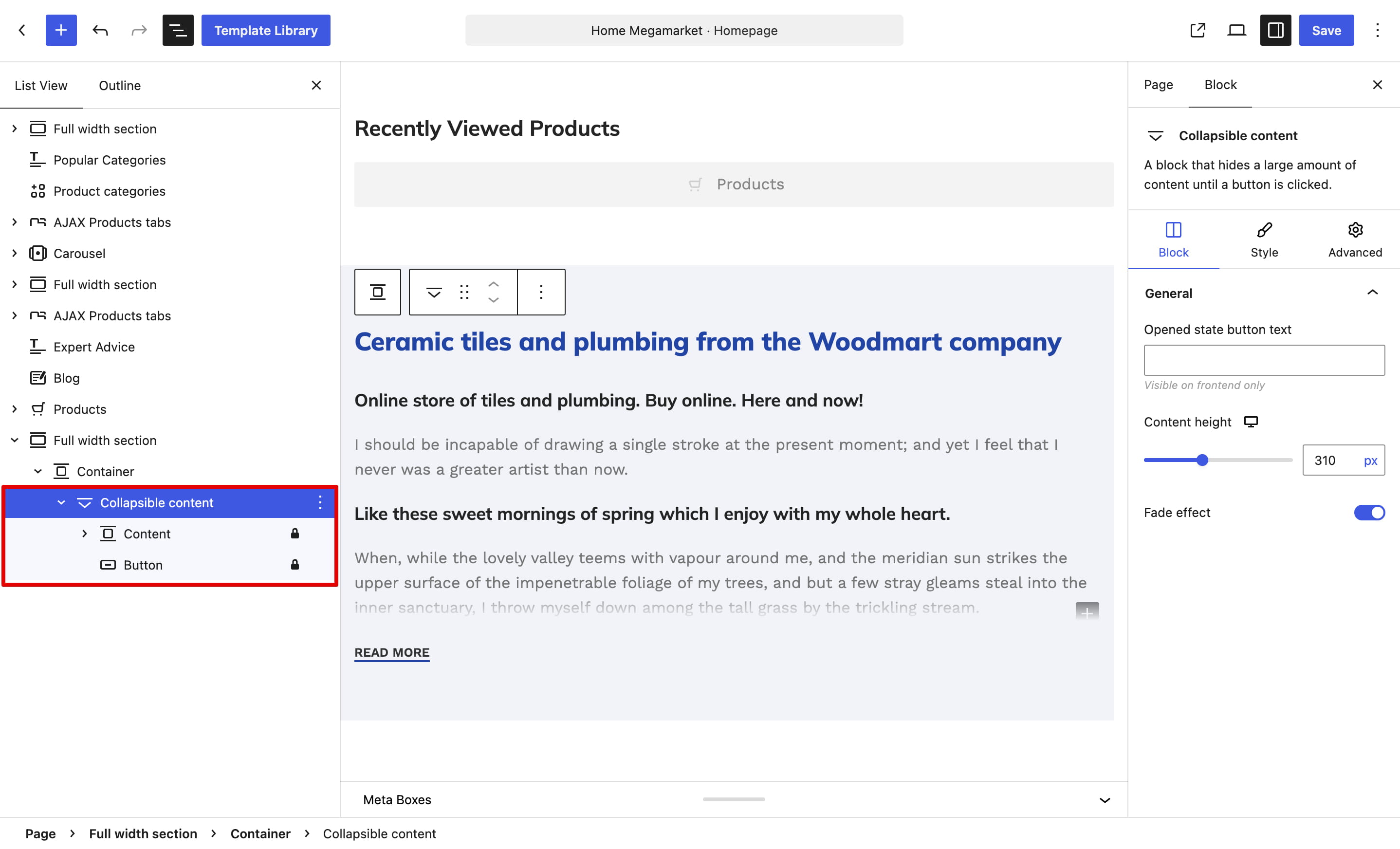
1. Add the WoodMart Collapsible content block to the page.
2. Add or edit blocks inside its Content container. The block also includes a WoodMart Button below the content.
3. Select the Collapsible content block and configure Content height for the required devices. This value determines how much content remains visible before the block is opened.
4. Optionally enable Fade effect, select a Color scheme, and enter Opened state button text, such as “Show less.” Customize the default button text and design by selecting the Button block.
Set up collapsible content in Elementor
1. Add an Elementor Container and place the content you want to collapse inside it.
2. Add the WoodMart Button as the last element in the same Container.

3. Select the Container, enable Collapsible content, and configure Column content height. You can also set Fade out color to match the Container background.
![Screenshot of Edit Container’s Advanced settings, highlighting [XTemos] Extra and enabled collapsible content with height set to 353](https://xtemos.com/wp-content/uploads/2020/09/td-xts-collapsible-content-enable.jpg)
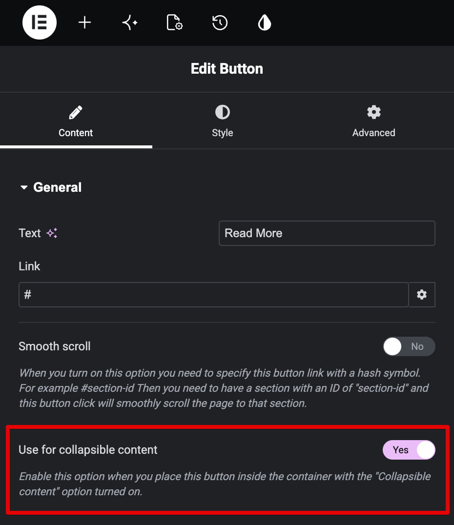
4. Select the Button and enable Use for collapsible content.
Set up collapsible content in WPBakery
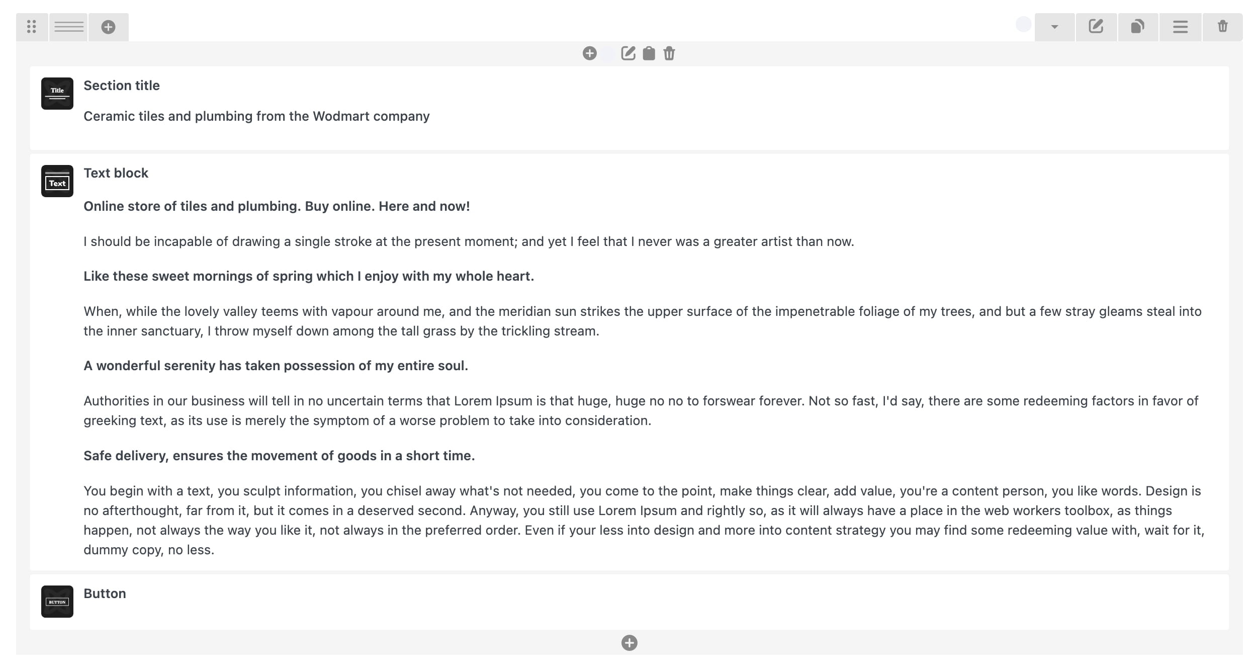
1. Place the content and a WoodMart Button inside the same Column. The Button must be the last element in that Column.
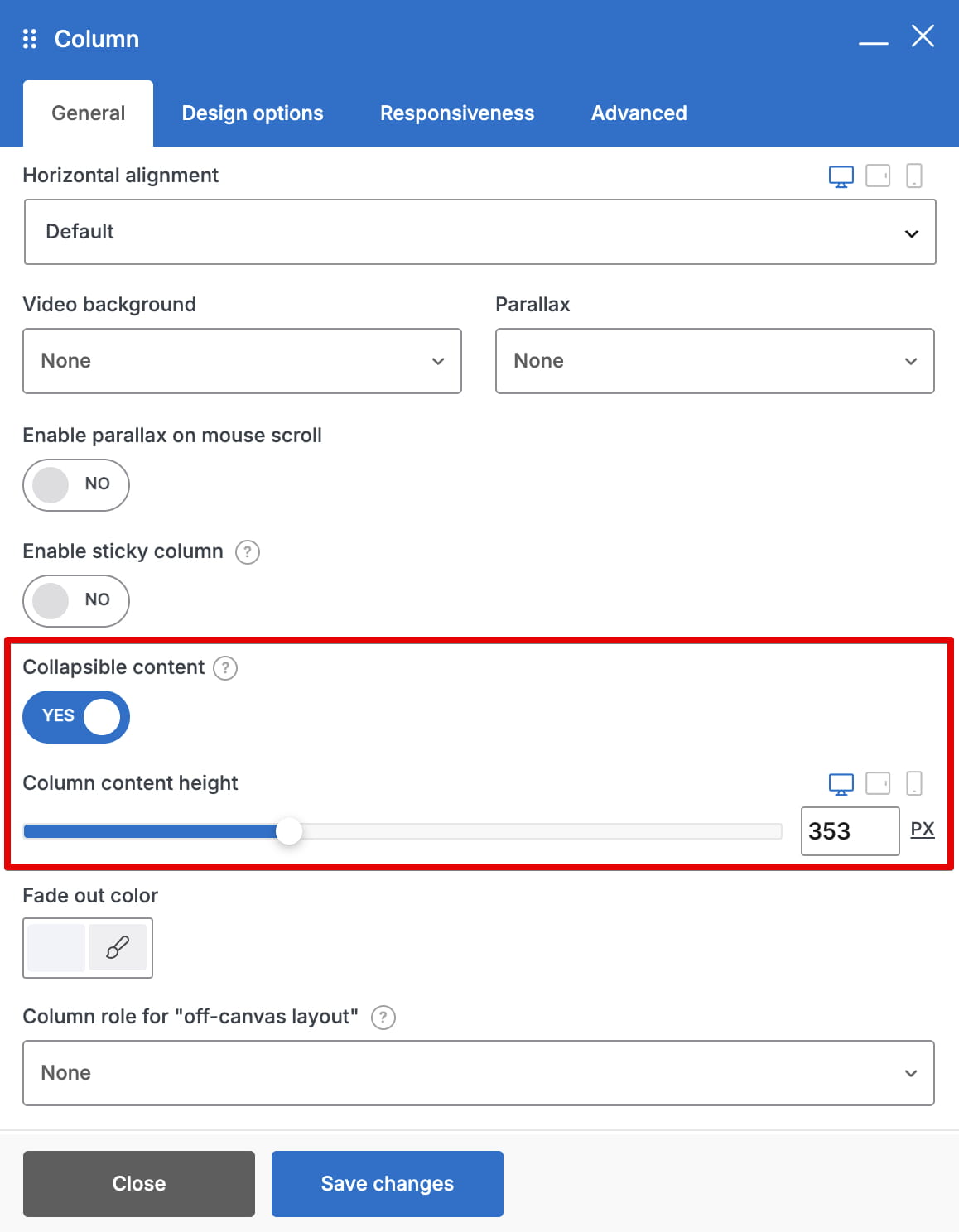
2. Edit the Column, enable Collapsible content, and set Column content height for desktop, tablet, and mobile. Use Fade out color when needed to blend the collapsed content with its background.
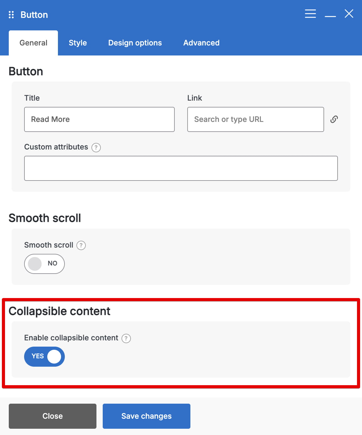
3. Edit the Button and enable Enable collapsible content.
Check the result
Preview the page on desktop, tablet, and mobile. If the collapsed area is too short or too tall, adjust the content height for that device. When the content is shorter than the configured height, there may be no visible content to collapse.

Don’t miss WoodMart updates
Receive feature updates, tutorials, and WoodMart news via email.
 Last updated: September 18, 2026