
Responsive editing for tablets and mobile
WoodMart blocks provide responsive controls for adapting page content to desktop, tablet, and mobile screens. You can preview each device mode in the editor and assign device-specific values to supported settings.
Responsive breakpoints
WoodMart uses the following viewport ranges for its Gutenberg block settings:
- Desktop: 1025px and wider.
- Tablet: from 769px to 1024px.
- Mobile: up to 768.98px.
Preview the page on different devices
Open the page in the Gutenberg editor.
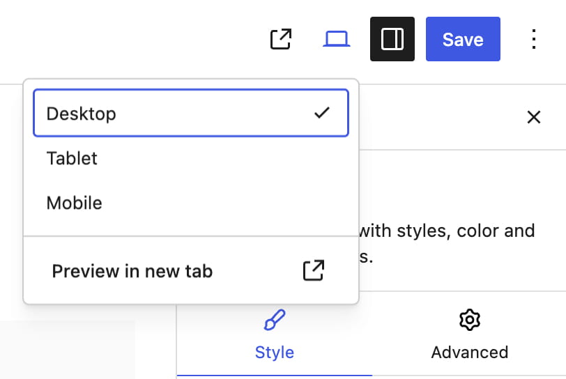
Use the device preview control in the top editor toolbar to switch between Desktop, Tablet, and Mobile. The preview changes the editor canvas width and also determines which responsive value you are editing in WoodMart controls.
Edit a responsive setting
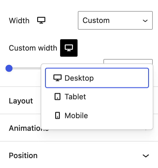
Controls that support device-specific values display a device icon. Select the required device from that control or switch the main editor preview, then enter the value for that device.
Example: responsive title typography
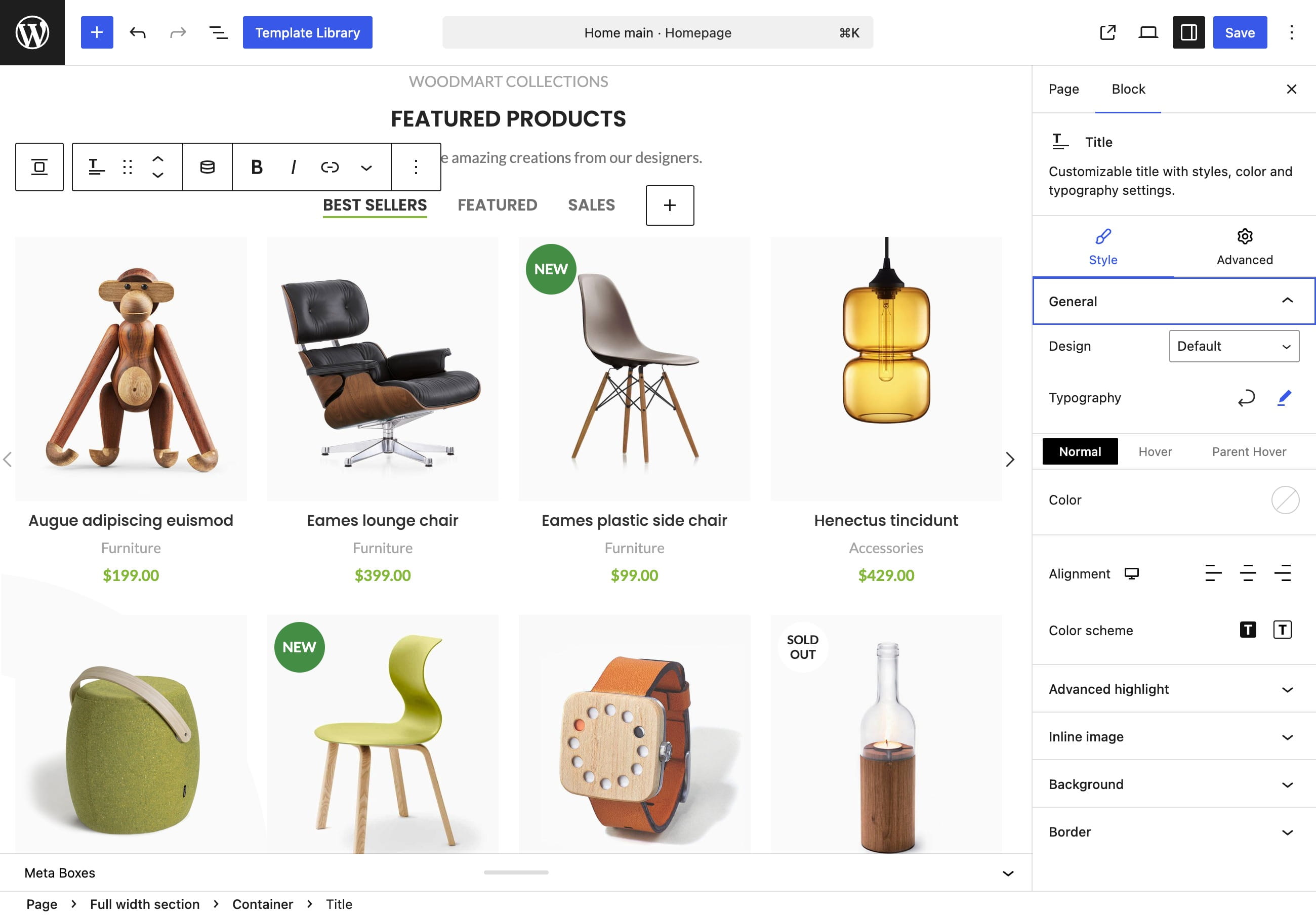
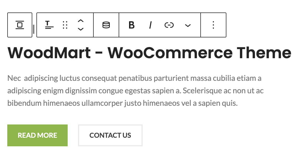
Step 1. Select the Title block that you want to adjust.
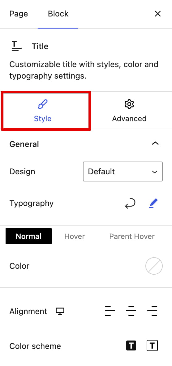
Step 2. Open the Style tab in the block settings sidebar.
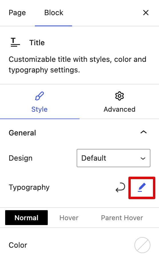
Step 3. Open the Typography settings.
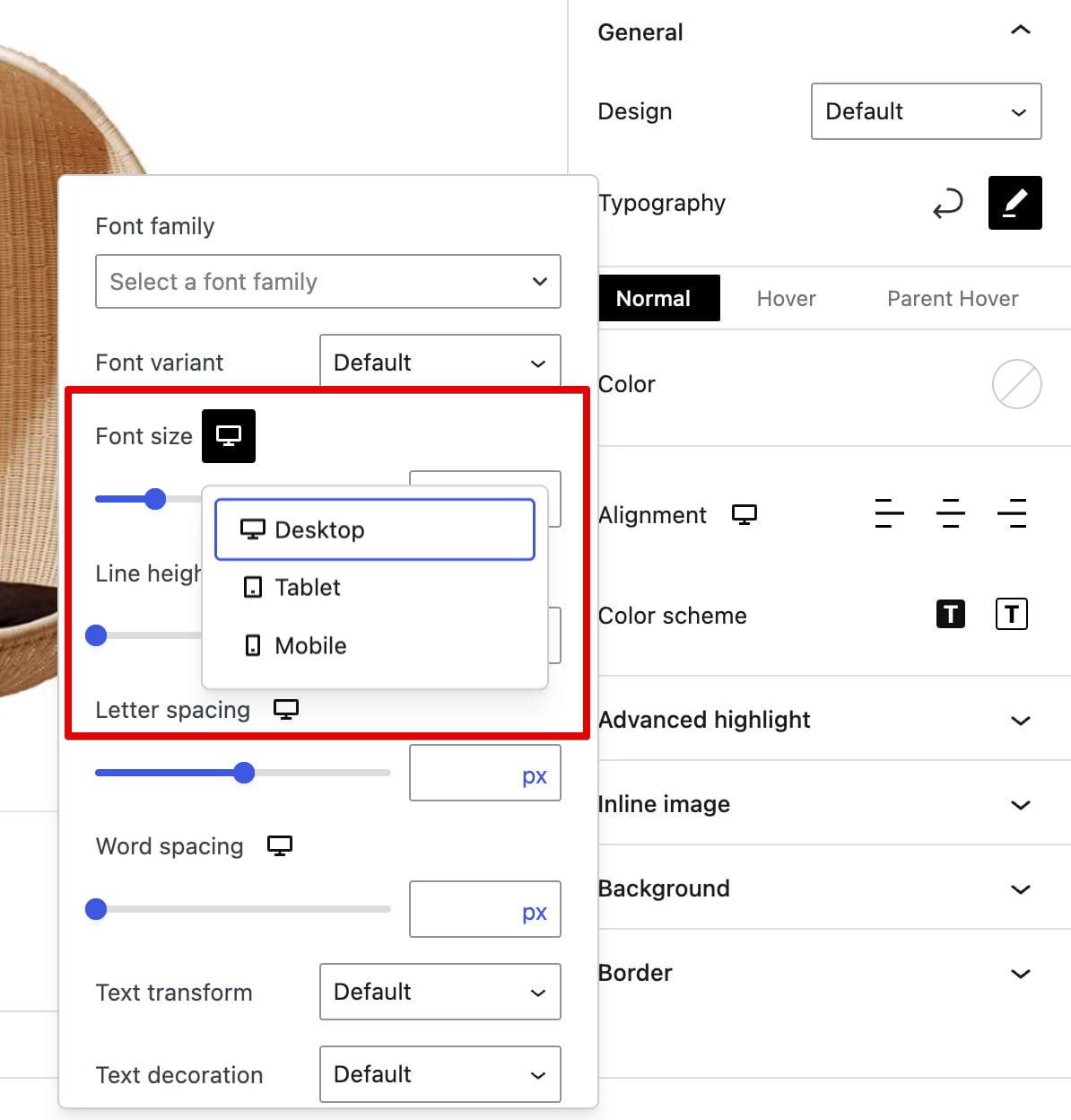
Step 4. Find Font size, open its device selector, and choose Mobile.
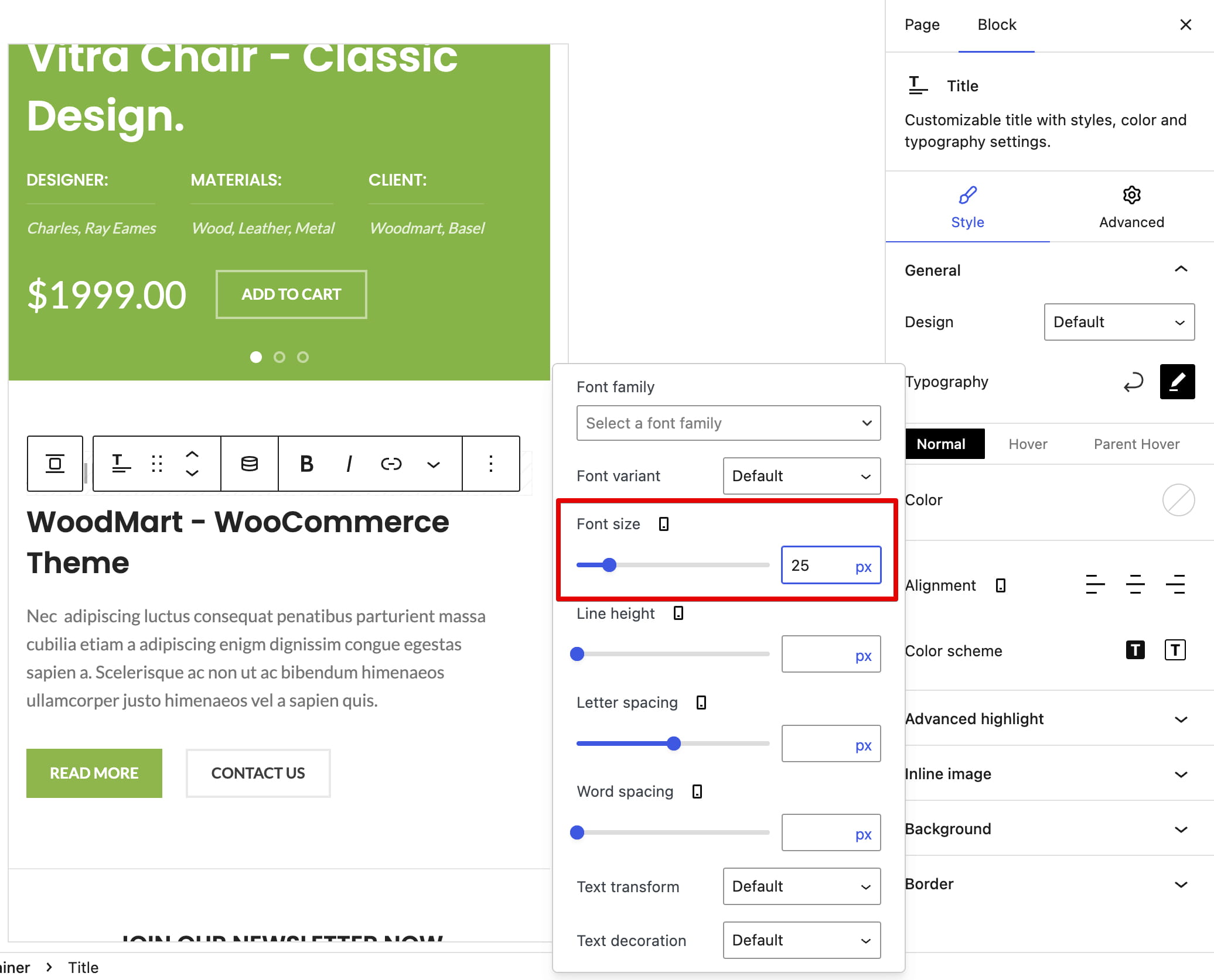
Step 5. Enter the required mobile font size and preview the result. The desktop and tablet values remain available independently.
Responsive Row and Column layouts
Each Column can use a different percentage width on desktop, tablet, and mobile. If the combined widths exceed 100%, the columns wrap onto another line. For example, six desktop columns can become three columns per row on tablet and two columns per row on mobile.
Responsive Container layouts
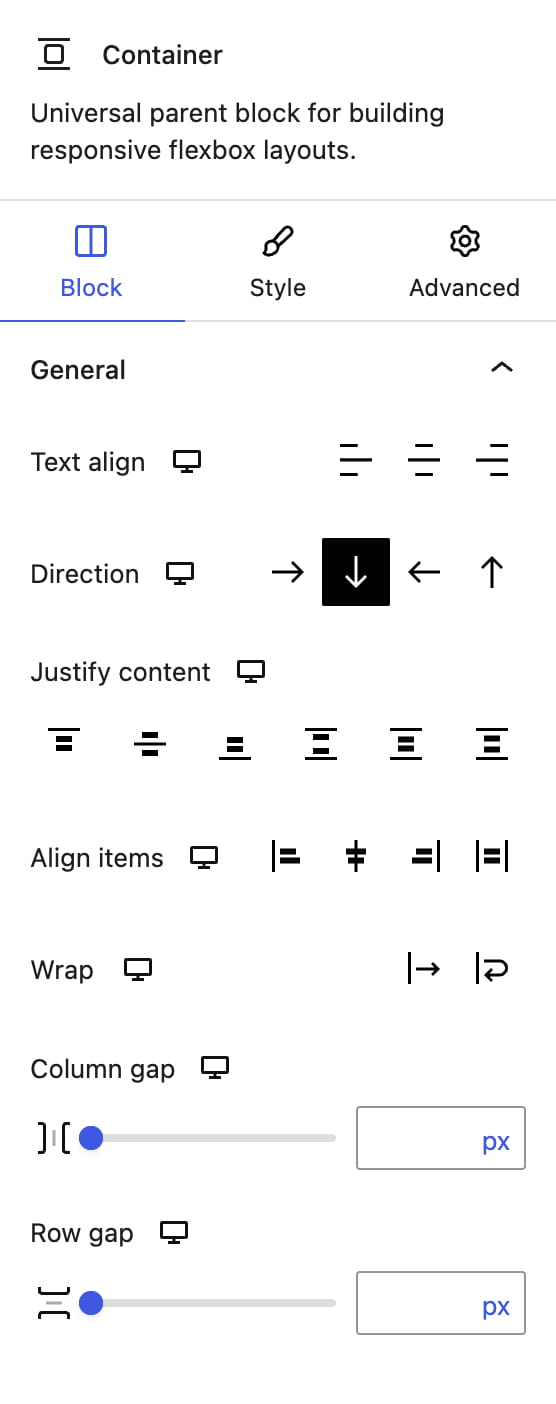
Container controls such as Direction, Justify content, Align items, Wrap, Column gap, and Row gap are responsive. For example, set Direction to Row on desktop and Column on tablet or mobile to stack the same children vertically on smaller screens.
How responsive values are inherited
Responsive values cascade from wider to narrower devices. Tablet inherits the desktop value when no tablet value is set, and mobile inherits the tablet value or, if that is empty, the desktop value. A value entered specifically for mobile does not change tablet or desktop.
Don’t miss WoodMart updates
Receive feature updates, tutorials, and WoodMart news via email.
 Last updated: August 17, 2026