
Position content with Flexbox
WoodMart layout blocks such as Column, Container, and Full width section use CSS Flexbox to arrange their direct child blocks. Their controls let you align content, change the order and size of individual children, and manage the spacing between them.
Position a child block
Select a block inside a Flexbox parent and open its Advanced tab. The Layout group includes Align self, Flex, and Order. When Flex is set to Custom, you can also configure Flex grow, Flex shrink, and Flex basis.
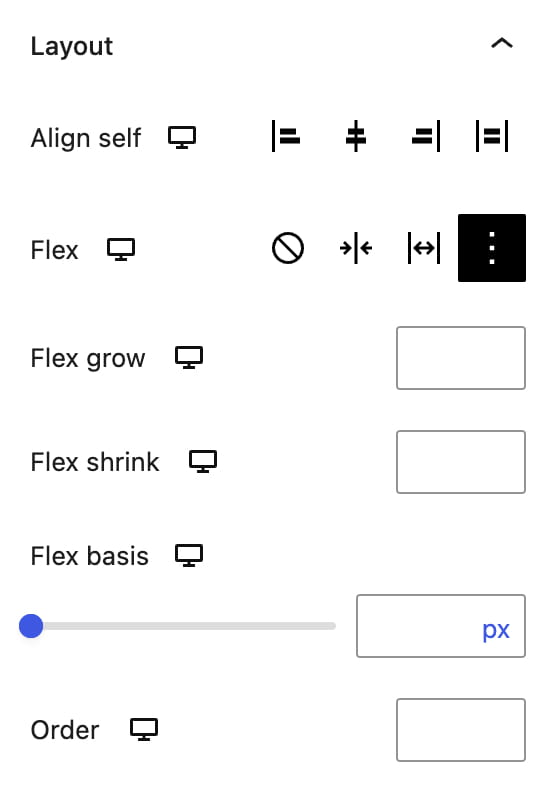
For example, Align self can position a Button inside a Column without adding another wrapper solely for alignment.
These controls affect the selected block only when its direct parent uses Flexbox. They do not control a block placed directly at the root of the editor because the root content area is not a Flexbox container.
Spacing between blocks
Parent blocks that arrange multiple children provide a Blocks gap, Column gap, or Row gap control. A gap applies consistent spacing between direct child blocks without adding margins to each child individually.
The default Blocks gap for Column, Container, and Full width section is 20px. Set the gap to 0 when every child needs different spacing, then configure individual margins in each child block. For blocks placed directly at the root of the editor, use margins because the root does not provide a shared Flexbox gap.
For a complete overview of Dimensions, Layout, Position, Transforms, Responsive, and other controls, see Advanced block settings.
Don’t miss WoodMart updates
Receive feature updates, tutorials, and WoodMart news via email.
 Last updated: August 17, 2026