
Floating blocks builder
The Floating blocks builder lets you create fixed, non-modal elements that remain visible while visitors browse or scroll the page. Floating blocks are useful for promotional banners, informational bars, persistent calls to action, and other content that should stay within reach without opening a modal window.
Create a floating block
1. Navigate to Dashboard -> Floating blocks and click Add New.
2. Select Empty to start from scratch or choose a predefined floating block category.
3. If you selected a predefined category, choose one of its block templates.
4. Enter a recognizable block name and click Create floating block.
5. Build or edit the block content with Gutenberg, Elementor, or WPBakery, depending on the page builder configured on your website.
6. Configure the block position, display mode, and conditions, then publish it.
Open floating block settings in the editor
The floating block settings contain the same functionality in every supported builder, but their location depends on the active editor.
Gutenberg
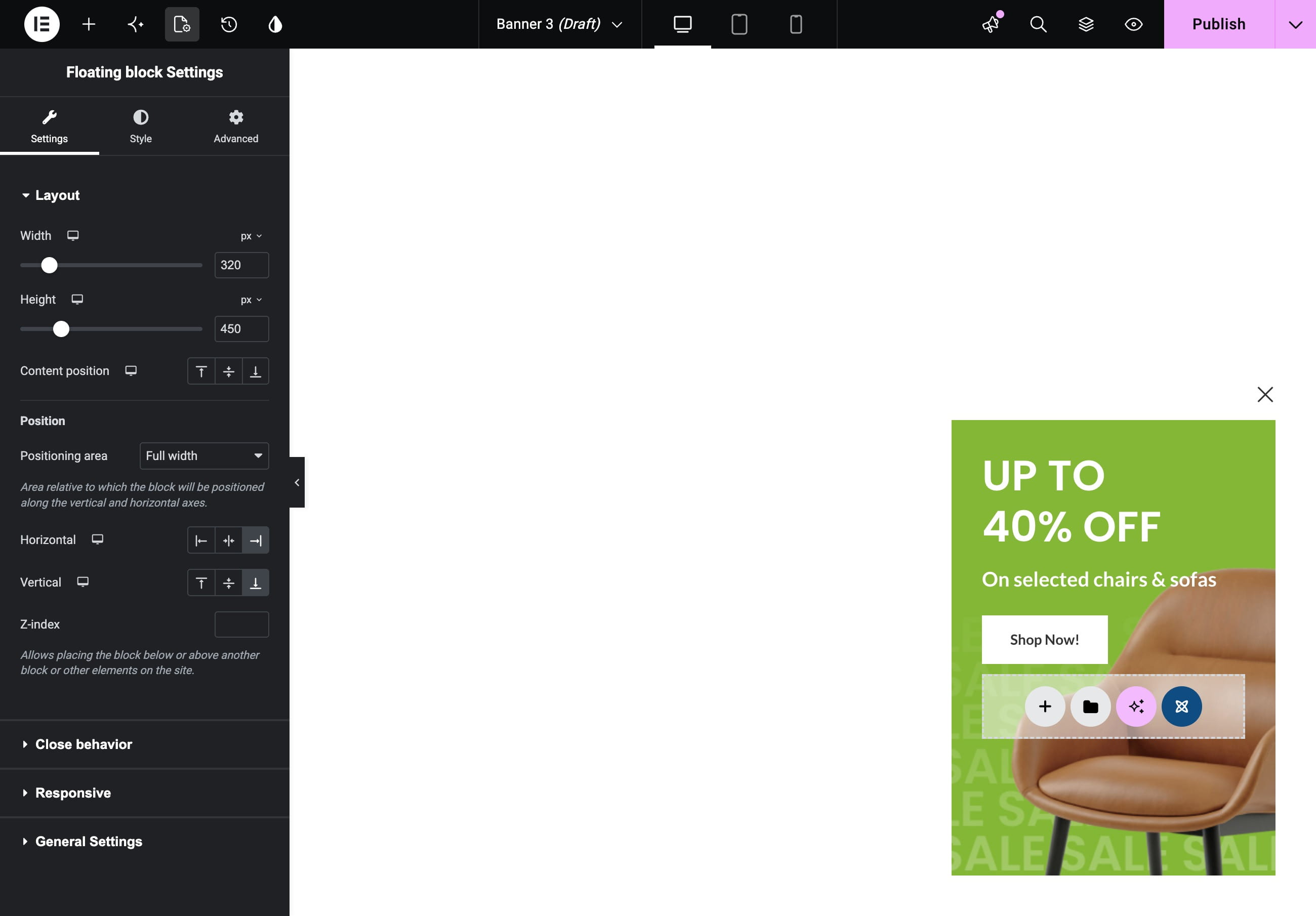
Click the Floating block settings gear icon in the top editor toolbar to open the settings sidebar.
If the gear icon is hidden, open the three-dot menu in the upper-right corner and select Floating block settings. In the panel that opens, activate the star icon to keep Floating block settings available in the top toolbar.
Elementor
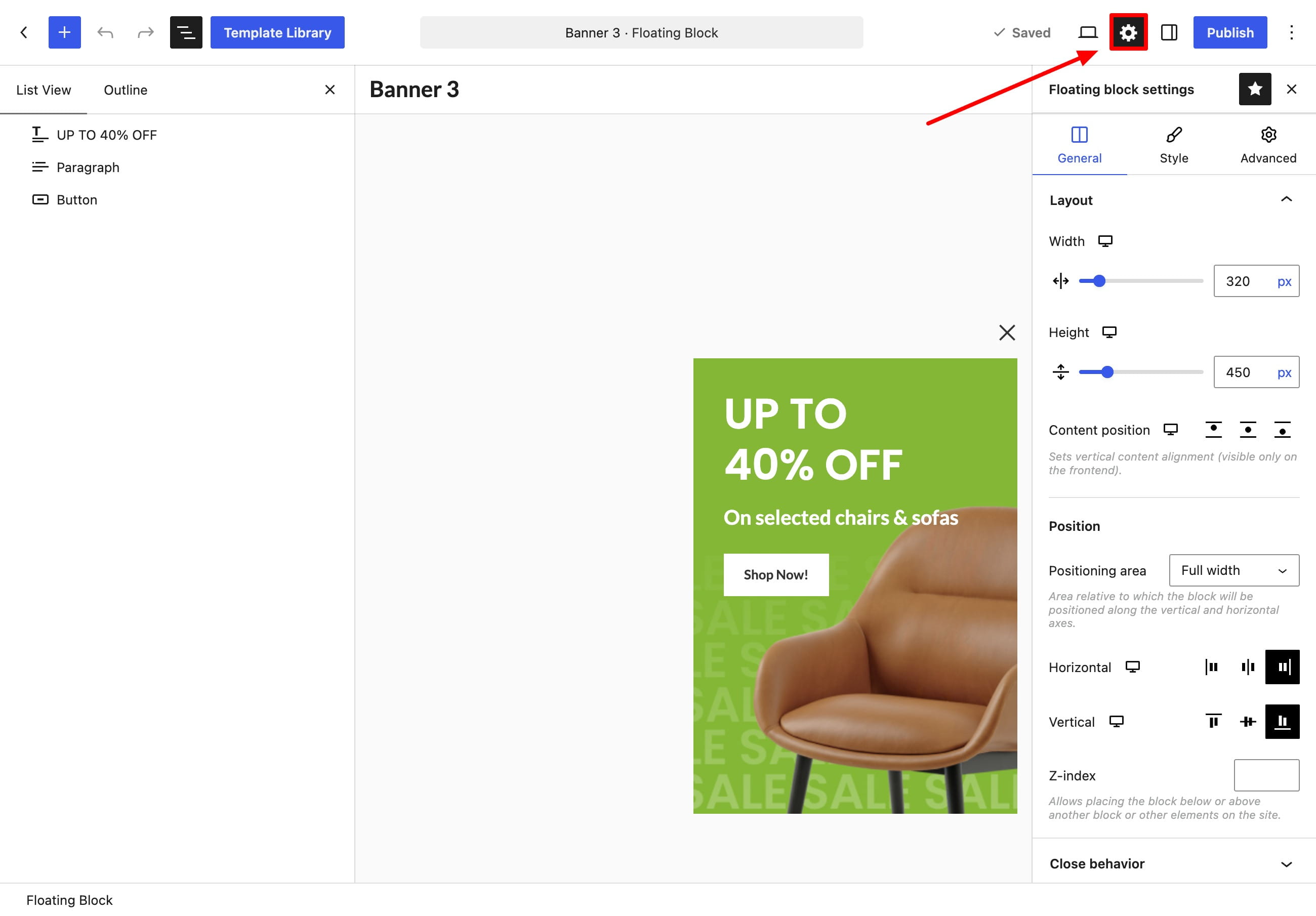
Open the floating block document settings from the gear icon in the Elementor editor. The block settings are displayed in the editor panel.
WPBakery
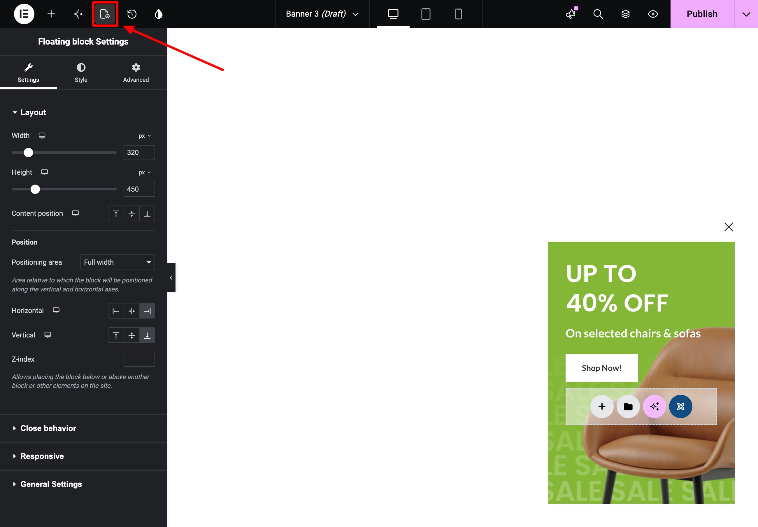
The floating block settings are displayed below the WPBakery content editor in the Settings panel.
Configure the floating block
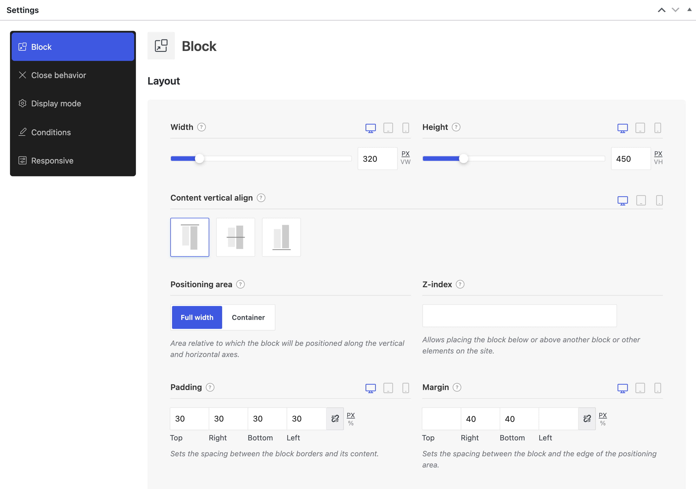
- Block — controls the responsive width and height, content alignment, screen position, spacing, background, border, shadow, and opening animation. Use Z-index to place the block above or below other page elements.
- Close behavior — adds and styles a close button, lets another element close the block through Close by selector, and controls whether a closed block remains hidden through Persistent close.
- Display mode — determines whether the block is displayed immediately or waits for a trigger.
- Conditions — determines where the block is available. Combine Include and Exclude rules to target the entire website, selected post types, individual pages, taxonomies, terms, user roles, or other supported contexts.
- Responsive — controls whether the floating block is hidden on desktop, tablet, or mobile.
Positioning area
The Positioning area determines the area used to align the floating block:
- Full width — positions the block relative to the full browser width.
- Container — positions the block relative to the website content container.
Horizontal and vertical alignment can be configured separately for desktop, tablet, and mobile. Padding creates space between the block boundary and its content, while margin creates space between the block and the edge of its positioning area.
Display mode
- Always — displays the block immediately when its display conditions are met.
- Use triggers — keeps the block hidden until one of its enabled triggers is activated.
Available triggers include page load, scrolling, inactivity, exit intent, clicks, URL values, page views, and sessions. See the Triggers article for details.
Default settings
- The block width and height adjust to its content.
- The block has a transparent background, is centered on the screen, and uses the Full width positioning area.
- The opening animation is disabled.
- The default condition includes the entire website.
- Display mode is set to Always, so triggers are not used and the block appears immediately.
- The close button and Persistent close are disabled.
Popup or floating block?
A popup is a modal window displayed over the page with an overlay. A floating block is a fixed, non-modal element displayed without an overlay, so visitors can continue interacting with the page. See Popup builder for the popup workflow.
| Feature | Popup | Floating block |
| Interaction | Modal | Non-modal |
| Overlay | Displayed behind the popup | Not used |
| Simultaneous display | Popups are shown one at a time | Multiple matching blocks can be displayed |
| Default display | Page loaded trigger with no delay | Always |
| Persistent close | Enabled by default | Disabled by default |
| Common uses | Focused promotions, forms, and notices | Persistent controls, information bars, and calls to action |
Test a floating block after closing it
If a floating block no longer appears while you are editing it, temporarily disable Persistent close and disable Trigger once for each active trigger. After testing, restore the required values.
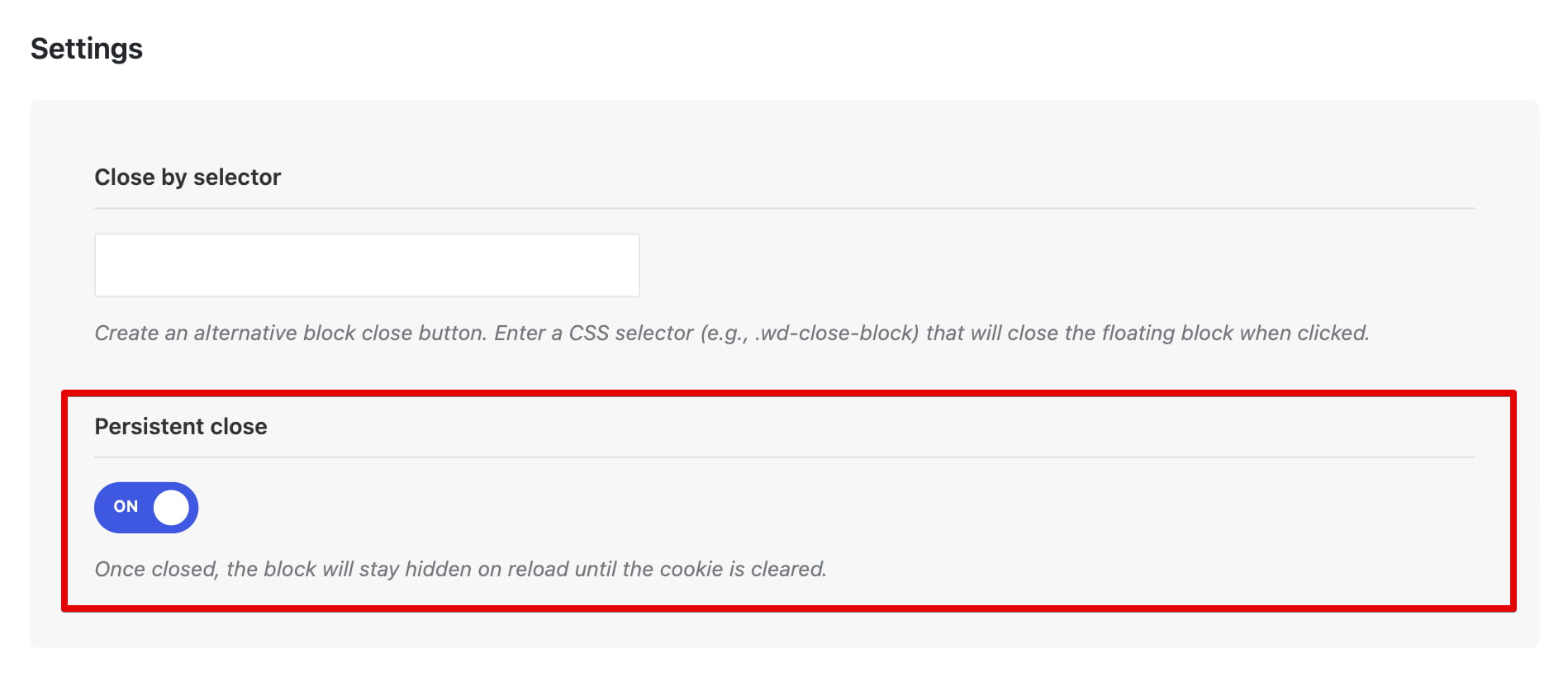
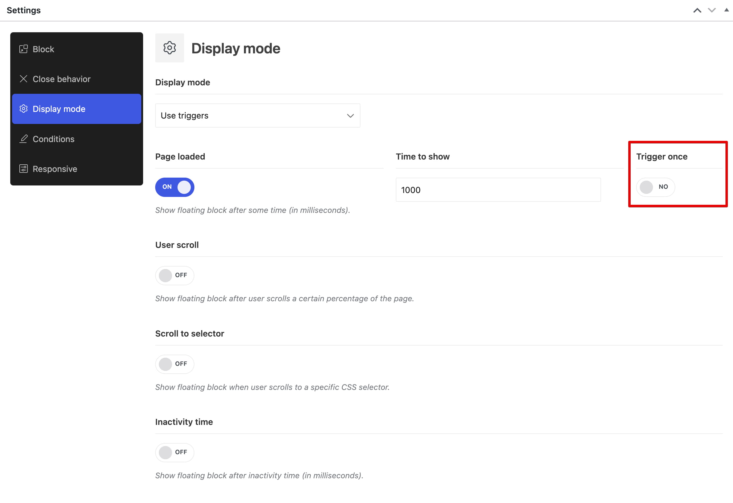
You can also test the floating block in a private browser window or clear the website cookies in your current browser. The default cookie lifetime is 7 days.
Video tutorial
Don’t miss WoodMart updates
Receive feature updates, tutorials, and WoodMart news via email.
 Last updated: September 7, 2026