
Configure parent hover effects
Parent hover changes the style of one or more child blocks when the visitor hovers over their parent. It can coordinate effects across a card, banner, column, or another group of nested content.
Set up parent hover
- Select the parent Row, Column, Container, or Full width section.
- Open Advanced -> Misc and enable Parent for hover.
- Select a child block that should react when the parent is hovered.
- Open a supported style control, such as color, background, border, box shadow, transforms, or opacity.
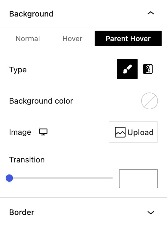
- Choose the Parent hover state and configure the required value.
- Repeat the child-block steps for any additional elements that should change together.
Banner and Info box blocks already act as hover parents for their nested content, so their child blocks can use Parent hover without enabling the option manually.
For example, a Container background can change from light to dark while its Title, Paragraph, and Button change to lighter colors. You can also rotate an Info box icon or move an image when the parent is hovered.
Don’t miss WoodMart updates
Receive feature updates, tutorials, and WoodMart news via email.
 Last updated: August 17, 2026