
Configure responsive headers
Header Builder provides separate layouts for desktop and mobile devices. The desktop layout is used at viewport widths of 1025 px and above, while the mobile layout is used at 1024 px and below.
Switch between responsive layouts
Use the Desktop and Mobile controls in the editor toolbar. Add and arrange elements independently in each layout; changing an element in one layout does not add it automatically to the other.

Build the mobile header
Keep the mobile layout focused on essential navigation and store actions. A typical arrangement includes the Mobile menu, Logo, Search, Account, and Cart elements, but you can use any elements available for the mobile layout.
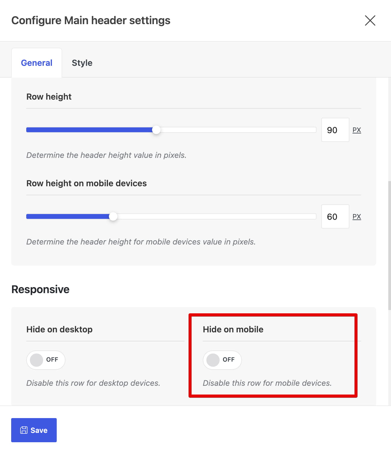
Row height has separate desktop and mobile values. You can also open a row’s settings and use Hide on desktop or Hide on mobile when a complete row should be available on only one device range.
Video tutorial
Don’t miss WoodMart updates
Receive feature updates, tutorials, and WoodMart news via email.
 Last updated: August 11, 2026