Product loop item layout builder
By utilizing a familiar drag-and-drop interface, administrators can construct custom layouts for product cards within the shop catalog. This ensures that every element — from titles and pricing to custom action buttons — aligns perfectly with the brand’s unique visual identity.
Step 1. Go to Dashboard -> Layouts -> Loop item and click on the “Add new” button.
Step 2. Write your layout name.
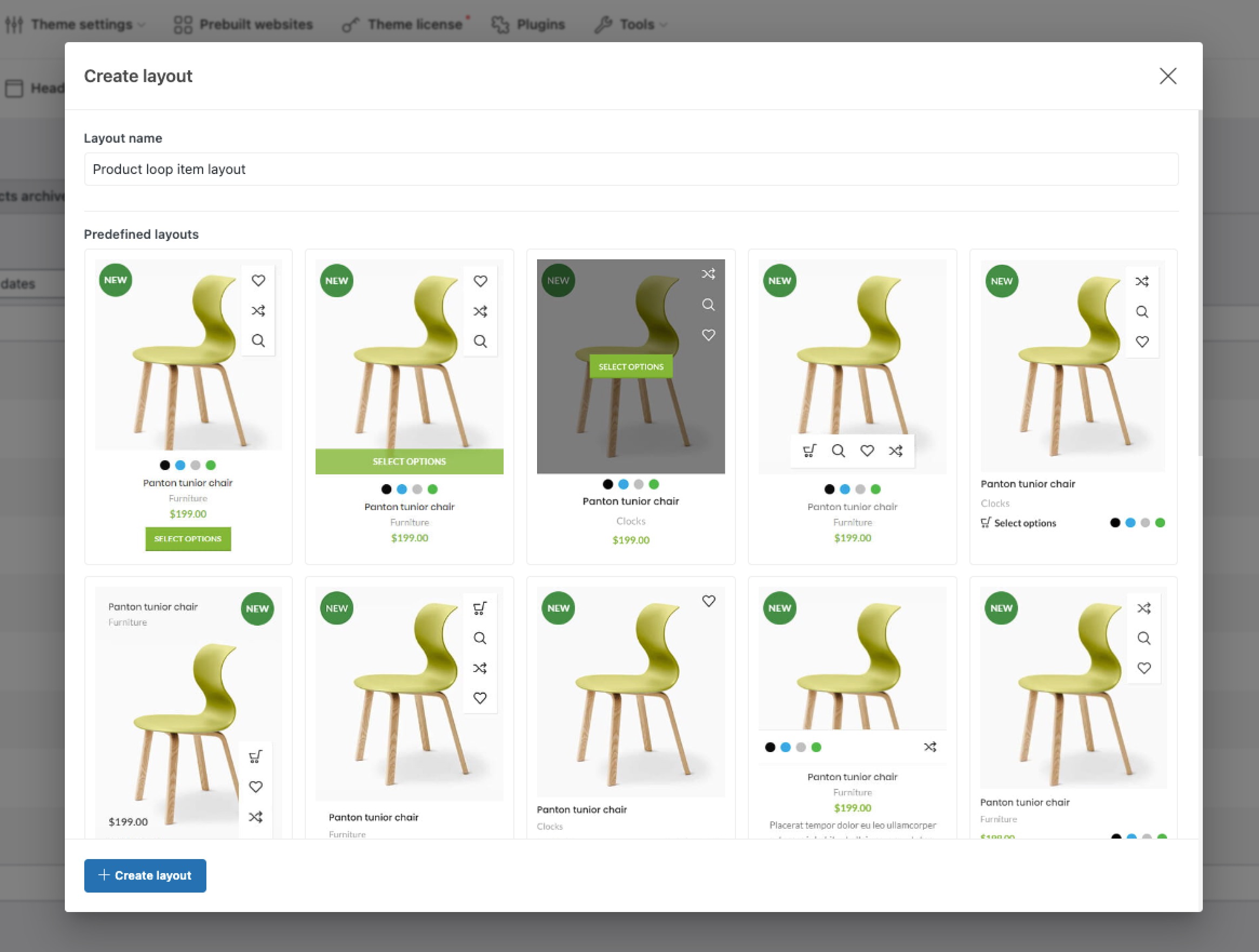
Step 3 (Optional). Choose one of the predefined layouts.
Step 4. Click on the “Create layout” button.
Step 5. Fill your custom layout with containers and special elements.
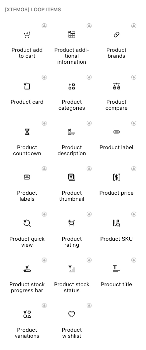
With the help of WoodMart dedicated product loop item elements and also other widgets like containers, rows and columns you can create your product design. Special WoodMart product elements are listed below.
- Product add to cart – displays button for adding the product to the shopping cart
- Product additional information – special information that includes product attributes, weight, and dimensions
- Product brands – show brand name assigned to this product
- Product card – additional wrapper for specific blocks that appears beneath the main item only upon hover
- Product categories – show category name assigned to this product
- Product compare – button to add this product to the compare table
- Product countdown – sale price end date countdown
- Product description – short information about the product
- Product label – displays one chosen visual badge, like “Sale”, “Hot” or “New”
- Product labels – displays all visual badges, like “Sale” or “New,” to highlight a product’s status
- Product thumbnail – featured image and additional product images
- Product price – regular and sale price
- Product quick view – button that opens a product preview in a lightbox without leaving the current page
- Product rating – star rating and reviews number
- Product SKU – unique identifier for each product to simplify inventory tracking and search
- Product stock progress bar – shows number of products in stock using a styled bar
- Product stock status – shows whether an item is currently in stock, out of stock, or on backorder
- Product title – current product name
- Product variations – selectable options like size or color directly on the product card
- Product wishlist – a button that adds this product to the customer wishlist
Features of product loop item layout builder
In Gutenberg, the product loop editor settings are located on the right side of the top editor bar, next to the save button. To open them, click the gear icon. Afterwards, you will see an additional product settings sidebar on the right side of the screen, which is similar to the settings for a standard builder block.
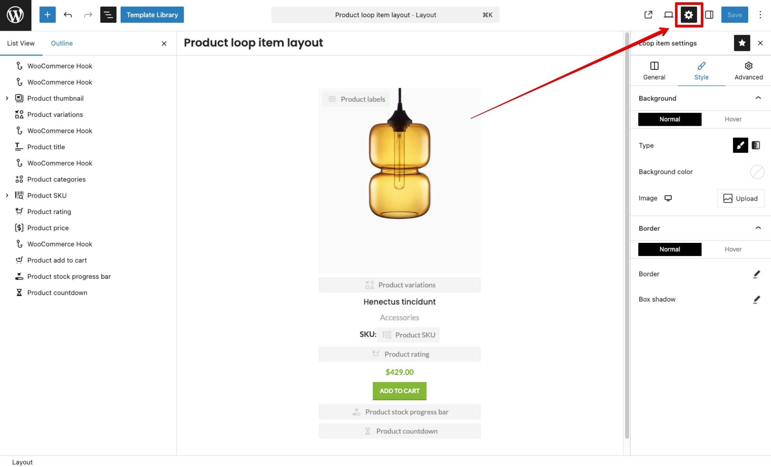
List of product loop editor settings
Product loop item layout builder include a set of options covering background, borders, shadow, paddings, and transforms. Most options are available for both idle and hover states. All these options are listed below:
- Blocks gap. Sets the spacing between individual elements within the root of main product wrapper.
- Even product grid. Ensures all product wrappers in the grid maintain a uniform height for a balanced layout.
- Bordered grid. Removes gaps between products, replacing them with a clean, continuous grid of divider lines.
- Editor preview product. Selects a specific product to display as a live sample while you are building the layout.
- Editor preview width. Adjusts the width of the container in the editor to simulate different screen sizes.
- Background. Sets the color, gradient, or image for the products’s main wrapper.
- Border. Defines the thickness, style, and color of the frame around an product wrapper.
- Box shadow. Adds a depth effect by casting a shadow behind the entire product wrapper.
- Padding. Controls the inner spacing between the element’s content and its border.
- Transform. Allows you to rotate, scale, or move elements, often used for hover animations.
- Overflow. Determines how to handle content that is too large to fit within the element’s boundaries.
Theme settings do not apply to individual Product Loop Builder blocks
The Product Loop Builder operates differently than the standard pre-defined product styles. The reason is that a custom loop is composed of individual, independent elements, each with its own specific configuration. Because every element (like the Title, Price, or Add to Cart button) has its own unique set of options within the builder, they cannot be controlled globally from a single toggle in the Theme Settings. To change the look or behavior, you must edit the specific element directly inside the Loop Builder interface. For example, if you previously used a Theme Setting to enable the product gallery inside the thumbnail, in the Loop Builder you must find the same option by selecting the Product thumbnail block and toggling the Product gallery setting there.
The Product Loop Builder opens in Gutenberg regardless of your primary page builder
Although the Product Loop Layout Builder is available on sites using any page builder supported by the theme, product designs can only be created using the native WordPress Gutenberg editor. This decision was made due to the limitations of WPBakery and Elementor regarding absolute positioning, nested element restrictions, and the lack of global “Parent Hover” functionality — all of which are critical for building medium-to-high complexity product designs.
How to change block color, background, and position on product hover
To change the block color, background, or position on hover within the WoodMart Loop Builder, you should utilize the Parent Hover state. The core concept is that the main wrapper of the loop item acts as the Parent. While many elements have standard “Normal” and “Hover” states, they also include a Parent Hover state. This allows an individual element to change its properties as soon as the user hovers anywhere over the entire product container, not just the element itself. Key features of parent hover:
- Dynamic Styling: You can change basic properties like background color, text color, and box shadow the moment the product is hovered.
- Advanced Animations: By using the Transform and Opacity options within the Parent Hover state, you can create sophisticated effects such as “slide-ups,” “fade-ins,” or elements that “pop out” only when the product is active.
- Coordinated Movement: Since all elements react to the same parent trigger, you can synchronize multiple blocks to move or appear simultaneously, creating a professional, interactive feel.
How to set up vertical alignment for the ‘Even product grid’ option
When you enable the Even product grid option, it ensures that all main product containers in a row stretch to the same height. However, by default, the elements inside these containers will still align to the top. To set the vertical alignment, you need to manually define how internal elements should distribute the newly available space. There are two primary ways to control this vertical alignment:
- The “Auto Margin” Method (Recommended for simple layouts). This is the quickest way to “push” an element to the bottom of the product (like the “Add to Cart” button). Select the element you want to push away from its neighbors. Go to its Margin settings. Switch margin units fom px to custom and set
margin-top: autoto push the element to the very bottom, ormargin-bottom: autoto push all elements below it to the bottom. - The “Flexbox Control” Method (Recommended for complex layouts). Since the main product wrapper acts as a Flex container, you can use Flex-grow to manage space distribution: Flex-grow: If you set this to
1on a specific element (like the product title), that element will “grow” to fill all available empty space. This pushes the elements above it to the top and elements below it to the bottom. Flex-shrink: This ensures that elements don’t get squashed when the container size changes.
 Last updated: March 18, 2026