Popup builder
The Popup builder gives you an incredibly flexible way to create and manage popups for your website. You can build highly targeted popups for specific pages and situations, moving beyond simple sitewide messages. With a set of conditions and triggers, you have full control over when and where your popups appear — whether you want to display a special promotion on a specific product page or offer a discount code to new visitors after they’ve been on the site for a certain amount of time. This level of customization allows you to create more effective and less intrusive popups that convert better.
Step 1. Go to Dashboard -> Popups.
Step 2. Click on the “Add new” button.
Step 3. Set predefined popups category and write your popup name.
Step 4. Click on the “Create popup”.
Step 5. Fill your custom popup with sections and special elements.
Step 6. Set the triggers and conditions for displaying the popup on the website.
Features of editors in different page builders
Since all three page builders used in the WoodMart theme have significant differences in their editors, it is worth knowing exactly where the popup settings options are located in each builder before creating and configuring a popup.
Gutenberg
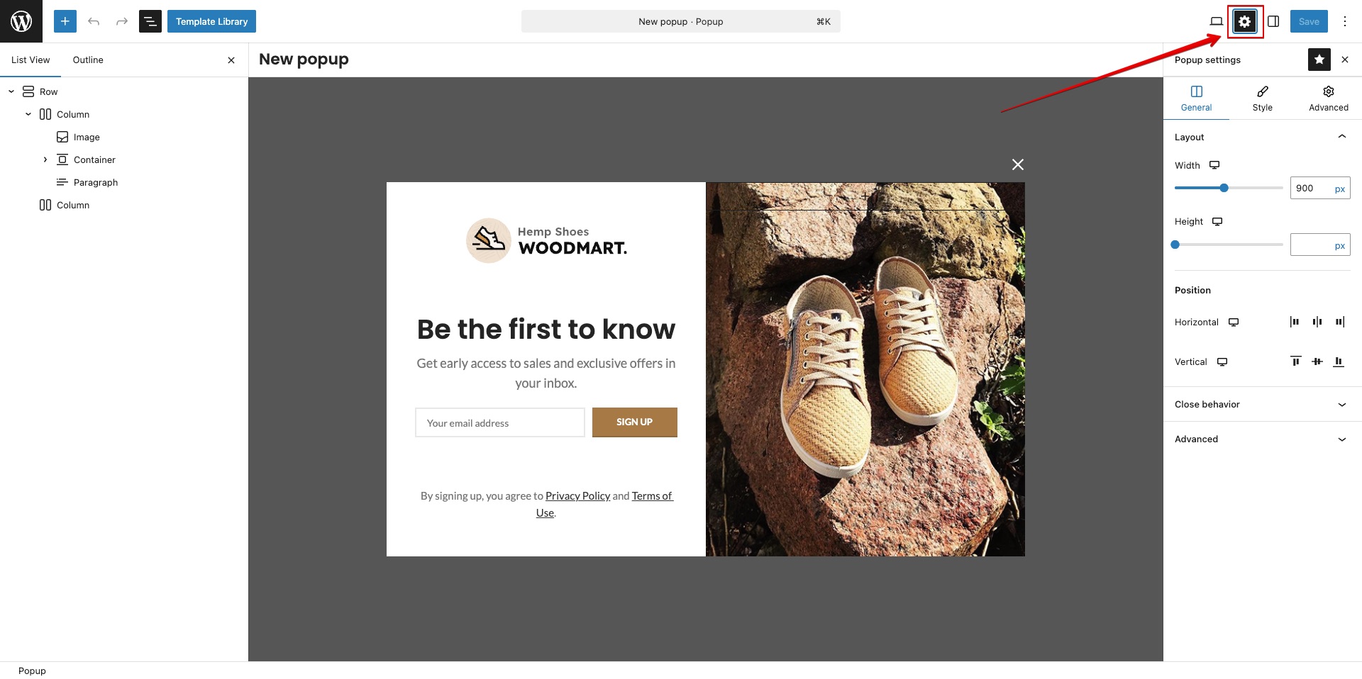
In Gutenberg, the popup settings are located on the right side of the top editor bar, next to the save button. To open them, click the gear icon. Afterwards, you will see an additional popup settings sidebar on the right side of the screen, which is similar to the settings for a standard builder block.
Important Note: Gutenberg has options for hiding elements on the panel, so if you do not see the gear icon, click the three vertical dots in the top-right corner of the editor, select “Popup settings” there, and ensure that the star icon (which enables the settings element on the top bar) is active in the upper part of the sidebar that opens.
Elementor
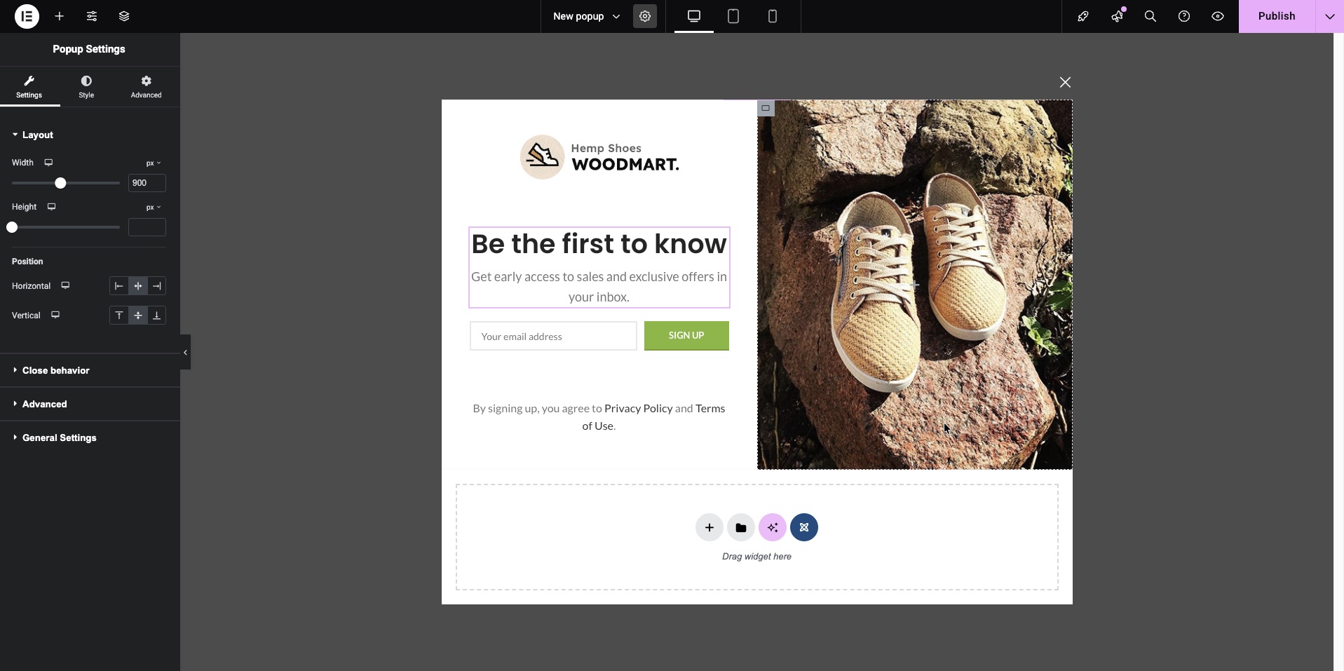
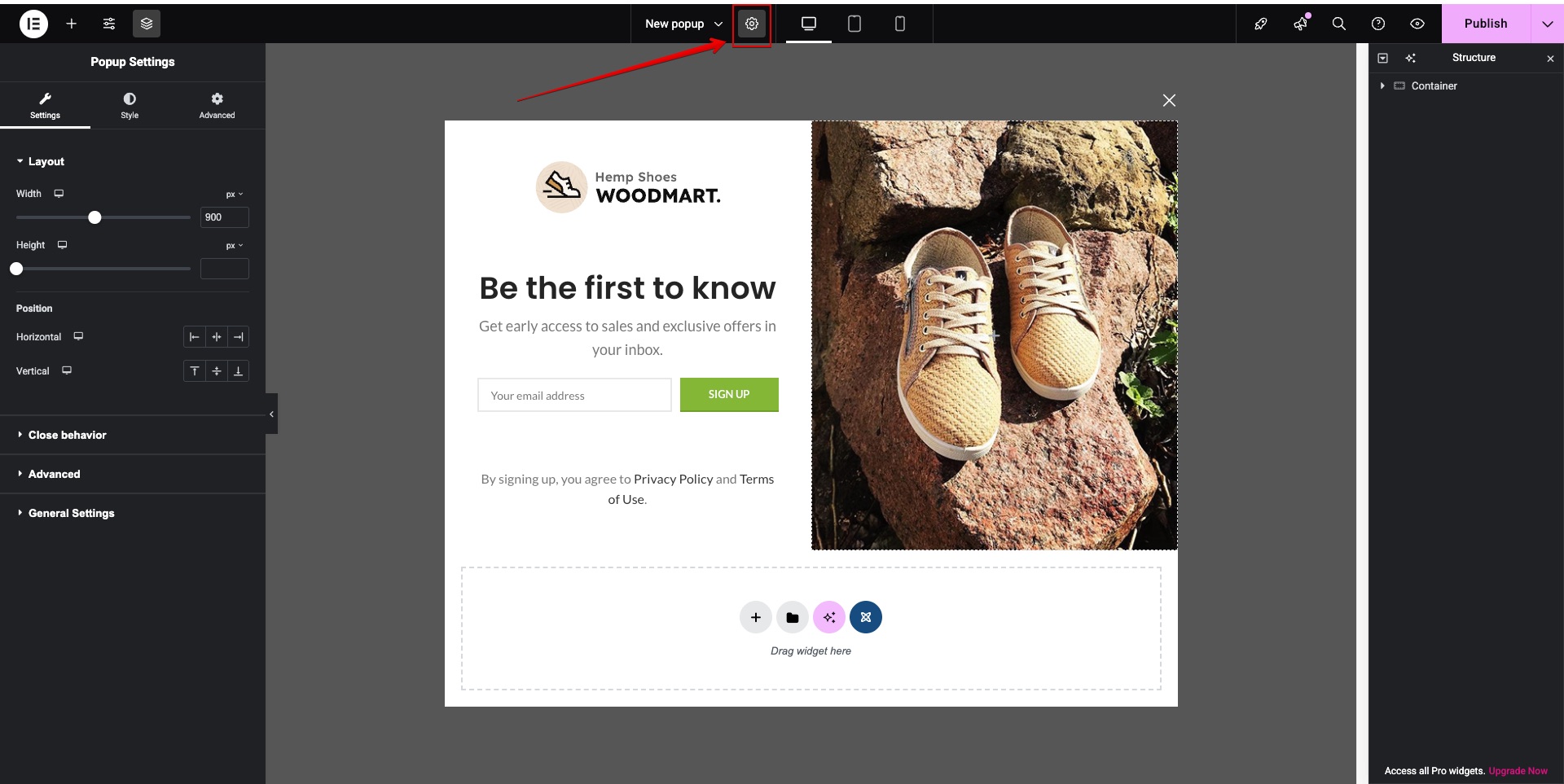
In Elementor, the popup settings are located in the same place as the regular page settings. To open them, click the gear icon in the center of the top panel. After doing so, you will see the popup settings in the left part of the screen, which are similar to the settings of a standard builder element.
WPBakery
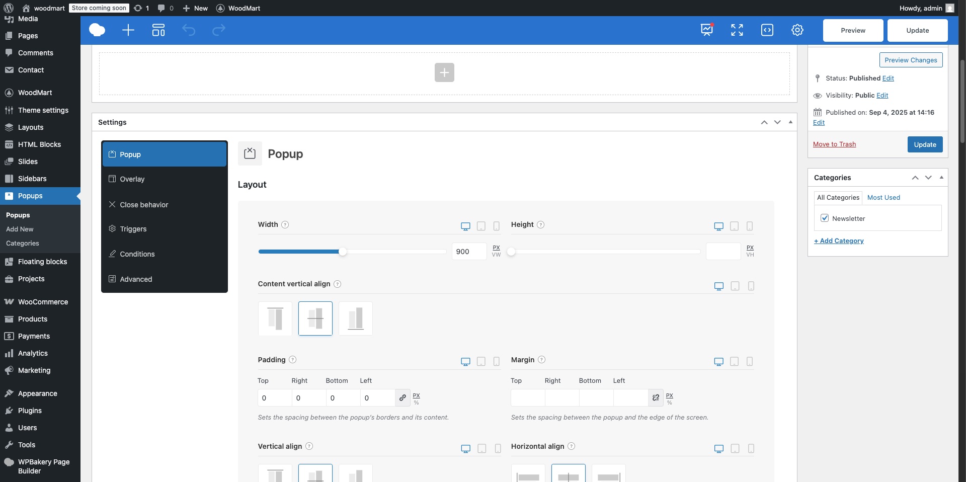
In WPBakery, the popup settings are located below the content editor, in the area where the page metaboxes are usually found. The popup is configured using controls similar to those used to set up a slider in this builder.
Standard popup behavior
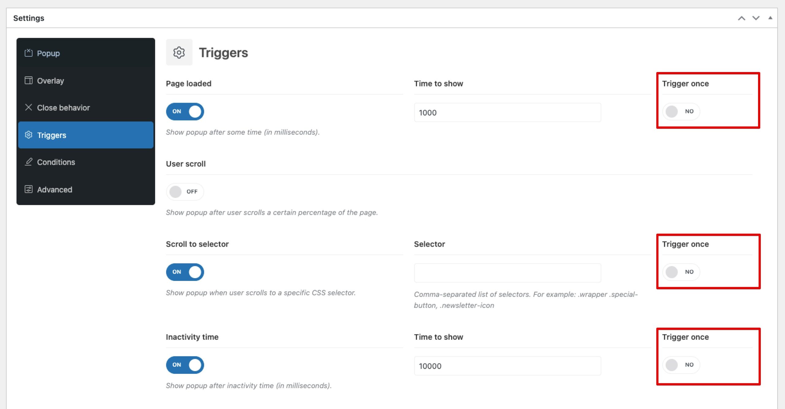
By default, a newly created popup has a width of 800px, a white background, a center-screen position, and the standard animation (sliding in from left to right). Only one condition is set by default, which displays it on all pages. From the available triggers, the first one, “Page loaded” with a zero-second delay, is selected, showing the popup immediately after the page finishes loading.
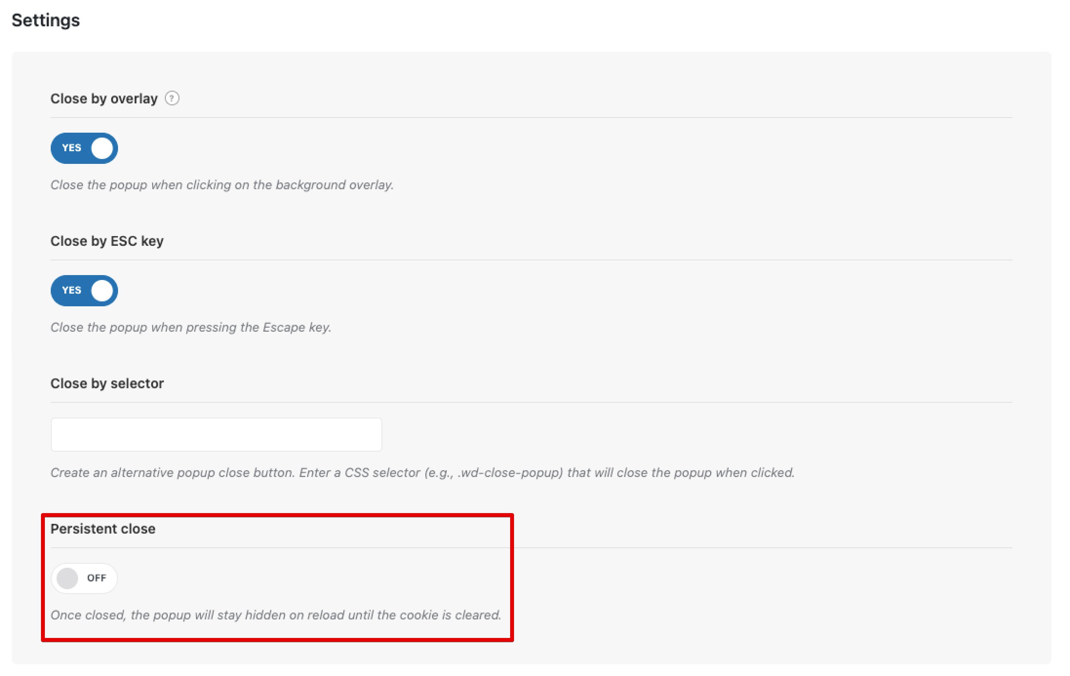
Regarding the closing options, all are enabled by default. The popup can be closed by clicking the close button, by clicking the background overlay, and by pressing the Escape key. The enabled “Persistent close” option means that if the popup appears due to a trigger but is then manually closed by the user, this popup will not be shown again until the cookie is cleared, even if the triggers are configured differently.
List of popup settings
Popup settings include a set of options covering size, positioning, styling, paddings, margins, borders, shadow, separate popup closing configurations, and animations. A separate and crucial category is the sections for configuring the triggers and conditions under which the popup will be displayed on the page. All these options can be divided into conditional categories:
- Layout. These are the options for width, height, and horizontal and vertical positioning that allow you to place the popup on the screen. The height and width options also let you stretch the popup to the screen edges, either vertically or horizontally, making it look like a sidebar or a horizontal bar. By default, the popup’s height depends on the size of the content within it. If the popup is given a fixed height, an additional “Content position” option appears. This allows you to position the content vertically if the content’s height is less than the popup’s fixed height.
- Styles. This is a set of options that allows you to configure all the basic styles, similar to those found in the vast majority of regular builder elements. Using the style options, you can customize the background, border, border-radius, shadow, paddings, and margins. It is worth clarifying that, in the case of a popup, paddings define the spacing from the edge of the popup to its content, while margins define the spacing from the edge of the screen to the boundaries of the popup.
- Animation. This option determines the effect with which the popup will appear. By default, it uses the same “From left to right” animation as all other popups on the site, such as the Quick-view and Add to cart popups, and others.
- Close behavior. These options are responsible for how the popup is closed. They cover the close button (including its design and color settings), closing by clicking the background overlay, closing by pressing the Escape key, and closing by clicking another element inside the popup specified via a selector. The last option, Persistent close, determines whether the popup can be displayed again after a user closes it, regardless of how the triggers that display the popup are configured.
- Overlay. This option controls the background color of the overlay that separates the site content from the popup. When setting the overlay background color, it’s important to remember that it’s always recommended to give it some level of transparency so that you can still see the content of the site behind it after the popup opens.
- Responsive. These options determine whether the popup will be visible on a specific type of device: desktop, tablet, or mobile.
- Scroll. This option determines whether the background will scroll after the popup is opened; it is disabled by default. This can be useful if the user wants to imitate the appearance of a standard off-canvas sidebar using the popup, similar to slide-out elements like the cart, mobile menu, and others.
- Triggers. These are a special group of options that define the conditions for displaying the popup, such as showing the popup after a certain time spent on the page, displaying the popup after a specific number of clicks, upon clicking a block with a certain selector, when scrolling the page to a specific height, and many others. Each trigger has its own sub-options and a “Trigger once” option, which specifies that this trigger can only be activated one time. The status of the trigger display is stored in a cookie with an expiration period of 7 days. You can find more information about triggers in a separate article.
- Conditions. These options determine on which pages a popup can be displayed. This can be a single page or a varying number of pages that meet certain criteria. You can set popups to appear only on the homepage or, for example, on products within a specific category. Conditions have sub-options: “Include” and “Exclude.” By manipulating these, you can, for instance, set a specific popup to display on all pages of the site, but then use the “Exclude” setting for the My Account page where it will not be shown.
How to configure a popup after it has been closed
If you plan to make changes to a popup but it is no longer appearing on the site because it was previously closed, go to the popup settings and temporarily disable the Persistent Close option for the duration of your development work. Also, ensure that the Trigger once option is disabled in all active triggers responsible for the popup’s appearance. Once you have edited the popup, checked its content, animation, and so forth, you can revert the aforementioned options to their previous values. An alternative way to see a closed popup again (when the options mentioned above are enabled) is to open your browser in an Incognito/Private window, use a different browser, or forcefully clear the cookies for the site. Without taking these actions, the standard cookie duration is 7 days.
 Last updated: February 19, 2026